It’s been four months since Google shared its modern vision for Material Design. The company has done a lot of work since then, redesigning several apps.
However, it still has a ways to go.
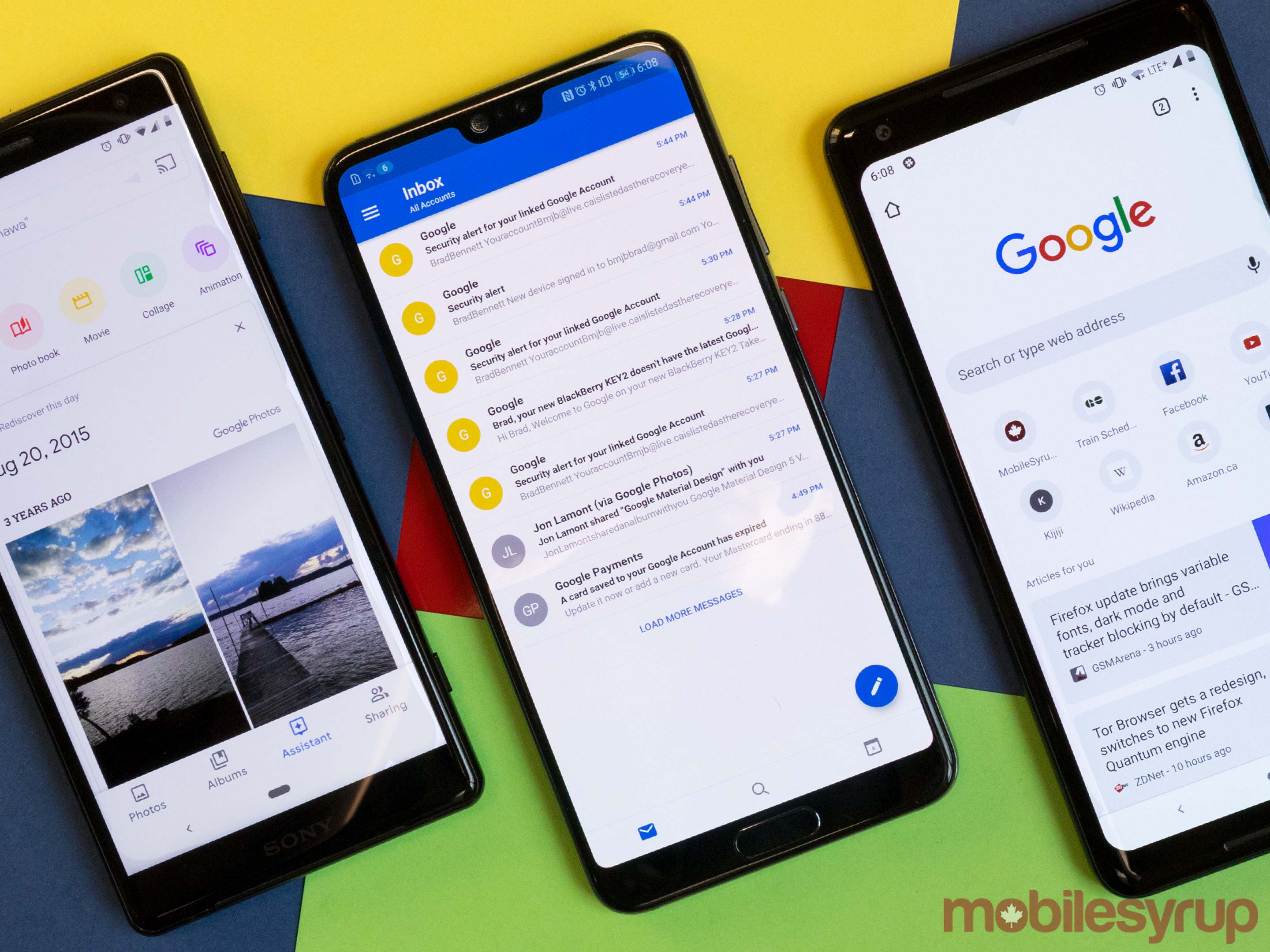
The Mountain View-based company already redesigned some titans of its app suite. The Android Maps app sports some new polish and Gmail on the web has an entirely new look.
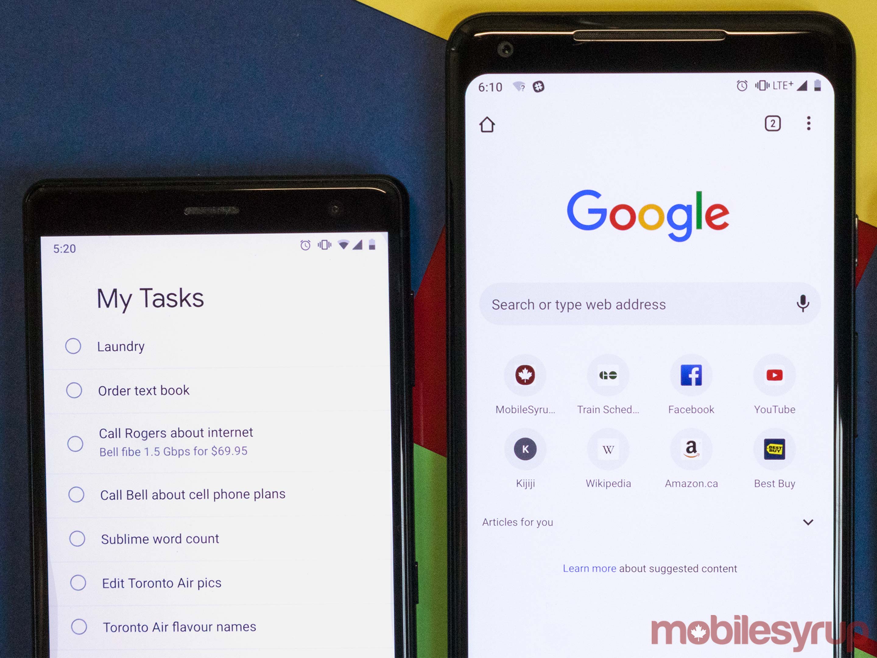
A few smaller apps have received a fresh coat of paint as well. Mobile Google Tasks and Podcasts, two relatively new apps, came out sporting the new look.
But what about Gmail for Android? Or Google Keep? Why don’t they have a new look? And Messages. It has a new look, but not for me.
There are several answers to these questions. And thankfully, there are solutions too. But to understand why some apps have a fresh new look and some don’t, you need to comprehend the nuances and ideals of Material Design and why Google’s redesigning and unifying its apps in the first place.
New Material Design
Material Design is Google’s framework for designing apps and web pages. More-or-less, it’s Google’s version of Apple’s iOS Design Principles.
Google uses Material Guidelines to help apps maintain consistency. The guidelines are designed to give developers control over the look of their app, while maintaining a set of rules for how an app should function. Examples of these guidelines include the way an animation flows, and how far a Floating Action Button (or FAB) should rest from the edge of the display.
If you’re interested, you can read more about how Google designed Material Design to give developers freedom.
The important thing to understand is that Material Design is a guideline. Google’s creative director Rachel Been described it as “infinite possibilities with guardrails.”
Google’s Material Design
While the new Material Design is a guideline, Google’s Material Design is an expression of the company. Matias Duarte, Google’s president of design, Been and the rest of the design team worked to create a clearly Google brand within the bounds of Material Design.
Been and Duarte wanted that design to feel trustworthy and distinctly Google. Additionally, the company’s ethos should permeate the design.
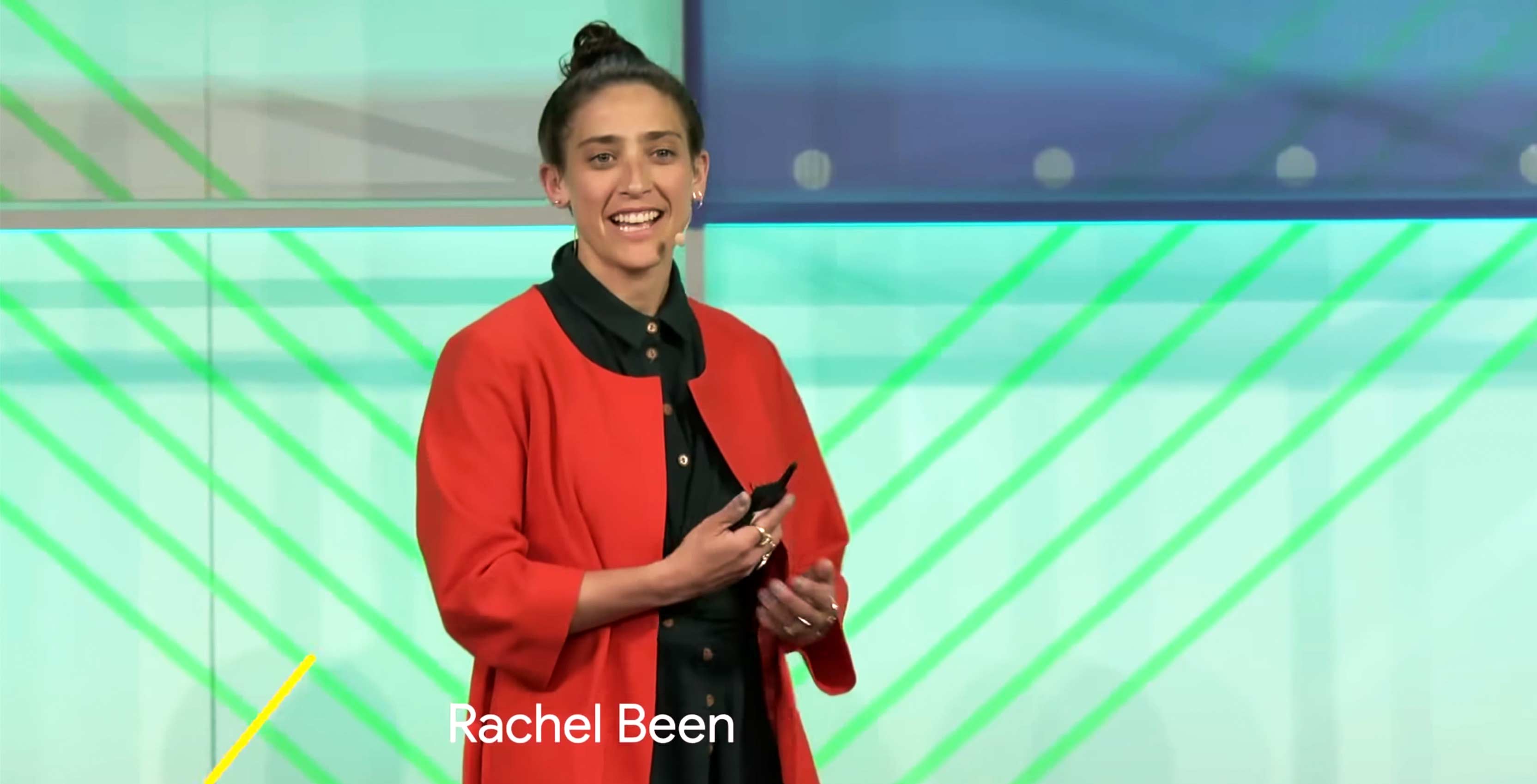
Image source: YouTube
Google defines its brand through fonts, elevation and colours. Fonts, for example, utilize Google Sans — a distinctly Google typeface styled like the company’s logo.
Elevation works by separating elements of the app from each other using subtle shading. Take the FAB for example. Developers elevate most FABs to make them stand apart from other elements of the app.
An example of Google Sans and a FAB
Colour is equally important, especially for Google. You may be wondering how that makes sense, given Google’s new apps heavily use white.
White space is one of the core tenants of Google’s modern design. When it comes to its design process, the company considers white a primary colour. It’s used to cut down on visual muddiness and to highlight content on the page.
Google also uses it’s signature logo colours to highlight action, especially if it’s a unique Google action. You can see this in the multicoloured microphone icon that activates Assistant and the multicoloured FAB in the Gmail redesign.
That’s great. Why do some of my apps look like this and others don’t?
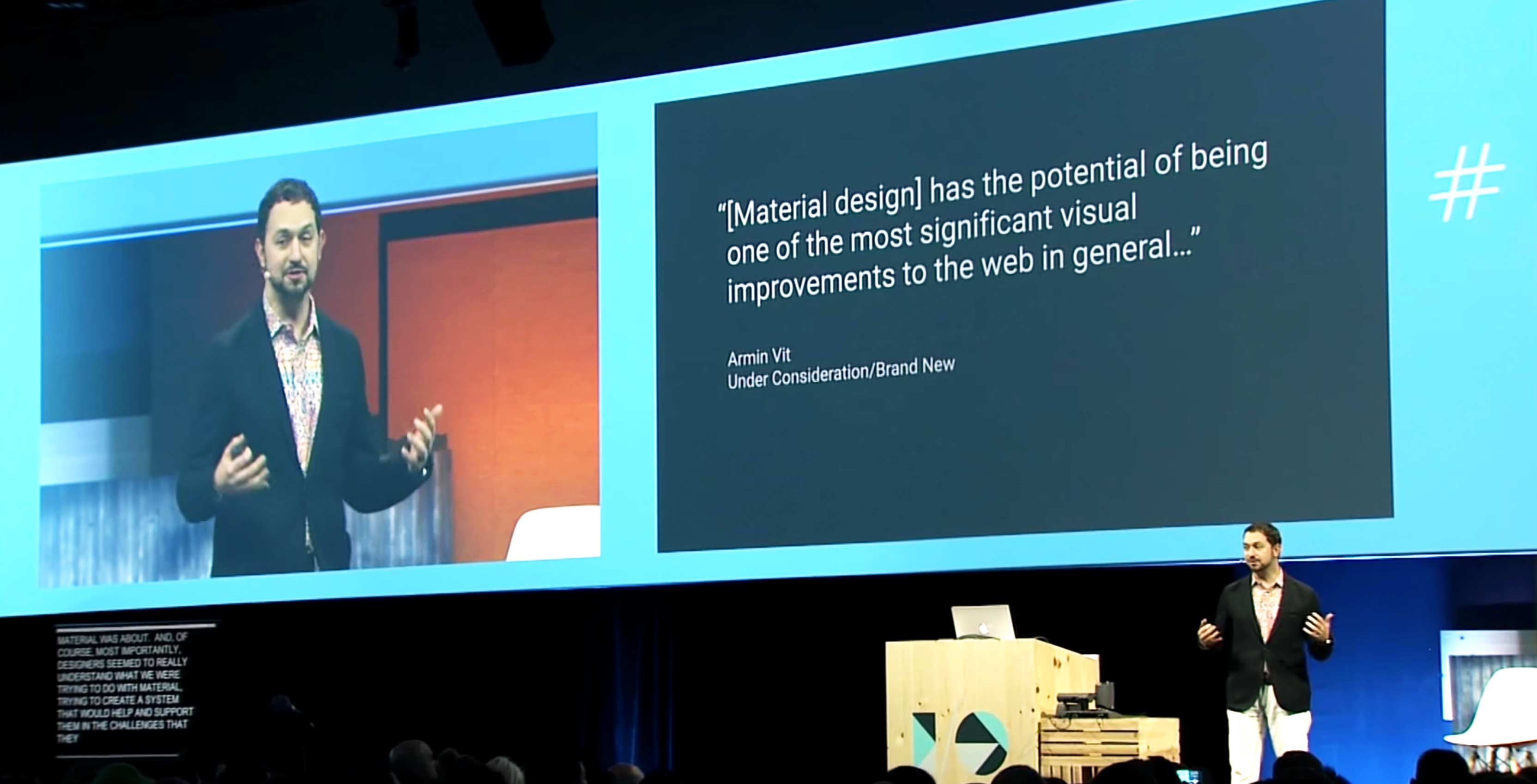
Image source: YouTube
During a round-table discussion at Google I/O, Duarte was asked a very similar question. His answer was a small glimpse into the company’s inner workings.
For one, Duarte said Google wanted to roll out the new Material Design to app developers as soon as possible. Google could have waited until all its apps were ready and did one massive Material roll out like Apple would. However, that would have delayed an integral tool for developers building Android apps.
Along with getting the tool to external teams, Google wanted to accommodate its internal teams. Each Google product has its own design team, according to Duarte. This makes the design process decentralized in a way. Duarte presents a vision and the individual teams integrate it in a meaningful way for their product.
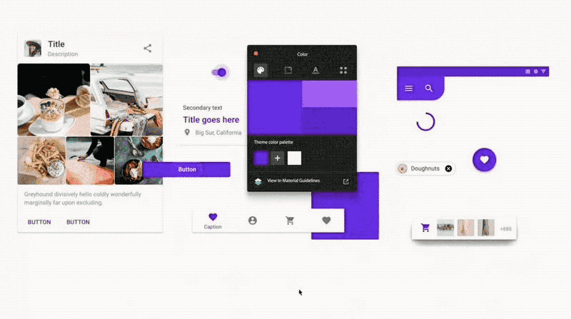
Examples of Material Design from Google’s Material Design YouTube videos.
Furthermore, some apps are much bigger and need more time. Google Maps, for instance, is massive. It’s incorporated some material changes on mobile, but the web version hasn’t changed yet.
Some product teams work towards the redesign slowly, implementing small changes. Others hold off for a single big update.
While this may work out better for the product designers, users are left feeling confused. Some Google products look and feel different on every platform.
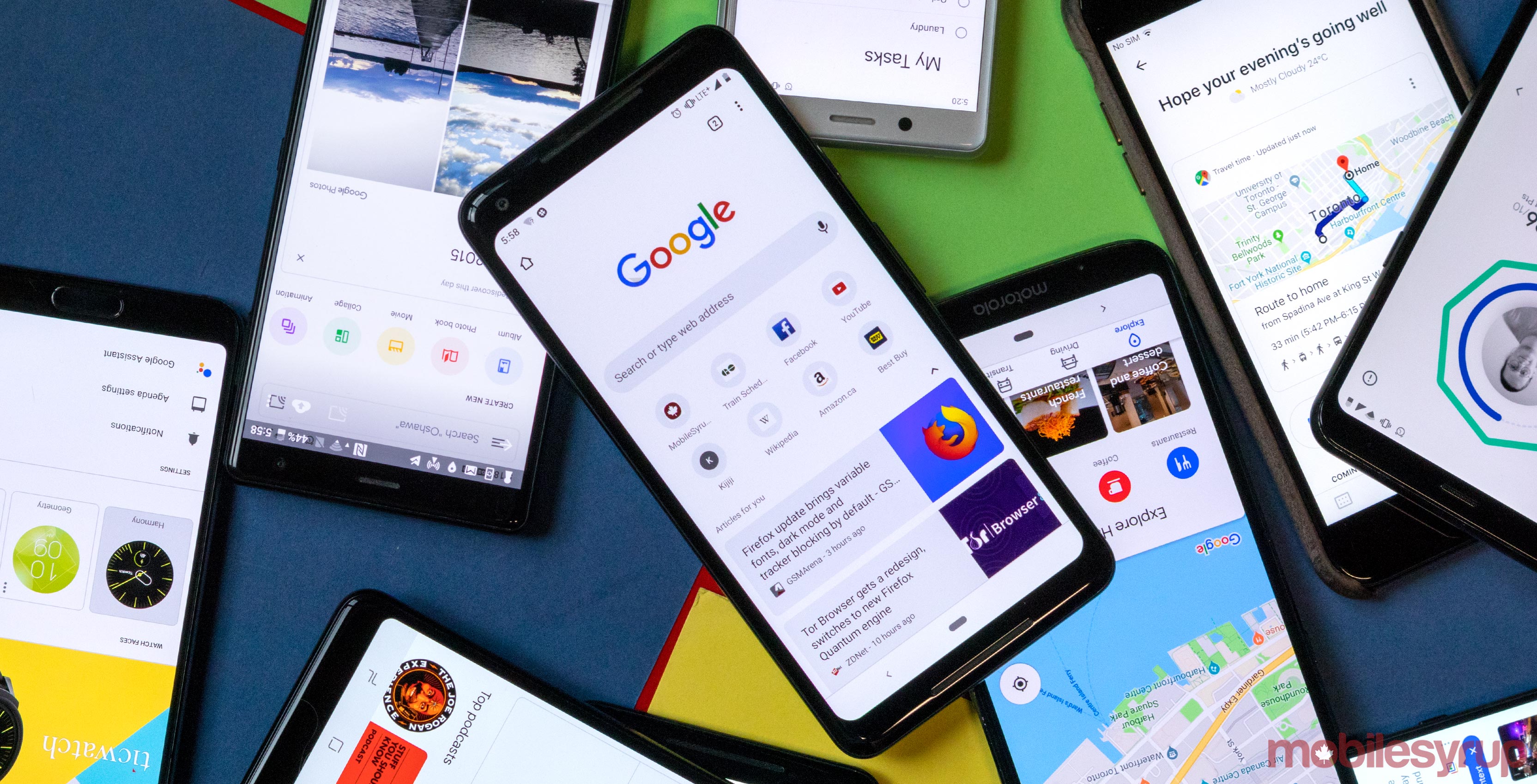
Which apps have the Google Material Design?
Google has an extensive suite of apps spanning Android, iOS and the web. We decided to make a comprehensive list of which apps on which platforms sport the new Google look.
Our list focuses on the most important Google apps. Not all apps are available on every platform. We’ve marked these instances with an ‘N/A.’
Furthermore, we’ve marked which apps sport partially implemented Google Material Design. These apps show ‘Partly’ under the corresponding platforms.
Finally, a ‘Yes’ indicates the app is redesigned, and ‘No’ means it hasn’t.
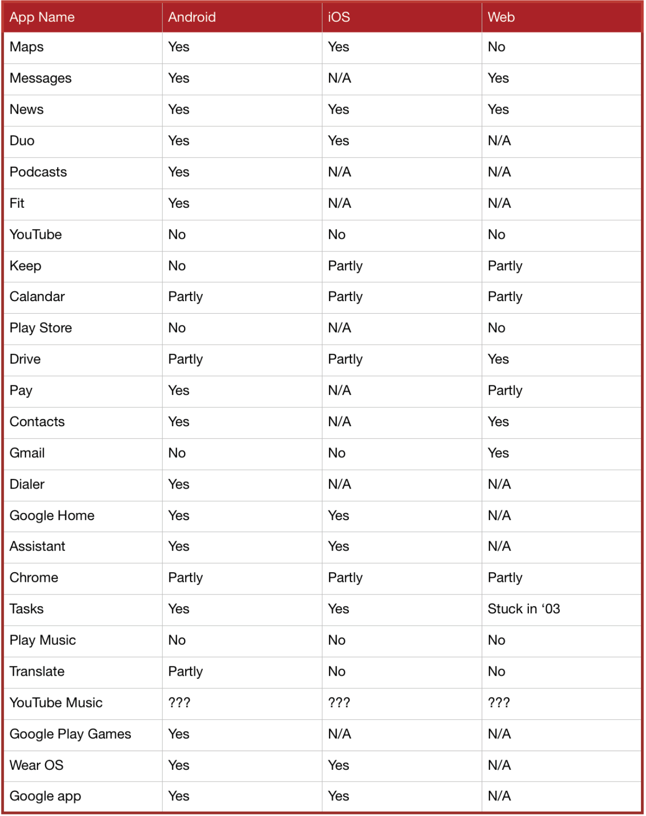 * The web version of Tasks is built inside of the new Gmail, Google Docs, Slides and Sheets. Plus there is a weird version from what seems to be 2003 that we’ve linked to at the end of the article.
- *We’ve added a list of apps at the bottom of the post that have been updated since this post went live.
The inconsistencies
Along with the inconsistent redesign schedule, redesigned apps aren’t always consistent with one another.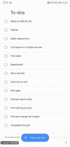
While all the apps get the big things right, like the use of white space and colour, there are plenty of small things that differ between apps.
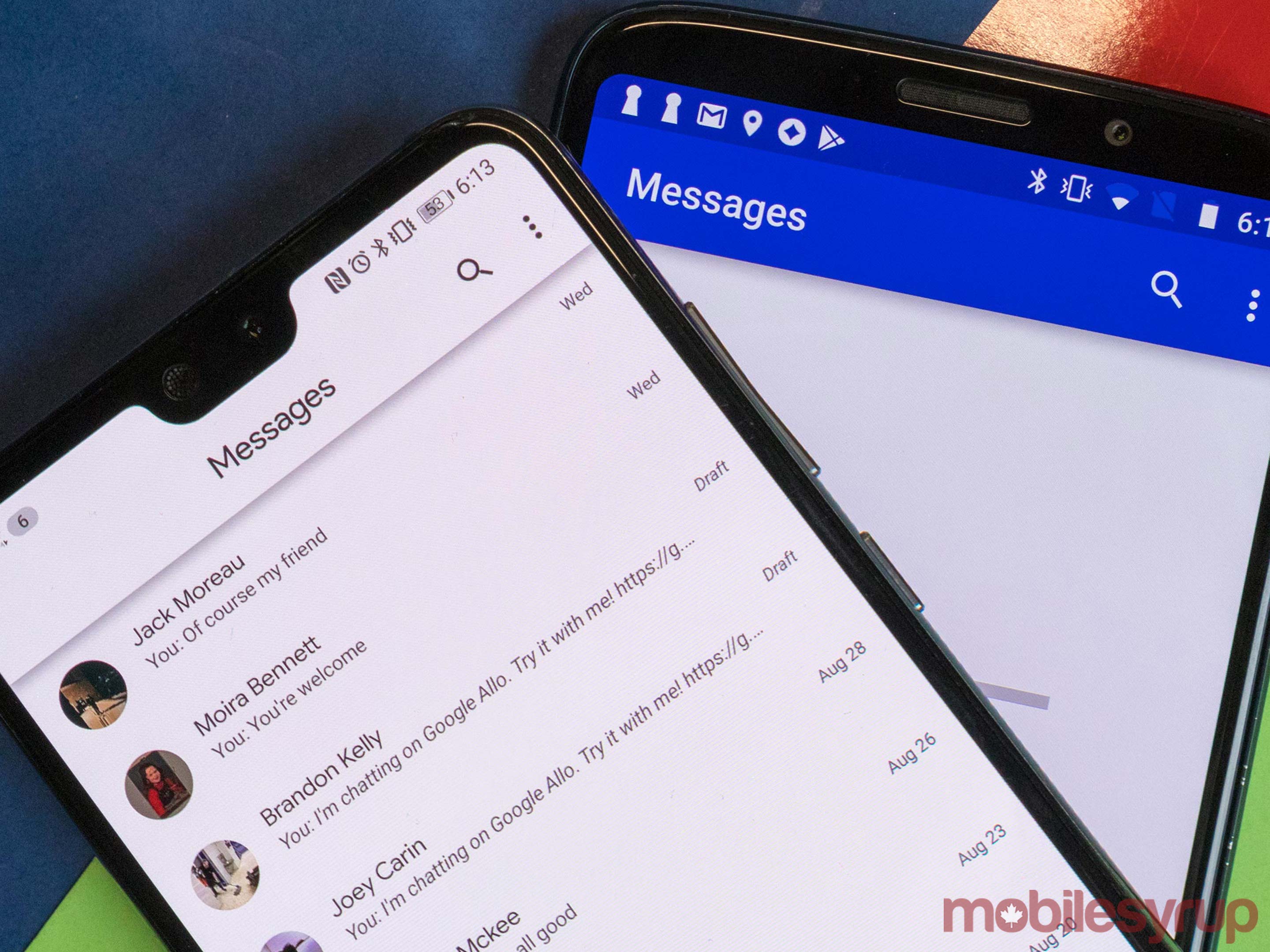
For instance, look at how scrolling affects the title bar of apps. In Messages and Podcasts, the title bar doesn’t move when you scroll.
However, the title bar does move when you scroll up in Google News.
Google Tasks differs even more — it doesn’t have a title bar until you start scrolling. On top of that, Tasks’ title isn’t centred.
Another inconsistency between these apps is the shadow under the title bar. Messages has a shadow, but Podcasts and Tasks don’t. News put a shadow under the status bar instead.
Granted, title bars and shadows are relatively nitpicky points. Considering the decentralized nature of Google’s design teams, these inconsistencies could be the result of the work of different teams. But Google Tasks differs from other redesigned apps in a big way.
Tasks is a bottom-oriented layout. There’s no title bar, but the bottom of the app has the hamburger menu on the left and the three-dot overflow menu on the right. In the middle, it has a large elongated blue FAB.
Despite the different look, Google Tasks is still clearly, undeniably Material Design. It’s also clearly Google’s Material Design.
And that’s the point.
Google wants app developers to know that Material Design is for everyone. Tasks is just one example of how flexible Material Design is now.
How to get Google’s Material Design
So, Google has all these redesigned apps, but my phone looks the same. Unfortunately, that’s likely because your apps haven’t updated yet. For Android users, Google tends to do slow roll-outs via the Play Store and through server-side updates.
It’s a safe way to do things. If an update breaks something, Google can catch it before too many people are affected. The downside is that it takes a long time for updates to reach all users.
The easiest solution is to sideload the APK file. This is how I updated my Contacts app and Messages app. It’s a rather simple process. Go to a website you trust — I personally like APK Mirror — and search for the app you want to update.
Then download the most recent APK and install it. You may have to enable installations from unknown sources in the Settings menu first. However, if you have a newer phone, a pop-up will ask you if you want to allow Chrome to install apps from unknown sources.
The APK file will update the app on your phone and likely give you the update. However, using APKs from outside the Play Store is always risky.
Unfortunately for server-side updates, you’ll have to wait like everyone else.
Other apps, like Google Chrome, may need users to force the update.
The stragglers
There are a few apps and platforms that either have their own design or are going to take a long time to update. Apps like mobile Gmail, and Drive’s app suite, all seem fairly set on getting an update soon.
It’s platforms like YouTube Music, Android Auto, Android TV and the Play Store that have an uncertain future.
YouTube Music may be the hardest to define. It’s one of the company’s most recent apps, yet it has a style that’s distinctly its own. It’s using Material Guidelines, yet it’s not Google’s Modern Design.
Android Auto is a huge project, but it seems like a new design may be on the way. At I/O, Google showcased a few tweaks that appeared to be coming to the in-car experience. While it didn’t show a lot, what it did show had more Material Design elements than the current Android Auto. However, what the company did show doesn’t quite line up with Google’s Material Design.
Android TV is a tricky one, and for most users it seems that they’re out of luck. The version of Android TV your television set came with is likely what it will be forever. There is a newer version that was shown off at I/O, but it’s hasn’t seen a wide release yet, and Google hasn’t shared any plans for updating older TVs.
https://www.youtube.com/watch?v=qf_2XeufnF4
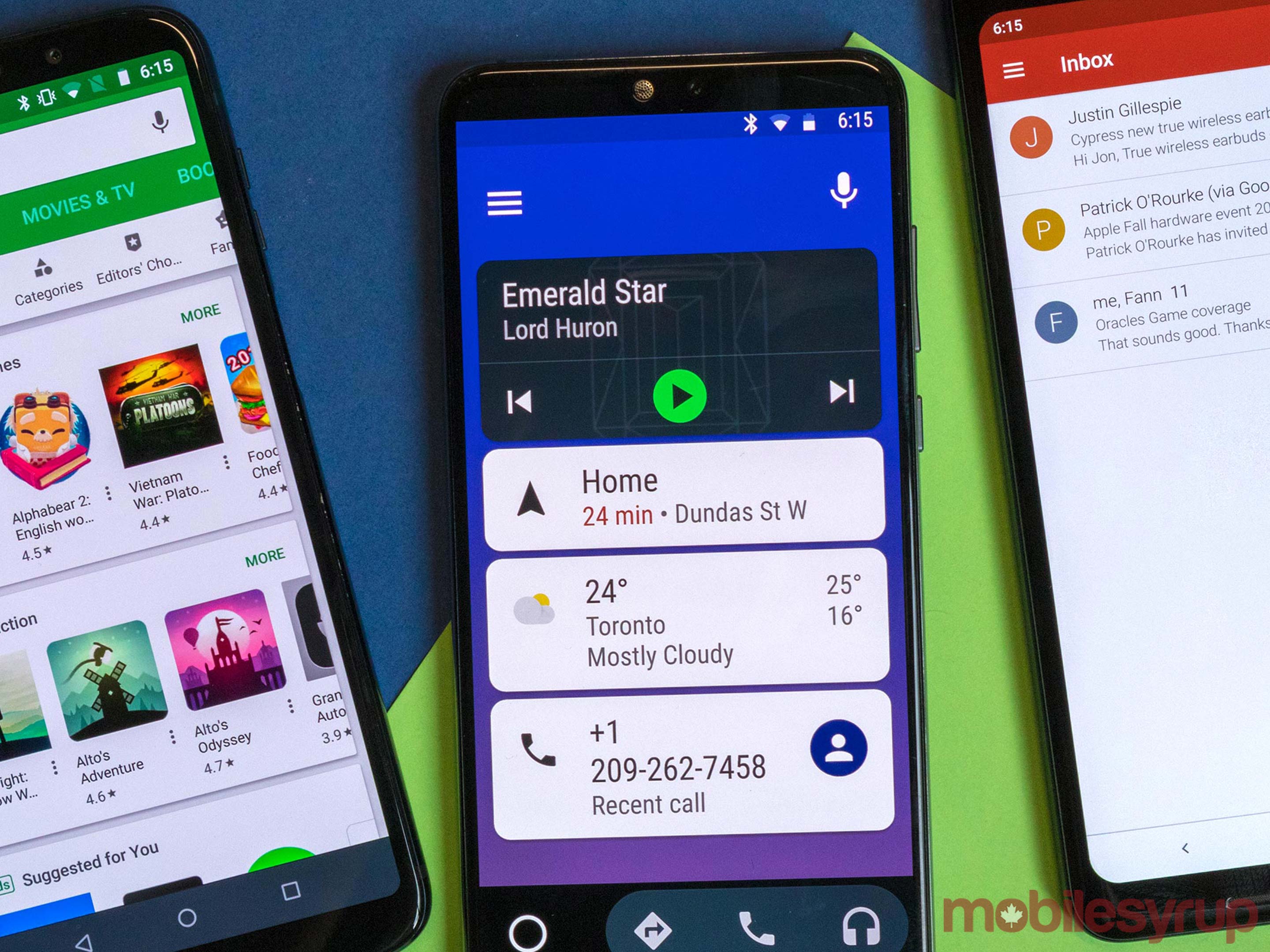
The Play Services are a slow process since there are five apps that stretch across as many as three platforms. Logic suggests that Google will update the apps with its modern design, but since the apps are huge to begin with it will definitely take some time. So far, the only updated app is Google Play Games.
It’s worth noting that Google operates a smaller scale virtual store-of-sorts inside the Google Assistant app. The store is for Actions and it has Google’s modern design through-and-through. It may be a potential option for what a future Play Store could look like.
We also found this fun web version of Tasks during our research for this story, so if you use Google Tasks and have a computer from 2003 back home, we got you. Click here.
Update 18/10/2018: In the time since we’ve published this post, Google has updated even more of its apps. Here are links to the stories we have written about them.
Further, here are a few other updates that we didn’t write about, but are still notable.
MobileSyrup may earn a commission from purchases made via our links, which helps fund the journalism we provide free on our website. These links do not influence our editorial content. Support us here.
