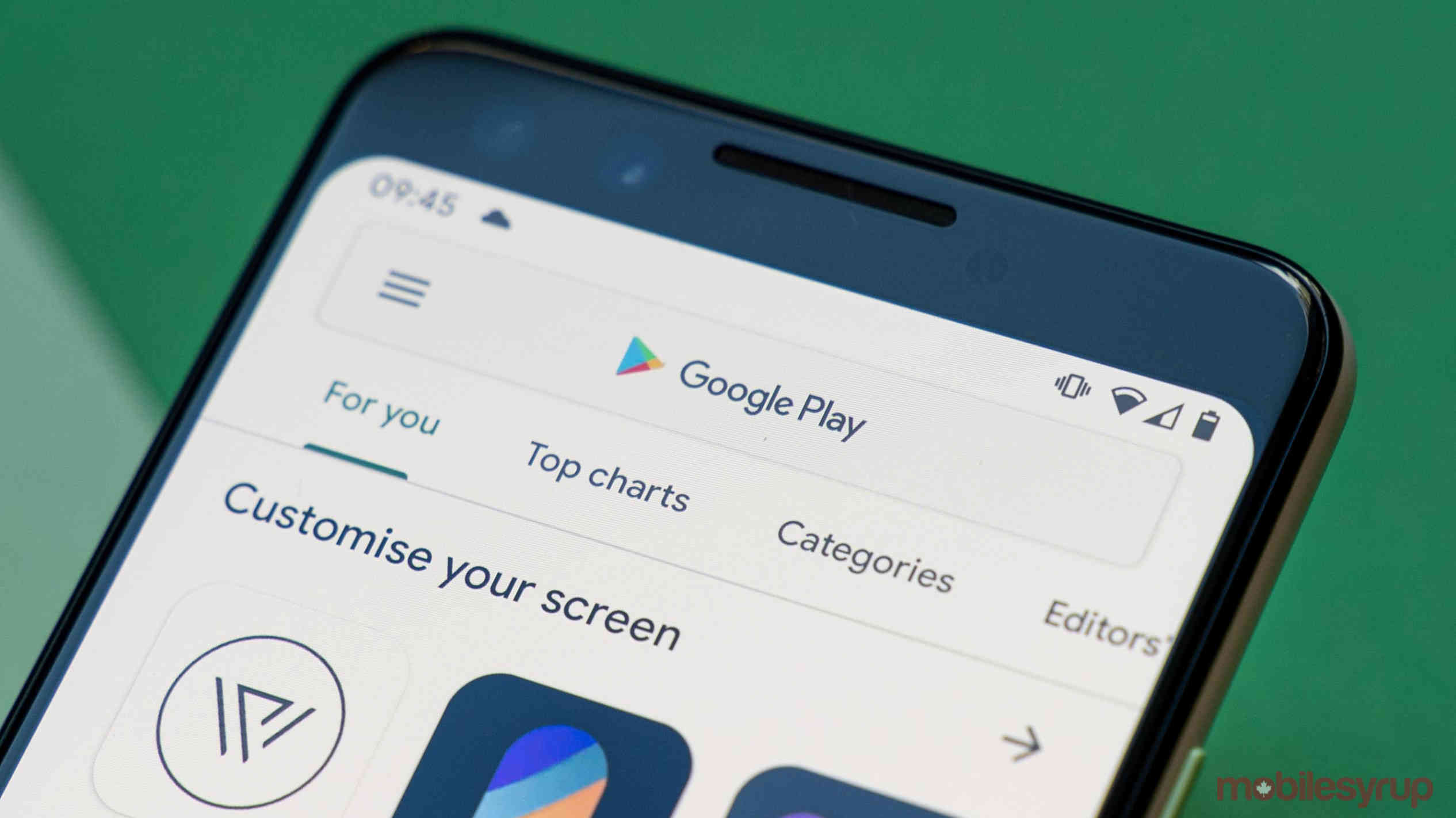
The Google Play Store is rolling out a redesign for the category section that makes it easier to navigate.
The redesign, which also includes a new look for the ‘Family and Kids’ categories with larger icons, was first spotted by a Reddit user.
The new look better spaces out the icons in the Play Store and makes them larger, more detailed and circular. The ‘Top categories’ section has also been removed.
Further, the Family section has changed a bit with new icons for the categories and an overflow menu to access all of the categories, instead of seeing them just on the main page.
According to 9to5Google, it’s unclear if this will be a wide rollout or if it’s part of a smaller UI test. For example, the update hasn’t hit my smartphone yet, indicating that it’s likely server-side.
Source: 9to5Google, Reddit
MobileSyrup may earn a commission from purchases made via our links, which helps fund the journalism we provide free on our website. These links do not influence our editorial content. Support us here.
