It looks like Google is working on a new user interface (UI) look for Chrome OS with a new light and dark theme.
Spotted by Android Police, several code changes to the Chromium Gerrit, an online tool used to submit and review code, indicate work on the new interface themes. Work on a dark themes was kind of given, considering everything has a dark theme these days. However, you might be wondering about the new light theme since Chrome OS is already available in a light theme.
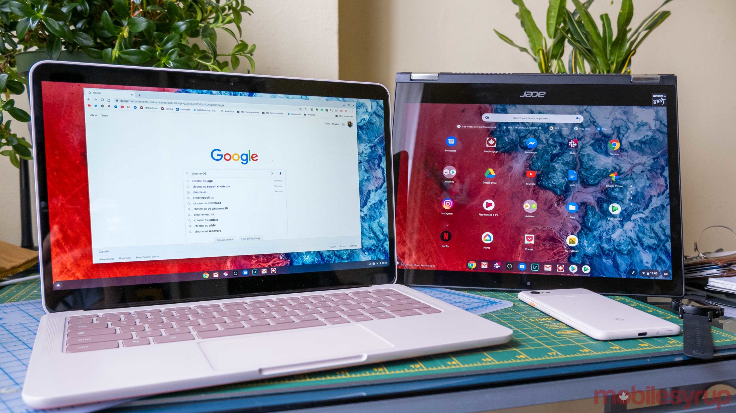
As Android Police points out, the answer is consistency. Currently, Chrome OS is an odd blend of light and dark theme, with things like the ‘Shelf’ and the notification area using a dark theme while other parts of the operating system have a light theme.
One code change addresses the Chrome OS login screen. In short, it appears the code would make the screen adopt a tinted colour based on the wallpaper, or default to white if it can’t do that. That differs from the current login screen code, which is similar but uses black instead of white.
Another code change spotted by Android Police overhauls the Chrome OS launcher to use a white colour for things like the app drawer, search box, suggestion bubbles and more. A third change adjusts the ‘Shelf.’
There’s also a dark mode in the works, but Google appears to be taking its time with the feature. Android Police points out that Google’s first attempt at dark mode in Chrome OS introduced a bug that crashed several Chromebooks. The company seems to be making changes slowly to avoid a similar incident.
The new UI will likely ship with both light mode and dark mode once both are ready since the two elements will play off each other. Unfortunately, it’s not clear how much longer we’ll have to wait.
Source: Android Police
MobileSyrup may earn a commission from purchases made via our links, which helps fund the journalism we provide free on our website. These links do not influence our editorial content. Support us here.
