Uber has brought its city commute time data to Toronto with the launch of the Toronto Uber Movement website.
The company built the tool using GPS data obtained from its driver, which has led to an interesting way to map out the city.
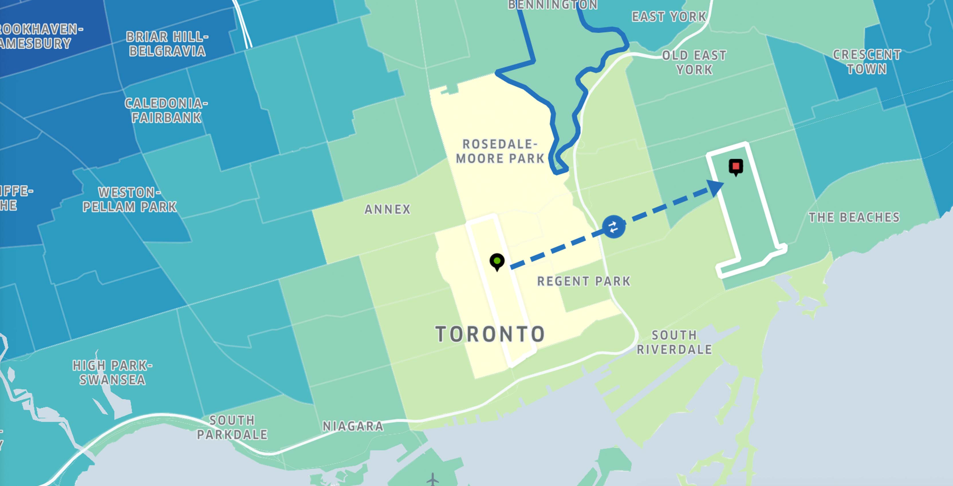
Uber Movement has data that is based on Uber rides since 2016. The new mapping tool can help predict how long it takes to get from one part of the city to another.
The company hopes that the data in the map will be used by city planners to better develop driving infrastructure in the city. For instance, in the Toronto map it shows that it takes less time for drivers to travel from downtown to Old East York than it does to go from downtown to the Danfoth Village because of the Don Valley Parkway speeds up travel to Old East York.
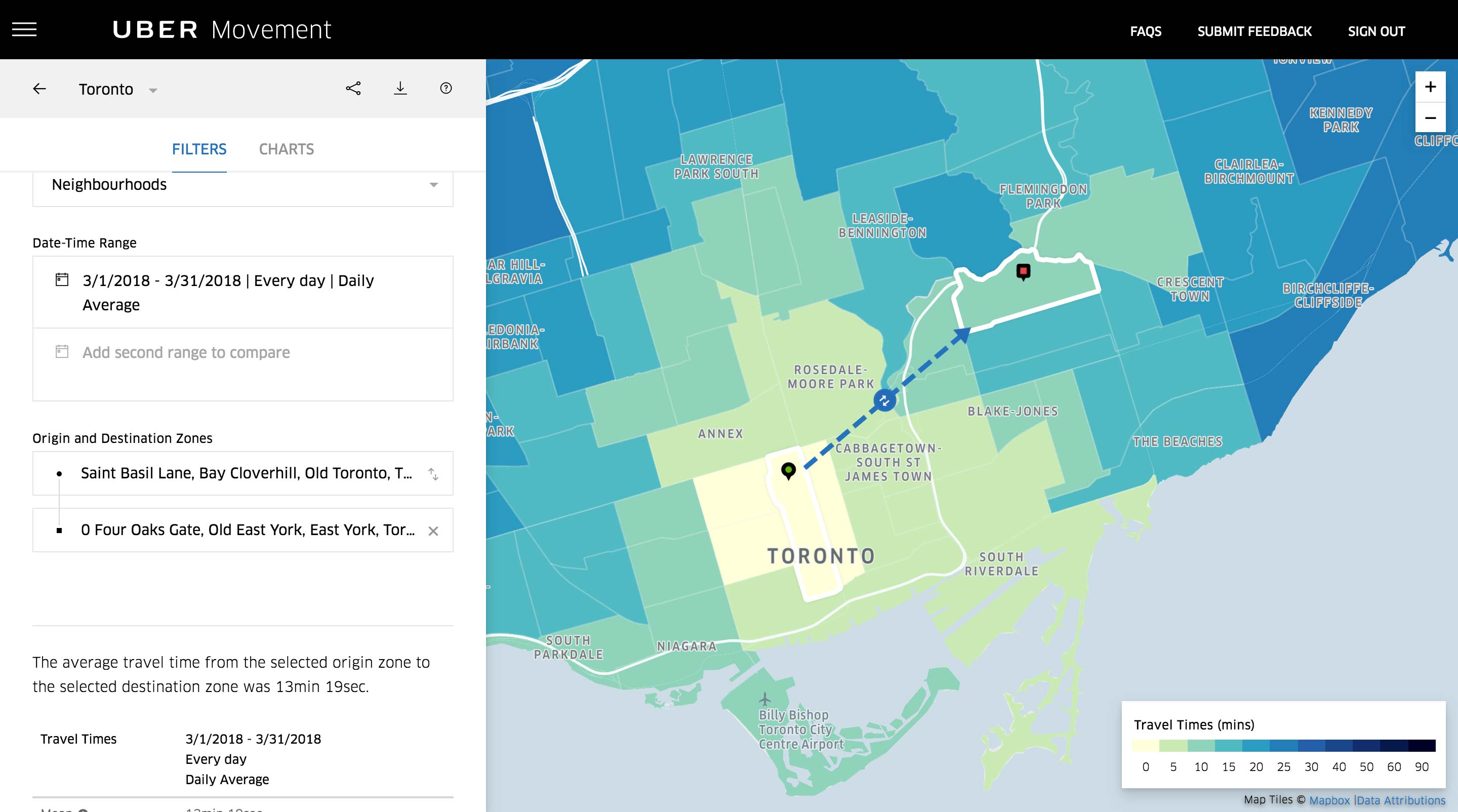
The map can also compare travel times throughout different times of days, years and months.
“Gridlock in the GTA costs as much as $6 billion annually in lost productivity. By sharing our aggregated and anonymized trip data, Uber can help inform decisions about how to adapt existing infrastructure and invest in future solutions to make our cities more efficient,” said Rob Khazzam, general manager of Uber Canada in a April 11th press release.
An Uber spokesperson at a press event in Pittsburgh told TribLive the All of Ubers data for the Movement map was collected from on duty drivers and is anonymous.
The project is similar to the Google Toronto Transit Explorer prototype that was shown off at a Sidewalk Toronto event near the end of March. The main difference being that Uber has a wealth of driving data, while Google is working with both driving and transit data.
MobileSyrup may earn a commission from purchases made via our links, which helps fund the journalism we provide free on our website. These links do not influence our editorial content. Support us here.
