Over the last few months, we’ve seen countless applications get the Material Design makeover. At this point, it’s started to feel like something of a non-update, especially as Lollipop starts to roll out to more devices, but that couldn’t be further from the truth.
Google has a set of guidelines for developers that offer instructions on how to build apps that flow well with the look and feel of the rest of the OS. It’s really easy for developers to sift through the guidelines and figure out what their app needs to be able to do and what it needs to look like. They also have access to the necessary icons and colours required for developing using Material Design. What’s often glossed over is how involved the redesign process can be for an already established app with its own identity and a multi-platform presence.
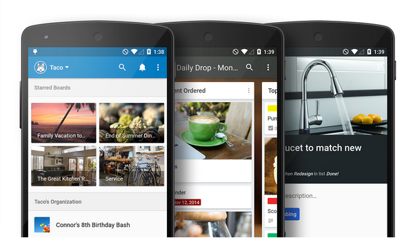
Organizational app Trello got Material Design as part of an update released on Christmas day. This week, the Trello team talked more about what it took to go from the old version of Trello to the new Material design version without losing its own brand in the process.
Trello admits today that when they were prepping for Lollipop, Trello for Android had already started “to feel a bit stale,” so the team was more than willing to update the app. Still, “be recognized as Trello” was number one on the list of goals for the new application. At the same time, the company also wanted to use this redesign as an opportunity to set a foundation for a consistent experience across all platforms.
A big part of remaining true to itself was knowing when to ignore Google’s guidelines. In the near four months Trello spent updating its app, the company encountered several guidelines that it just couldn’t incorporate into the new version of Trello. For example, it wasn’t too crazy about the colours provided in the Material guidelines so it stuck to the colours in its own branding guide. What’s more, Google says no to cards in a list format, but Trello felt that aspect of the app’s design was too integral to how the app functions. Without the cards, Trello wouldn’t work the way it was supposed to, so the cards stayed.
What did change was the navigation drawer. More specifically, it’s been replaced by the homesceen, which now handles navigation as well as hosting your boards. The navigation experience and board creation are now also more in line with what you’ll experience when using native Material Design apps. It’s a lot cleaner and it removes some of the clutter that existed in the old version.
As evidenced by the removal of the nav bar, Trello used Material Design as an opportunity to address some user pain points and improve overall functionality of its app. This led to a drawer, accessible from your boards, that offers easy access to all actionable items in one place. It uses overlays to reduce confusion when switching between archived items, cards, lists, and activity. Cards and lists have also become more readable.
Trello’s blog post highlights how something as seemingly simple as a new coat of paint can end up impacting how users interact with a device or an app on a really basic level. Google’s goal with Material Design is to “synthesize the classic principals of good design.” No easy feat when thousands of applications are being developed every day.
That said, blog posts like the one published today show us that Google’s plan is working. At least with some developers. Trello’s Material Design revamp represents a streamlined and simple UI that wasn’t quite there before. We can only hope that other developers follow in Trello’s footsteps. And, if the company meant what it said about the Material Design version of its app influencing Trello on other platforms, Google is probably pretty happy about that, too.
[source]Trello[/source]
MobileSyrup may earn a commission from purchases made via our links, which helps fund the journalism we provide free on our website. These links do not influence our editorial content. Support us here.
