Todd Yellin, Netflix’s vice-president of product innovation, insists that the old cliche about a picture being worth a thousand words isn’t correct. Or rather in his case, it’s worth thousands of views.
He’s showing a series of promotional images for Orange is the New Black, the streaming company’s hit prison dramedy, to a group of reporters here at Netflix headquarters in Los Gatos, Calif. The six photos — different permutations of cast members — were used in tests with new subscribers to see which would attract the most clicks.
Yellin is asking us to guess which turned out to be the most popular. My pick is a group shot of the main cast, but it turns out I’m wrong, as is most everyone else in the room.
The winner was a photo of the show’s principle star Taylor Schilling looking exasperated behind a chain link fence, which resulted in almost 24 per cent more views with new subscribers than average. A similar picture of Schilling, without a fence in front of her, resulted in 5.5 per cent fewer views than average.
“Forget people’s opinions about what works,” Yellin says. “The data tells the truth.”
The image quiz is an example of the sort of data-driven decisions that drive Netflix’s continual tweaking of its product. While staff who create and program the user interface have their opinions and favourites, they find those innate biases often don’t resonate with subscribers.
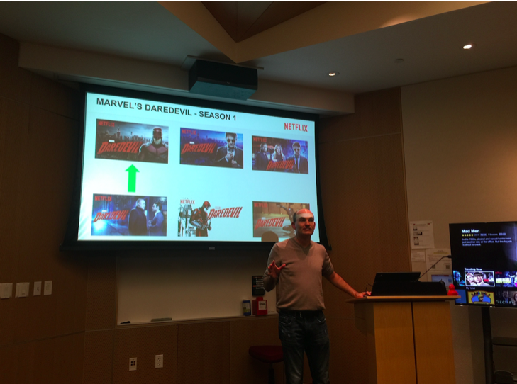
Yellin shows us another series of images, this time for the recently launched drama Bloodline. The current promo image seen by users is of star Kyle Chandler, but a picture of a burning boat won out in tests.
“I wouldn’t be surprised if in a few weeks that’s the image,” Yellin says.
Next up for Yellin’s division is a revamp of its desktop PC interface, set to take effect within the next few weeks.
The current interface, a grid of titles with vertical “box” art on a white background, is out of sync with the mobile and television versions that were rolled out last year. Those interfaces feature more graphic-intensive horizontal promotional images on a black background.
The new PC interface will be visually indistinguishable. And, rather than a new page loading when a title is clicked on, more information will expand on the same page below the promo photo, similar to how Google Image search results expand when clicked on.
Netflix is also eliminating the horizontal carousel on each row of titles in the PC interface. Instead, users will click on an arrow and a new row of titles will appear.
“People prefer using an app so we wanted to make an experience that feels much more like an app,” Yellin says. “It’s something that feels like a mobile app, but it doesn’t slow things down.”
One of the keys to Netflix’s data-driven approach, he explains, is knowing what information to listen to and which to ignore.
Users have for a long time asked for an alphabetical listing of content, for example, but when Netflix tested it on subscribers, viewership went way down.
“Everyone says they want to be a god, but do they really want to be a god?” Yellin says.
The same goes for star ratings. Although every title has one, their importance to Netflix’s recommendation algorithm has been de-emphasized. In tests, staff found that users were giving acclaimed films such as Al Gore’s climate change documentary An Inconvenient Truth five stars without actually watching them. Instead, they would actually watch silly comedies, such as Paul Blart: Mall Cop.
The ratings were thus generating false recommendations, suggesting films to users that they maybe should watch — but not those that they’d actually want to watch.
Ryan Chanatry, director of marketing consumer insights, says Netflix isn’t entirely dependent on algorithms. His department is charged with finding out what people think of the service, and then coming up with hypotheses on what actions to take based on that feedback. For the consumer insights division, 70 per cent of the job is based on data, with 30 per cent depending on their own judgment, he says.
In 2014, Chanatry and his staff performed 1,500 interviews with users in 16 countries. They also sent out 15 million surveys in an effort to study everything from viewer habits, pain points and trends.
The results inform the company’s decisions on everything from user interfaces to what content to create or acquire. The team found, for example, that there is currently a dearth of family-oriented programming on mainstream TV, which is different from the 1980s and 1990s, when there were numerous sitcoms that appealed to all ages.
That feedback led to Netflix’s recent decision to bring back Full House, the John Stamos sitcom, as Fuller House, expected to air on the streaming service next year. While the company continues to create or acquire content aimed specifically at adults and kids, it now sees an additional opportunity that isn’t being addressed.
“It’s really opened up a space for Netflix to play in,” Chanatry says. “The research that goes into why we launched House of Cards is completely different than Fuller House. We don’t have a target demographic that we’re going after.”
The consumer insights division also studies social media mentions and conversations, a growing source of insight for all parts of the business. The company is seeing around 4 million Netflix-related mentions on Twitter in a given month, for example.
An emerging trend, Chanatry says, is the idea of “Netflix pants,” or a pair of pants that subscribers wear specifically when watching.
“There’s so much information we can get from those millions of tweets alone.”
MobileSyrup may earn a commission from purchases made via our links, which helps fund the journalism we provide free on our website. These links do not influence our editorial content. Support us here.
