Back in 2000, Sony released the PlayStation 2, a so-called sixth generation console that boasted 128-bit computing, its “Emotion Engine” processor running at 300Mhz. It had 32MB of RAM and, optionally, a 40GB hard drive.
At the time, the PlayStation 2 was a powerful computer, a catalyst for the modern living room revolution. It heralded games like Gran Turismo 4 and Grand Theft Auto: San Andreas, experiences that are considered today some of the most engrossing and well-designed pieces of entertainment ever.
Fifteen years later, smartphones possess the processing abilities to reproduce those games on touch screens, in addition to performing base actions like calls, texts, emails and social networking, all of which we take for granted.
But Moore’s Law isn’t just about shrinking die sizes and component commoditization; it’s about the availability of transformative technology in packages accessible to millions of people.
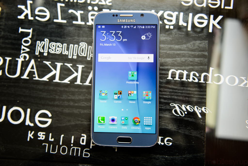
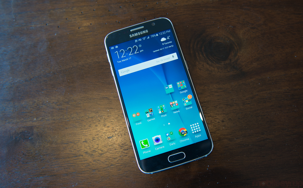
Itself in its sixth generation, the Samsung Galaxy S6 is by far the company’s best phone and, like the PS2 was at the time, a ripe conduit for the kind of experiences Android users have been waiting for. It’s not perfect — there are some infuriating design decisions within — but after the major missteps of the Galaxy S5, its successor’s foibles feel minor in comparison.
Pros
- Beautiful, bright and accurate QHD display
- Much improved build quality over previous Galaxy devices
- Light and thin, with a robust frame
- Best-in-class Cat-6 LTE network speeds
- Superb camera speed and daylight photo quality
- Improved low-light capabilities over previous Galaxy devices
- Pared-back TouchWIZ experience with less bloat
- Improved speaker
- Wireless charging / Adaptive Fast Charging alleviates battery issues
Cons
- Glass back is a fingerprint magnet and occasionally slippery
- Software has some infuriatingly bad design decisions
- Limited use for the fingerprint sensor
- Volume buttons too high up on left side
- Lower battery life than Galaxy S5
Note: While I’ll be tackling the Galaxy S6 edge in a separate (shorter) review, it’s important to know a few things about both products: but for the curved edges on either side of the 5.1-inch display, and a slightly larger 2,600mAh battery, the Edge is otherwise identical to its flatter counterpart.
Looking at Samsung’s quick rise, subsequent plateau and relatively recent dip in Android dominance paints a pretty bleak picture of the fickle Android market. What was once possible only at the $600-$900 price tier is now accessible for less than a third, from companies like OnePlus, Xiaomi, Huawei, ZTE and Motorola.
Pressured by Apple’s calculated dominion of the the smartphone industry’s most profitable segment, and an influx of excellent, low cost Android devices, Samsung had a choice: keep going with its massively successful, but flagging and utilitarian line of Android smartphones; or invest in design and materials, focusing on the user experience.

The Galaxy S6 resembles its predecessor in many ways, but Samsung has tackled every deficiency lobbed against the series going back to the S3, which debuted in June 2012. It’s interesting to see, unlike the tick-tock iterations of the iPhone, how the Galaxy S series has morphed over the years. The Galaxy S3 debuted with what at the time was impressively forward-thinking hardware: a 4.8-inch 720p display, a Snapdragon S4 chip, 2GB of RAM and an 8MP camera.
A catalyst for smartphone growth across the industry, Samsung eventually eclipsed all other OEMs in terms of shipments, reaching 85 million in Q3 2013 after the debut of the Galaxy S4. But after two quarters of stagnancy, followed by three of worrying declines, it became apparent that despite Samsung’s vertically integrated advantages — it manufactures many of the components inside its smartphones, including the screen and battery — it needed to better position itself for the future.
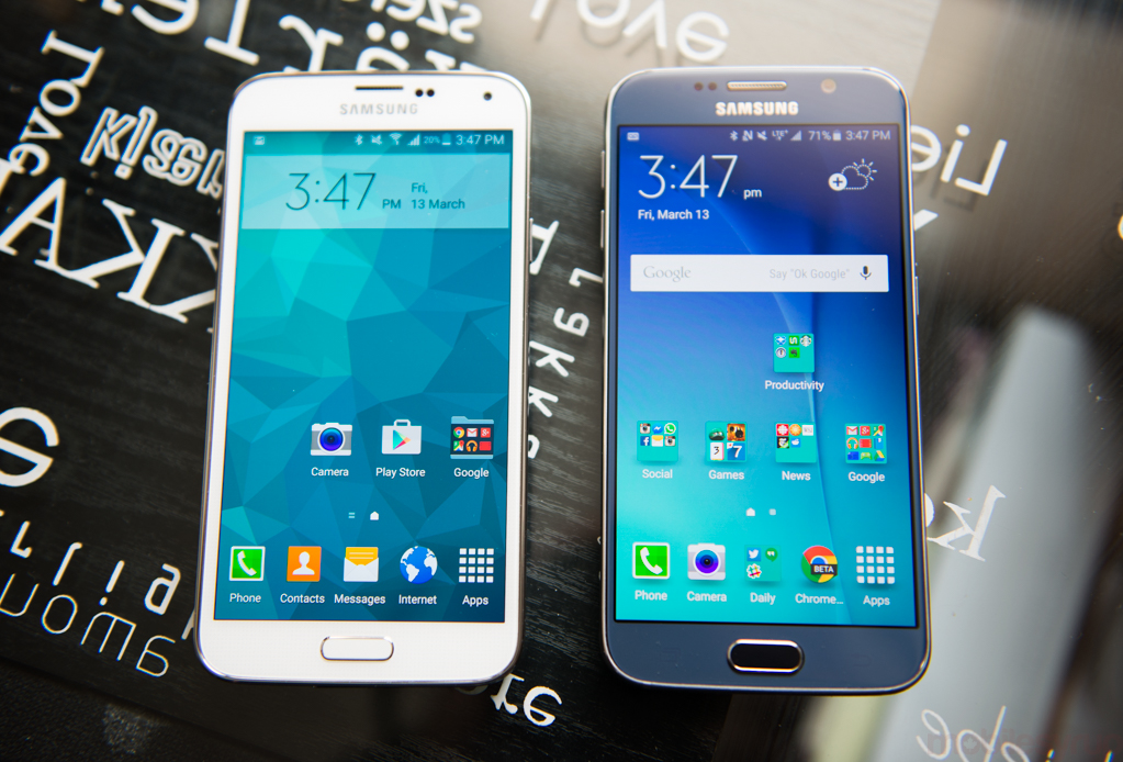
Few would argue that the Galaxy S4 and S5 were bad smartphones, but they suffered from feature bloat, a throw-it-and-see-what-sticks approach to smartphone design. In fact, I argued in late 2014 that the Galaxy S5 was the best boring Android smartphone out there, that it did everything reasonably well. But many consumers and analysts saw that as an inherent failing, since Samsung only controlled part of the Android stack; it struggled to differentiate itself from the hordes of other “pretty good” Android flagships.
This puts us in early 2015, when Samsung began promising big changes. We’d already seen hints of the inevitability: a metal frame in the Galaxy Alpha and, later, the Note 4; and a brand new design language, built around the curved “3D” glass of the Note Edge. But we also began hearing about a renewed focus, scaling back hardware and software features to allow the important things — speed, camera, software — to shine through.
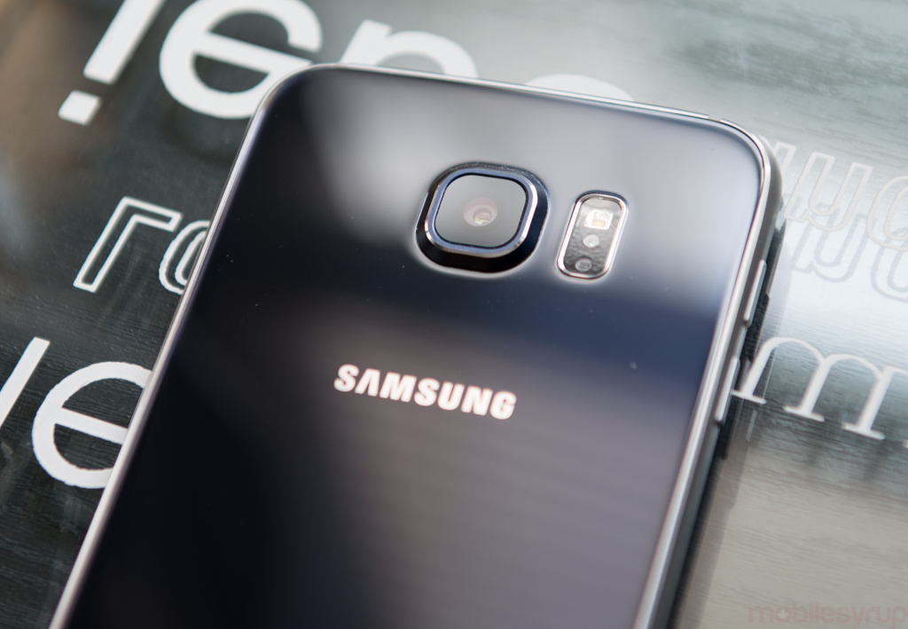
In essence, this is the Galaxy S6. It looks like a Galaxy S5, but lighter and slimmer, with a metal frame, glass back and significant usability improvements.
Specs
- Android 5.0.2
- 5.1-inch 2560 x 1440 pixel Super AMOLED display
- 4 x 2.1Ghz Cortex-A57 cores / 4 x 1.5Ghz Cortex-A53 cores, Exynos 7420 SoC w/ Mali-T760 GPU
- 3GB DDR4 RAM / 32-128GB internal storage
- 16MP rear Sony IMX240 sensor w/ F1.9 lens, Optical Image Stabilization
- 5MP front camera
- UHD 4K @ 30fps, 1080p @ 60fps, 720p @ 120fps video capture
- LTE (Band 1, 2, 3, 4, 5, 7, 12, 13, 17, 20), HSPA (Band 1, Band 2, Band 5)
- 2,550mAh non-removable battery
- 143.4 x 70.5 x 6.8mm
- 138 grams
We’ll tackle the S6 edge separately, but both it and the S6 proper look monumentally and feel indescribably better than the S5. Gone is the slimy plastic and fake chrome edges of previous Galaxys, replaced with simple, high-quality materials. Though the rear glass collects fingerprints like a mirror, its separation from the finish beneath reveals a changeling colour palette that shimmers and warps in shifting light. What looks black morphs to a pleasing and playful shade of blue when exposed to sunlight. It’s actually quite beautiful.
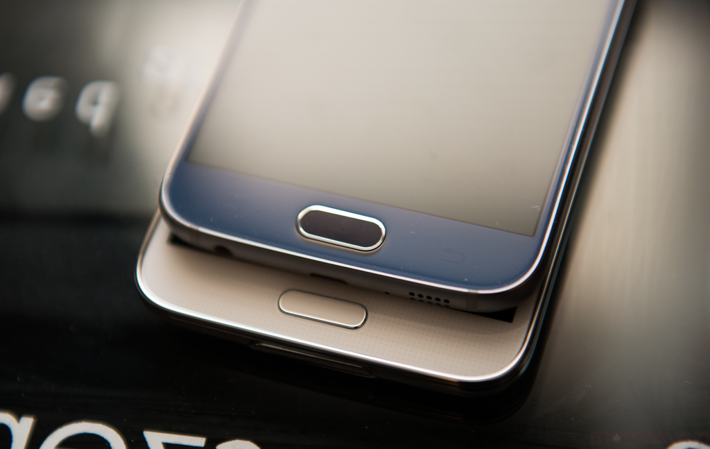
The metal frame curves to meet the front and rear glass, with the white plastic antenna lines the only break in an otherwise clean facade. At 6.8mm, the Galaxy S6 is thinner than the iPhone 6, and as solid as the HTC One M8. It’s a clean break, both in design and structure, from anything the company has made before, though its bottom frame bears more than a passing resemblance to Apple’s latest. While it could be argued that there are only so many ways to drill speaker holes into anodized aluminum, the cynic in me doubts the results were coincidental.
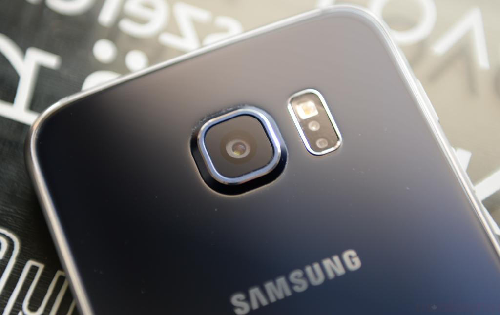
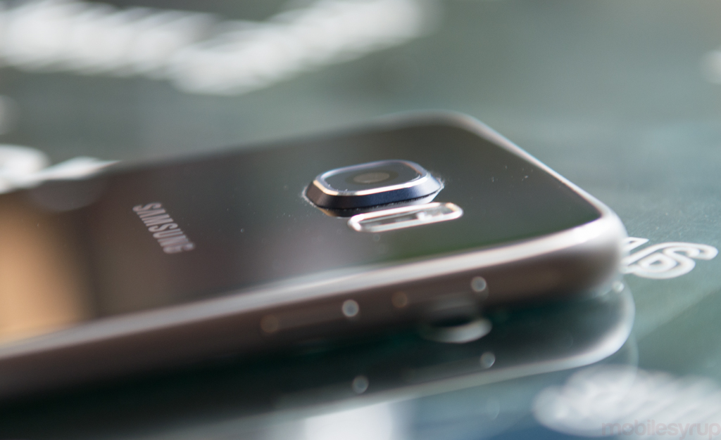
With such a slim device, last year’s moderate camera bulge has transformed into a stately bump. Samsung wisely opted to maintain a lithe but interrupted silhouette rather than risk camera quality with a slimmer, less capable sensor, but there’s no question the next few years will see more than a few injured camera lenses returned to stores.
Samsung has never struggled to showcase its display technology, but the Galaxy S6’s Super AMOLED display contrives to remind us that OLED can compete with LCD in nearly every way. One needn’t sacrifice colour reproduction, brightness and viewing angles for deeper blacks, and while the 2560×1440 pixel panel uses a Diamond pixel array, the individual pixels are far too small to differentiate. When the 4.8-inch Galaxy S3 pushed the industry to 720p, it seemed improbable that displays four times the resolution would be the norm only three years later.
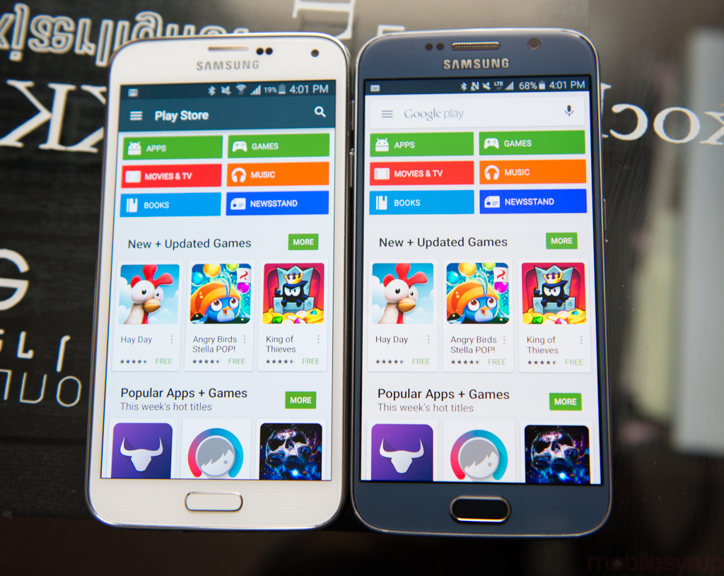
Resolution aside, it’s just a beautiful screen. Like the Galaxy S5, one can adjust colour behaviour using four predefined Screen Modes, Adaptive, Cinema, Photo, and Basic, but the default setting lends the palette a pop while avoiding extreme over-saturation. Selecting Photo or Basic mutes the vibrancy adds a warmer yellows and reds to the AMOLED’s typical blue-biased tendencies, but few will be disappointed with the gamut here. According to DisplayMate, an independent screen analysis website, the S6 reaches 101% of the standard RGB palette, a watermark for an OLED screen.
There are two criticisms lobbed against high-resolution mobile displays like this: they’re implemented more for the spec sheet than the benefit of the consumer — humans typically can’t resolve detail above 400 pixels per inch — and they put additional strain on battery-sensitive graphics processors. Apple took four years to move its flagship above what is considers Retina resolution, 326ppi, but Android manufacturers have been warring with one another for years over that spec.
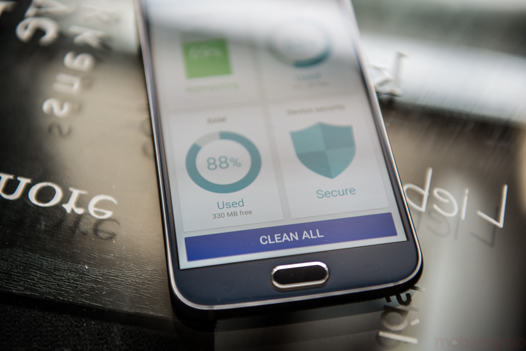
Most 2015 flagships will ship with Qualcomm’s 64-bit Snapdragon 810 chip, but Samsung has used allegations of its overheating — despite protests from LG and others — to replace Qualcomm with its own silicon. The S6 runs a homegrown solution called the Exynos 7420 which, while purporting to be schematically similar, runs cooler and more efficiently, due in no small part to the more compact 14nm manufacturing process. Though they run at similar clock speeds, Samsung’s chip is physically smaller, and outputs less heat than Qualcomm’s.
It also replaces Qualcomm’s Adreno 430 GPU with ARM’s own Mali-T760, a proven performer, and knocks Qualcomm’s widely-used baseband solution to the curb in favour of its own Category 6-compatible Shannon modem.
This is about as close as Samsung has come to controlling its entire hardware stack, and it’s the first North American device the company has shipped since the Note 2 that leaves Qualcomm behind. Much was made about this reversal, but performance is paramount, and the S6 does not disappoint.

Subjectively, it’s difficult to quantify the sub-millisecond improvements in responsiveness from one generation to another — the Galaxy S3 still runs most apps relatively well, for example — but the Galaxy S6 truly feels like a step in the right direction for Android. Combined with Android 5.0’s new ART runtime and Samsung’s homegrown UFS 2.0 storage solution, the S6 is not only the fastest Android device I’ve ever tested, but the first in which I haven’t noticed anything resembling slowdown. From the sub-second opening of the camera app to the way (well-coded) apps scroll, the S6 achieves what Android has been striving for years towards: utter smoothness.
Benchmarking the beast, a 15-20% delta separates the Exynos 7420 from the Snapdragon 810 in some CPU tests, but the cores are cut from the same cloth, and don’t differ much in synthetic results. More 3D-biased benchmarks skew to the Adreno 430, and for some reason the Galaxy S6 suffers in browser-based benchmarks like Sunspider and Browsermark.
Camera speed plays a role in making the S6 feel like a big step up from the S5, which was already fast, but quality, especially low-light photographs, separate it from most other Android devices.
Read any review of the Galaxy S5 and the refrain was uniformly thus: Great camera quality, really fast, but low-light results disappoint. This time, the addition of a wider F1.9 lens combines with optical image stabilization to achieve good results, anywhere. There are some caveats, especially when compared to the industry-leading image signal processing of the iPhone 6: white balance is not always correct, and there’s a fair amount of digital grain, owing to the small pixels of the 16MP sensor.
It can’t be overstated how much I enjoyed using the camera on the Galaxy S6. In a market where phones are differentiated by millisecond benchmarks and number of pixels, the camera continues to be the single physical (and optical) roadblock to success for many manufacturers. This time, Samsung understood its major limiting factor, the 16MP Sony IMX240 sensor, and compensated with a much more light-friendly lens.
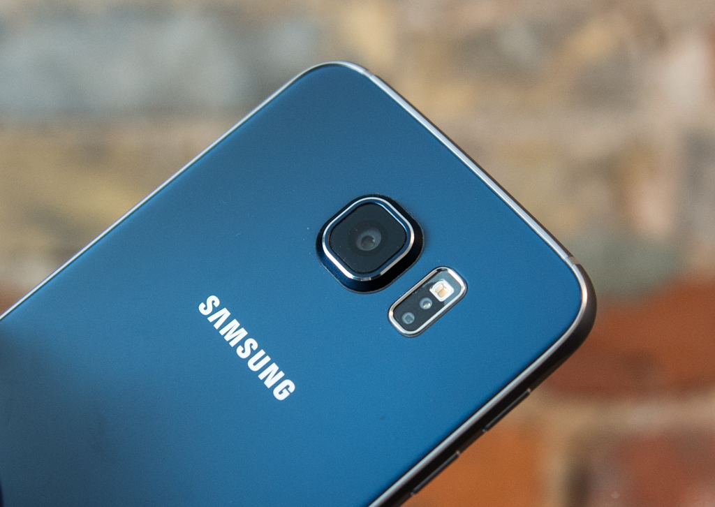
The essence of a good smartphone camera experience is broken down as: Can I open the camera quickly (yes) and take an excellent shot on Auto nearly 100% of the time (yes). And, if I want to take things a bit further, are there manual settings that allow for more granular controls (yes, mostly) that allow me to take even better photos (often, but not always).
The Galaxy S6 takes superior photos to most Android phones, and often shows up the iPhone 6, especially when it comes to spatial detail. In daylight shots, the iPhone 6 has more accurate tones, and generally less grain, but the GS6 wipes the floor with it in autofocus speed and overall resolution. The Galaxy even boasts a remarkable autofocus tracking system that, with subjects moving at moderate speed, manages to keep them in focus.
In low light, things begin to get a bit more tricky. The iPhone 6 Plus, which also has optical image stabilization, combines oversampling and slower shutter speeds to bring in as much light as possible while minimizing grain. As a result, the average low-light shot on the iPhone 6 Plus has a shutter speed of 1/4 (one fourth of a second) and an ISO of between 100 and 1600 depending on how much light is available.
The Galaxy S6, on the other hand, uses a more modest form of oversampling, which activates automatically as a Night Mode setting. Like previous Samsung flagships, low-light shots obscure EXIF data, likely because they’re composites of more than one exposure.
To get over this, I had to turn to Manual Camera to manually set the shutter speed and sensitivity to attempt to match the iPhone 6 Plus, but the Galaxy S6 won’t go below 1/10. Multiple tests show that the iPhone 6 Plus is still a better low-light shooter, likely for two reasons: its 8MP sensor has larger individual pixels; and its image signal processor is superior. In scenes with limited light, for example, the iPhone almost always has less grain and more accurate white balance.
The opposite is true for shots taken in natural light: neither the iPhone 6 or 6 Plus can keep up with the Galaxy S6’s faster lens and superior spatial resolution.
Samsung has also pared back the built-in camera features, opting instead to prompt the download of additional experiences like Virtual Shot and Sport Shot. There’s also a new Pro mode which, while lacking the ability to manually select shutter speed, provides granular control over White Balance, ISO (light sensitivity), exposure and, new to Samsung, focus. Part of these improvements come from the implementation of Google’s new Camera2 API, which was developed for Android 5.0, but part of it is a realization that with great resolution comes the responsibility of using it. Many smartphone users rely on their devices for 100% of their photography, and rarely has a smartphone camera been so capable.
Users looking for a more full-featured camera experience can download Manual Camera, an app that opens up all of Camera2 API’s features, including shutter speed. While I tested the app only briefly, and several bugs still exist, it worked like a charm.
The Galaxy S6 has a pretty remarkable lens. To some, including me, the ability to achieve true depth of field potential is worth the price of admission alone, as the F1.9 optics allow for the kind of authentic bokeh typically limited to sharp prime DSLR lenses.
But because the device has a fixed aperture, and most users won’t want to mess with the manual controls to set focus to “infinity”, some GS6 buyers may be unhappy with just how severe the depth of field is.
I had an enormous amount of fun playing with the camera’s macro abilities; its minimum distance is formidable and, combined with 16 megapixels of resolution, makes for a consummate stand-in for a dedicated macro lens.
There’s also the added bonus of being able to access the Galaxy S6’s camera from any app, any time, using the new system-wide double-tap-home-button gesture. Samsung wisely replaced the old S Voice shortcut, a service that few used, and it’s quickly become one of my favourite new features. Entering the camera app takes under a second from a cold start — just booted, without no previous openings — but that time drops when the camera app has been cached in RAM.
It’s a simple, extraordinarily useful tool that, combined with the S6’s exemplary focus and shutter speeds, improves the entire experience.
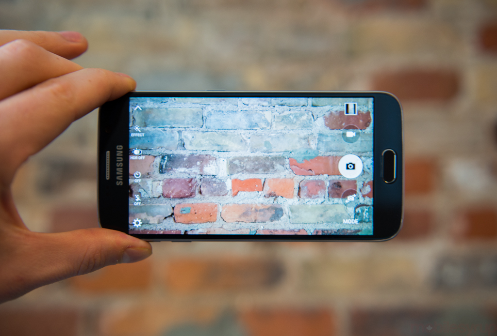
Like its predecessor, Samsung has implemented 4K video capture at 30fps, but still limits individual clips to five minutes. Quality is markedly improved, thanks to more deft processing, but the company can’t quite match Apple’s slow motion capture: 720p video still maxes at 120fps.
Video quality is very good, with smoother panning than the Note 4, Samsung’s first device outfitted with optical image stabilization. Because the two devices use the same sensor, it’s likely that Samsung has upgraded the OIS module inside the phone, though it’s clear from the more sensible transitions between light and dark areas the ISP received a substantial upgrade, too.
Samsung is perpetuating a trend in the industry of distributing sensors in 16:9 ratio, which means 4:3 photos are cropped down to 12MP. HTC began this trend with the One M7, but the last few Galaxys have followed suit, likely owing to the proliferation of widescreen video sharing. But not every photo needs to be epic, and there’s a reason sensors have maintained a 4:3 or 3:2 aspect ratio in traditional digital cameras.
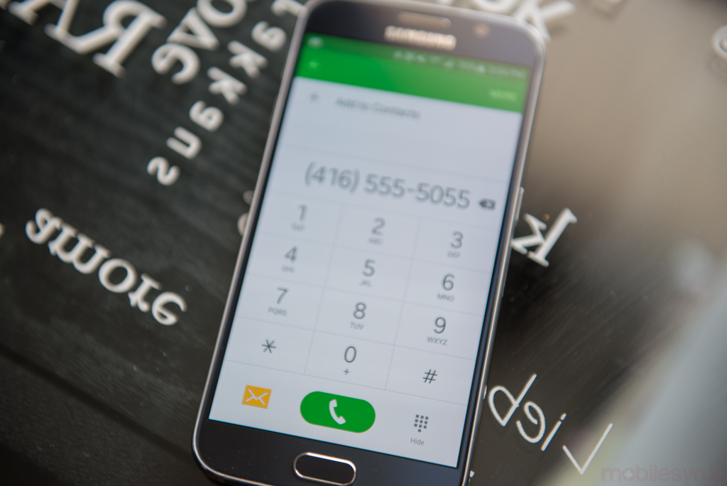
TouchWIZ is dead; long live TouchWIZ. That’s the impression one gets from perusing Samsung’s vaguely-refreshed UI on the S6. Lighter, simpler and more user friendly, Samsung’s design language benefits from Google’s more adroit Material Design guidelines, which show themselves in the dialler, messenger and many other first-party experiences.
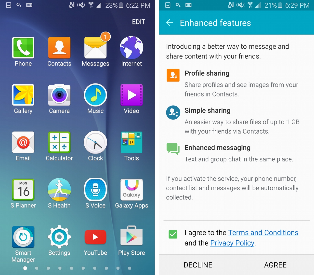
It’s in the launcher, though, where things start to fall apart. Samsung has bifurcated its home screen and app drawer into two separate and opposing areas, marking none as useful and confusing users in the process.
Traditionally, the app drawer is exactly that: a place to obtain icons for placement on one of many home screens. But for some reason, this new version forgoes any kind of sorting, opting to place apps in the drawer in the order they were downloaded. While other OEMs default to this view — Sony and HTC come to mind — it’s possible to later sort alphabetically, which makes more sense when your priority is finding an app and putting it into a folder on the home screen. Here, your only choice is to manually rearrange your icons inside the app drawer, which doesn’t align with the way Android has heretofore worked.
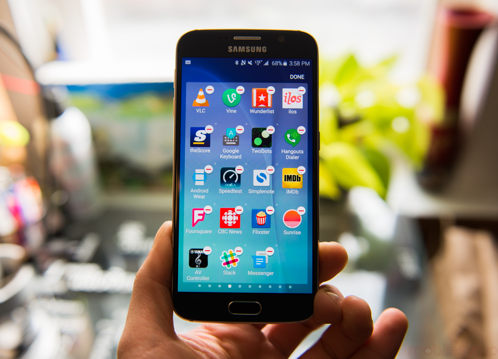
It’s clear that Samsung has been inspired by iOS here, but instead of doing away with the app drawer entirely, you have a hybrid system that appeases few.
Things are better elsewhere in the launcher, though. It’s now possible to create folders by dragging an icon on top of another (why did this take so long?) and the default clock widget actually looks like something you’d be happy to look at every few minutes.
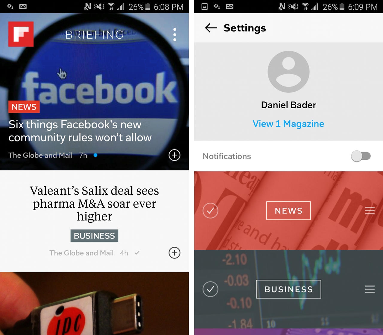
Samsung is still working with Flipboard for its Briefing product, which has thoroughly improved in accordance with the app itself. Unlike HTC’s BlinkFeed, which I generally avoid due to its standalone nature, that I already use Flipboard’s excellent Android app makes it easy to scroll over and catch up on the latest local news from outlets like The Globe & Mail, CBC, The Verge and others.
But Samsung still struggles tremendously with design. Elements of the phone’s UI stick out like anachronistic sore thumbs. For example, several app icons have not undergone changes in accordance with the rest of the interface, so Phone or Messages still look like they’re straight out of 2012. Folders still have an arbitrary label limit of 11 characters per line, so the word ‘Productivity’ falls onto two. And while some apps have received the pixel-level TLC they deserve, others like Music have been neglected.
Unlike in the past, there are far more examples of where Samsung has improved than regressed. Every first party app, but for the one I mentioned, has been given the Material Redesign treatment, with Floating Action Buttons (FABs) galore. Clean and light, most apps retain a certain Samsung-ness without alienating users from Google’s overall design intentions, but there’s one last egregious change that should never have been approved: Samsung has changed all the three-dot menu buttons with the word ‘More’, another nod to iOS that does not translate to Android.
Samsung also does consumers a service by letting alone many of Lollipop’s most useful elements. Lock screen notifications are in tact, and they work well with the new touch-based fingerprint sensor, as does the ability to pin apps to prevent others from tampering.
Similarly, features like Smart Lock, which allow the pairing of a phone to Bluetooth accessories or predetermined locations to temporarily bypass the lock screen, also integrates nicely with the fingerprint sensor.
Lollipop also brought new developer tools, making it easier for designers to build beautiful and functional Android apps. Samsung may have hired some better designers, but its smartphones, as are all Android handsets, are benefiting from a richer selection of third-party apps.
The takeaway from Samsung’s reevaluation of its software priorities is the presence of more practically useful features and far fewer that users will look at once and ignore thereafter. Gone are the various Hubs, and the hovering — Air View, Air Gesture, Air Scroll — but remaining are the genuinely helpful tools, like Direct Call and Palm Swipe to Capture Screenshot. The company claimed that it spent months with real customers (imagine that!) gathering data on how people used its smartphones, and the restraint shows.
While the base Galaxy S6 model comes with 32GB of internal storage, up from 16GB on the S5, Samsung has maintained a relatively low bloatware count on the device. There are some strange pre-installs, like WhatsApp, Instagram and Facebook Messenger, which can only be disabled but not removed, but the worst offenders are the three Microsoft-branded apps — OneNote, OneDrive and Skype — that, while individually fine, are of little use to those entrenched in the Google ecosystem.
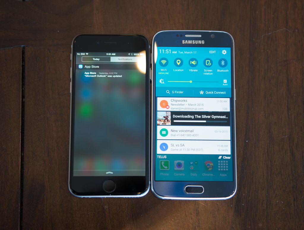
That decision to bump the base model to 32GB and forgo the microSD is likely going to have more lasting repercussions than the other big change, the removable battery. Expandable storage has long been a rallying cry of the Android Enthusiast, with LG and HTC recently adding it back to their flagships to drum up support from that vocal minority. But expandable storage creates complexities around Android as a platform, and within Android as an experience, that Samsung is trying to avoid with its renewed Galaxy. This is the Galaxy for the iPhone lover, as Samsung has seemingly exhausted its caché from within.
Of course, the removal of microSD was also due to the decision to increase speed through a new flash memory standard called UFS 2.0, which runs the same underlying technology as the solid state drive inside a laptop or recent desktop. In our testing, the Galaxy S6 had the fastest storage benchmarks across Android, often twice as fast as some year-old flagships. This translates to faster install times and file transfers, while decreasing the time apps take to locate and activate local data. As with what happened when solid state drives began replacing physical ones in desktops and laptops, UFS-type storage brings the speed of a smartphone’s internal storage closer to that of the RAM, which in the Galaxy S6 has also been bumped to DDR4.
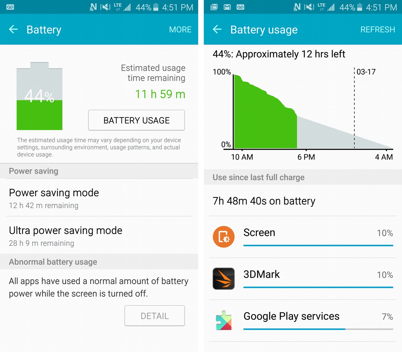
All this extra speed does marginally impact battery life, but the main takeaway here is that Samsung is hoping for frequent top-ups rather than all-day performance. The 2,550mAh battery is locked inside the chassis which, while ensuring a slimmer profile, relegates users to recharging a single cell for the phone’s duration.
Thankfully, Samsung has employed two new technologies to make charging easier and faster: Adaptive Fast Charging, which employs a higher-voltage adapter to boost charging speeds by up to 75%; and wireless charging, which makes it easier to top up in more places.
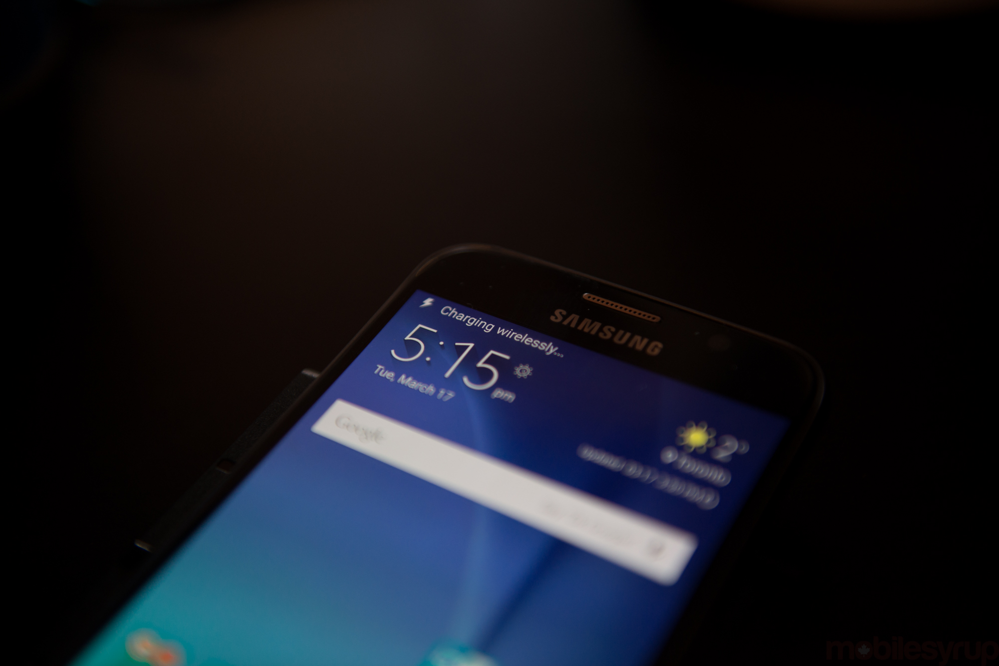
The Galaxy S6 isn’t the first device to employ AFC, but it is the first to combine Fast Charging and dual-standard wireless charging in the same chassis. The latter works with any Qi or PMA pad, achieving nearly 100% compatibility with today’s consumer and commercial charging stations. Companies like Starbucks, Second Cup, McDonald’s and Tim Horton’s are all experimenting with in-store wireless charging stations, and an increasing number of third-party manufacturers, from Tylt to Microsoft, are distributing consumer product at low costs. Even Ikea is getting into wireless charging.
Of course, you can’t use your phone while it’s charging, which negates some of the usefulness, but the Galaxy S6 shouldn’t need to be topped up for more than a few minutes during the day to keep it going. I recorded slightly poorer results in our battery tests compared to last year’s S5, owing to a cell 10% smaller in the current model, but in regular daily use I didn’t once reach zero before 10pm.
Much of the concern around the S6’s smaller cell doesn’t take into account its impressively forgiving 14nm system-on-a-chip, which is between 20 and 30 percent more efficient than Qualcomm’s 20nm-based Snapdragon 810, but the main source of power consumption improvement is in the display, which despite being nearly double the resolution of the S5 draws 20% less power.
The immediate outrage over a non-removable battery will hopefully be drowned out by the many ways in which the Galaxy S6 is more consumer-friendly than its predecessor, especially when one considers the S5 placed a tab over its microUSB port to prevent water ingress. Are people going to miss the Galaxy S5’s water resistance? It was prominently advertised during the first months of its lifespan, but Samsung likely made the right compromise between aesthetics and function.
On the cellular side, Samsung has undertaken to use its homegrown baseband chip, another first for the company, and on Canadian carriers the results are nothing short of spectacular.
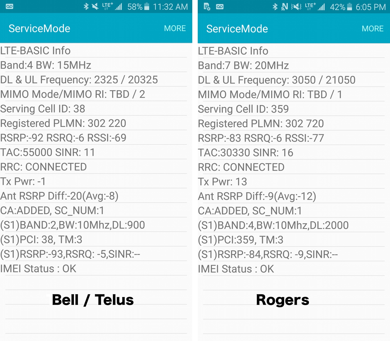
Rogers and Bell (and TELUS, through its spectrum sharing with Bell) switched on LTE-Advanced networks in the months and weeks running up to the Galaxy S6’s release, and using carrier aggregation achieve theoretical speeds close to 200Mbps.
Samsung wisely only connects to the second carrier channel when the downlink is saturated, usually during a file download, but users can immediately see the benefits of multi-channel connectivity by virtue of the fact that signals are uniformly stronger in most parts of the city. I tested all three networks in Markham, downtown Toronto, and Oakville, and experienced various implementations of carrier aggregation depending on the carrier.
<technical jargon>
Rogers typically used Band 7 (2600Mhz) as a main carrier, relying on Band 4 (AWS) with CA active. Bell and TELUS, which share a network, rely on AWS as a primary carrier, with Band 2 (850Mhz) for secondary aggregation. According to Bell’s head of network technology, Bruce Rodin, the company has refarmed some of its Band 2 network, which traditionally carried HSPA+ traffic, for the purposes of LTE.
Category 6 LTE carriers a theoretical speed limit of 300Mbps, but that’s using 2x20Mhz channels. Neither Rogers nor Bell uses that much spectrum when employing carrier aggregation: Rogers uses 20Mhz of Band 7 and 10Mhz of Band 4; Bell/TELUS use 15Mhz of Band 4 and 10Mhz of Band 2.
</technical jargon>
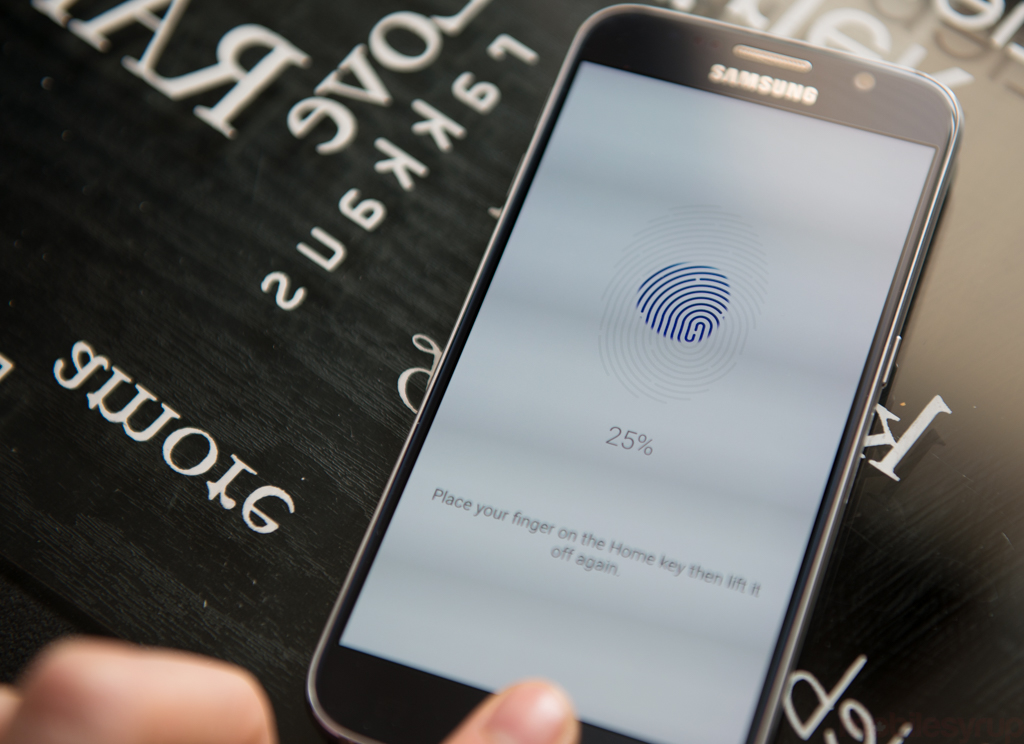
The last bit of good news is that Samsung has finally fixed up its fingerprint sensor. While the sensor’s purpose is limited to unlocking the phone and making purchases in Samsung’s tiny app store, it now works the same way as Apple’s Touch ID, by placing rather than swiping a finger on the home button.
With support for up to four fingers (one fewer than Touch ID), Samsung now has the same biometric capabilities as Apple, but it’s incumbent on the company to partner with developers to implement support in their apps. The fingerprint does stand in for anywhere one would enter a pin or security pattern, but one of Apple’s best decisions in recent years was to open up its Touch ID API to developers. With the Galaxy S6, Samsung finally has the hardware; now it needs the developer support to make biometrics more than just a passing fancy. Considering the U.S. and South Korea are the first markets to benefit from Samsung Pay, the company’s in-store payment solution, by the time it comes to Canada we’re hoping there’s an API to go with it.
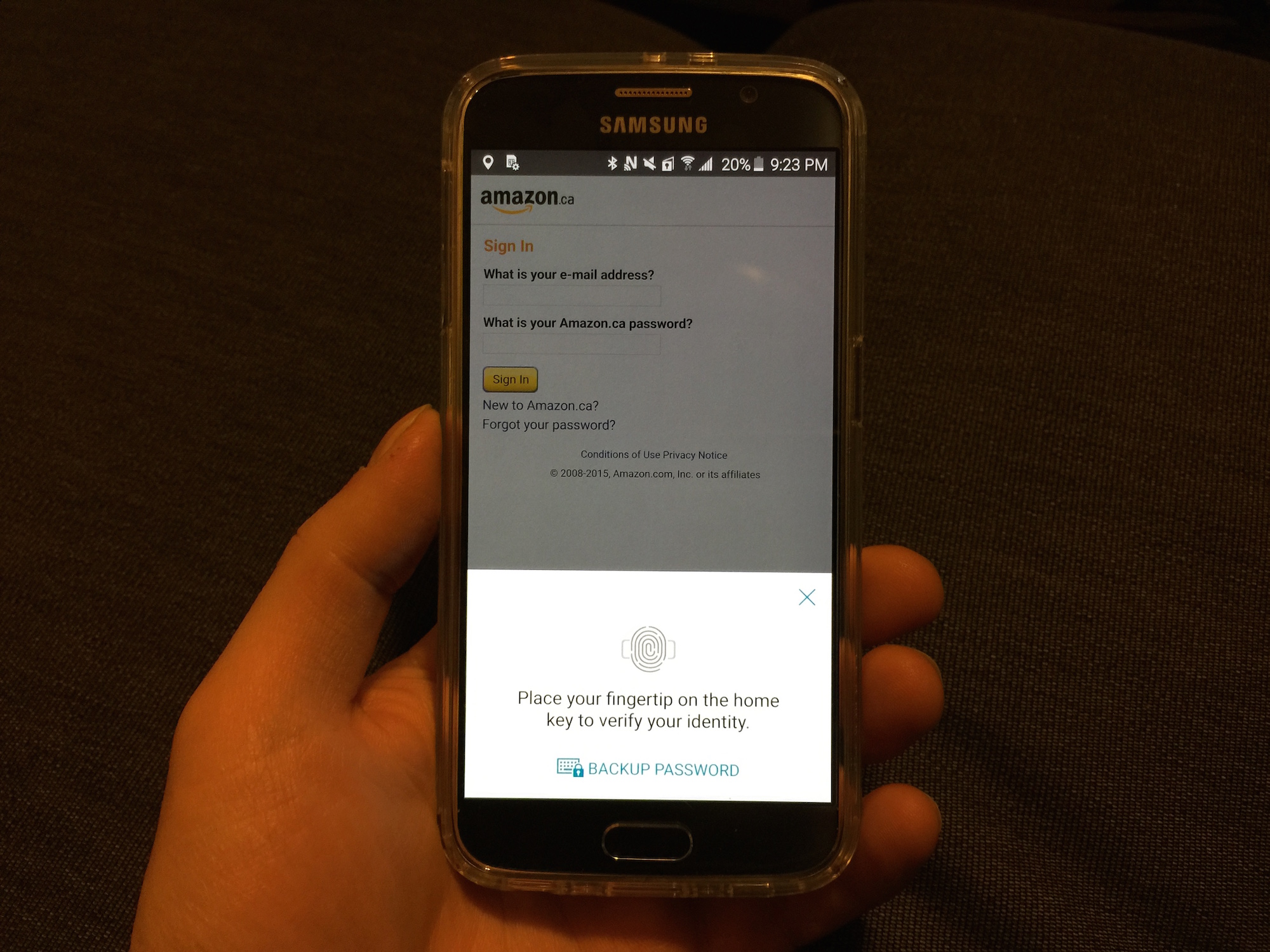
In its Browser app, Samsung teases the future of its biometric authentication potential. Like many browsers, it can store credentials like usernames and passwords, but Samsung taps into its fingerprint sensor to recall that data, similar to the way LastPass or 1Password integrates into desktop browsers.
Elsewhere, Samsung’s rear heart rate monitor and pulse oximeter appear to be identical to that of the S5 and Note 4, but the company has added the ability to place one’s finger over it to activate the 5MP selfie cam. While the front-facing camera rarely gets much attention, Samsung has done a fine job with it here. It won’t win any awards for speed or clarity, but its Wide-angle Selfie mode will likely appease next year’s Oscars host.
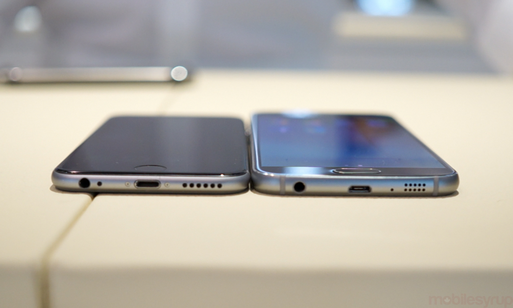
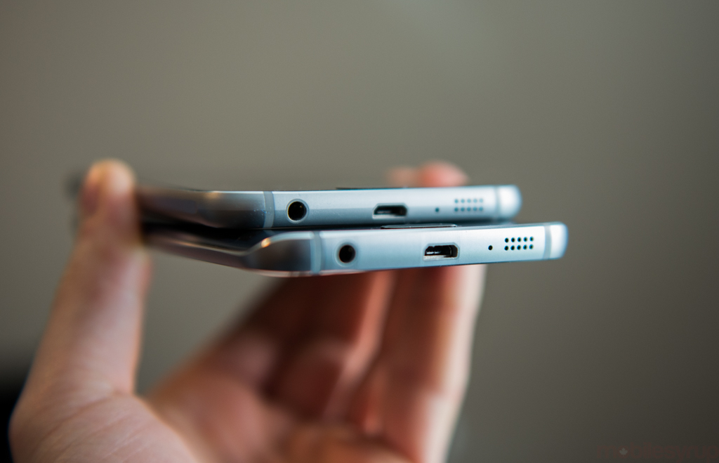
Visuals are all well and good, but how does the phone sound? With the elimination of a removable battery cover, Samsung relocated the mono speaker to the S6’s bottom frame. The quality is marginally improved over the S5, which had a rear-facing port, but when compared to the identically-placed mono speaker of the iPhone 6 the S6 was louder but muddier. Both devices lack bass, but there’s a crispness to the iPhone’s mids and highs that the Galaxy lacks.
I tested call quality on Rogers, TELUS and Bell, with all three networks sounding crisp and clear over the embedded headpiece and through Bluetooth, which retained a strong connection to anything it was connected.
TL;DR
When the Galaxy S6 is released on April 10th, many Canadians approaching the end of their three-year contracts will have a big decision to make: stay with Android, or switch to iPhone. Despite its modest declines over the past year, Samsung reportedly shares with Apple the top spot in Canadian smartphone mind- and market share. To many, the choice when buying a new smartphone is a two-horse race.
Samsung has an immediate advantage over Apple in that the Galaxy S6 is considerably cheaper than the entry-level iPhone 6, especially when one factors in the amount of available storage.
When one takes all of the Galaxy S6’s disparate features into account, it’s the first truly exciting smartphone of 2015, even if many of them are iterative improvements, or outright thefts from other devices.
It wasn’t the aluminum frame or high-resolution screen that sold me on the S6, but the camera, which has been a thorn in Android’s side for years now. Samsung has made a great smartphone, irrespective of platform: It just happens that Android is now at the point where it is both powerful and simple, beautiful and developer-friendly.
If this is the future of Samsung, I’m happy to stick around.
MobileSyrup may earn a commission from purchases made via our links, which helps fund the journalism we provide free on our website. These links do not influence our editorial content. Support us here.


