Following an earlier promise to speed up Android’s sharing menu, it looks like a fix may be incoming.
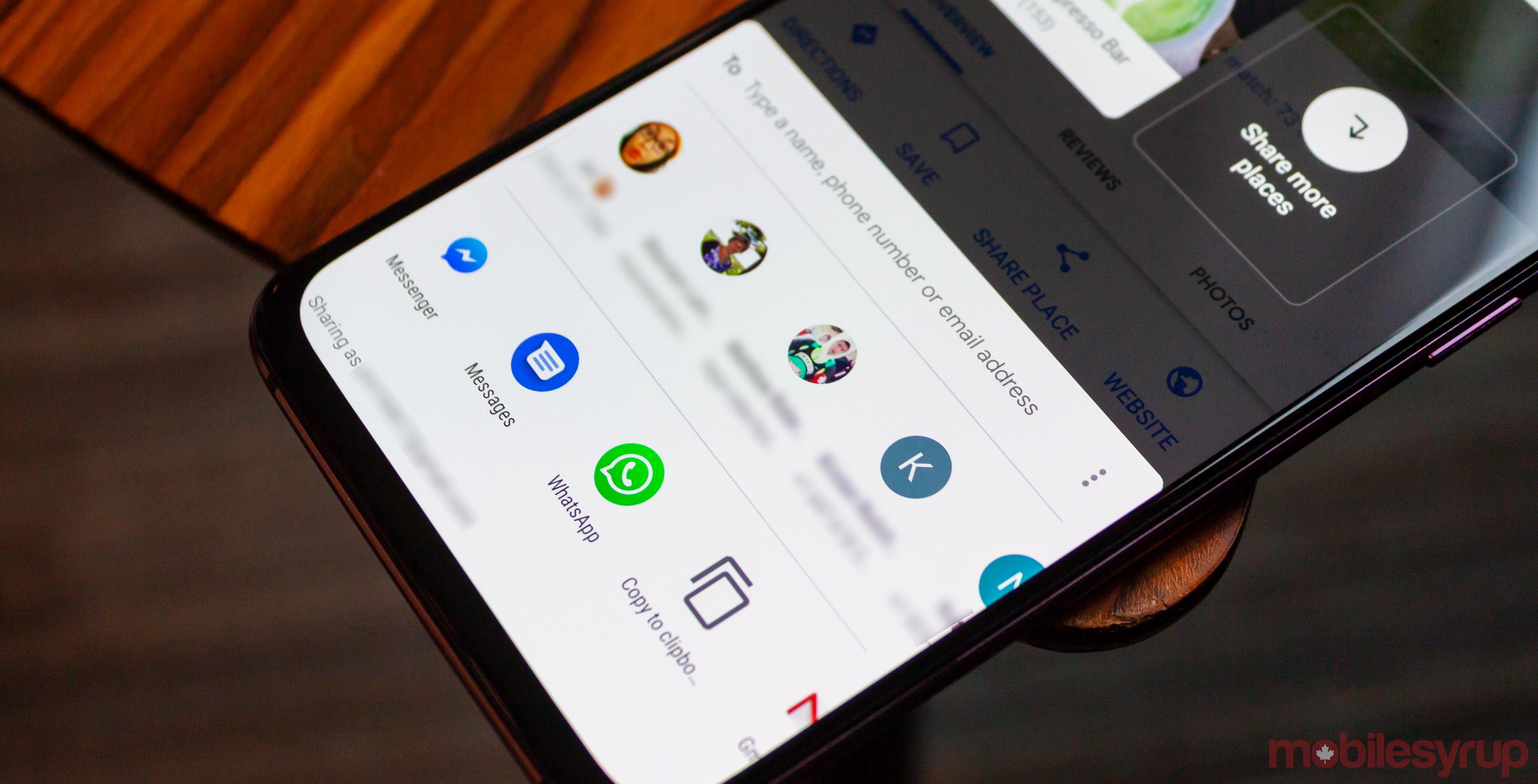
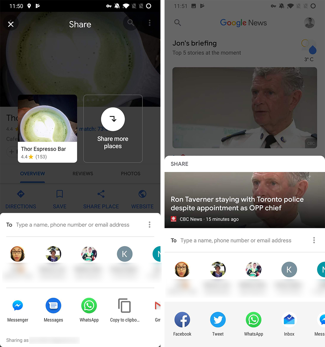
The newest version of Google Maps (version 10.6.1) sports a fresh new sharing menu that’s both faster and features Google’s new Material Design.
One of the main issues behind the sharing model’s slow load times was the backend architecture. This often caused elements to load in slower than others, which further results in users tapping the wrong item as icons shuffle around during loading.

Google Maps sharing menu (left) and Google News menu (right)
The new sharing menu design avoids this by creating two horizontal carousels. One is for contacts, and the other is for apps. This avoids having icons shuffle around if loading takes a long time.
Further, there’s a new ‘To’ field where users can type in contact names, phone numbers or emails for sharing.
Additionally, the new sharing menu appeared in Google News as part of the Material Design revamp when Google announced it at I/O 2018. It’s also worth noting that Google Photos offers a similarly styled sharing menu, but it isn’t identical.

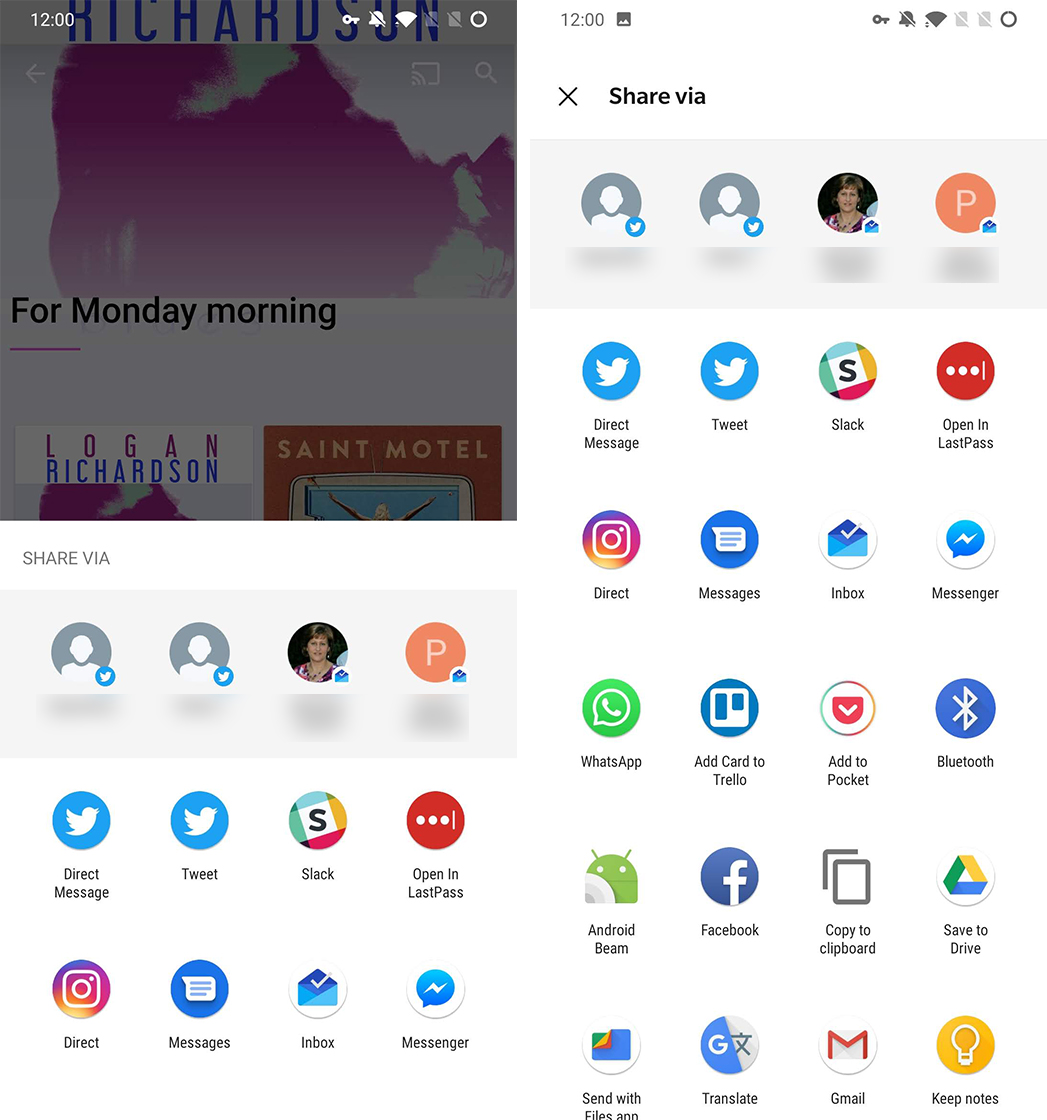
Old sharing menu
Along with the new sharing carousels, the menu features Material Design elements like rounded corners and Google Sans.
Most importantly, however, the new sharing menu feels quite snappy in comparison to the old sharing menu.
Hopefully, this is a sign of things to come. A full roll-out of this sharing menu would likely resolve many of the current issues with the sharing menu.
Source: 9to5Google
MobileSyrup may earn a commission from purchases made via our links, which helps fund the journalism we provide free on our website. These links do not influence our editorial content. Support us here.


