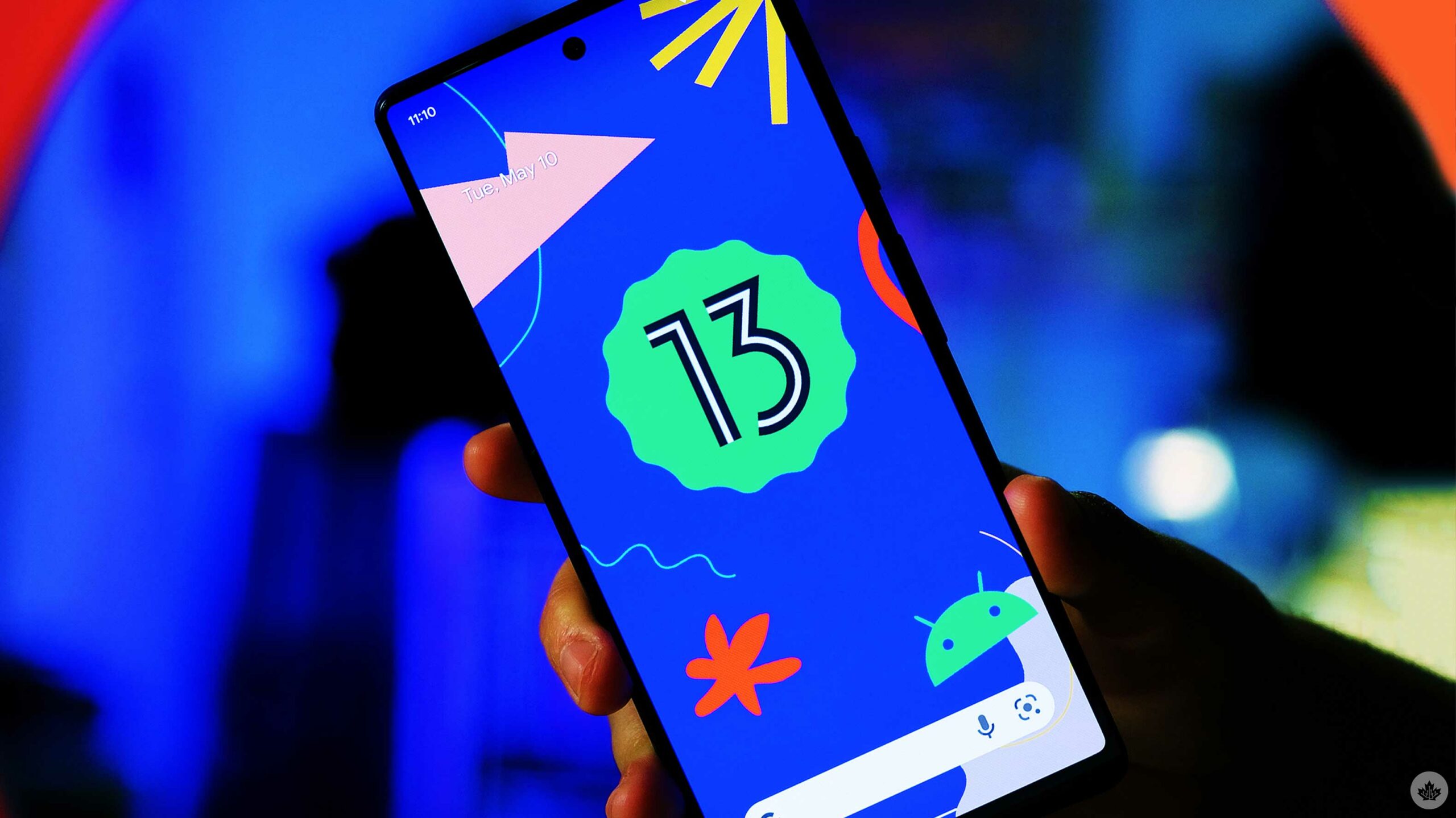
Google is now dropping the Android 13 beta 2 for Pixel devices and select OEMS.
The update is rolling out now and includes several subtle new features like a new ‘Now Playing’ notification, better-theming options, Google Wallet and more.
This year’s update is less focused on reimagining Android and instead seems like it’s full of refinements that will ideally make Android 13 a little more user-friendly than Android 12, at least visually. Behind the scenes, some changes hopefully set the stage for significant Android updates to come.
Android 13 Beta 2 is now available
Google mentioned that the beta is available today, but it’s actually been available for Pixel phones since April; this is technically Beta 2. At past I/O events, the company has usually released the beta for Pixel phones and then supported devices from other manufacturers start rolling out a little more sporadically.
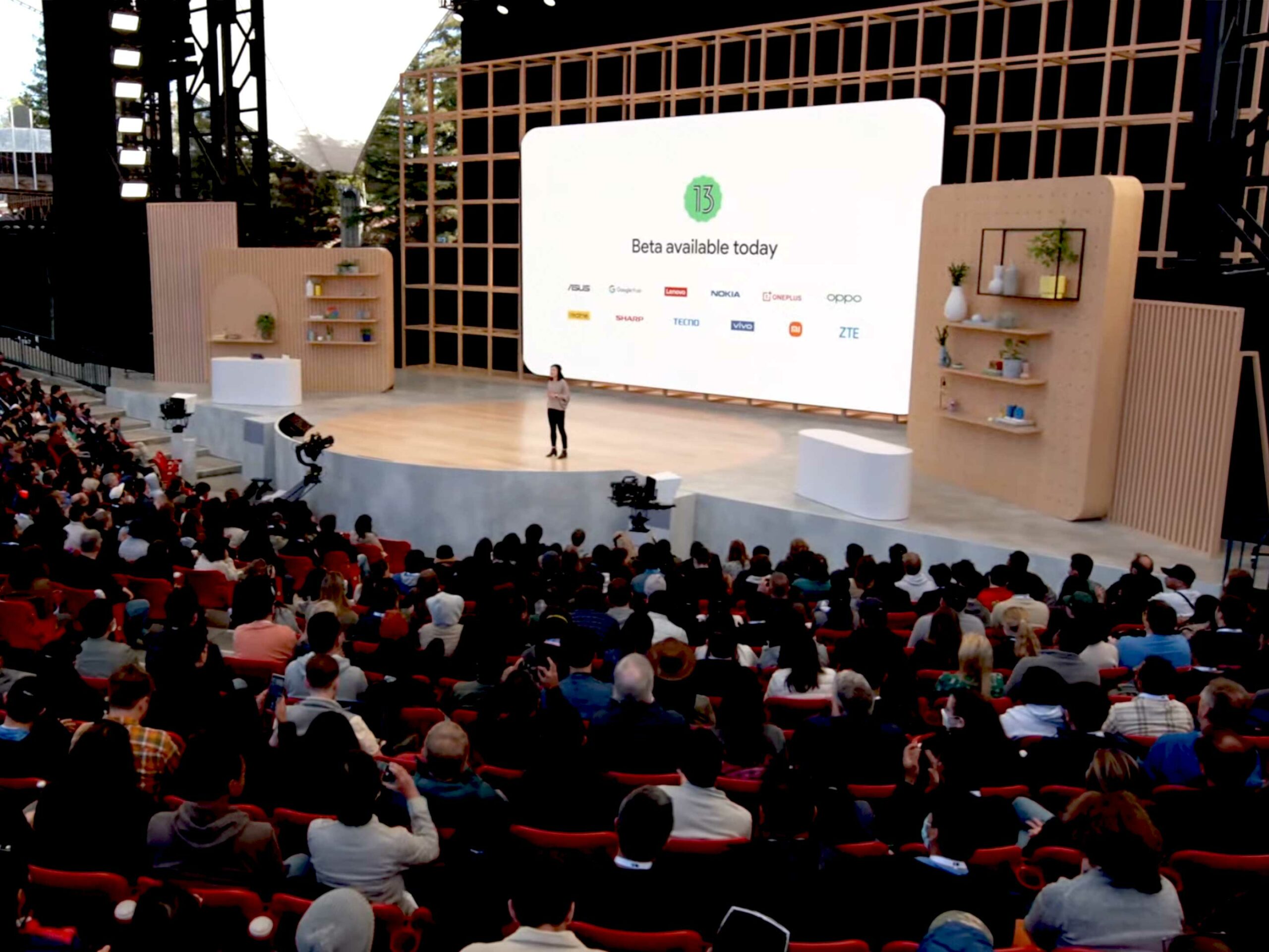
At I/O, Google said OnePlus, Nokia, Oppo, Lenovo, Asus, ZTE and more will all be getting the beta updates.
Pushing RCS Chat
Onstage at Google I/O, the company emphasized that all manufacturers are switching over to RCS chat to help provide users with encrypted private chats, unlike traditional SMS messages.
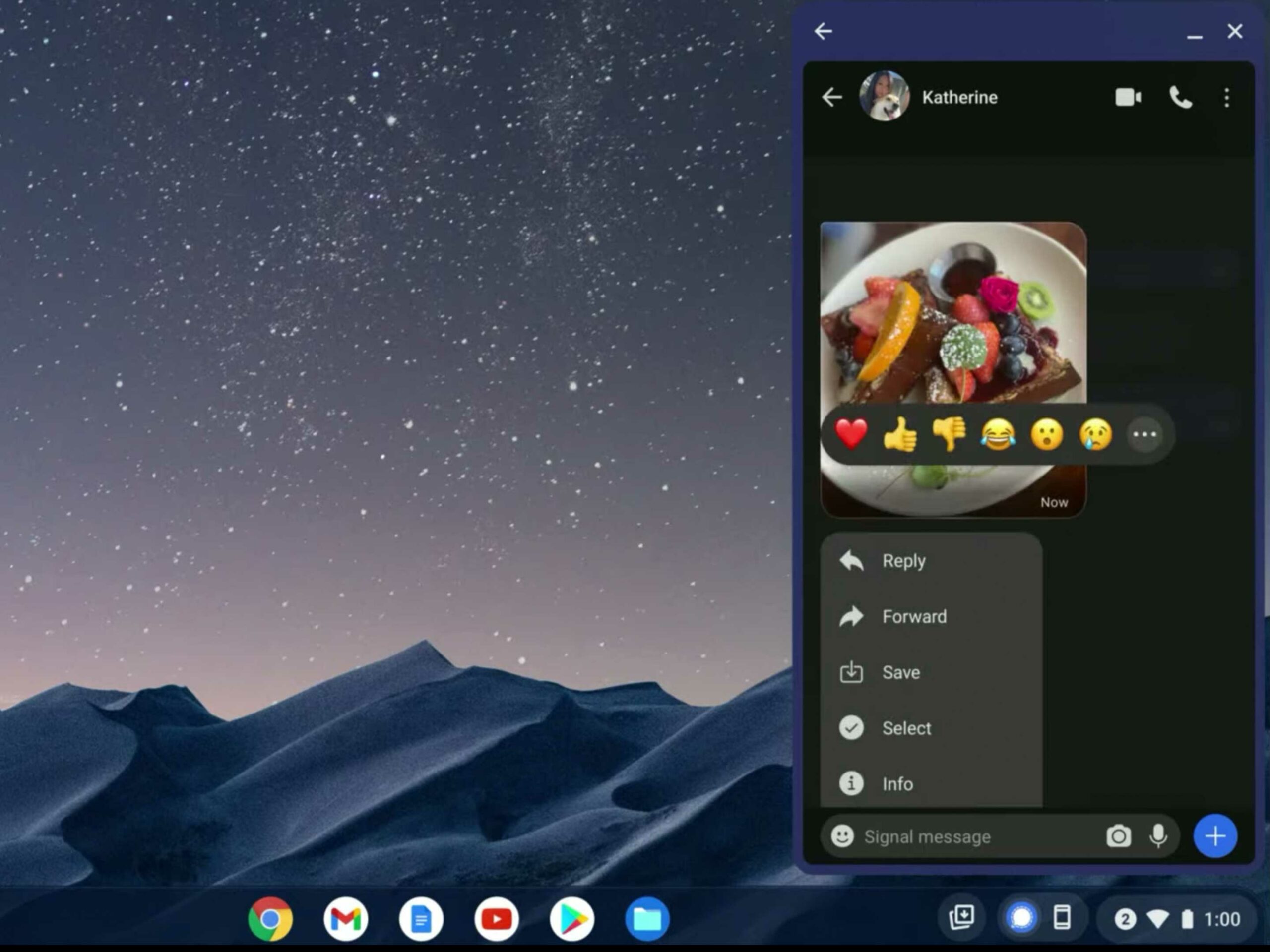
Google has been pushing RCS for years as the Android alternative, but I’m not sure if this latest bit of showmanship will make a difference. Hopefully, it can, though, as Android and RCS chats get even closer to Chromebooks. We’ve been waiting for Android and Chrome OS to get closer for years, and this year, that’s finally happening.
New Now Playing notification
One of the more visual flairs to be stuck in Android 13 is a new Now Playing interface on your lock screen and in the notification shade. It looks really nice and uses the album art in the card which seems pretty unique.
Google has also added a more squiggly line to this system that looks great. It’s a bit weird that Google showed off this squiggle so much around the release of Android 12 and then never really used it in the OS.
Better smart home control
An update is coming to the smart home control toggles, so users will no longer need to unlock their phone to use the shortcuts that appear on your lock screen when you hold down the power button.
This is pretty sweet, but it’s not on by default, so you’ll need to enable it within your phone’s settings.
Google Wallet
The new Google Wallet is vastly improved over the old version and at a baseline, it functions more like the Apple Wallet. This means you can store boarding passes, car keys, vaccine cards and more.
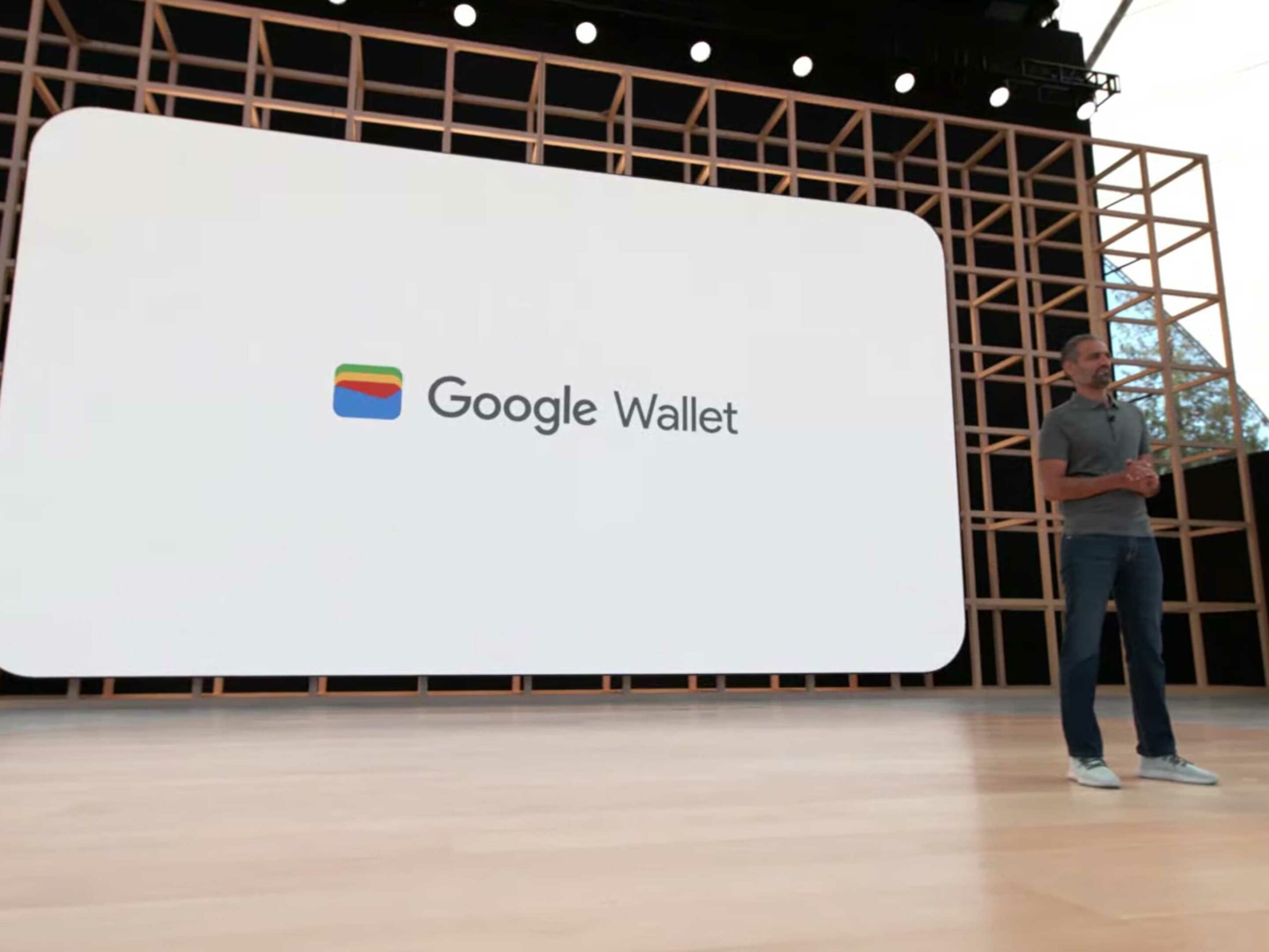
Google is even loading up Google wallet with the ability to take driver’s licenses, but that likely will need government approval where ever you are.
According to Google, the new Google Wallet app is rolling out to Android and Wear OS devices in the coming weeks.
Better foldable device and tablet integrations
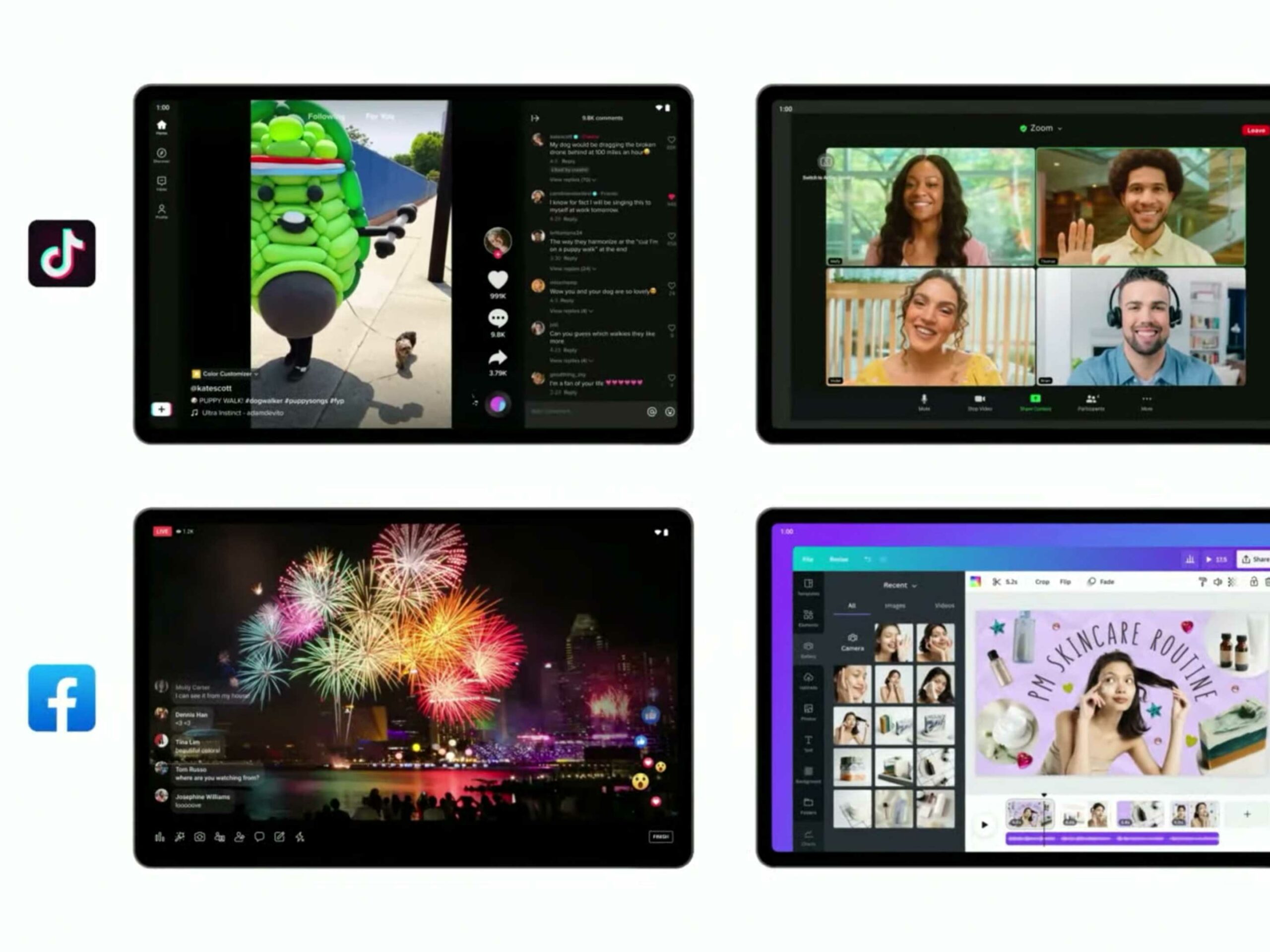
Now on foldable devices, the notification shade is more significant to take advantage of the larger interior screen on foldable.
There’s also a new consistent menu bar that stays along the bottom of the screen like the Chrome OS taskbar. It’s pretty cool and seems very useful.
To continue down this path, Google has updated 20 of its apps to be optimized for larger screens. This includes Maps, YouTube Music and Messages. Even some third-party apps like TikTok and Facebook are revamping their apps for tablet-sized Android devices.
Better theme controls
One of the most exciting updates in Android 12 (at least on Pixels) was the new device theme options. However, some users found that the colour palette that Google offered them was a little lacklustre.
That all changes in Android 13 now that Google presents users with 16 colour combos instead of just four.
Another pain point in Google’s heavy-handed customization efforts last year was that third-party apps don’t play nice with the new universal colour icons. This might change with the new update since Google has now published the code so other developers can take advantage of the colour theme.
This likely won’t spur all Android developers to adopt this new icon style, but it will receive most of them.
Google Cast controls are spreading
Google glazed over this announcement at I/O 2022, but Casting technology is coming to cars running Android Automotive like the Polestar 2 and Chromebooks.
Improved QR scanner
Google has added a quick access QR scanner to Android. Now you can place a quick toggle above your notifications that opens up a new scanning interface.
This new interface is a simple camera, but instead of the QR code’s link popping up in the middle of the screen, it appears along the bottom to make it easy to open with one hand. Hopefully, other manufacturers will notice this and bring it to more QR code interfaces.
Silent night
Google has tweaked how the silent mode works on Pixel phones in Android 13 by removing a lot of the vibrations from the phone as well as the sounds.
This is likely to be more controversial, so we’ll need to go test it more in the full release to see how it really feels.
A new clipboard
In Android 13 copy/paste looks a bit different. Whenever you copy/cut something, it will appear in the bottom left corner of the screen as a bubble, similar to the screenshot interface.
Also, like when you take a screenshot, you can tap on the copied text and edit it easily if you want to change it slightly before you paste it.
To take this to the next level, you can even cloud copy/paste between Android and Chrome OS just like you can with an iPhone and a MacBook.
At I/O, Google also revealed the Pixel 7/7 Pro, the Pixel 6a the Pixel Watch. For all of our content from I/O 2022, follow this link.
MobileSyrup may earn a commission from purchases made via our links, which helps fund the journalism we provide free on our website. These links do not influence our editorial content. Support us here.


