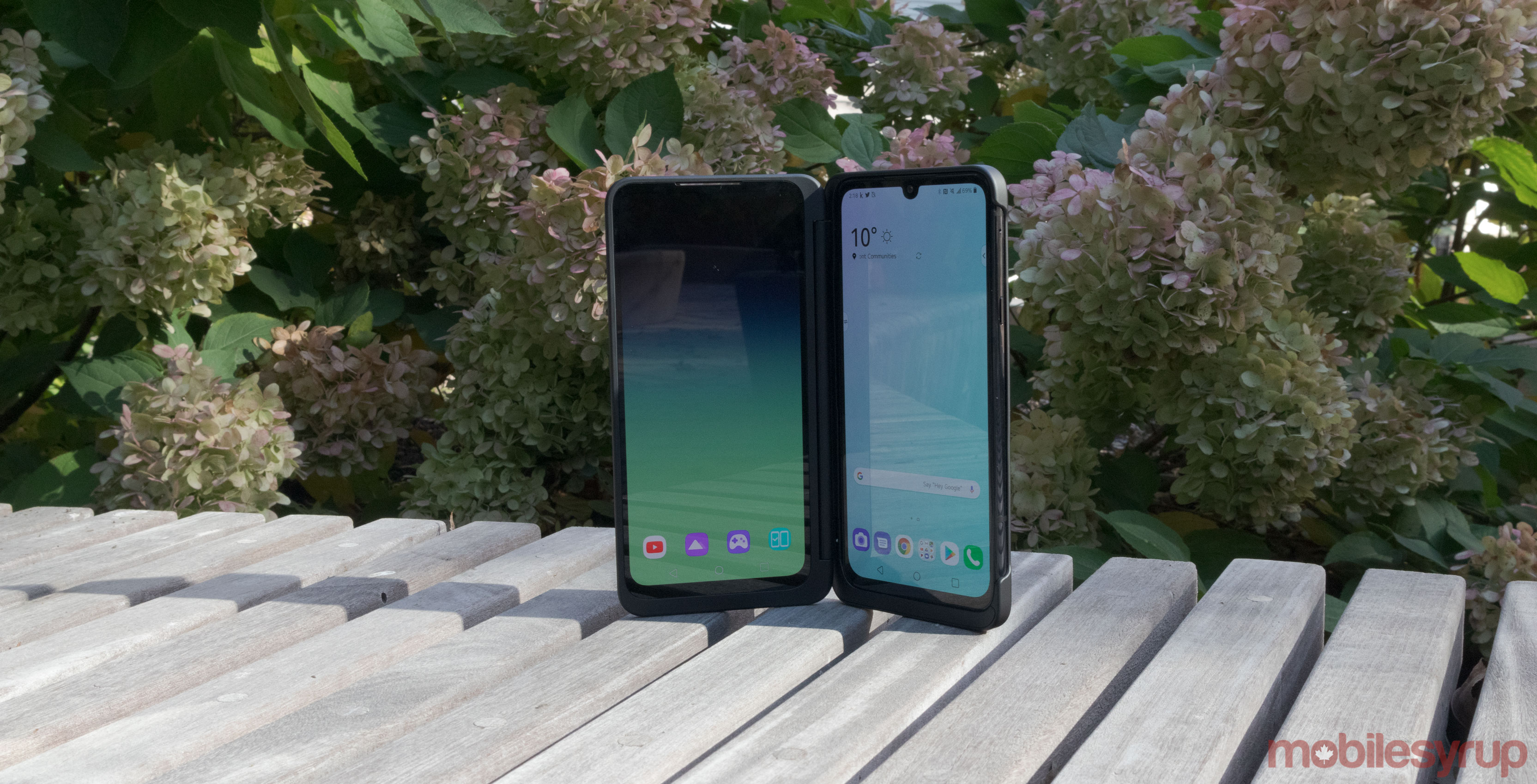
LG’s smartphones, while decent, come with one major flaw: the user interface. However, LG is working to make up for that with an updated version of LG UX.
The South Korean company showed off LG UX 9.0 in a video, and it looks a tad similar to Samsung’s One UI.
For example, the Messages app now has bigger chat previews so you can see more of your conversations on the main page.
The Contacts app now has bigger spaces between the different contacts, similar to the Clock app. Also within the Contacts app, LG UX moves the ‘Dial,’ ‘Call logs,’ ‘Contacts,’ and ‘Groups’ options as well as the ‘Search contacts and call logs’ bar to the bottom of the screen so it’s easier access with your thumb.
Additionally, the Gallery app is more streamlined with more space for your albums.
Apps also seem to be more interactive. For example, when you start to dial a phone number you see options to start a video call or to delete numbers. Additionally, when you select a picture in the Gallery app, you’ll see the trash can option.
LG UX 9.0 also has a system-wide Dark mode. Additionally, the new user interface looks like it will improve battery performance, according to the video.
It’s unclear when LG will launch UX 9.0; however, the YouTube video description explains that the new user interface is optimized for LG G8X ThinQ.
Source: LG
MobileSyrup may earn a commission from purchases made via our links, which helps fund the journalism we provide free on our website. These links do not influence our editorial content. Support us here.


