Back in October, Samsung revealed its latest Android user interface, One UI.
When I initially saw it, I was skeptical as the South Korean company continuously advertised its improved usability and visual comfort. Samsung claimed that One UI made it easier to perform specific actions, with its ‘Viewing’ and ‘Interaction’ sections.
However, with so much wasted space it was difficult to believe. After using the One UI for several months, I have to say that Samsung proved me wrong.
Here are the top reasons why One UI might be the best Android user interface out there.
Natural Interactions
Natural Interactions is a feature that allows the user to navigate Samsung smartphones that feature big displays with just one hand.
The Samsung Messages app features the title ‘Messages’ at the top with smaller text below. With One UI, the top message in the list is halfway down, making it easier to access. In contrast, the Samsung Experience version of Samsung Messages required the user to reach to the top of the app to open up the top text.
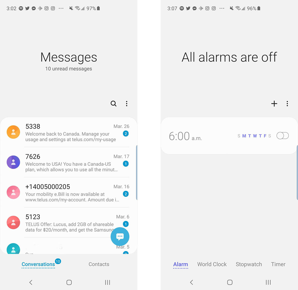
While this is a minor change, I’ve found it makes a significant difference in my day-to-day experience using the One UI, especially when comparing Samsung’s Messages app to Google’s Messages app. I noticed I prefer to use Samsung Messages over Google Messages.
Another example of this type usability is the ‘Clock’ app. The new Clock app features menu buttons in the bottom of the app, which gives users quick access to alarms, world clock, stopwatch and timer. Many clock apps found on other devices place these options at the top of the app, requiring the user to reach up to access them.
Again, it’s a very small shift, but it changed my user experience.
General appearance
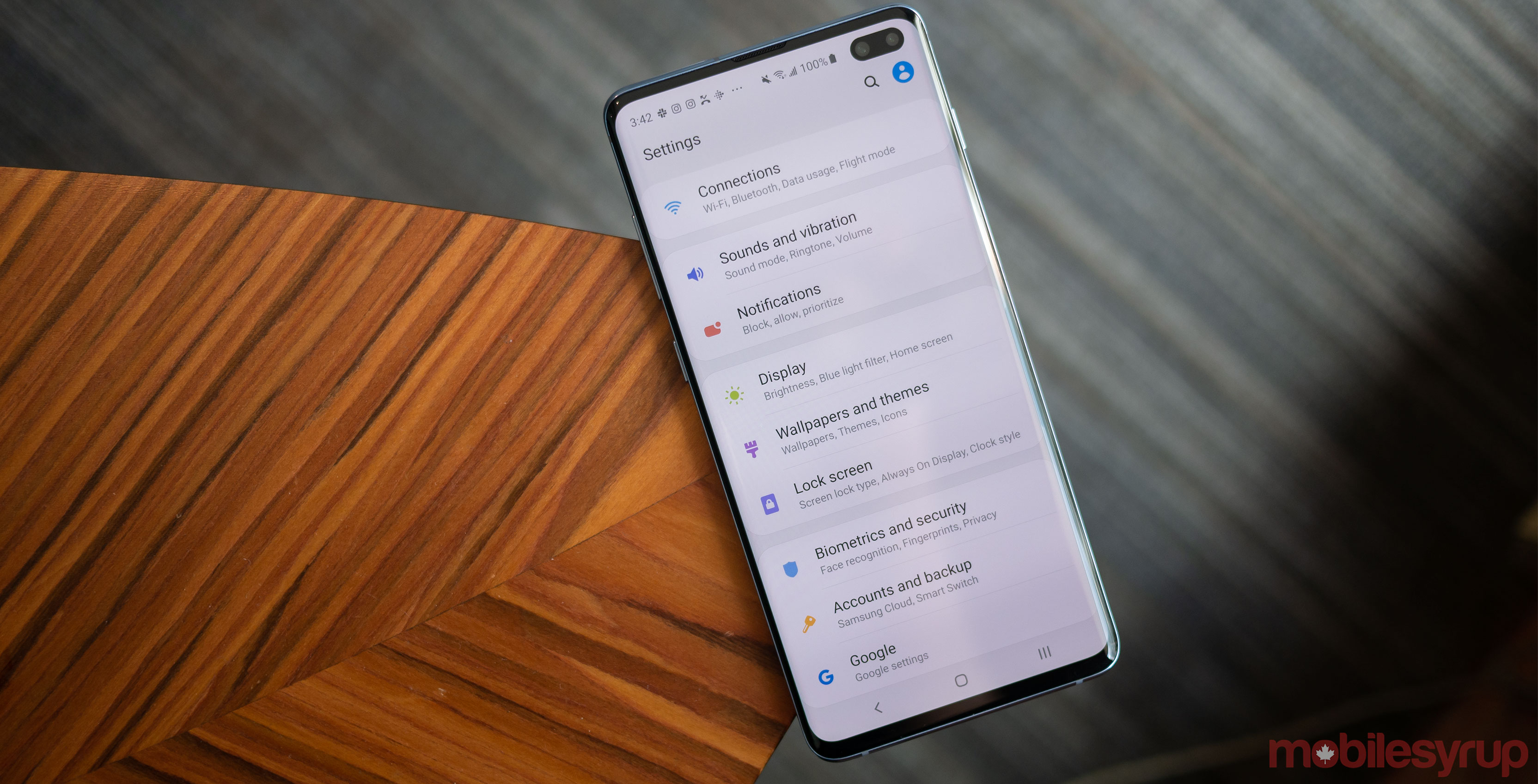
Samsung’s One UI skin on top of the stock Android 9 Pie launcher creates an aesthetically pleasing design. The perfect example of this is the Settings app, which hasn’t changed very much from its previous iteration.
All of the options are the same, but with One UI there are slight differences. Similar to the Messages app, Samsung has added ‘Interaction’ and ‘Viewing’ sections into this app as well. Therefore at the very top, there’s a large space that only reads ‘Settings.’ After scrolling down, you’ll notice slightly different symbols for each of the settings as well as they’re separated into groups.
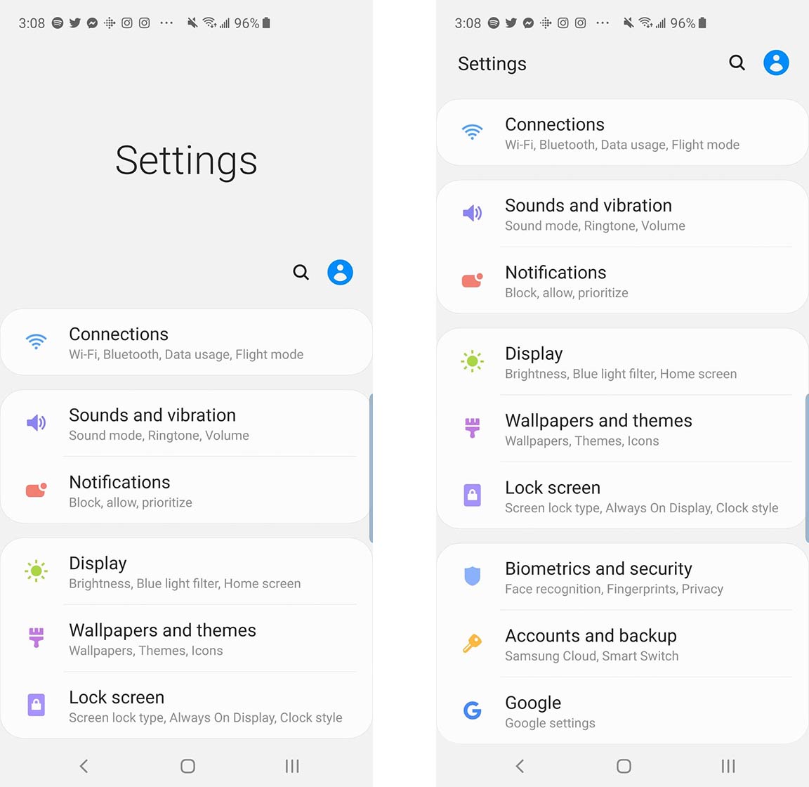
As seen below Samsung has created blocks for ‘Sound and vibration’ and ‘Notifications,’ grouping these two settings together. Continuing further down, you’ll notice other blocks, as well. What Samsung has done here is it has grouped together similar settings group so that alike tasks are easier to find.
For example, if you want to add a new fingerprint to your device, you’ll notice that the ‘Lock Screen’ setting is located in the same block as ‘Display’ and ‘Wallpaper and themes’ which likely means that you need to keep scrolling down, as this block of settings is to customize appearance. Searching slightly further down you’ll see a setting called ‘Biometrics’ which includes, in smaller lettering, ‘Face recognition, Iris and Privacy’ which is the place to add a fingerprint.
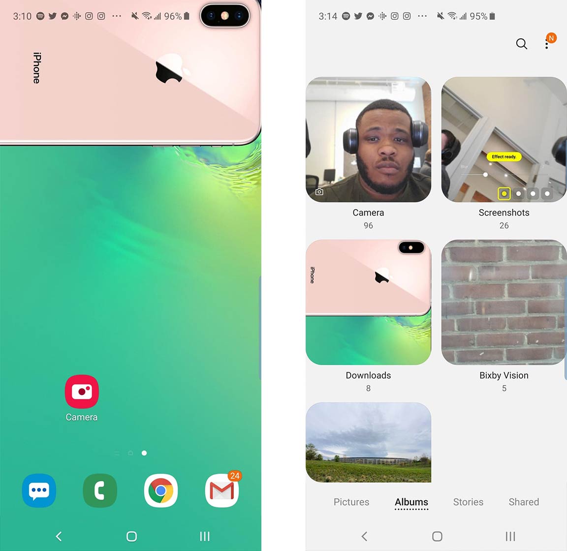
Samsung has even changed the look of its apps so they appear more in-line with Google’s Material Design. This changes the look of app icons like the ‘Camera’ so instead of just showing the outline of a camera, it’s a filled in camera, similar to the Settings’ and the Clock app, and most of Samsung’s first-party apps.
Samsung has also made a point of rounding the corners of literally everything so that it mimics the rounded corners of the device. Which means all apps, all settings, even your albums are rounded.
Settings and Gestures
In a combination of both the aesthetic and the making things more usable, Samsung has the option to make quick settings more accessible as well. Swiping down on the home screen will open up the notifications, and swiping down again opens the quick settings menu. This time, opening up the quick settings menu in its entirety will cause the quick settings to take up all of the phone’s display, with the time at the top, in the ‘Viewing area,’
This quick settings menu is more aesthetically pleasing and hides other notifications.
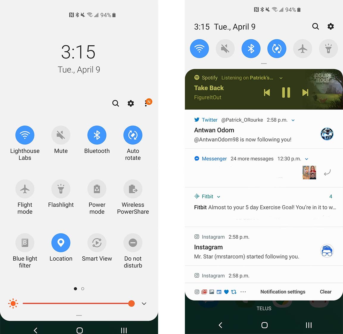
Within a quick settings menu, all of the titles are rounded and easily accessible because they’re in the ‘Interactions’ area.
I also found the Android Pie-based gestures very usable with One UI. This is partly because of Note 9’s, S9’s and S10’s hardware and software.
Samsung got rid of Google’s Android Pill in favour of completely showcasing the phone’s display. To go home, you swipe up from the middle to go home, swipe up from the right to open recent apps and swipe up from the left to go back.
This process is natural and works somewhat similar to Huawei’s gesture-based controls for the OnePlus 6T, however, with the combination of Samsung’s Hard press Home button on the phones before the S10 there’s never a need actually to swipe up from the middle, users can simply press down where the home button would be and it’ll bring users back to their home page.
In combination with hardware and software, One UI’s gesture-based navigation is one of my favourites, and I’ve used a number of Android handsets over the last few months.
Focus Block
One UI also sports what Samsung calls Focus Blocks. This feature works within the Bixby Home section located on the left of the home page.
Focus Blocks, essentially block the information you’d normally find in the Bixby Home page, such as weather, calendar, Facebook videos and tasks. Samsung says these Focus Blocks will help direct users to their task without distracting them.
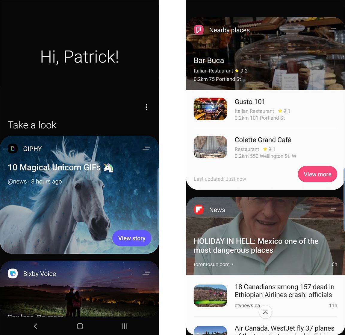
Personally, I like the Focus Blocks. Users can always get rid of blocks they don’t want but it’s a quick way to look at your schedule, news, what’s trending on Twitter and more.
You can pin your favourite cards, which I pinned the GIPHY card which features new GIFs with every refresh of the page. The Bixby Home section beforehand featured smaller cards that were difficult to follow. Focus Blocks are bigger and everyone can read them with ease.
One UI in comparison
While it would arguably be blasphemy for me to say that One UI is better than stock Android, the user interface is definitely in the top five of all Android skins. Though I haven’t used all of the devices from different manufacturers, over the last year I have used devices from Sony, HTC, Huawei, Motorola, OnePlus, Samsung, Asus, LG and Nokia.
Even though I’ve missed out on BlackBerry and Alcatel devices, I can confidently say that Samsung’s One UI experience is preferable, especially if you’re looking for an interface that is easy to use with one hand, or that is different from Google’s stock UI, but is still is simple and great to use.
MobileSyrup may earn a commission from purchases made via our links, which helps fund the journalism we provide free on our website. These links do not influence our editorial content. Support us here.
