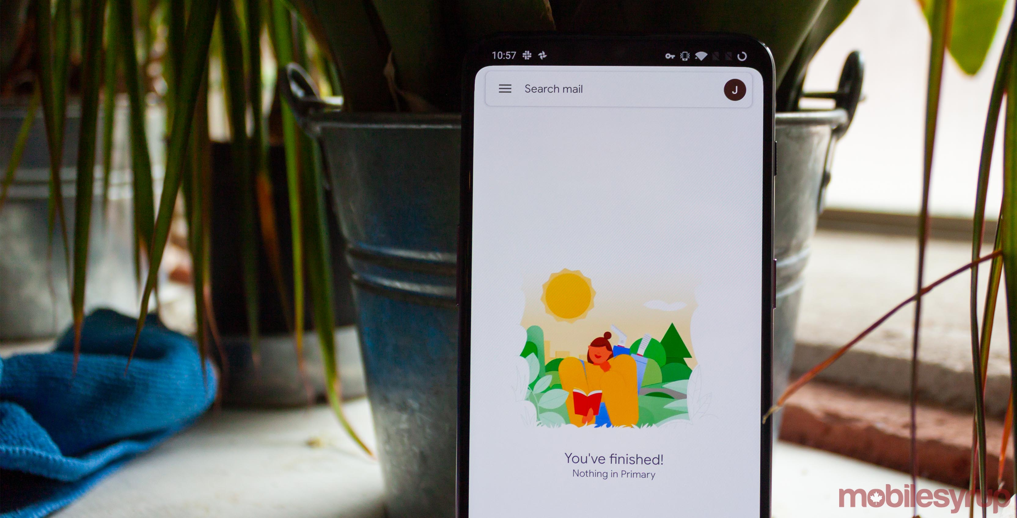
Android widgets have fallen out of favour over the last few years, but for those few devoted widget users out there, Google has updated its Gmail widget.
It’s a small update that doesn’t introduce new functionality. Instead, it brings the visual style of the widget in line with Gmail’s new Material Design refresh.
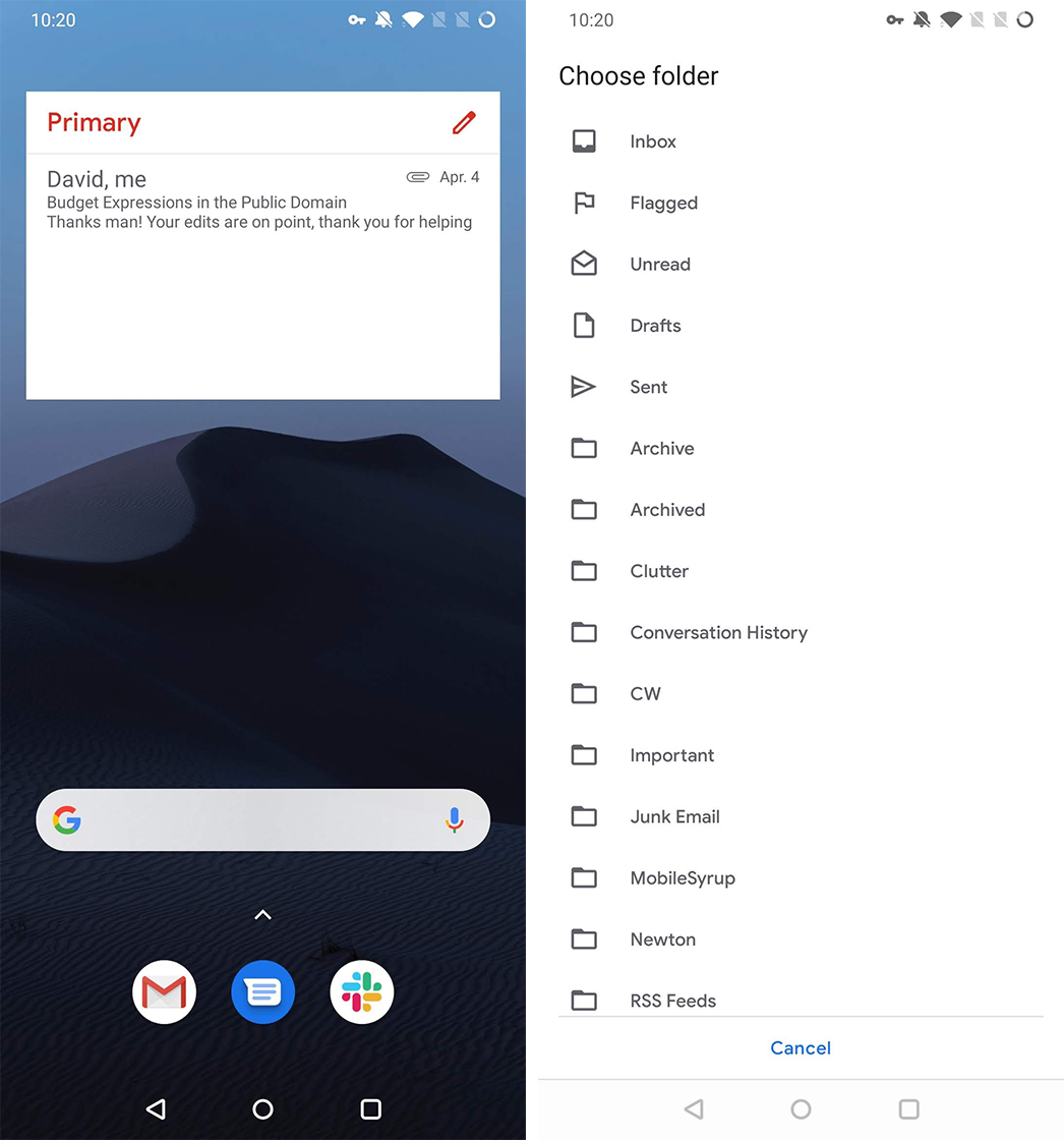
The most noticeable change is the inversion of the widget’s header bar. The old style had a red bar with white text, but now it’s white with red text. The widget also makes use of smaller Google Sans font, and the pencil icon has also adopted a new Material Design style.
Further, the widget still works as before. You select it by long-pressing on an empty space on your home screen, select ‘Widgets’ from the menu and scroll to Gmail. Drag the widget to your screen, then select an account — if you have more than one — and a folder to display in the widget. You can then resize the widget to fit your needs.

For the few widget users still out there, if you haven’t gotten the Gmail update already, it went live with version 2019.03.17.240613483. However, that version rolled out a while ago, so everyone should have it by now.
If not, you can update your Gmail app from the Play Store here.
Source: Android Police
MobileSyrup may earn a commission from purchases made via our links, which helps fund the journalism we provide free on our website. These links do not influence our editorial content. Support us here.


