I remember driving to Oakville at the end of 2007 thinking about starting a blog focused on the wireless industry in Canada. At the time, BlackBerry was king, Motorola was innovating with the Moto Q, Sony Ericsson was pushing music, and Nokia targeted gamers.
As for the wireless carriers, Rogers was setting the stage to launch the iPhone 3G on its GSM network, Bell and Telus were rocking CDMA, Virgin Mobile was an MVNO, our regional players had limited handsets, and the thought of a new entrant invading protected market share with more choice, was not of concern.
So here we are, a decade later. The cellphone is vastly different than simply being a companion device. What was once targeted to a select audience — mainly those interested in playing Brick Breaker — the mobile phone is now in the hands and pockets of millions of Canadians and has become a necessity when it comes to connecting with family, friends, business, and in emergency situations.
The CRTC’s latest stat revealed 29,765,430 wireless subscribers, which is an increase from 2007’s wireless subscribers numbers of 19,919,512.
The industry has evolved and we have too. This is the third massive iteration of MobileSyrup.
First off, MobileSyrup started from my condo in Toronto and we now have expanded to an office located in the heart of the city. Behind the scenes are a number of people — Patrick, Igor, Rose, Jessica, Zach, Rob, Teddy, Steven, Matthew, Robyn, and Tom — that bring you the latest news, reviews, galleries, and unique perspectives of wireless in Canada.
Since the term ‘mobile’ has changed drastically over the course of the past decade, here’s the Canadian-focussed tech we cover on MobileSyrup, both in the consumer and enterprise space: smartphones, tablets, wearables, automotive, IoT, gaming, accessories, and VR/AR.
Homepage, news articles, reviews, gallery and search
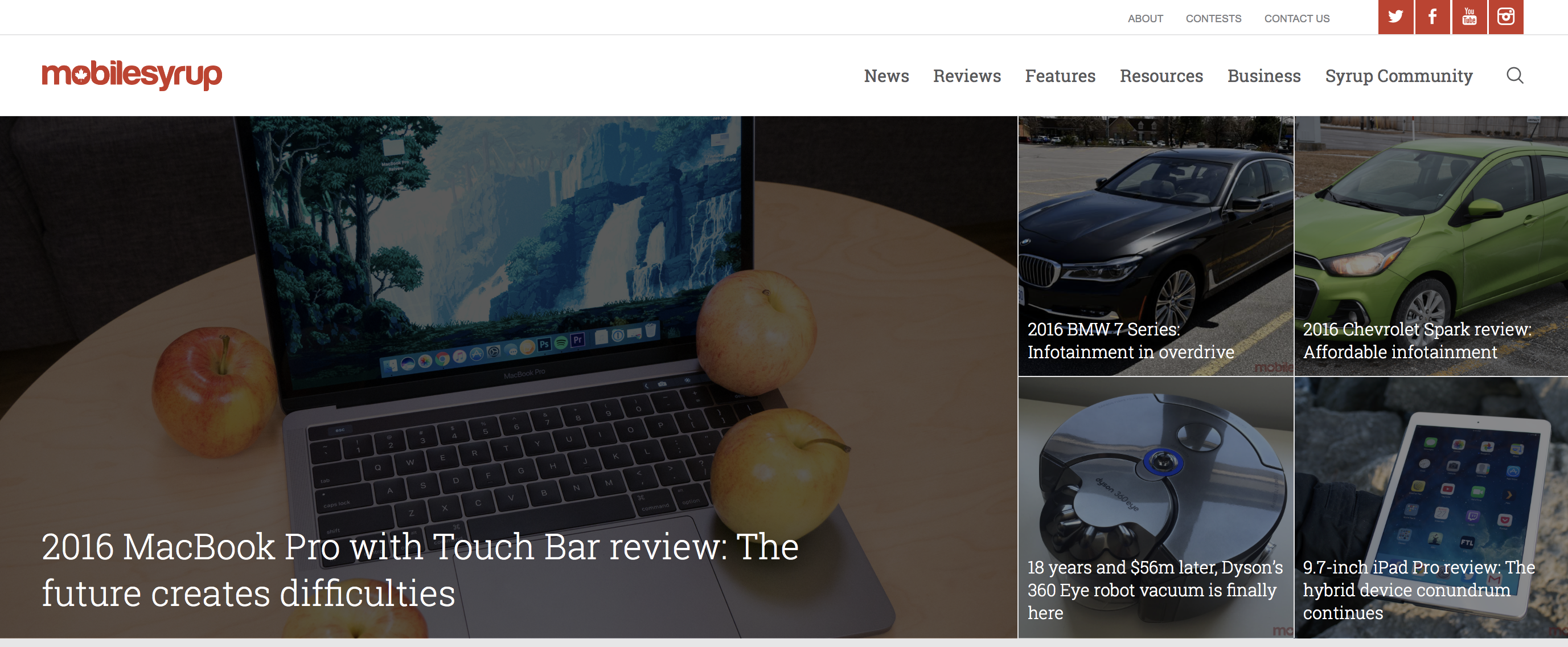
Version 2.0 of MobileSyrup was lacklustre but served its purpose. With version 3.0, we’ve amped up and uncluttered our layout with full-screen view, larger photos, cleaner text, and included galleries and a search box that actually works.
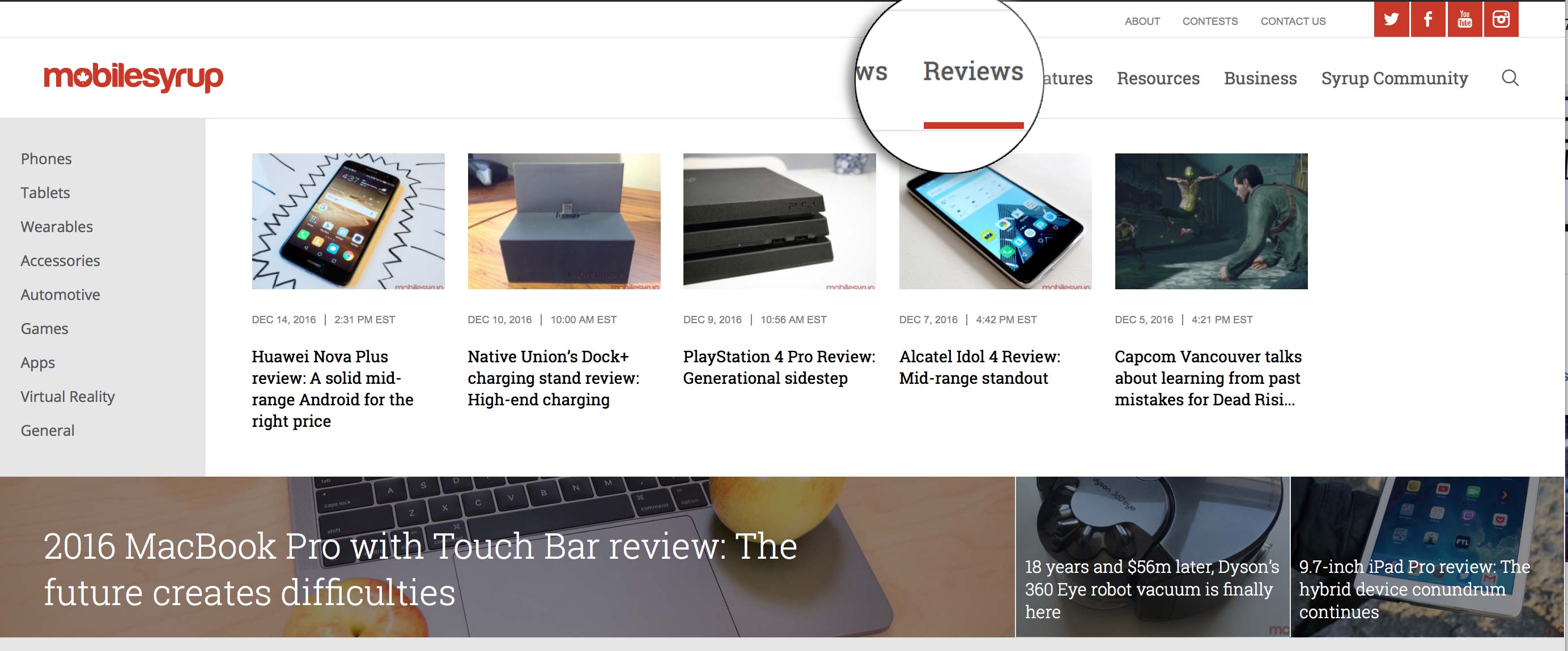
The homepage is where you’ll find all the latest news and features on the site, along with an array of pictures and text sizes that bring the articles to life. If you’re interested in perusing one specific section, just click or tap on the dedicated button to view, news, reviews, features, resources and business. In addition, there is a large placement directly under the latest articles that highlights a specific story we feel needs to be communicated and shared more than others.
Our general news articles aren’t that different from what you’re used to, however. They are now cleaner with larger fonts and a larger title. On desktop, instead of us linking to a related page, we have included a stream of articles that are automatically generated based on what you’re reading (this is omitted in mobile to save data and time scrolling to the comment section).
The reviews section now features a revamped working gallery, which many have been asking from us for years.
We have also included the ability to have multiple galleries within a review. Finally, you’ll notice we brought forth the ability to compare one device to another — for example, an iPhone 7 to the iPhone 6s, iPhone 6 and Galaxy S7.
In our media section, this is where our readers can have quick access to our latest photo galleries and videos.
Rate comparison and how-to section
One of the major concerns of the 30 million Canadian wireless subscribers is their monthly rate plan. Time and time again we’ve heard of ‘bill shock,’ massive overages, and unwanted charges appearing on their monthly bill. We now have embedded a service that helps you compare your plan with a competitor to see if your charges are in-line with the industry, or if you can easily switch to a better deal.
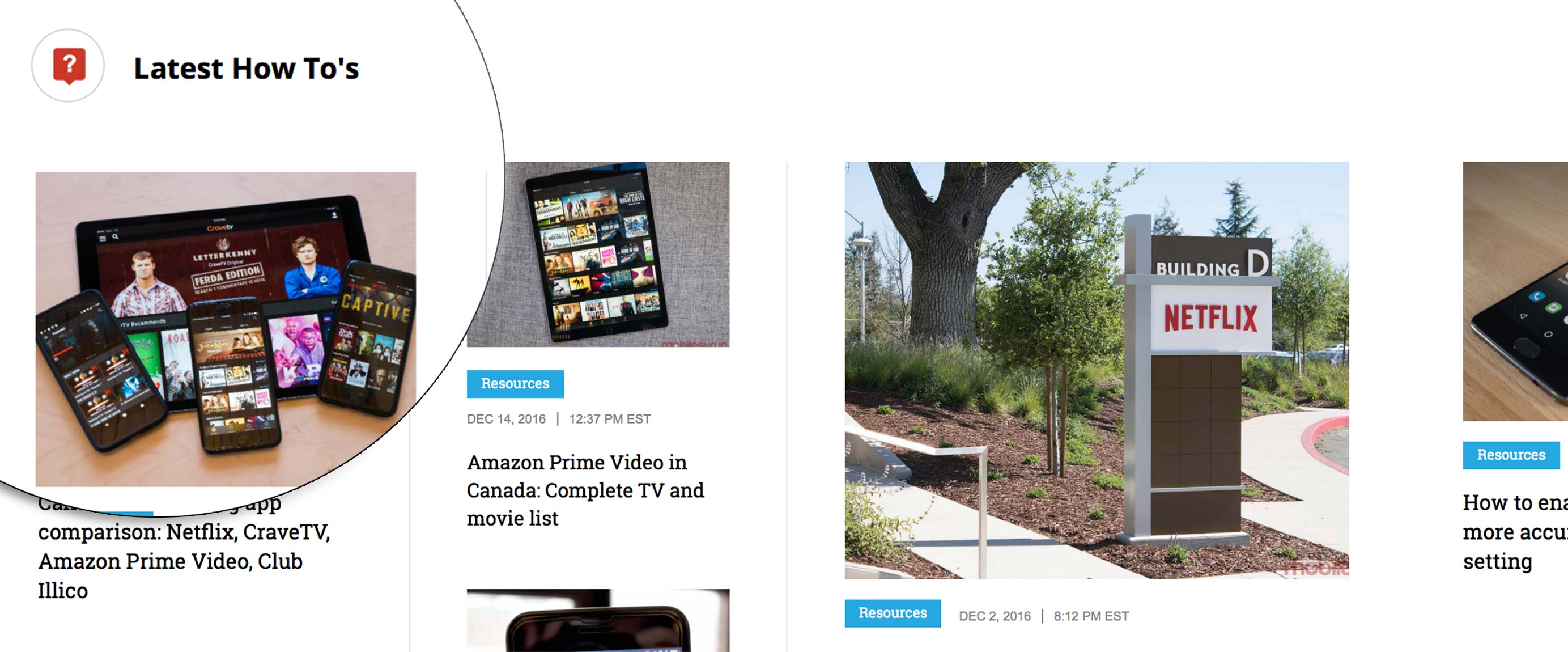
Our goal is to offer you more than news and reviews to help you have a deeper understanding of your mobile device. We have been compiling various how-to’s and step-by-step processes on several topics, including, “How to upgrade from Windows Phone 8.1 to Windows 10 Mobile,” “How to enable Wi-Fi calling on your iPhone,” “How to use Netflix’s new offline viewing mode,” and “How to enable the OnePlus 3’s more accurate colour space setting.”
On a weekly basis, we’ll be publishing more how-to’s to be a resource for you, enabling you to be more productive and also allow you to have more fun with your device.
Dedicated section devoted to Canadian-specific news
Since our core focus is on Canada, you’ll notice we now have a section on our homepage devoted to the latest Canadian mobile news. This is based on time and showcases the latest eight articles. On desktop, you’ll see this feature can be viewed with a beautifully designed scroll bar, while on mobile you can simply swipe with your finger.
What’s next?
This is the first phase of the new MobileSyrup and over the course of the next two months you’ll see a number of new additions and improvements.
As always, we appreciate your feedback and would love your thoughts on how we can improve and what features you’d like us to add.
MobileSyrup may earn a commission from purchases made via our links, which helps fund the journalism we provide free on our website. These links do not influence our editorial content. Support us here.


