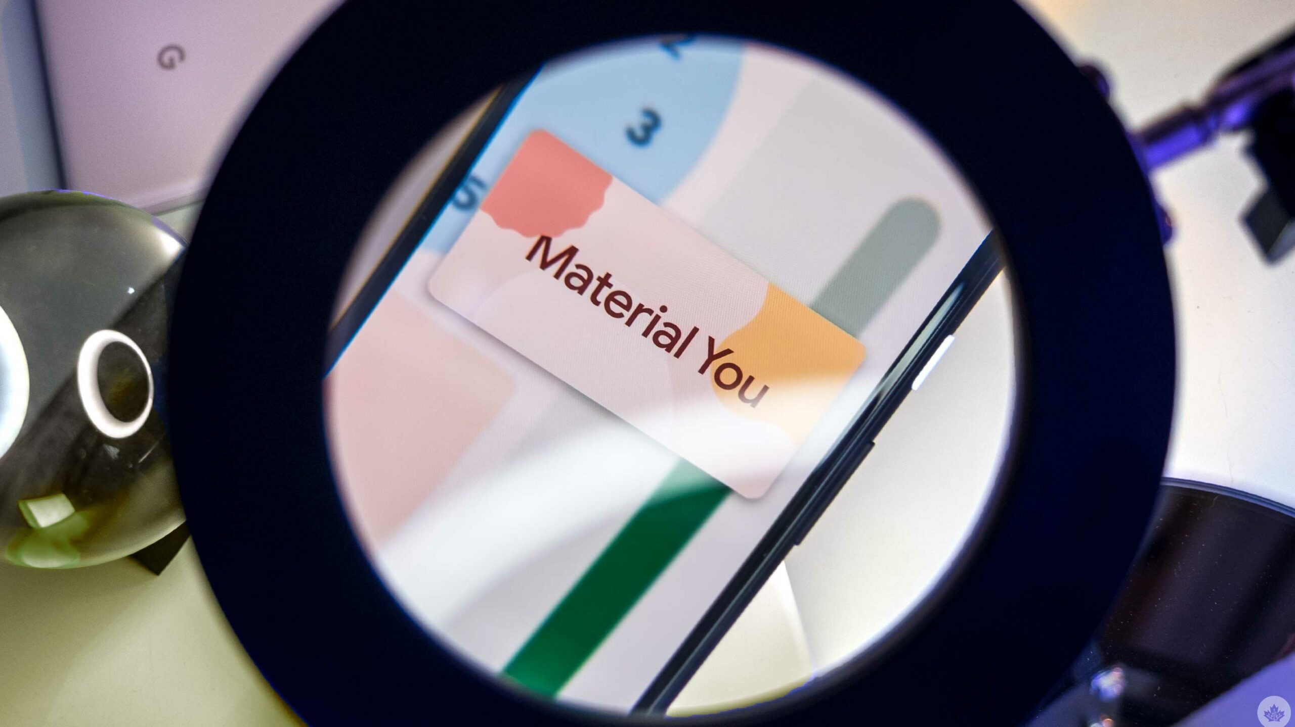
Google seems to be on the verge of releasing Android 12 with its new colour-shifting design.
To help prepare for the launch, we rounded up all of the apps with Material You updates or widgets so far. We should note that these updates are predominantly on Pixel phones, but I’ve noticed a few updates on my OnePlus 9 Pro.
I’ll make sure to mention which apps have rolled out to us so far, and will update the list as more apps roll out to myself and other MobileSyrup staffers. The last time Google did a significant design change, it took a while for all apps to update to support it. Leading into Android 12, it looks like the tech giant is better prepared, but I’d still expect a bit of a delay for all of the apps to catch up with the colour-changing look once the full release of Android 12 drops this fall.
I used a Pixel 4a 5G for most of my testing — it’s running the latest Android 12 beta.
Gboard
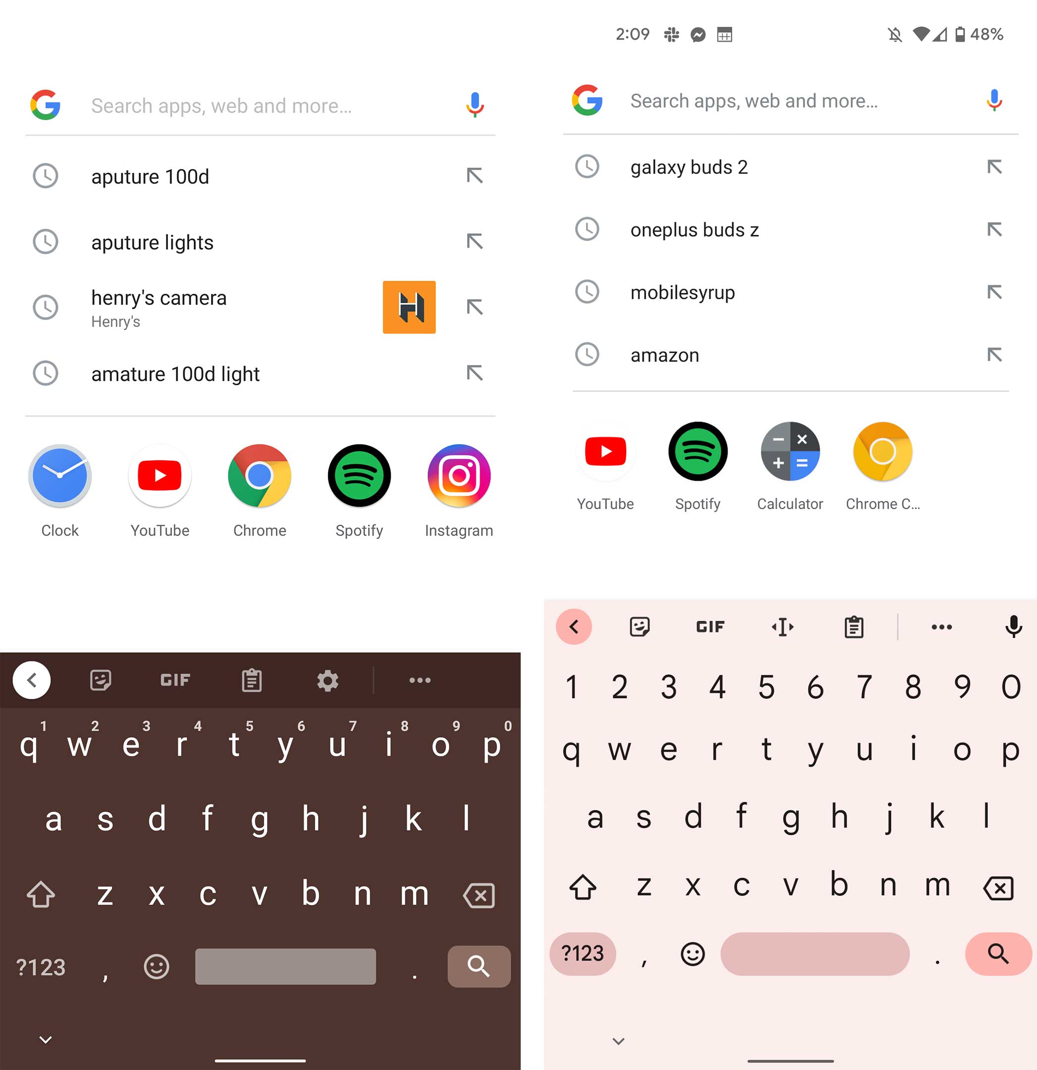
Of course, the first app that got updated was the Google keyboard app, Gboard. The app is functionally the same as it was in Android 11, but the buttons are a little more rounded, and it adopts an accent colour based on your wallpaper. I have this app on my Pixel 4a 5G.
Phone
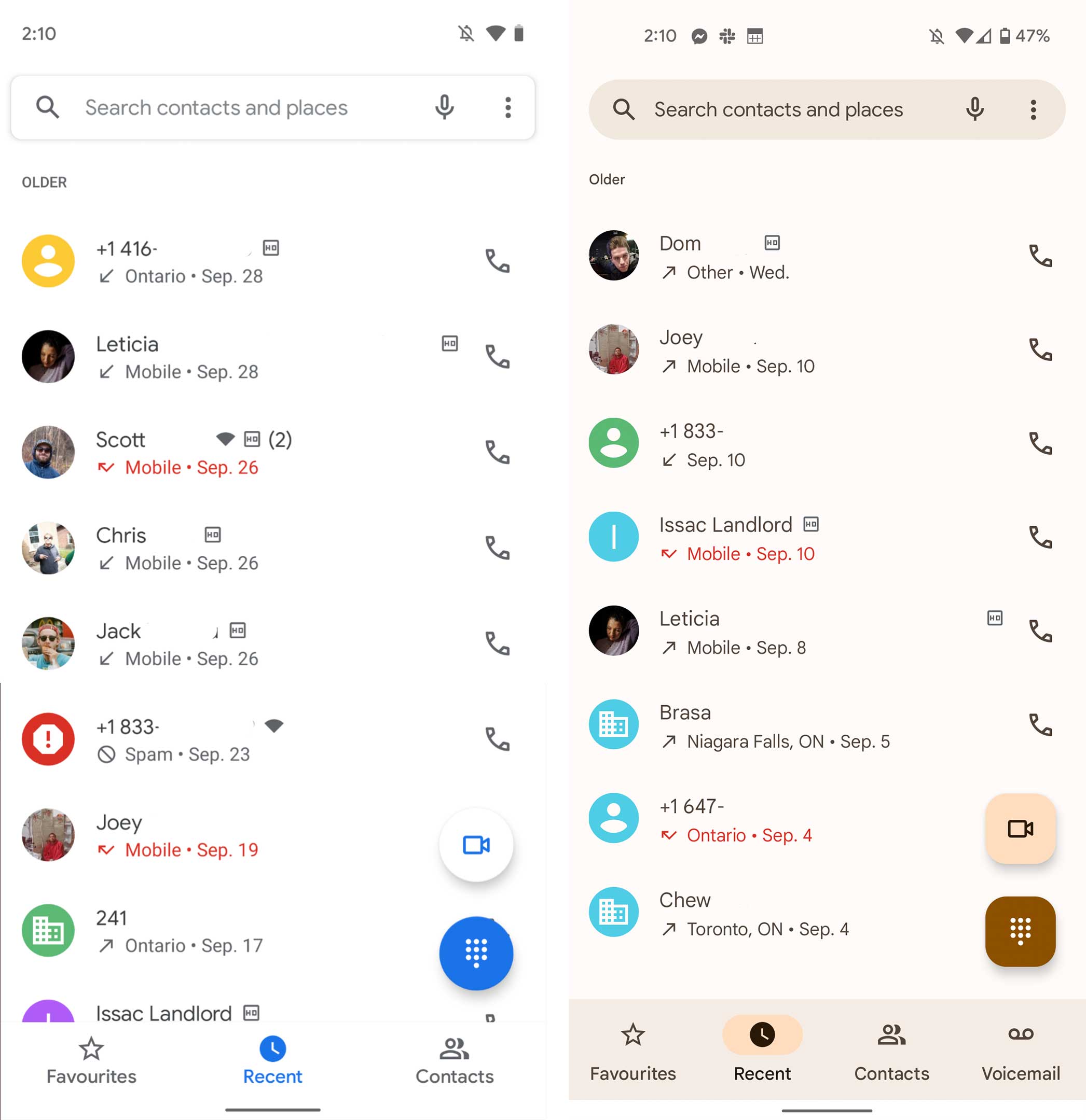
The Phone app has been updated, and the floating action buttons (FAB) are square this time around. They also adopt an accent colour from your phone. This update is live on my OnePlus 9 Pro, but the colours don’t change. Even some of the animations, like the empty voicemail screen, take on your accent colour, and it looks really great on the Pixel 4a 5G.
Calculator
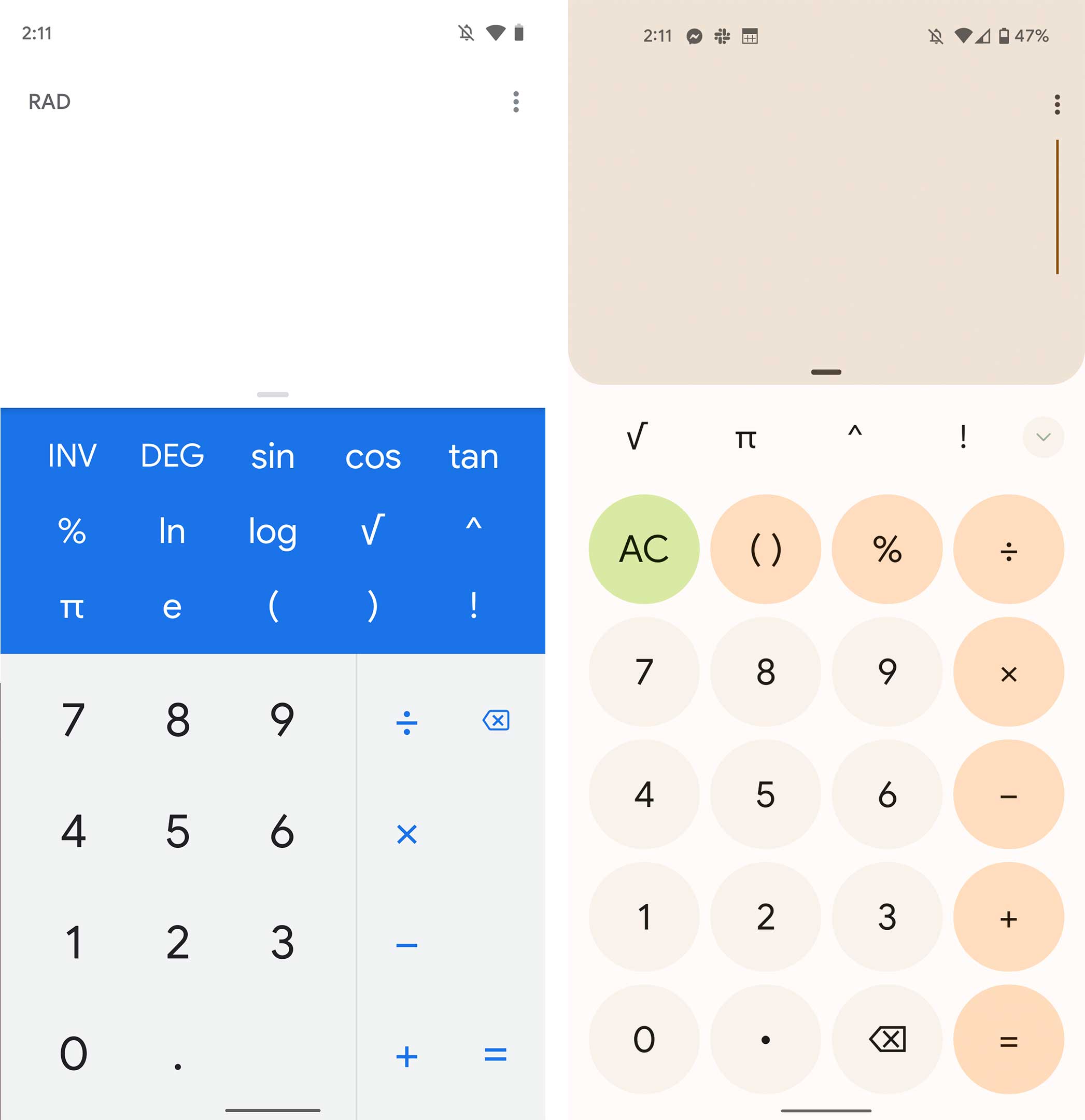
The calculator is also updated, and it looks awesome with a new round button design and bright ever-changing colours. This app is on my Pixel 4a 5G.
Camera
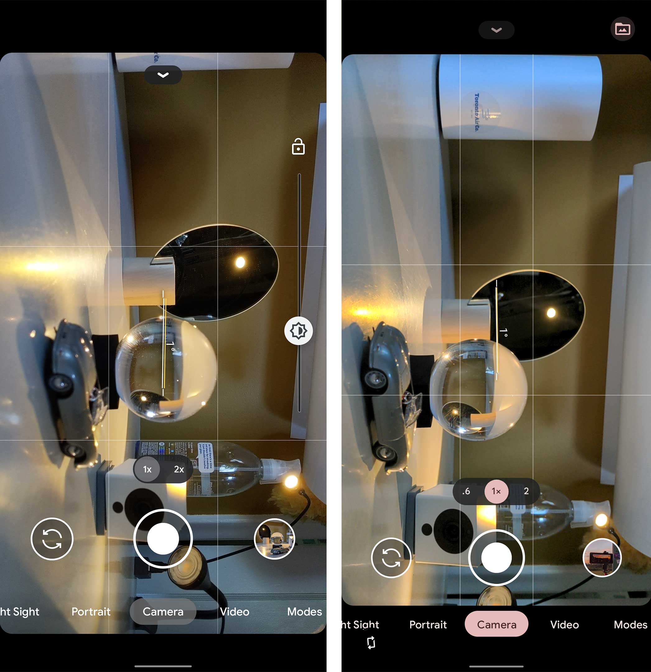
The camera app has been updated slightly to take on the accent colours from your wallpaper. I have this update on my Pixel 4a 5G.
Gmail
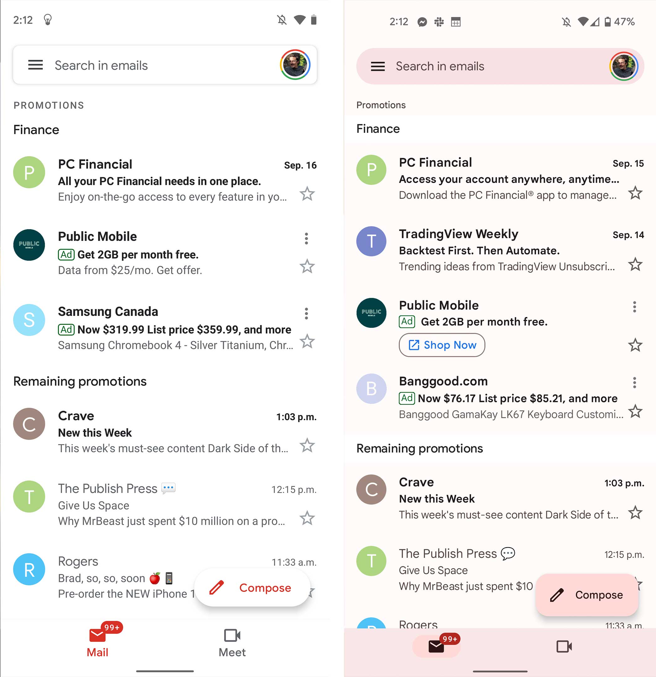
The Gmail update, like a lot of these redesigns, is quite subtle. The background colour doesn’t change, but the accent colours do, and the FAB is square this time around to match the other apps. This update is already live on my Pixel 4a 5G and my OnePlus 9 Pro. On the OnePlus (Android 11), the accent colour is locked to blue.
This app gets a little more colour, and the background changes slightly to match your colour scheme, but it’s not overly noticeable. This update hasn’t rolled out to me yet.
Keep Notes
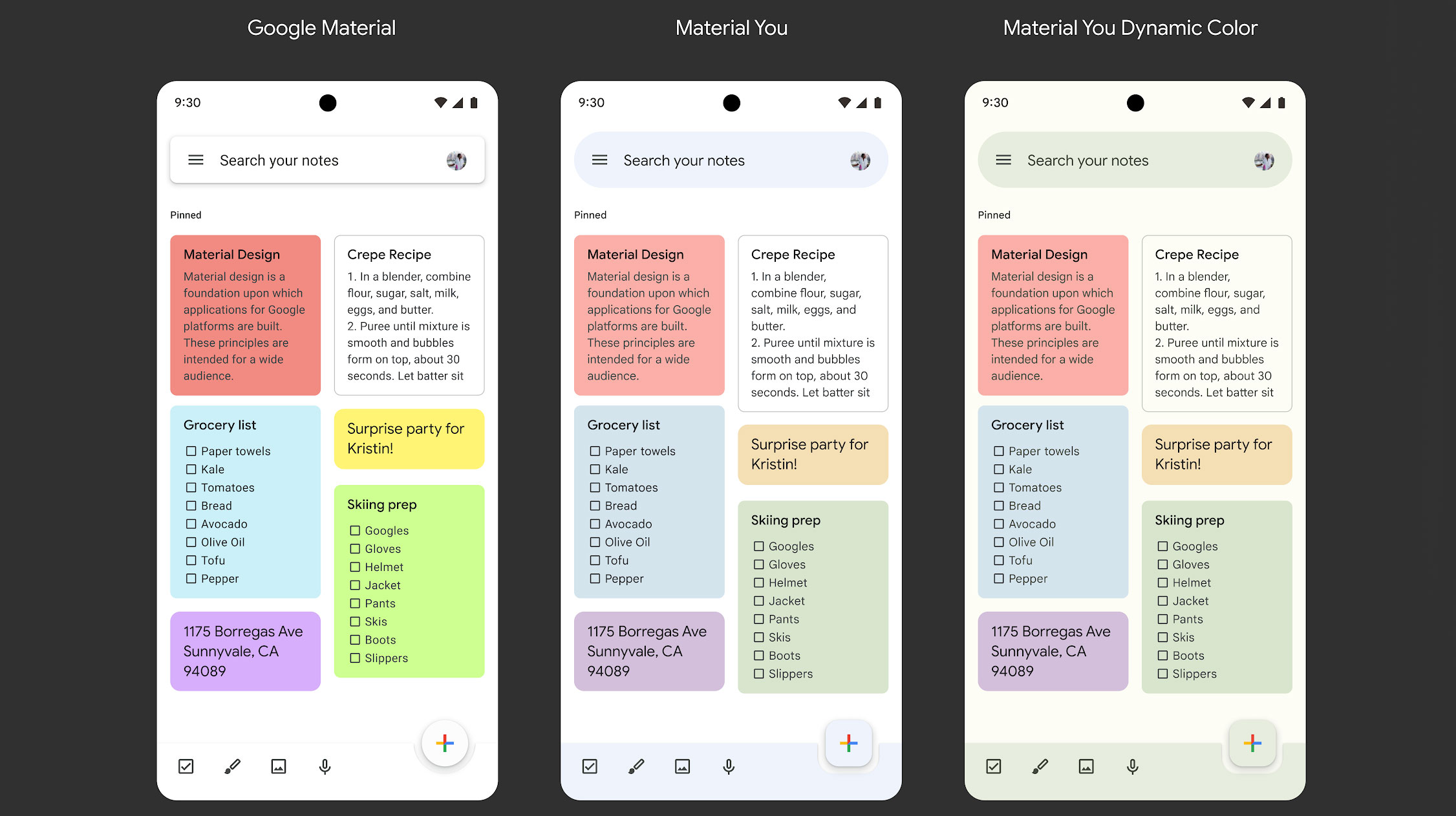
The Keep update is similar to the Google one, with a subtle background colour and brighter accent colours. The one change worth mentioning is that the colourful notes look a little muted compared to how saturated they were before. I think it’s an improvement, as it matches the muted accent colours better. This update has been rolled out to us.
Google Meet
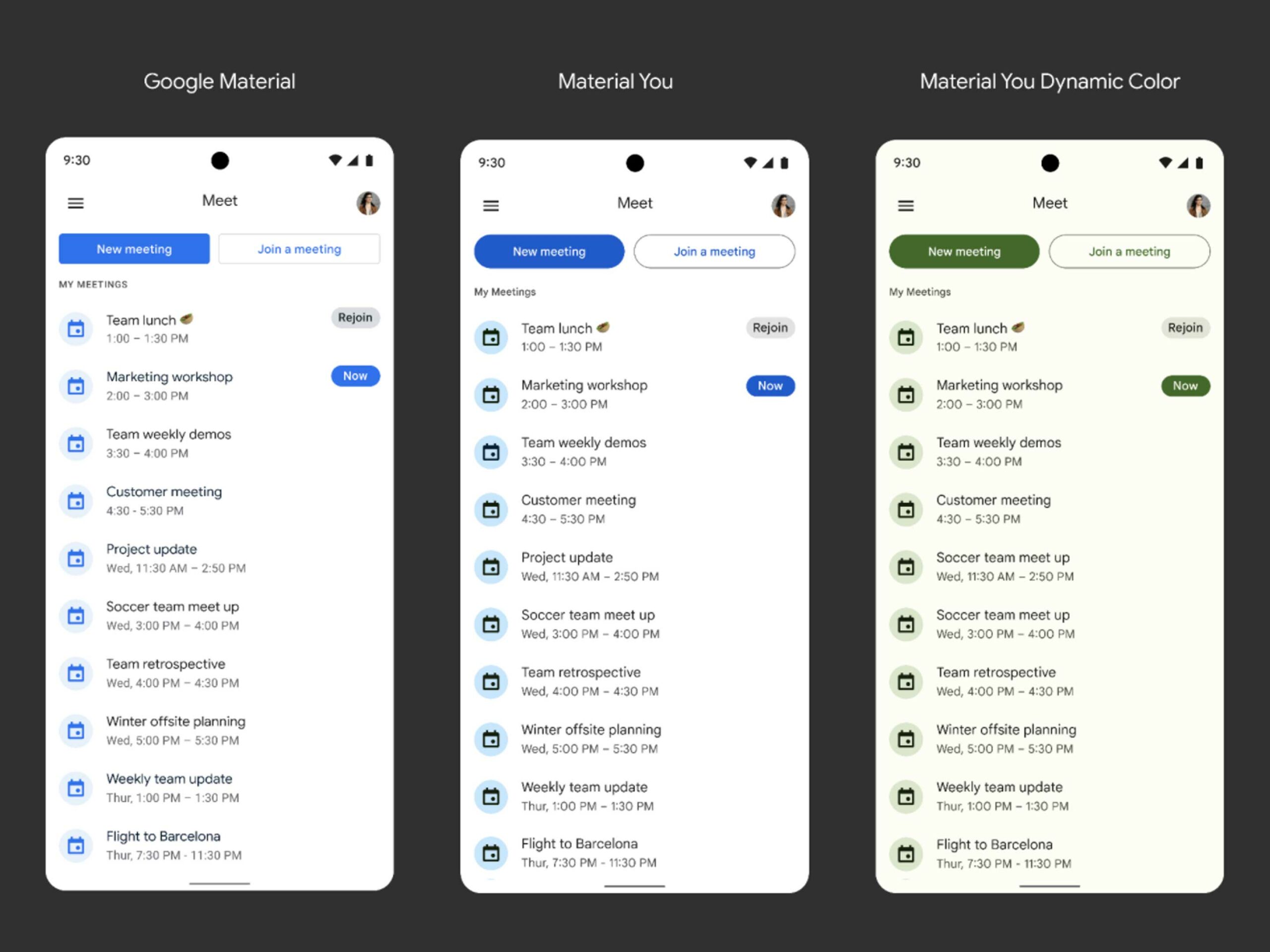
Google Meet doesn’t have a lot going on, other than some subtle changes to accent colours. I don’t have this update yet.
Drive
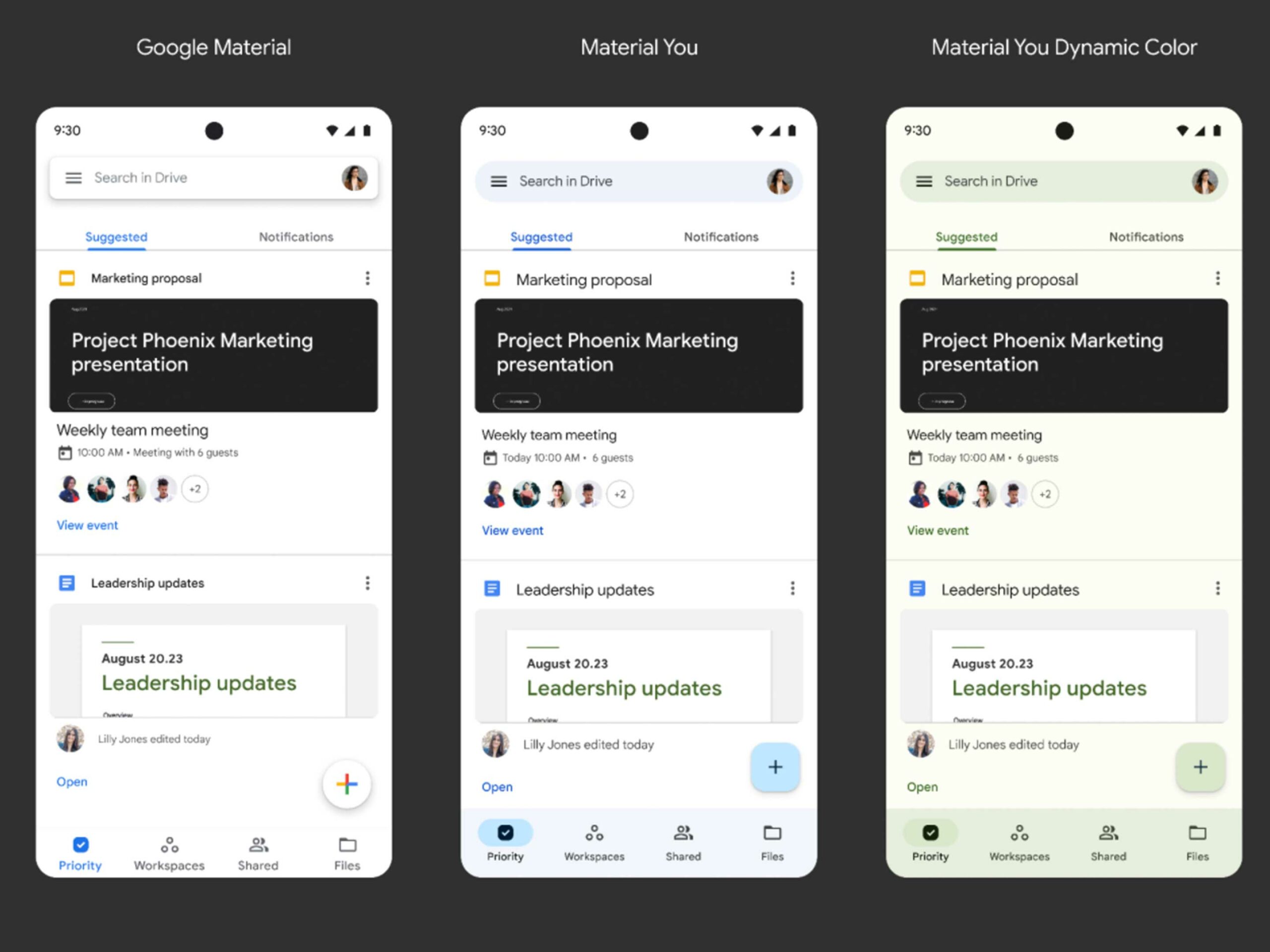
Google Drive has gotten a little more of an update with a slightly reworked bottom bar that now hosts a square action button. All the accent colours also match your wallpaper. This app has rolled out to us.
Docs
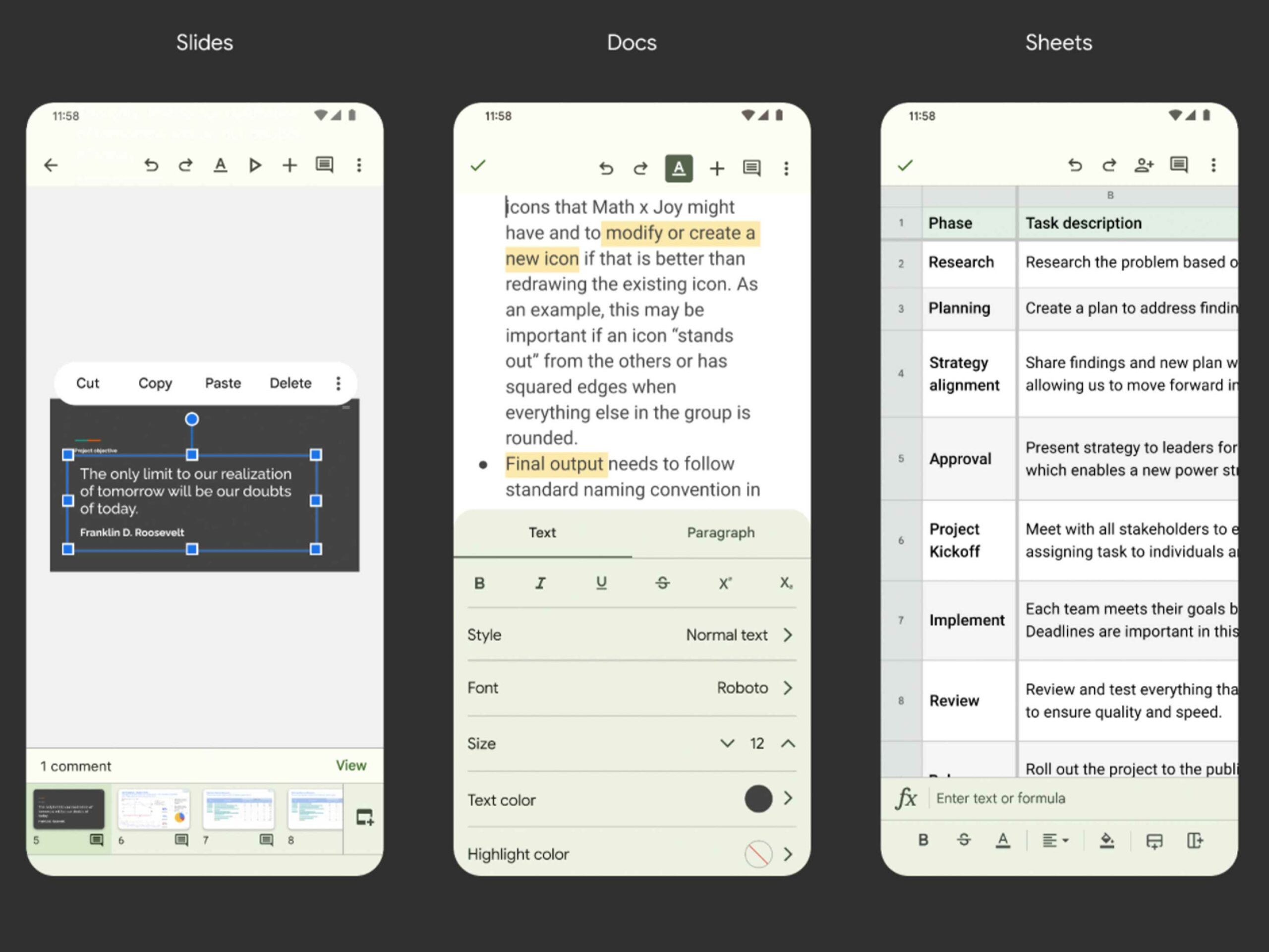
Within Docs, the accent colours and toolbars are also taken over by the prominent background colour. Don’t worry though, the workspace areas still have white or black backgrounds. This update is the same across the Google Work suite, so mobile Sheets and Slide users can expect the same changes. I have this update.
Calendar
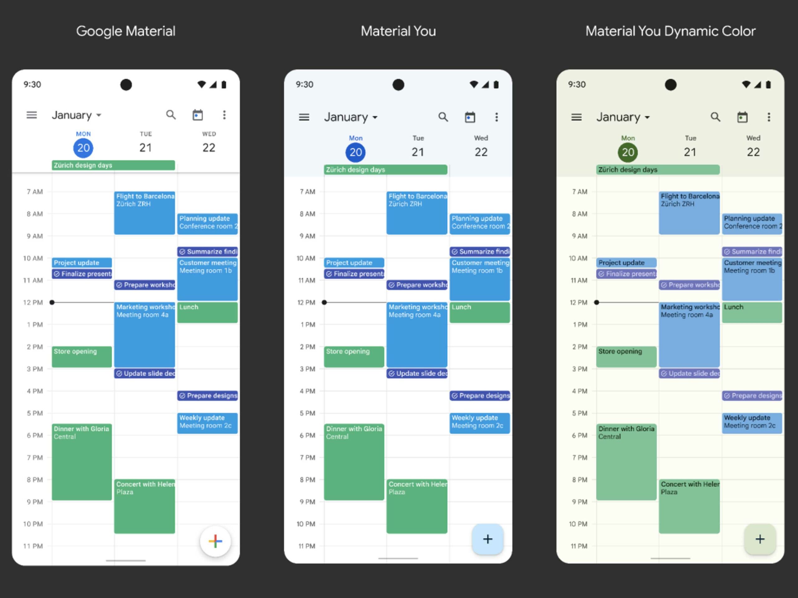
Google Cal users will get an update too, but it won’t look that different since all the existing calendar accent colours will still be there. This update has rolled out.
Clock
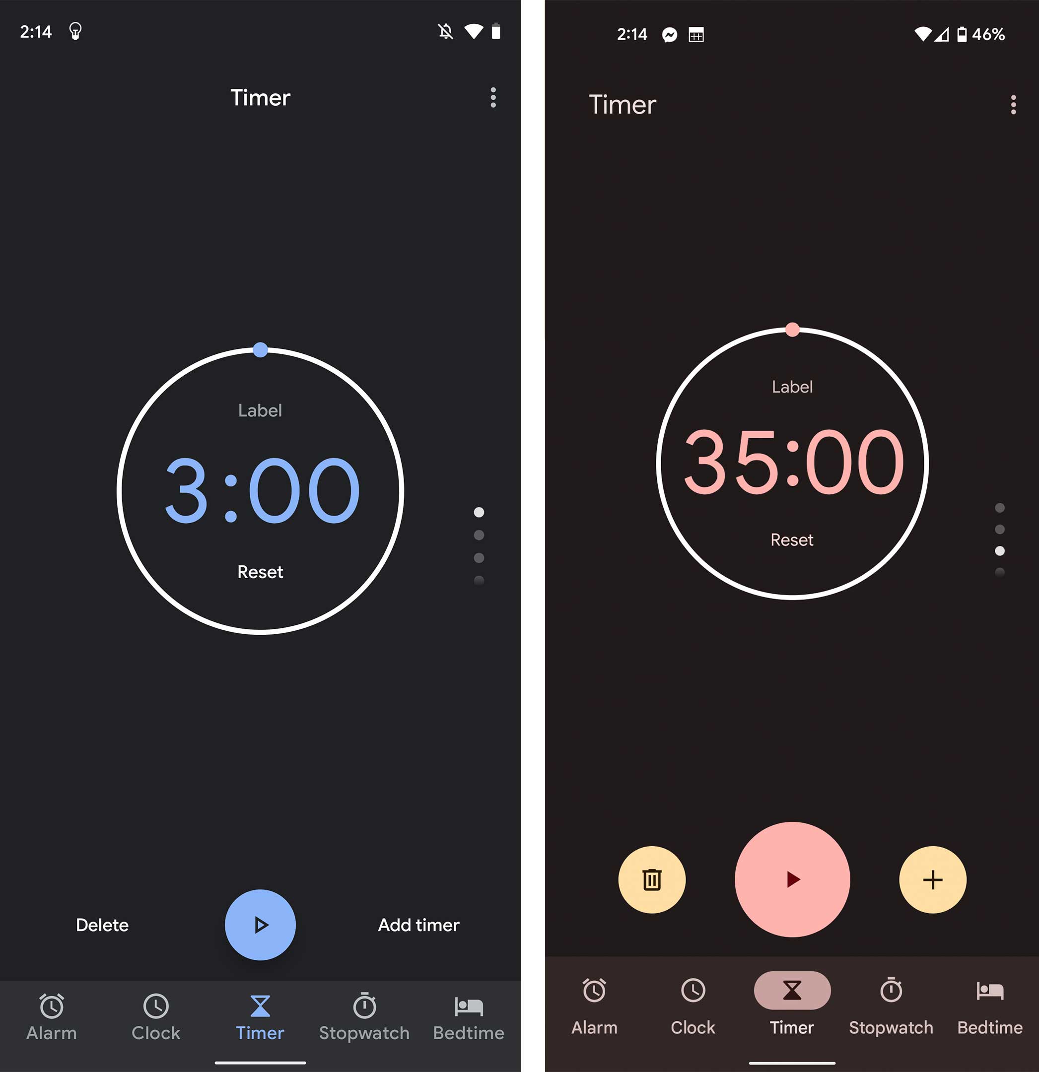
The Clock app has been updated, and it looks pretty sharp. That being said, it’s got a huge ‘Plus’ button at the bottom of the screen. At first I found it a little weird, but it’s since grown on me and makes a lot of sense in the ‘Stopwatch’ section of the app. This update has rolled out to me.
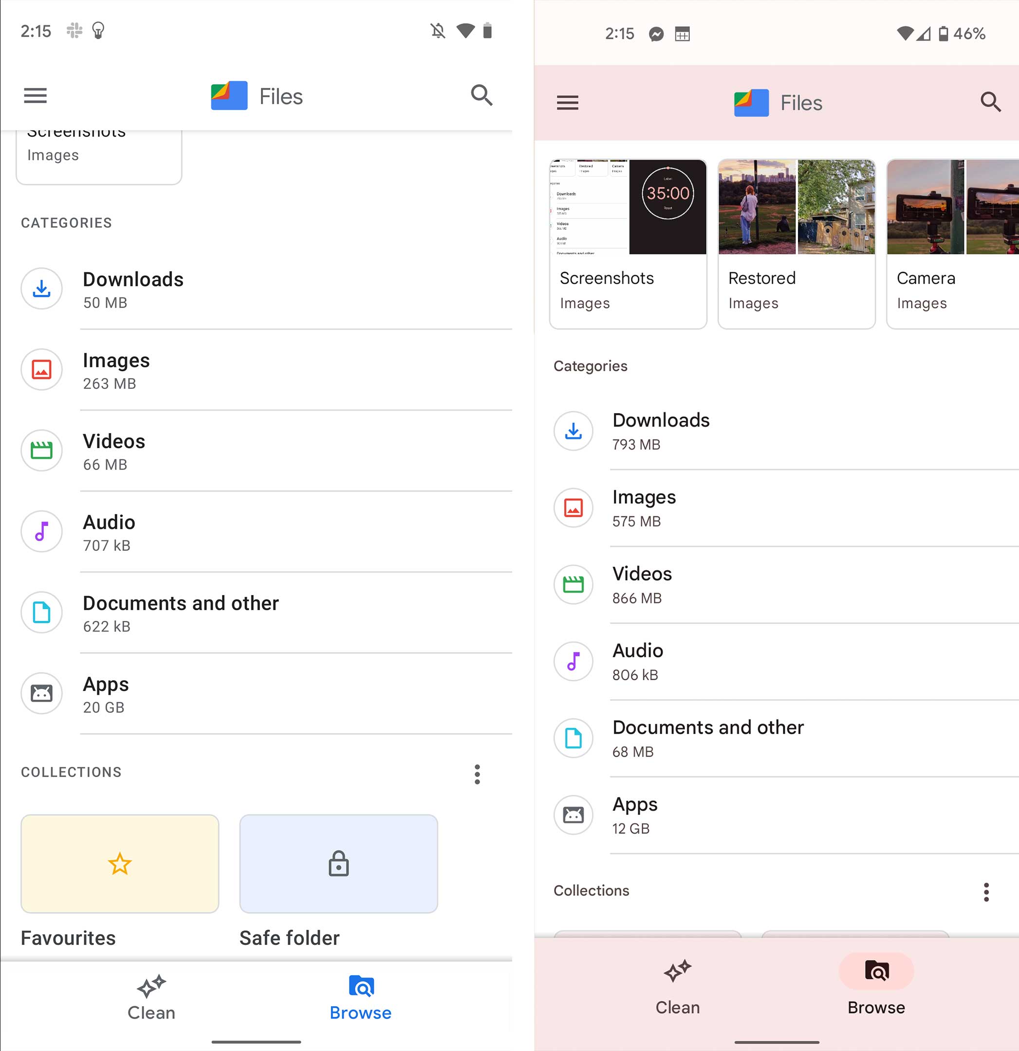
Files
The Files app takes on some colour across the bottom bar and in other accent places. However, it has this strange design feature where the top bar is white until you scroll down, and then it takes on an accent colour. This colour doesn’t extend to the notification bar at the top of the screen, so for me, it looks like a weird red bar. This update has rolled out to me.
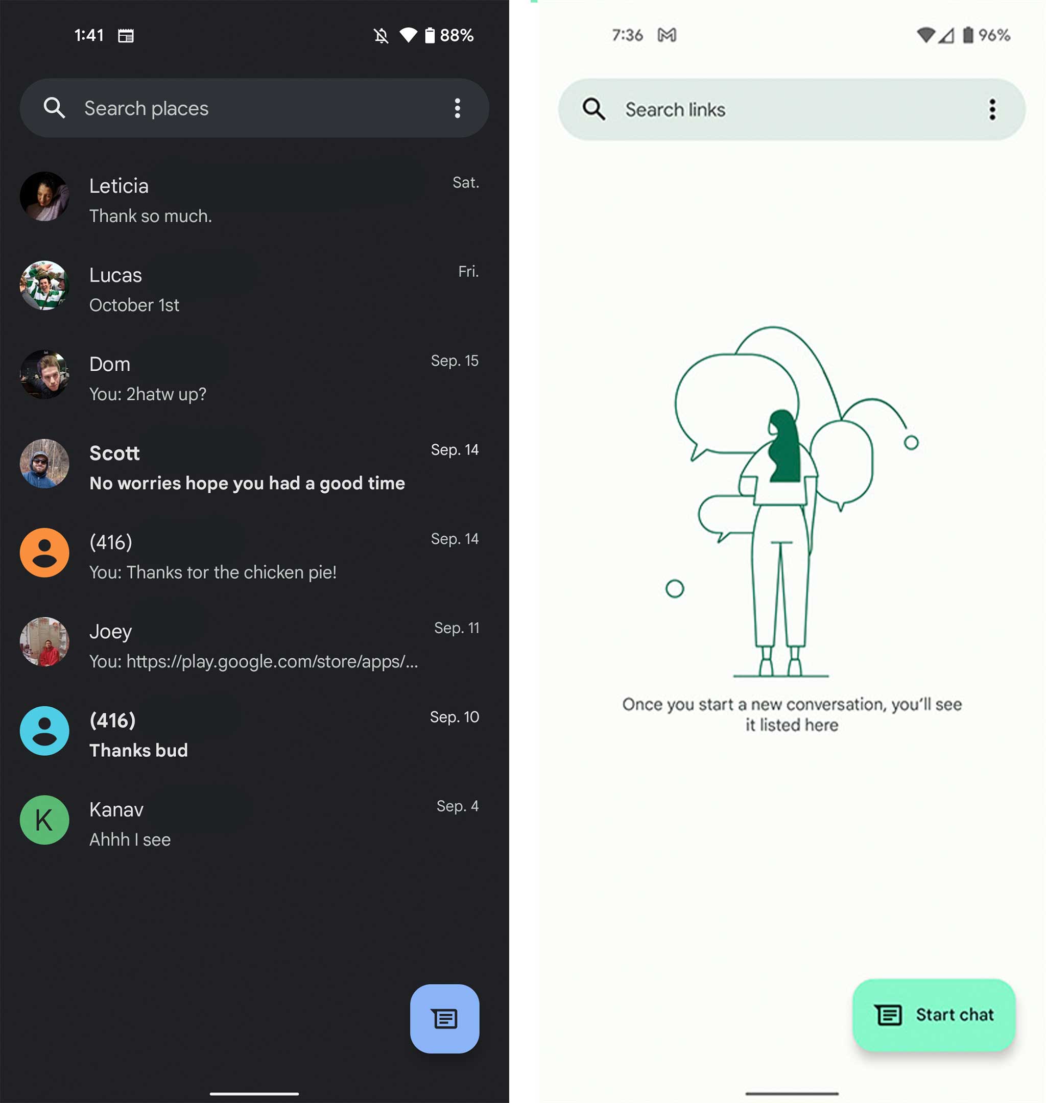
Google Messages
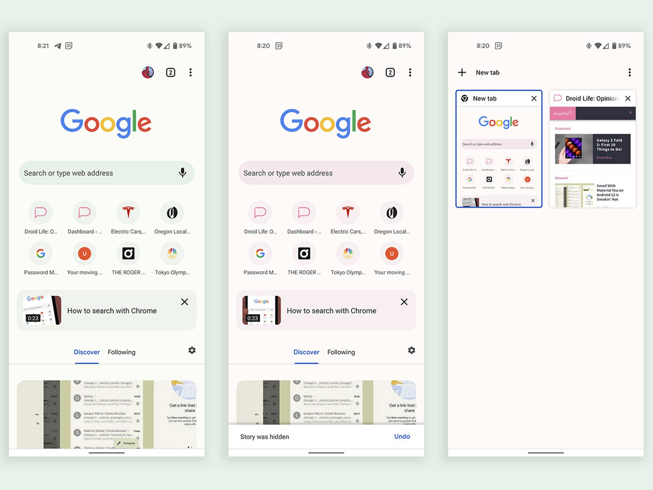
Google has begun rolling out updates to its main texting app as of September 22nd. The messages selection page has been updated for me with a new square ‘Start chat’ button and a rounded search bar, but as of the time of writing it’s not adopting my Android 12 theme’s colour. Other reports from Droidlife mention similar inconsistencies, with only parts of the app working with their accent colour.
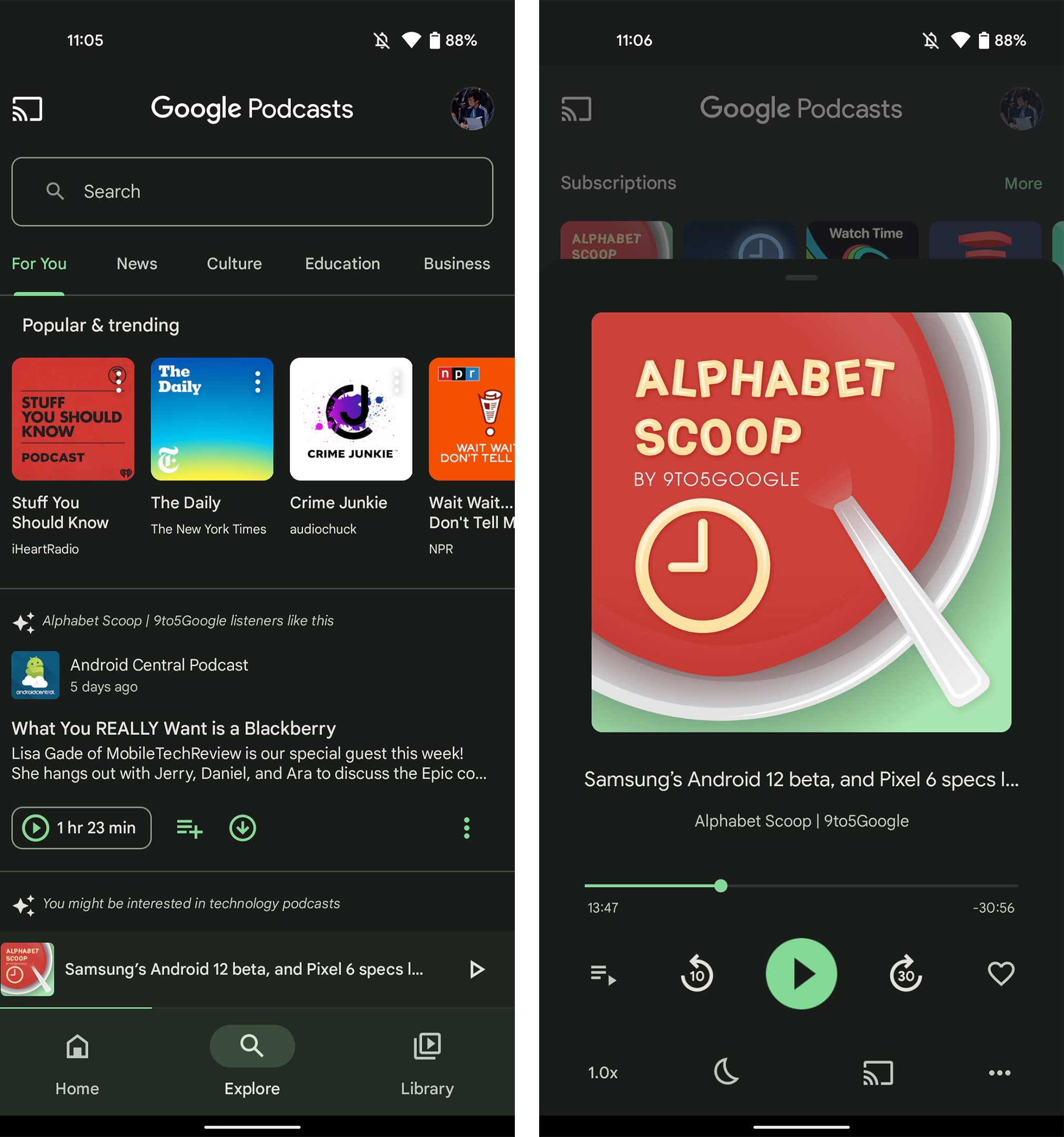
Google Podcasts
Another report from 9to5Google also notes that the Google Podcasts app is updated to work with ‘Material You’ for some people.
Update 22/09/2-22 2:04pm: This article has been updated with information and images from Droidlife and 9to5Google about Google Podcasts and Messages.
MobileSyrup may earn a commission from purchases made via our links, which helps fund the journalism we provide free on our website. These links do not influence our editorial content. Support us here.

