When Apple announced its newest iPhones, the XS, XS Max and XR in September, I was intrigued by an Apple device for the first time in years.
I’ve always been an Android user. My first phone was a Samsung Nexus S. With the OnePlus One being the only exception, I’ve always had a Nexus or Pixel phone. I love what Google is currently doing with software on Android.
I always paid attention to what Apple was doing, too — the company has an enormous influence on the smartphone market, after all. But for the most part, I discounted the iPhone and iOS as too expensive and restricting. Instead, I opted to use Android because I felt the iPhone was just not worth the money.
But the XS and XS Max are compelling devices. Or, maybe I’d finally bought into the hype. Either way, I decided to use the iPhone XS for a couple of weeks and see why so many people choose iPhone when the cost is so high. So, I took the SIM card out of my daily driver Pixel 2 XL and popped it in an iPhone XS.
To be clear, this isn’t necessarily a comparison of hardware. There are plenty of great comparisons between iPhone and Android hardware. iPhones feature incredibly powerful proprietary silicon designed by Apple. Samsung phones have beautiful screens. Pixels have the best cameras. It’s all been discussed before.
This isn’t an Android versus iOS argument either. There have been plenty of those as well. Instead, this is a comparison of experience. Smartphones are expensive, regardless if you choose Android or iOS. If you’re spending $1,000 on a phone, or $700 or $400, I think the most critical aspect is the experience. You want the best, no-compromise experience, the best value for your money.
Naturally, discussion of software and hardware will come into the conversation, but only where pertinent to the experience discussion.
Let’s dig in.
What is the iOS experience?
The first thing I noticed when I started using the XS was that things just worked. The overall experience was consistent and reliable. Apps had a clear design language as well. In a word, things were cohesive.
Another thing that struck me in the switch was how little iOS explains to you. The set-up screens tell you about the value of privacy and introduce you to tentpole features like Siri. However, users have to figure out some of the little things — a daunting task if you’ve not used a smartphone before or if you’re switching to a new operating system.
Some things don’t need an explanation at all. Adapting to the new gesture navigation through interacting with it worked well. But not everything benefits from the simplicity of a swipe.
For example, I learned from other iOS users that you could move multiple apps at once by tapping other icons while you’re moving another one. I also learned that iOS has a ‘Shake to undo’ function after complaining to a coworker when I accidentally deleted something I was writing. iOS didn’t tell me about these features.
![]()
That’s not to say Android explains all the nuances of its operating system either. The new gesture navigation system in Pie has several small and unexplained features. Things like flicking the pill to flip between apps, for example.
However, Android does explain many things the first time you encounter them. The first time you see the home screen, it tells you how to open the app drawer and move apps around. The first time you view a fullscreen video, it tells you how to summon the navbar with a swipe up on the edge of the screen.
Most importantly, if you press and hold on a button in Android, the system will tell you what it does. This is an incredibly useful feature, especially when developers use symbols instead of words for buttons. I missed this little feature a lot on iOS.

While some may want users to understand things through interaction, I’d rather know what the button I’m tapping will do before I press it.
The app experience
Some believe that imposing restrictions can encourage creativity. For example, setting a word limit when you write something can force you to pick your words and thoughts carefully in an attempt to be concise and direct.
While not an identical scenario, Apple’s App Store is relatively restrictive and in my experience with it, apps are more creative.
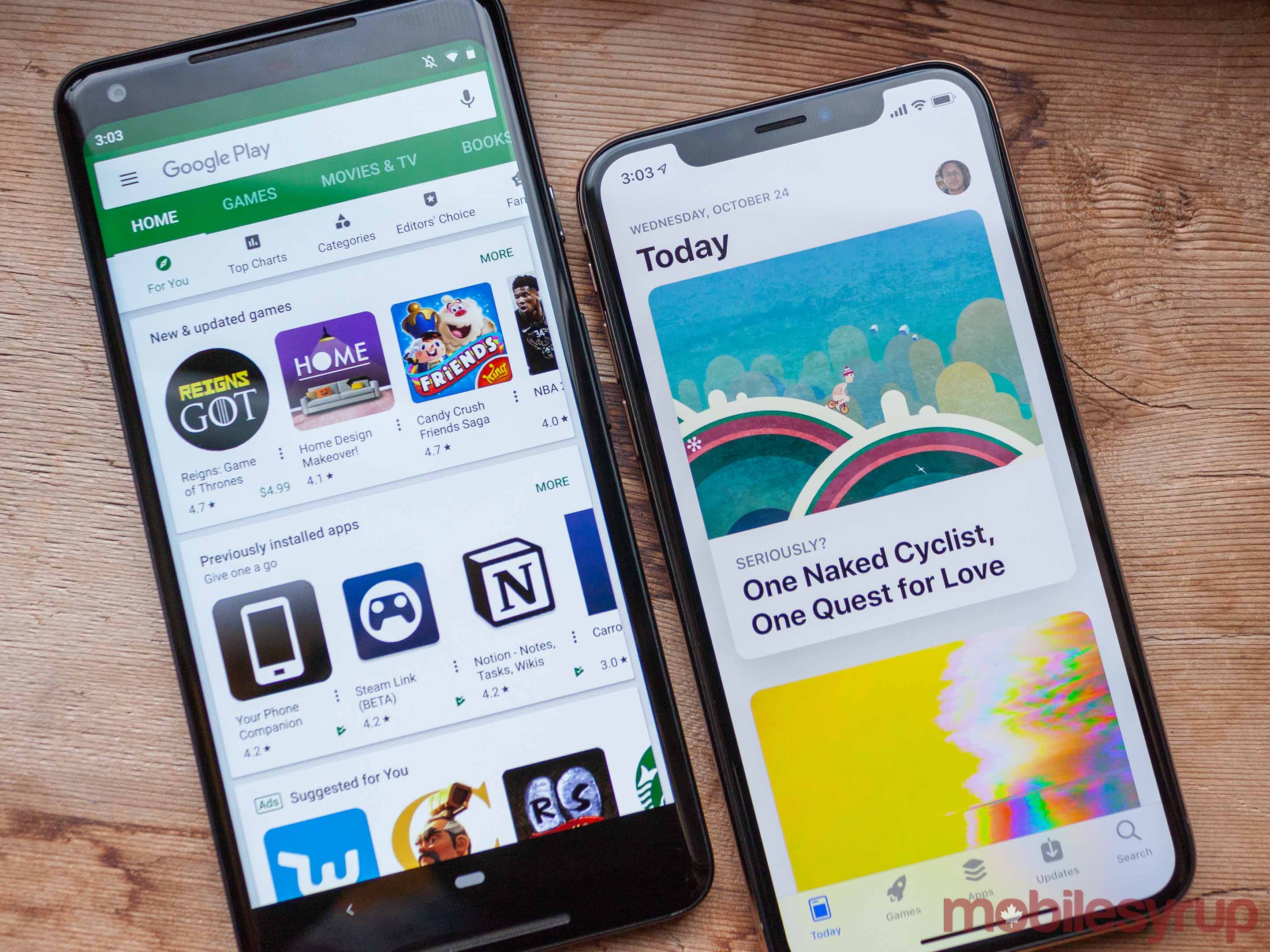
Additionally, using the App Store is a much better experience than Google Play. Apple spends a lot of time curating and highlighting unique and significant apps. It makes it easy to discover new games and apps.
The apps that I use feel much better as well. That’s not to say iOS apps are better made. I encountered several bugs while using the XS, in apps like Twitter and Google Assistant but also in Apple apps like Messages.
Instead, apps performed consistently. It didn’t matter if I opened Facebook or Snapchat or an Apple app, they all launched and ran smoothly. I mention Facebook and Snapchat specifically, as I found both of those ran sluggishly on Android.

Despite having generally better apps, Apple’s are more restrictive. Unlike Android, which allows more access to the underlying OS, iOS keeps things locked down and isolated.
This has its advantages, namely performance and security. But it also means users lose out on functionality.
For example, iOS forces users to open links in Safari. If you tap a URL, it opens in Safari. Android lets you set your default browser, so when you tap a URL, it’ll open in any browser.
While the default browser was perhaps my biggest annoyance, there are other examples of restrictive iOS policies. Take the Steam Link, an app that let users stream PC games to their phone and play them. Apple booted the app from the store because it allowed access to the Steam store.
On Android, however, users can freely enjoy Steam Link.
Ultimately, I prefer Android’s approach to apps. As much as I enjoyed the look and feel iPhone apps, I missed the openness of Android’s software.
The hardware-software marriage
Part of what made using iOS apps — and the iPhone XS in general — so enjoyable is the marriage of hardware and software.

A benefit of having hardware and software designed by the same company is that the designs compliment each other. Nowhere is this more clear than in the iPhone’s haptics.
Pulling to refresh on Twitter elicits a subtle ‘click’ from the phone. If you pick up the iPhone and it doesn’t see your face, it gives you a little nudge. 3D Touching an app makes it thump nicely.
In comparison, Android feels rough. Vibrations aren’t subtle. Often, they’re loud — I can hear the vibration more often than feel it.
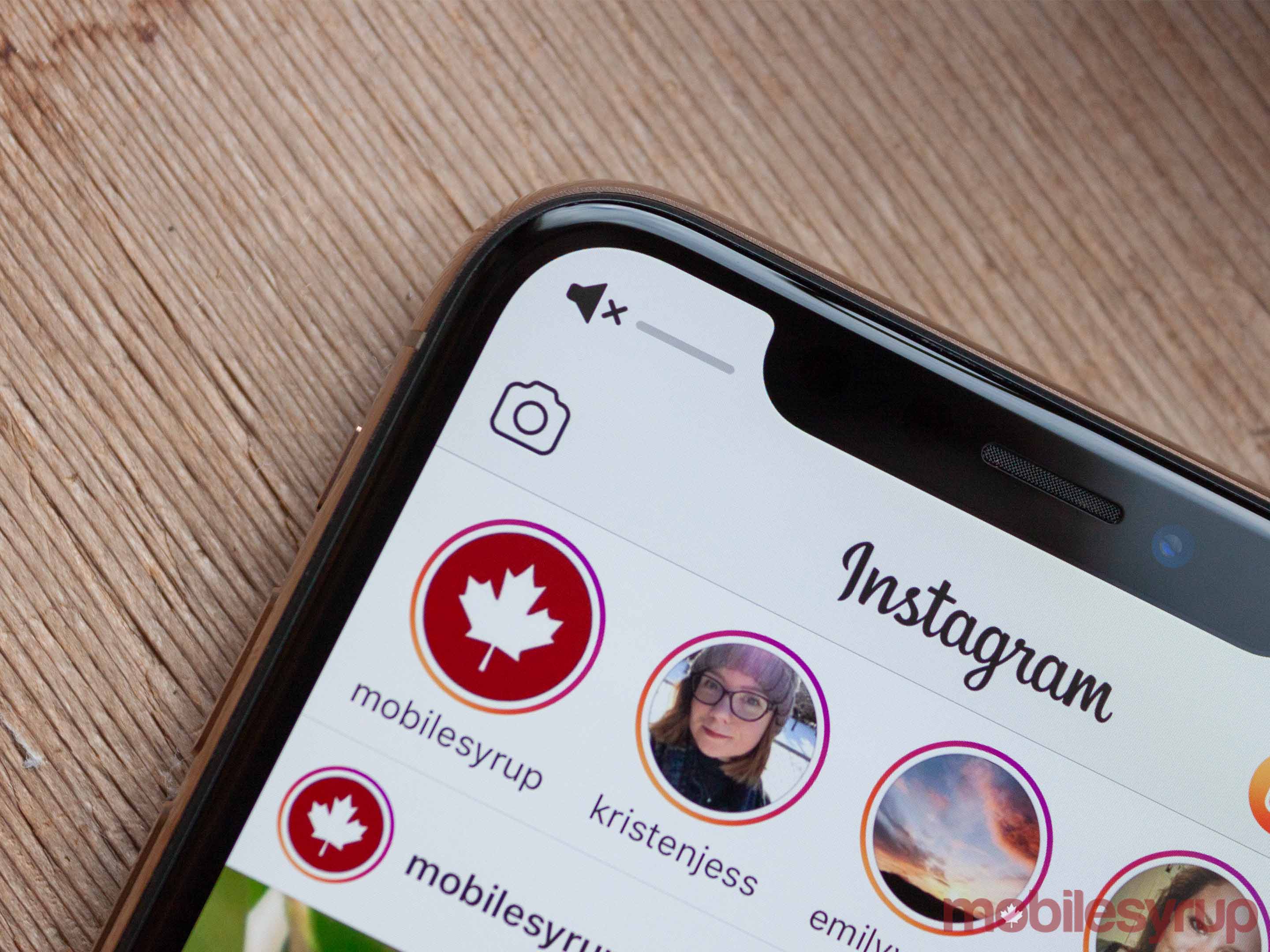
Another example is in the notches. Apple’s apps generally feel like they’ve adapted for the notch well. Some apps intelligently use the space. Instagram, for example, puts the volume indicator in the top left corner of the iPhone XS display, so it’s not in front of the picture you’re viewing.
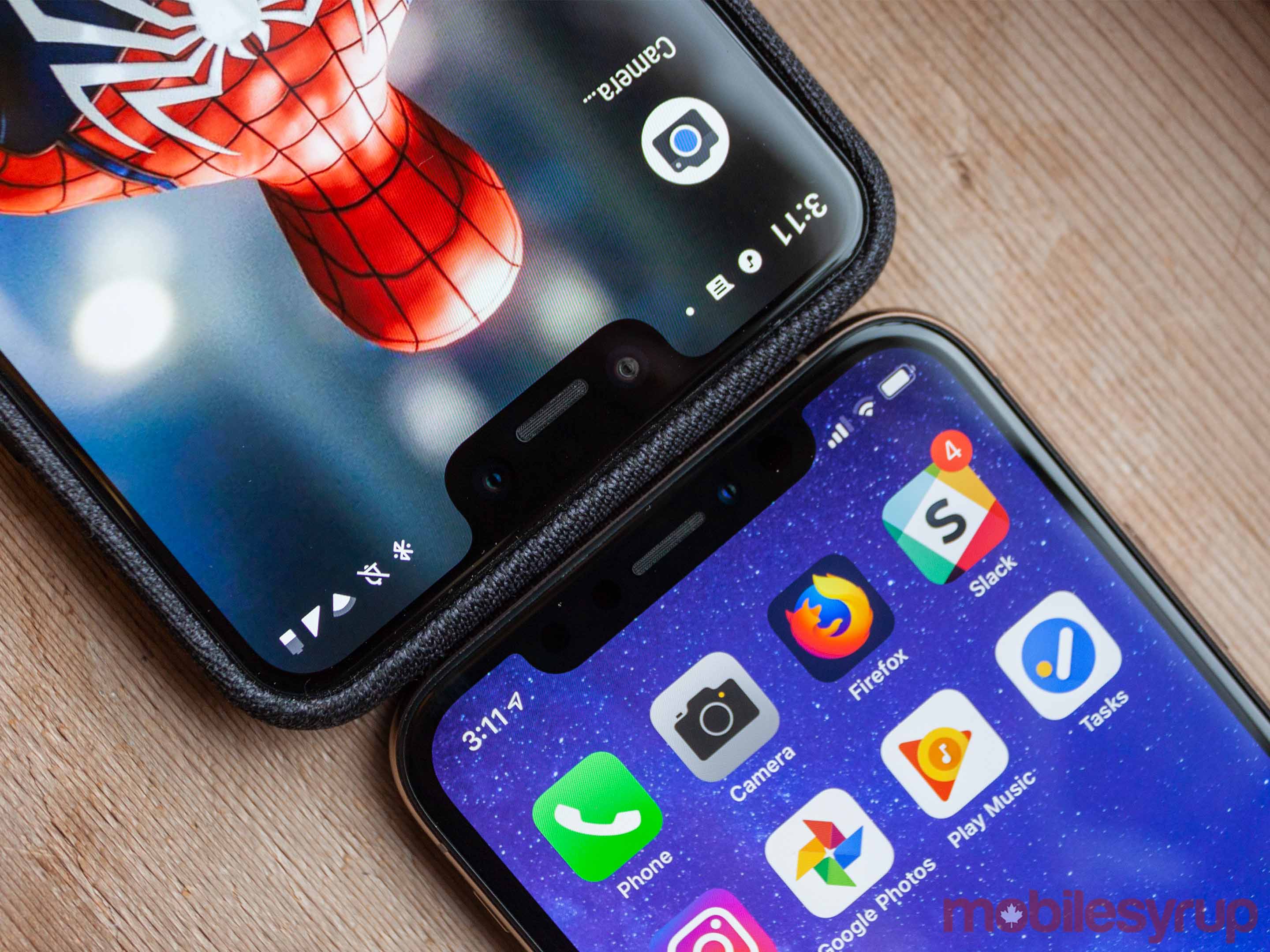
Android isn’t at this level yet. Granted, Google only recently added official notch support in Pie. However, the support isn’t that great. Currently, Android extends the status bar to the bottom of the notch. This works fine on small-notched phones, but devices with deep notches — like the Pixel 3 XL — leave lots of space to fill with the status bar.

Finally, I found external hardware like Bluetooth headphones tended to work better with the iPhone. Finding and syncing my fitness tracker was quicker and the Loop earbuds I used connected easily and never lost connection. This was not the case when I used Android.
Both experiences are compromises
Overall, I found that for everything I enjoyed about my time with the iPhone XS, there was something I missed from Android.
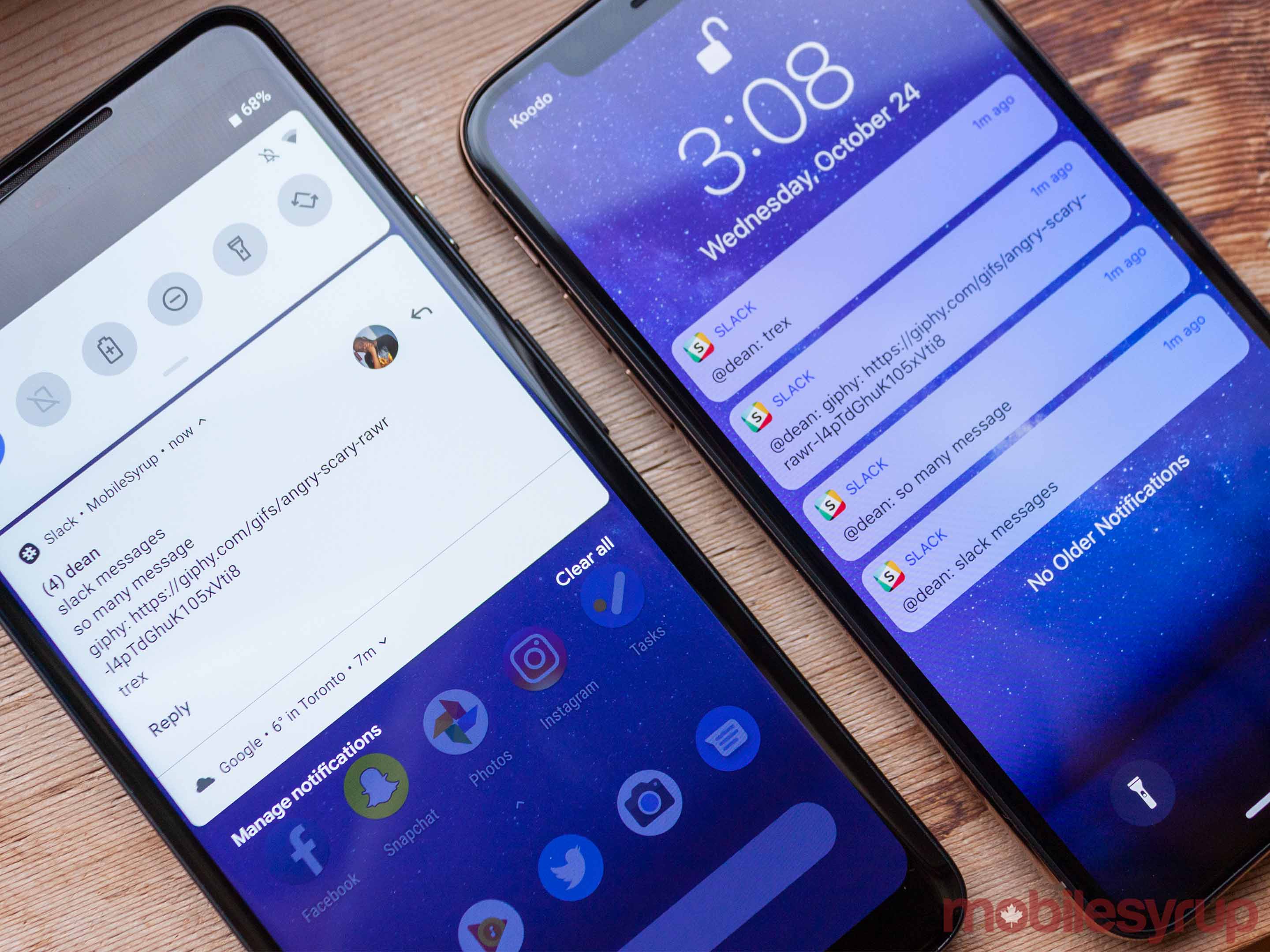
For example, customizing notifications on iOS was incredibly intuitive and straightforward. I liked that I could turn off vibration and sound for one app but keep it on for another — something that was confusing and often impossible on Android. Additionally, I could cutomize things like vibration pattern on a per-app basis and easily mute annoying notifications by 3D touching and selecting the ‘Deliver Quietly’ option.
However, managing notifications wasn’t such a great experience. Android handles this much better, allowing me to clear notifications with a swipe, instead of a swipe and tap.
Furthermore, Android’s notification shade syncs with the notification dots placed on apps. If I remove a notification from the shade, the dot on the corresponding app disappears as well. On the iPhone, I often cleared notifications from the Notification Center only to find the badge on the relevant app was still there.
My point is that both systems handle things in similar and different ways. Ultimately, it’s good for consumers. Apple and Google will continue to evolve their software offerings, improving them for us.
The other part of this is, whether you buy an Android or an iPhone, you’ll make a compromise. There will be something you choose to give up in favour of something that serves your needs better.

As much as I enjoyed the iOS experience, if I were to go out and buy a new phone today, I’d likely buy an Android device (probably a Pixel 3). I like to be at the cutting edge, and in my experience, Android tends to have more cutting-edge features.
Google Assistant, Google’s AI offerings, even the camera software offer more powerful features than Apple’s equivalents.
Furthermore, being on the bleeding edge generally means I upgrade my phone every year. As such, the lower cost of Android phones compared to the equivalent iPhone makes Android a more compelling buy.
For example, the Pixel 3 starts at $999 compared to the iPhone XS at $1,379.
That’s my compromise — I’ll take a slightly lower-cost phone that’s more cutting edge but with a worse hardware-software experience.
Not everyone would make that compromise. For many people, a phone is a purchase they make once every few years. Considering the longevity of iPhones, the XS makes more sense. The higher price gets spread out more, and you can use it reliably with excellent performance for at least three years if not more.
Ultimately, this experiment made it clear to me why people love the iPhone so much. It’s a consistent, reliable and generally safe experience. Things work as expected and the experience is great.
But it also reminded why I love Android. I love playing with the newest innovations and being on the frontier. Sure, sometimes things don’t work as expected. Sometimes things break. I like that.
Not everyone does.
MobileSyrup may earn a commission from purchases made via our links, which helps fund the journalism we provide free on our website. These links do not influence our editorial content. Support us here.


