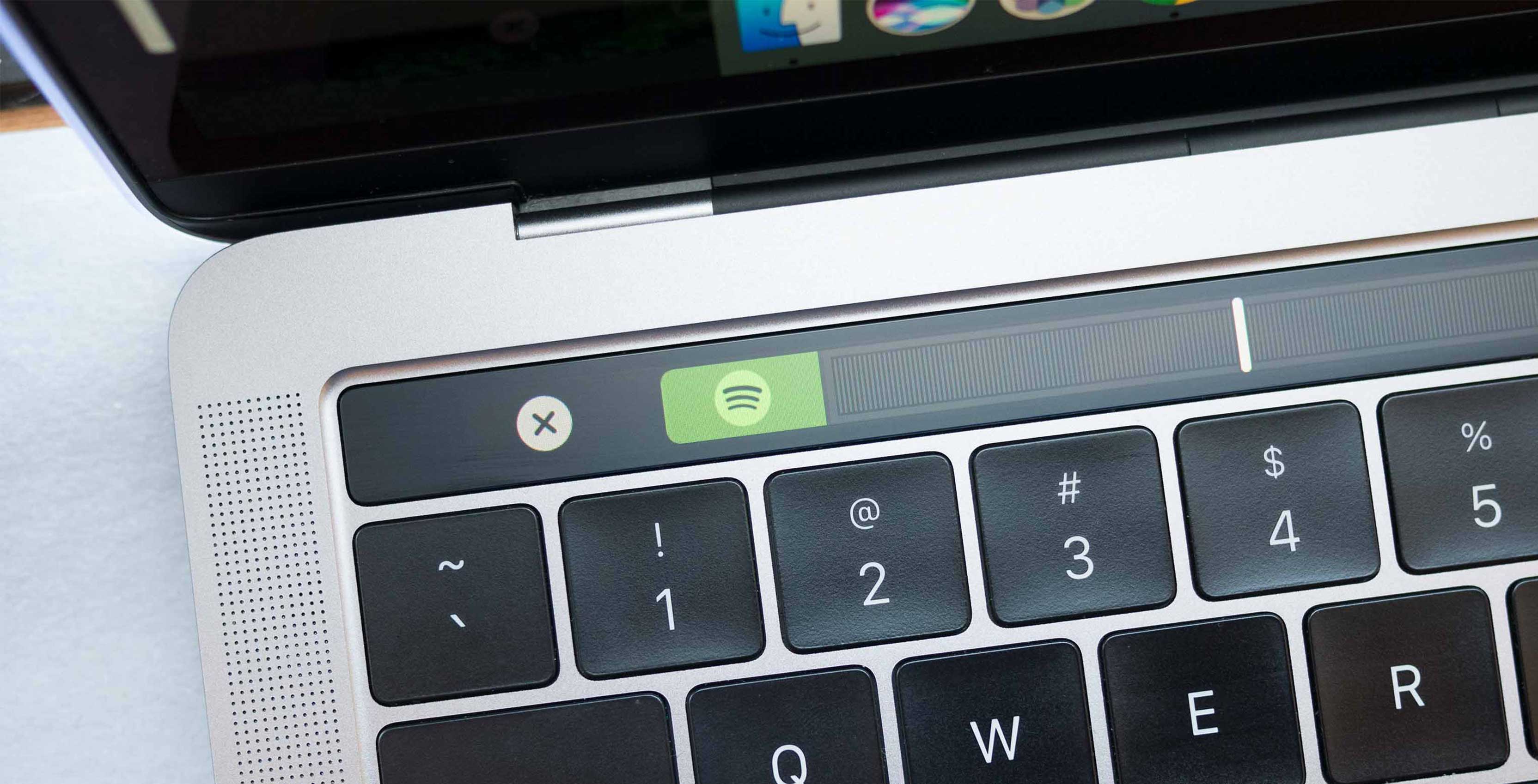
To the disagreement of many, I still contend that Apple’s Touch Bar is a compelling concept that holds a significant amount of untapped potential.
While at first I rarely ran my fingers across the 13-inch USB-C MacBook Pro’s secondary screen, I’ve found myself using it more frequently over the last few months, though I admittedly only reach for the Touch Bar with specific apps where its functionality feels seamless. This is because of one main reason: app support for the Touch Bar has improved significantly over roughly the last five months.
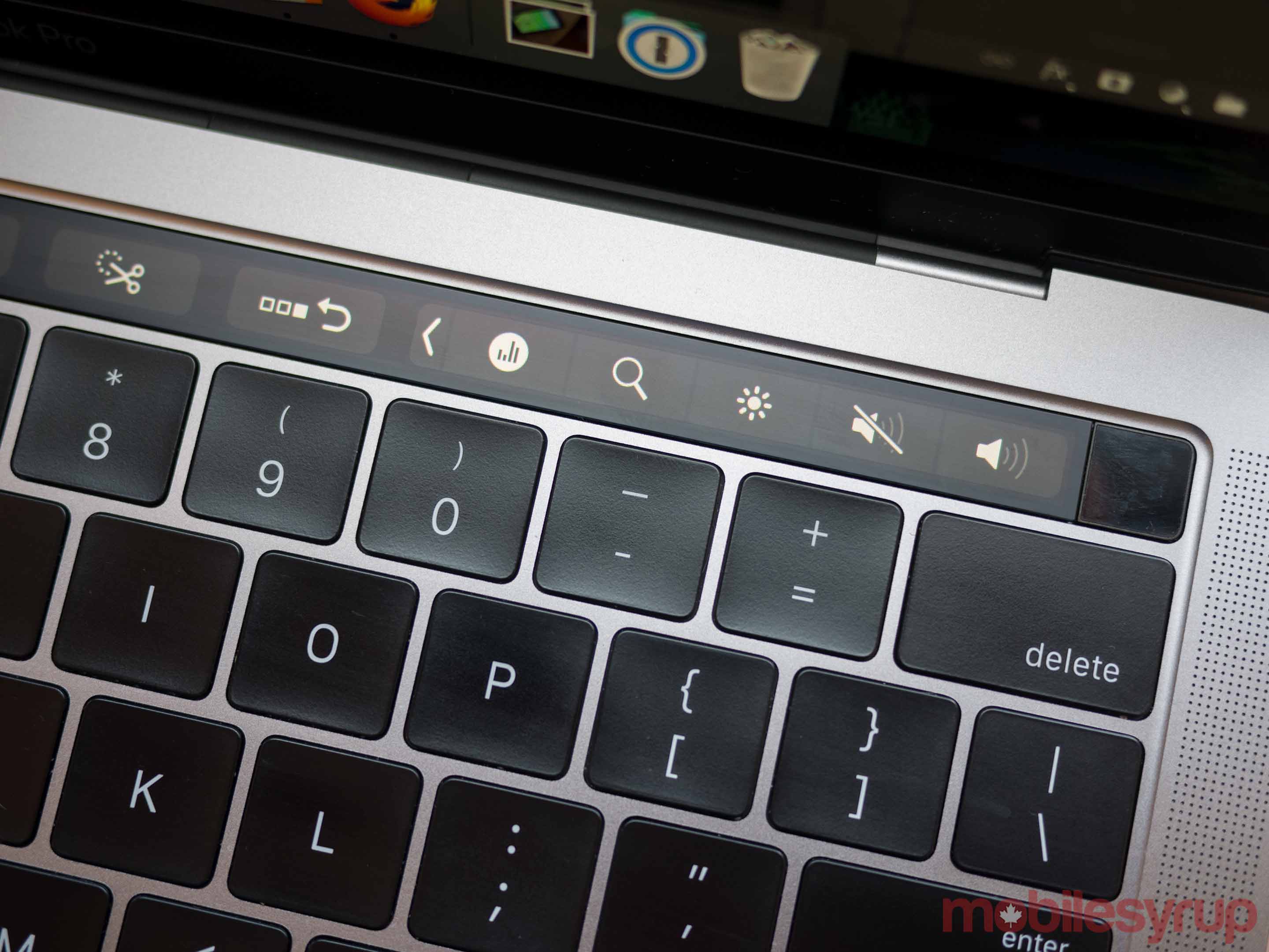
The inherent concept of the Touch Bar remains a worthwhile endeavour for Apple. On a basic level, the Touch Bar is a display that constantly shifts and changes in the same way the screen of a smartphone or tablet does. It shifts in a dynamic manner, changing to suit whatever app is currently being used. In the context of a desktop environment, this gives users quick access to often-utilized functionality, coupled with the ability to constantly shift inputs, unlike the function keys featured in older MacBooks and other laptops.
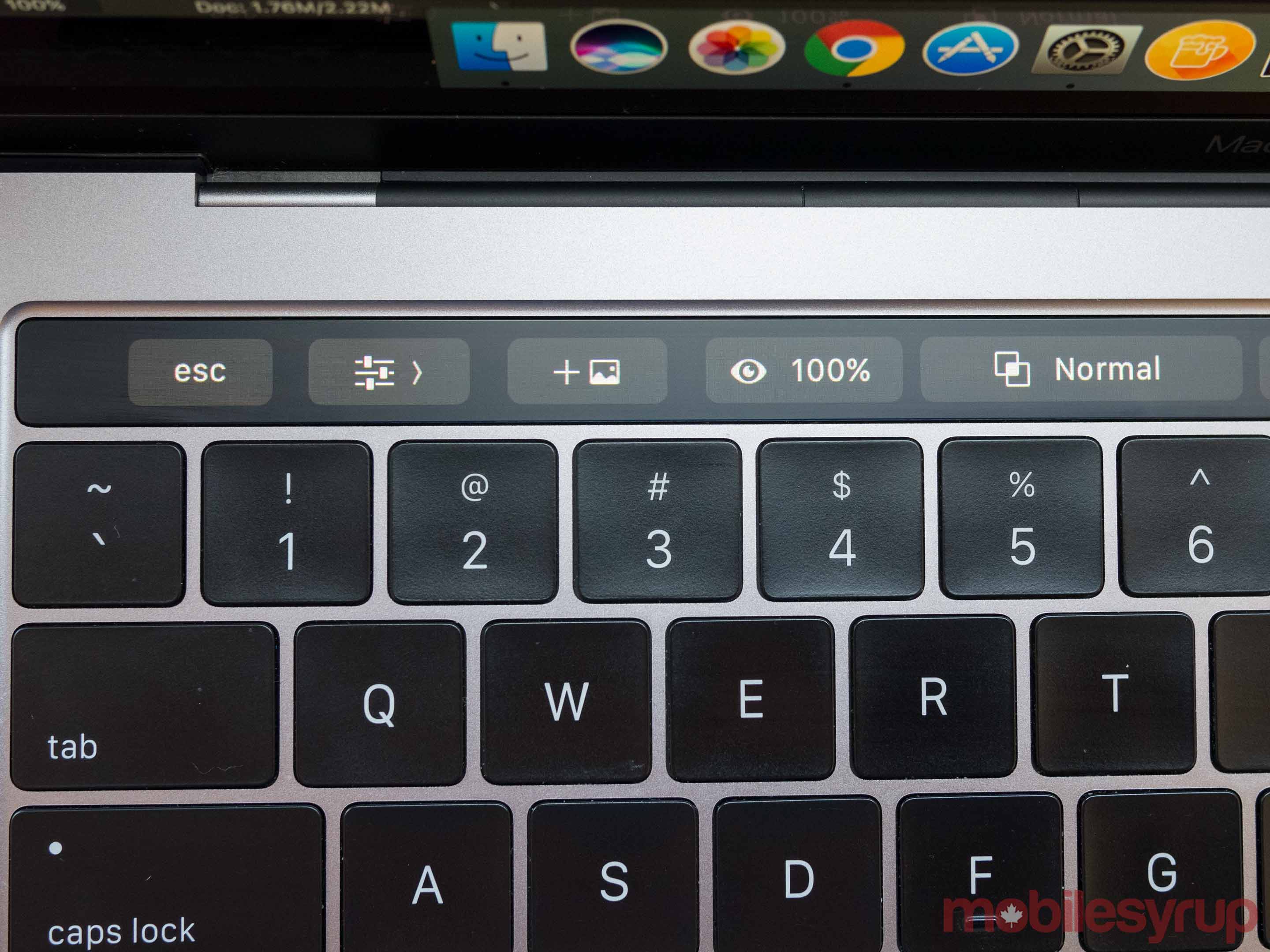
Unfortunately at launch, Apple’s Touch Bar was more of a hindrance than a sleek new addition to the company’s pricey Pro laptop line, a point most critics who reviewed the long-awaited laptop placed emphasis on. While some of the Touch Bar’s issues still remain when it comes to stability, with its screen crashing and locking up on rare occasions, it is slowly but steadily becoming more useful — though it’s still far from the necessary feature Apple likely envisions it becoming.
So lets take a look at what has changed with the Touch Bar since the initial launch of Apple’s 13-inch and 15-inch USB-C MacBook Pro.
One of my major gripes about the Touch Bar when it was initially announced related to its lack of Spotify integration. Roughly a month ago, however, Spotify finally added Touch Bar support to its Mac app, giving users quick access to skipping songs, as well as a time stamp scroll bar similar to Quick Time’s integration.
Prior to the app’s release, changing songs was a chore via Spotify and required users to expand the standard tool bar each time they wanted to change a song, even with the app open. While that’s still the case when using an app that isn’t Spotify, in-app integration is a welcome and much-needed addition.
Evernote has also entered the Touch Bar fray and though I’ve slowly stopped using the platform in favour of Google Keep, the app’s new integration is one of the most recent and arguably best examples of how developers can use the Touch Bar properly.
With Evernote, the Touch Bar allows you to start a search, begin a new note and access tags, all simple actions that make sense in the context of a simple tap.
The bar also turns into a slider when selecting colours (which could be confusing for some). The platform says the goal of its recently launched Touch Bar integration is to ensure the controls fall somewhere between traditional touchscreen controls you may expect on a smartphone, and keyboard shortcuts.
The above examples are two relatively niche apps finally adding Touch Bar functionality, but there are other more substantial instances out there as well, including Microsoft updating its entire Office suite with support back in February. While much of the integration isn’t particularly useful, I’m fond of Office’s new Focus Mode that removes the standard navigation ribbon and drops it on the Touch Bar, resulting in less on-screen distractions while writing. Other simple shortcuts like text format changes and font styles, are included in the Touch Bar functionality.
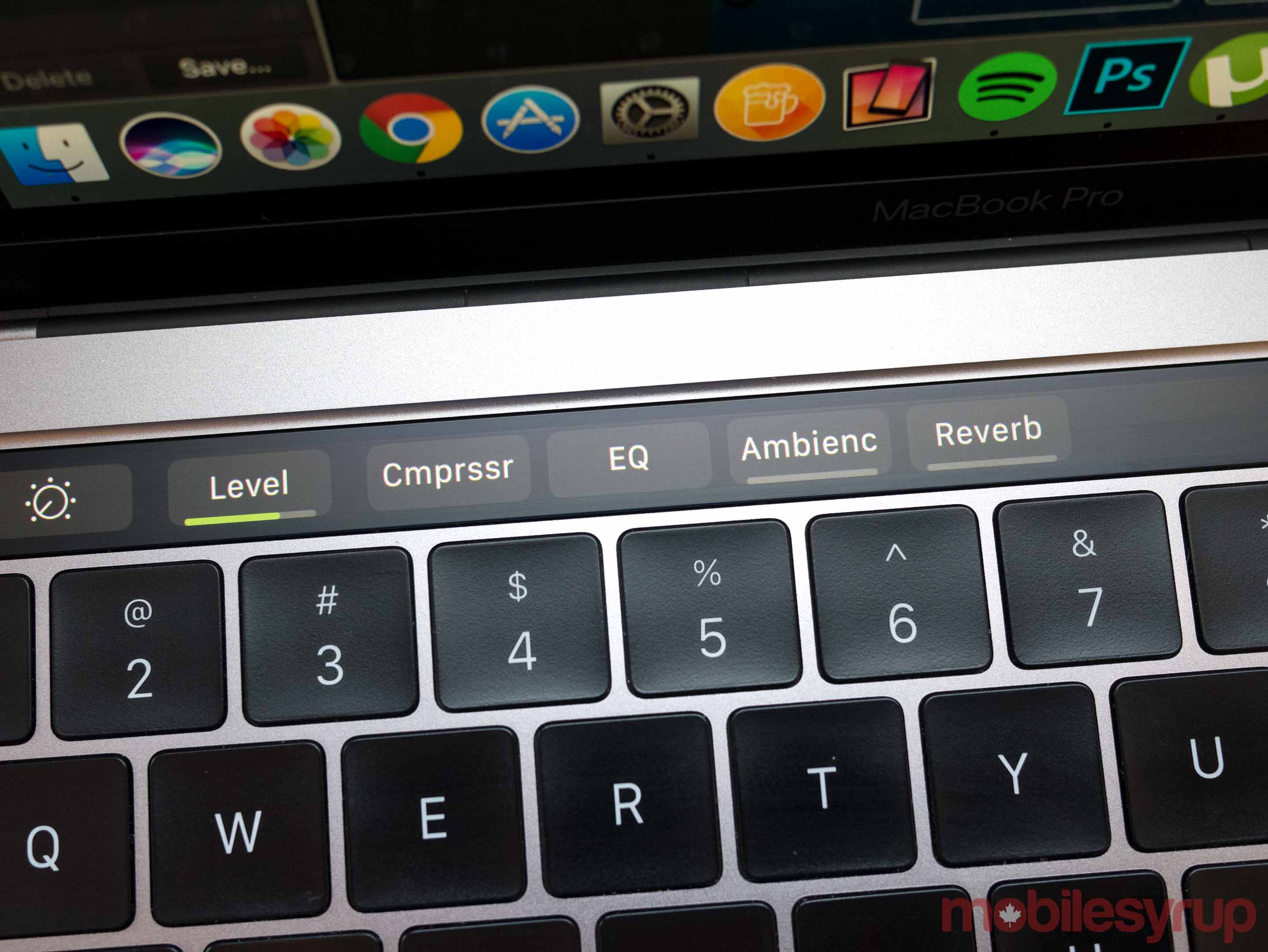
While Apple-developed apps like Final Cut and Logic should have launched with Touch Bar integration, Apple is only rolling out the functionality now. Touch Bar integration is mostly limited to shortcuts and basic volume controls, but in the crowded UI — especially if you’re using just one screen — the Touch Bar gives users quick access to controls that are typically buried, or at the very least cumbersome to find with multiple windows open. Apple’s iMovie and GarageBand also have similar, quick-access Touch Bar shortcuts available.
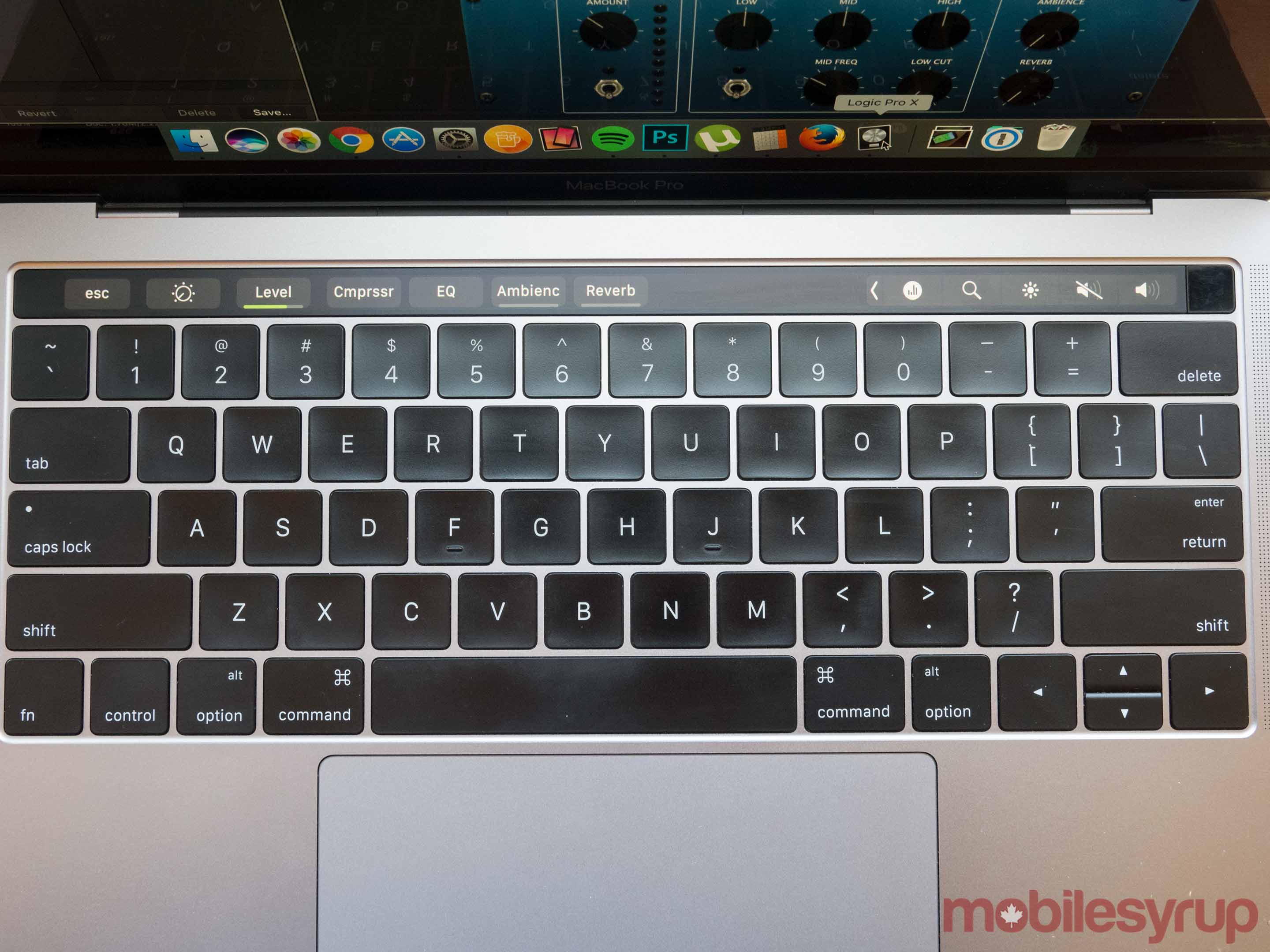
While somewhat unrelated, the ability to record in both Logic and the mobile version of GarageBand and share content between both apps via iCloud, is also extremely useful.
Other apps like Toronto-developed 1Password, Adobe’s entire Creative Cloud suite, Pixelmator and Sketch, have also added Touch Bar functionality. Some holdouts still remain unfortunately, with Google’s Chrome browser being unsurprisingly one of the many major apps that have yet to integrate Touch Bar functionality, though rumours indicate it could be coming soon.
Apple doesn’t admit mistakes — unless you count the company’s uncharacteristic recent press briefing about the Mac Pro — and I don’t see the company admitting the Touch Bar was a side step anytime soon, though it certainly hasn’t lived up to the company’s lofty claims.
As more app support arrives, Apple’s Touch Bar is set to continue becoming increasingly useful, though it’s unlikely it will ever become as integral to most user’s day-to-day activities as a traditional keyboard. Still, I commend Apple for trying something different in the typically stagnant laptop industry.
If you temper your expectations, there’s actually lot to like about the Touch Bar now.
MobileSyrup may earn a commission from purchases made via our links, which helps fund the journalism we provide free on our website. These links do not influence our editorial content. Support us here.


