The smartphone that used to be considered an outlier has now reached the ripe age of three, or 24 in phone years. It has a job, a girlfriend, a nice apartment in downtown Samsungville. It started exercising, eating well; it doesn’t drink as much and therefore doesn’t crash as often. It went to school, focused on a few things it was good at. It’s now a much happier smartphone.
Three years into Samsung’s experiment, the Galaxy Note 3 is not only its fastest phone but its best phone. It takes everything that made the Note II so viable and wipes away the muck, leaving a stable foundation on which to focus your attention (and affection). While much of that improvement comes from a new version of TouchWIZ, coupled with the much-faster Android 4.3 code base, Samsung has taken care to improve every part of this 5.7-inch device.
But is it worth the premium price? Let’s take a look.
Specs
- Android 4.3 w/ TouchWIZ
- 5.7-inch 1920×1080 pixel Super AMOLED display
- 2.3Ghz quad-core Qualcomm Snapdragon 800 SoC
- Adreno 330 GPU @ 450Mhz
- 3GB RAM / 32GB internal storage (expandable via microSD)
- 13MP rear camera / 2MP front-facing camera
- 3200mAh removable battery
- 3G HSPA+ 850 / 900 / 1900 / 2100 MHz, 4G LTE 700/ 850 / AWS / 1900 / 2100 / 2600 Mhz
- WiFi a/b/g/n/ac, NFC, Bluetooth 4.0 + LE, A-GPS, GLONASS, IR blaster
- 151.2 x 79.2 x 8.3 mm
- 168 g
Design & Display
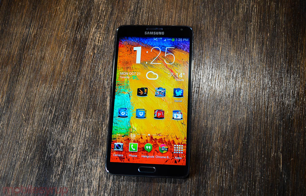
The Galaxy Note 3 is a nice-looking smartphone. While it shouldn’t come as too much of a shock, Samsung has really improved the entire aesthetic of the device, from its feel in the hand to its weight distribution to its build quality.
In fact, at first glance the Note 3 looks more like the international version of the original Note than its immediate predecessor, eschewing the smooth, rounded “pebble” curves of the Note II for a more graceful, business-like boxiness. Though the screen is 0.2mm larger diagonally than the Note II, the device’s overall dimensions are within spitting distance of its predecessor, owed to narrower bezels and a slightly more compact frame.
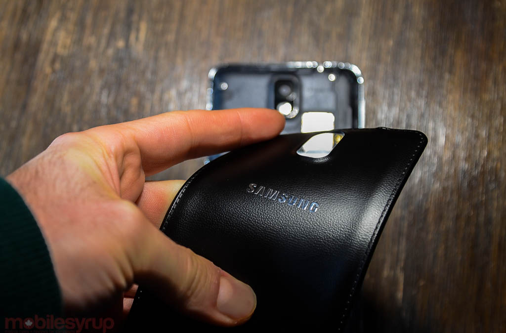
Most of the notable changes to the body are around back, where Samsung has (thankfully) replaced the slippery Hyperglaze cover of the Note II and nearly every other recent Galaxy device for a matte, leather-like plastic. Mind you, there is a lot to dislike about this decision, notably the penchant to so overtly push the notebookness of the device, complete with fake leather stitching around the edge of the backplate, and fake metallic plastic around the phone’s perimeter.
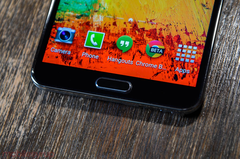
That’s really the main continuing issue with Samsung smartphones in general: there are too many shortcuts and diversions taken to reach the higher margins shareholders care about. Though the Note 3 is the most solid Samsung flagship to date, with nary a creak or groan to speak of, I wish the company would opt for better materials and higher quality assurance; like Android Police, I found the Note 3’s home button to wobble and at times nearly dislodge from its housing.
Samsung has done a lot of things right with the Note 3, none more so than the gorgeous full HD Super AMOLED display, which is brighter than the Galaxy S4, though it shares the same diamond subpixel array. Though the RGBG arrangement isn’t quite the same as PenTile, it equates to two subpixels per pixel, and lacks the full RGB stripe of devices like the HTC One, LG G2 and iPhone 5s. Still, this is a stunning and vibrant display, and recent versions of TouchWIZ have introduced the ability to change the vibrancy of the display to offset AMOLED’s exaggerated colours.
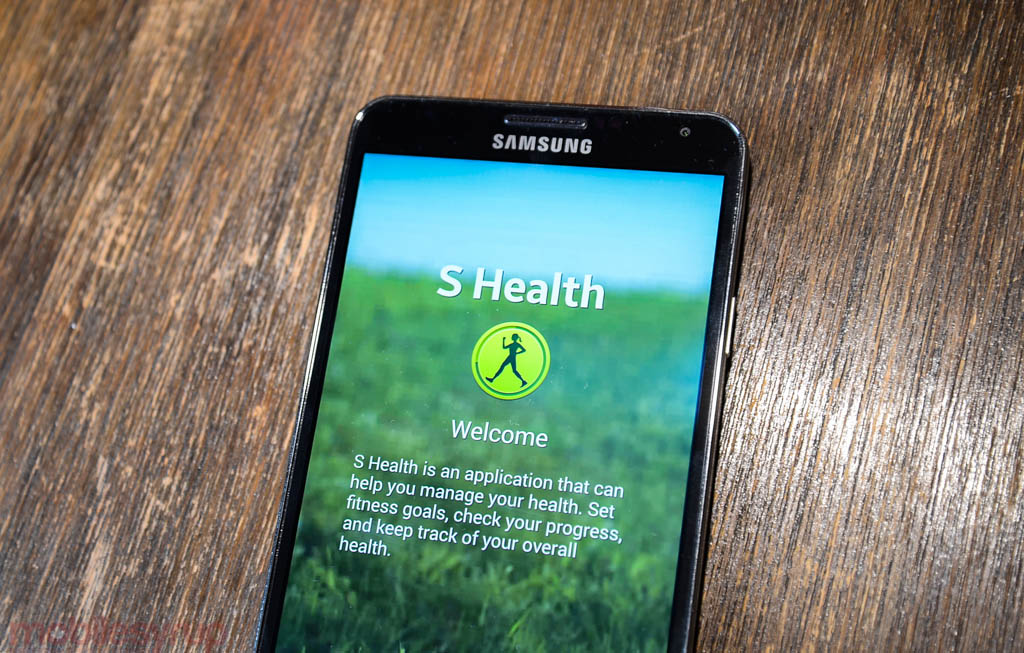
With a removable 3200mAh battery and expandable storage, the Note 3 offers a very similar experience to previous Note devices, but this device feels far more refined. The S Pen is also slightly changed, made more comfortable to hold, fitting within its holster in two orientations. More importantly, the Wacom digitizer is more responsive in the Note 3, but it’s the software experience around the S Pen that truly shines. It must be said that the Note 2 will receive a similar set of features when it received Android 4.3 in November, but it lacks the high-resolution display and much faster hardware of this year’s model.
Ultimately — and I couldn’t say this about its predecessor — the Note 3 looks elegant. And in the time between the release of the those two smartphones, the rest of the industry has embraced the form factor as normal. As a result, the Note 3 feels far less gargantuan than previous models, even though it’s still a very large smartphone. It will still be too large for many people — I had issues reaching the capacitive menu button with my thumb when holding the device in my right hand — but Samsung is quite willing to sell you any device in their Russian Doll-like smartphone lineup.
While Samsung has repeatedly resisted the notion of offering a single flagship, I think the Note 3 fits into its lineup as Lexus to the Galaxy S4’s Toyota. It manages to improve the hardware and software experience of the S4 without obsoleting it; the core experiences of the two phones are too similar to say one is better than the other. The Note 3, of course, offers more through its S Pen integration, but it’s a niche feature that will go ignored by a number of users. Though it has a faster processor, more RAM and storage, the Galaxy S4 is still a better phone, fitting more compactly in the hand. Its impending Android 4.3 update will narrow the gap even further.
Software & Performance
The Galaxy Note 3 is practically a computer. Its ARM-based quad-core 2.3Ghz Qualcomm Snapdragon 800 SoC is far more powerful than most Android apps can take advantage of, and the 3GB of DDR3 RAM is icing on an already-sugary cake. More impressive is the inclusion of Category 4 LTE, which pushes theoretical downlink speeds to 150Mbps on networks that support it (like in Rogers 2600Mhz areas) and USB 3.0 I/O, which pushes transfer speeds to a theoretical 5Gbp/s.
Of course, none of these numbers are meaningful without a concise way of comparing them to other devices. While the Galaxy Note 3 is one of the fastest-feeling Android devices I’ve ever used, the gains are beginning to be less noticeable generation to generation. It was recently discovered that almost every phone manufacturer is optimizing their hardware for CPU- and GPU-bound benchmarks, making the results far less interesting, as they don’t properly translate to real-world use (if they ever did in the first place). That said, the Snapdragon 800 is a big improvement in terms of GPU performance over the 600, which powers the Galaxy S4 and many last-generation devices. The Note 3, Sony Xperia Z1 and LG G2 are among the first devices to push the Snapdragon 800 and its Adreno 330 GPU; not only are the CPU and GPU clocked significantly faster — 2.3Ghz from 1.7Ghz for the CPU and 450Mhz from 400Mhz for the GPU — but they are both more energy- and clock-efficient.
All this is to say the Galaxy Note 3 does feel very fast, we’re past the point where it’s meaningful to measure performance in terms of points on a benchmark scorecard. I played through several rounds of GPU-heavy games like Riptide GP2 and comparatively-light games like Dots, and found the performance on par subjectively to the Galaxy S4 and HTC One. The conclusion I came to is that the onus is on developers to properly code the games for use on Android; even on a powerful smartphone like the Note 3, Betaworks’ Dots cannot maintain 60fps.
It’s worth noting that because Samsung has quickly become the de facto Android manufacturer, developers tend to test their devices against the latest Nexus smartphone, considered the “developer standard” of Androids, and the latest two or three Samsung flagships. This means that almost every significant app release has been tested on at least the Galaxy S3 and Note II, if not the GS4 and, more recently, the Note 3. Certain accessories like the Fitbit Flex only work on iPhones and the latest Samsungs, because they figured it would be too much work to fiddle with the custom Bluetooth stacks on non-Samsung products.
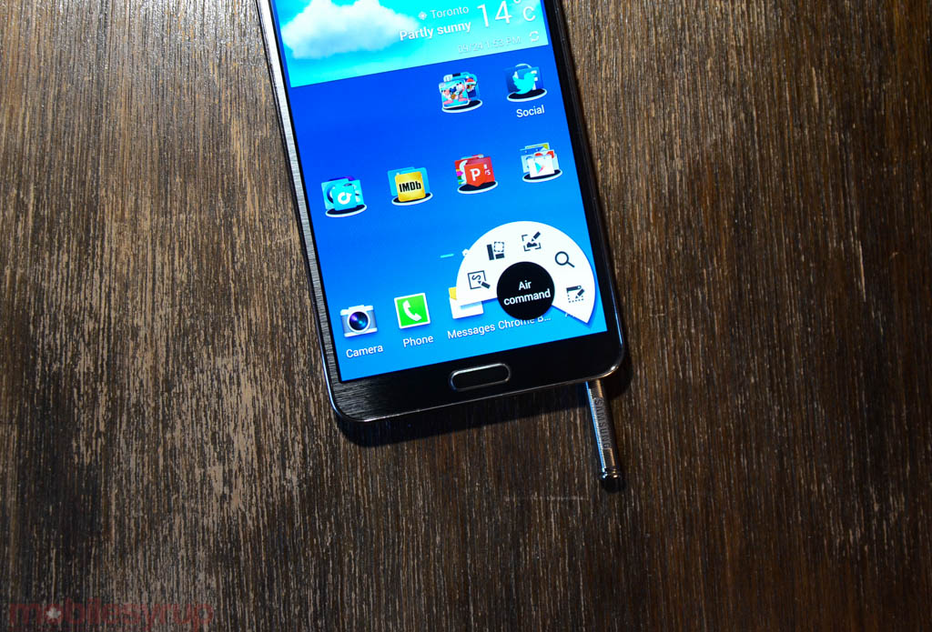
The Galaxy Note 3, as stated, is very fast. It also has a number of interesting software additions, some of which are very useful, others that will fade quickly from memory. At the phone’s core is the new S Pen control centre, dubbed Air Command. Accessed by removing the pen from its holster or tapping the side button when the on-screen pen tip comes into view, the overlay replaces last year’s far less-useful TouchWIZ-only launcher deployment. Not only does Air Command work with other launchers, but it facilitates essential functions, such as bringing up a quick memo pad, intuitively.

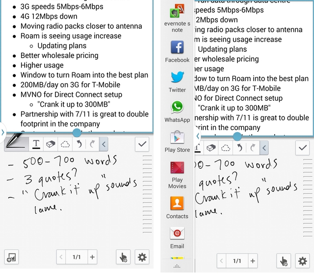
Being able to jot a name and number and highlight it to tender a new contact is useful, but the S Pen improvements in the Note 3 are broader and more generalized; the Wacom digitizer is far more precise, making it possible to jot notes or sketch drafts without almost no perceptible lag or loss in quality. The improvements even let me replace my paper-and-pen combo for interviews: the updated S Note app, which now syncs to Evernote, became the perfect surreptitious journalist tool. Not only does the app accurately convert written words to text, but in situations I did not want to wait for the stop-start conversion process, the legibility of my chicken-scratch prose was surprisingly good.
The S Pen can also engage the capacitive buttons below the screen. This means that you can basically control the whole Note 3 with or without the stylus — yes, I know it’s impractical to use all the time — without switching needing to stow or place it aside. It didn’t appear important at first, but I found myself using the S Pen even without overtly intending to, like swiping across SwiftKey’s Flow keyboard.
I also found it easier to manage the improved Multi Window workflow with the S Pen. Not only are more apps compatible with Multi Window now, but you can drag and drop items between them. For example, with the Gallery app on top and Hangouts below, you can drag a photo to share it with a contact. It’s also possible save two windows in a preconfigured orientation, much like opening a folder to retrieve multiple apps. While Multi Window is not quite the equivalent of opening several windows in OS X or Windows, largely because the sandboxed nature of Android limits their application, it’s worth experimenting with to see if it improves your workflow.
Like other Galaxy devices, Google Now is relegated to a button inside the multitasking menu, which is accessed by holding down the physical home button for a moment. This is clearly an intentional way by Samsung to limit the visibility of essential Google Services — Samsung Apps is placed on the default home screen instead of the Play Store, for example — but once properly rejigged, TouchWIZ circa Android 4.3 is not half bad. Samsung appears to be reigning in its “feature creep”: while there are myriad features, both finger- and pen-optimized, this was the first Galaxy device I’ve used in a long time that didn’t feel bogged down by them.
One interesting feature is the ability to swipe up from the home screen to reveal a Flipboard-powered magazine. Though it’s completely optional, and no better than merely opening up the Flipboard app itself, it’s great to see Samsung collaborating with well-known app developers, and not trying to develop bespoke (and likely less effective) variations on the same theme. The same is true of Samsung’s impressive integration of S Note with the Evernote API, which has actually made the app worth using.
It’s also worth noting that, though the Note 3 runs Android 4.3, there’s little to distinguish the UI from the TouchWIZ on the Galaxy S4. This has been a staple of the Samsung experience over the past two years — the company wants customers to differentiate phones based on software features, not Android versions. Not only does this protect them against slow (or non-existent updates), but it maintains customer loyalty between generations, as the experience is more predictable year over year.
Camera
The camera experience on the Samsung Galaxy Note 3 is almost identical to that of the Galaxy S4. Not only do the two phones share the same 13MP sensor and lens combo, but the interfaces and results are very similar.
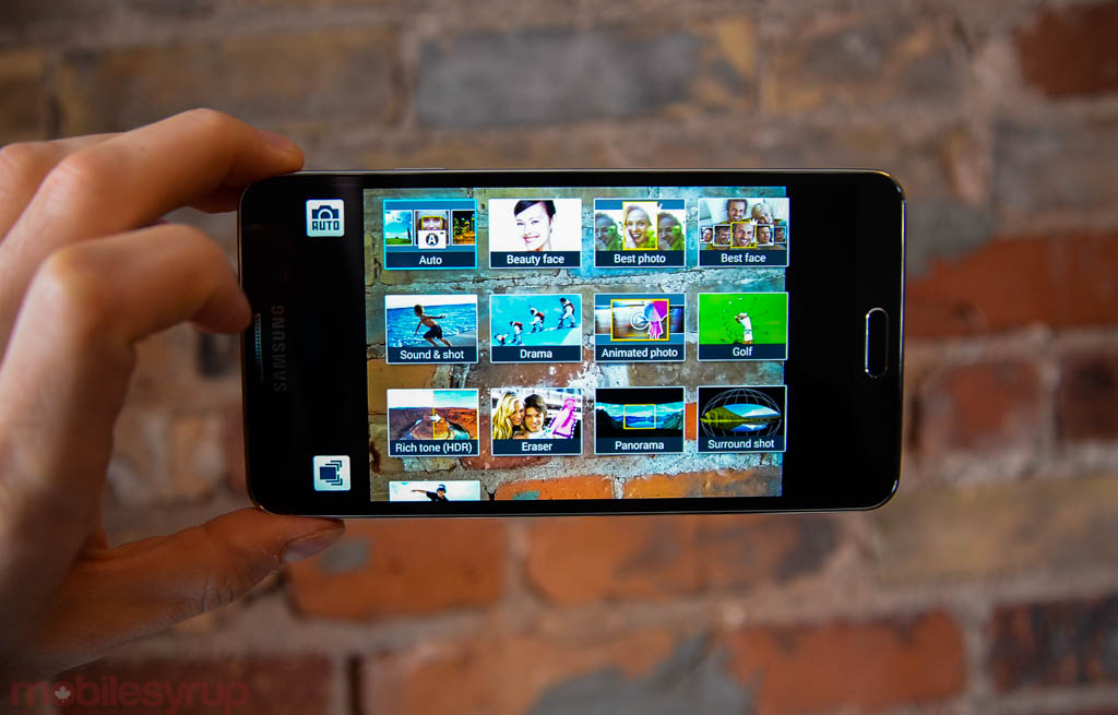
As with most Galaxy products, there are a prodigious number of photo- and video-taking modes, but on Auto the Note 3 takes some pretty fantastic pictures. While it lacks the optical image stabilization of the LG G2 and HTC One, the software is usually able to perform a few tricks to ensure blur-free results in low light. The Snapdragon 800 processor does facilitate a few improvements over the Galaxy S4, such as 4K video (which can’t be played back on the device itself).
The 4K video is an interesting addition, since it eats up an enormous amount of storage on the device without promising a visible return in quality without the right projection equipment (which is why the camera defaults to 1080p). Still, the fact that this relatively small sensor can capture and encode
I found the depth of the Note 3’s camera feature set to be quite overwhelming; for every few minutes spent creating cinemagraphs with Animated Photos or 360-degree panoramas with Surround Shot, I doubted the necessity for Golf Mode or Beauty Face. There are so many ways to frame or manipulate photos and video on the Galaxy Note 3, the value of a good Auto Mode — the ability to open the app and take a decent photo — is undermined.

To this end, while the Note 3 captures some great photos, its IQ has been passed by Apple, HTC and Sony in recent generations, and whereas the Galaxy S3 and Note 2 were on par with the iPhone 4S and 5 in many respects, the Galaxy S4 and Note 3 have been surpassed by a number of devices, including the iPhone 5s, Xperia Z1 and Lumia 1020.
Connectivity & Battery Life
It’s clear that as phones get bigger, and processors more powerful, so too is device uptime expected to stretch even further. That is true of the Galaxy Note 3, which predictably and iteratively ups the 3100mAh cell in the Note II to 3200mAh. Of course, there’s still that coveted, and remarkably popular, microSD slot for expandable storage, despite the fact that the device, which comes in black and white variants, has 32GB of internal storage, around 25GB of which is usable out of the box.
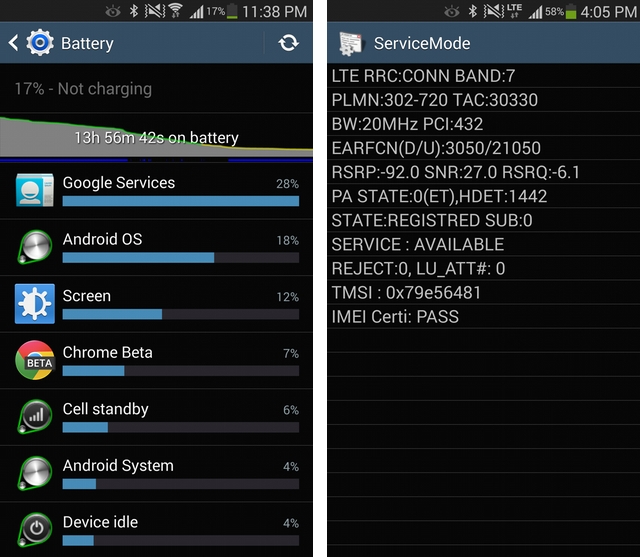
I found the battery to last well into the evening, eking between 14 and 18 hours on a charge. Accessories, such as the Extra Battery Kit, let you charge a second cell and keep it with you for emergency juice, but you shouldn’t need it: the Note 3, along with the LG G2 before it, has finally ushered in an era of all day Android devices. It’s possible that the Snapdragon 800 SoC is to thank for this, along with the mega-sized cell, but users should not have a problem reaching bedtime without charging.
If charging is necessary, the USB 3.0 cable and AC adapter that come in the box allows the device to charge extremely quickly, up to 2A, in fact. While this is going to add around 10% in 15-20 minutes, it will also reach around 80% in just over 1.5 hours, certainly an improvement over previous generations. The USB 3.0 interface is certainly quicker for transferring data, too, but the 5Gb/s theoretical limit is just that, and the regular speeds are just marginally faster than USB 2.0. The device’s USB 3.0 Mode is only compatible with Windows PCs, too.
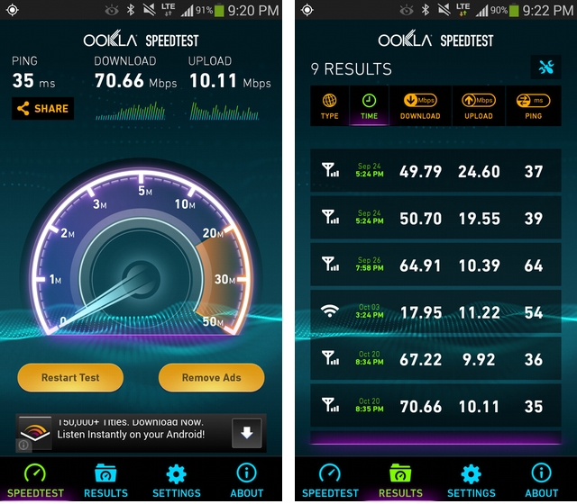
Because the Note 3 supports Category 4 LTE as well as Rogers’ 2600Mhz LTE Max network (the carrier with which I tested the device), I expected fast speeds. The LG G2 managed to hit downlink speeds of nearly 120Mbps, but I couldn’t quite manage that on the Note 3. While that isn’t to say those results aren’t possible — it could have been a heavily-loaded node, or just bad luck –but speeds were closer to 70Mbps in downtown Toronto.
Phone calls sounded great through the headpiece, but the Note 3’s single rear speaker was marginally softer than much of the competition, including the Galaxy S4. While I expected the phone to sound thin — all but a few aren’t really worth listening to — I was surprised by its fullness and vitality. Still, the volume was disappointing.
Conclusion
The Galaxy Note 3 has a lot of competition in today’s market. There are smartphones bigger, sleeker, with better cameras or nicer displays. But Samsung has really nailed the feel of a high-end smartphone for the first time, and it’s not just the less slimy plastic or faster performance, but the relative cohesion of the entire package. From the superlative performance to the delightful richness of the 1080p display, there are few marks against the product.
While my preference would be to see Samsung get rid of the hardware buttons and move to Nexus-style virtual keys, and I would certainly love to see the company take more care with their hardware materials and quality control, there is something lovely about all that extra screen real estate — especially when coming from an iPhone 5s — and not worrying about battery life. Samsung got a lot right here, despite the throw-everything-at-the-wall software melange, and I can easily recommend the device to someone looking for the closest thing to a PC replacement that fits in a pocket.
MobileSyrup may earn a commission from purchases made via our links, which helps fund the journalism we provide free on our website. These links do not influence our editorial content. Support us here.


