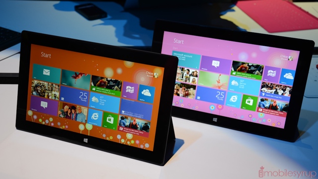
We just had our first chance to play with Microsoft’s new Surface tablet, the $519 device that runs Windows RT. As expected, it is sublimely built, seamless, angular and extremely hardy. In fact, Surface’s Head of Design, Panos Panay, dropped the device — with no case — on the stage during today’s keynote. So confident is Microsoft in the tablet’s ability to stand up to the elements that they used it as a skateboard in a recent promotional video.
Microsoft was effusive in describing Surface as the best way to experience Windows RT. While they are enamoured with their various partners, many of which are building their own ARM-powered slates, Head of Windows, Steven Sinofsky, describes Surface as “extending the stage for Windows.” Plenty of time was spent describing the Surface as “magical,” and while we wouldn’t go that far it definitely appeals to the multitasker in us.
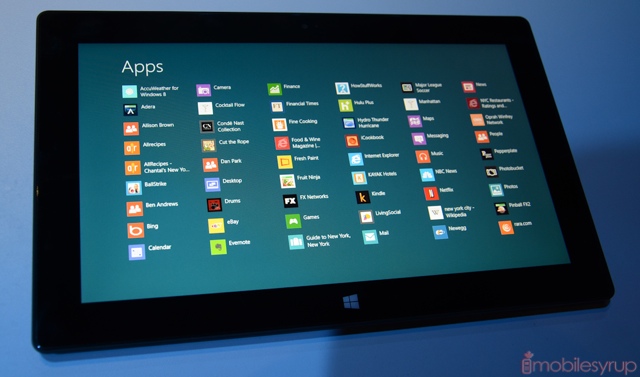
Windows RT is the anti-iOS. It is never static, with pulsing backdrops and varying live tiles that are always updating in the background. The start screen is versatile while remaining simple; the gestures are many but intuitive, and customers will easily pick up the nuances of using Windows 8. In fact, every device comes with a short “how-to” before letting users venture out on their own.
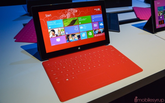
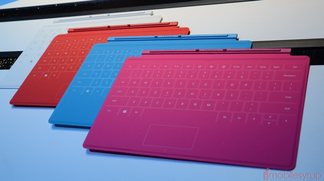
Much of the keynote was spent explaining why Microsoft extends the kickstand at a certain angle, and how using it with the Touch Cover is akin to creating a fully-loaded laptop out of nothing at all. In reality, the Touch Cover provides little of the actual experience of using a keyboard. Because there is no tactile feedback, the pressure-sensitive array provides varying degrees of success. At times, when I fell into a rhythm, I was able to type at maybe half the speed of a regular laptop keyboard.
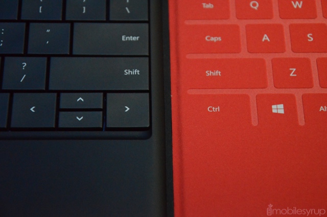
Much of my time with the Touch Cover, however, was spent mashing on the backspace key in frustration. At 3mm thick, the Touch Cover is an added convenience — a $100 convenience, unfortunately — but it will not detract from your experience in any way. The Type Cover, however, at 6mm thick, is much more to my liking, and provides an excellent tactile keyboard experience. But when you close the Surface with the Type Cover, you immediately notice it wasn’t meant to be used that way.
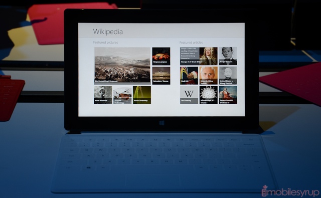
I had a great experience using many of the pre-installed apps, both from Microsoft itself and from third-party vendors such as Wikipedia. They resemble the Metro-style UI from Windows Phone but have more space to breathe, and the touch response was just flawless. It’s clear that Microsoft spent a lot of time optimizing the software for touch.
As promised, it’s possible to have two apps side-by-side on the Surface, allowing you to work and watch a movie, or read a website and take notes. The Office 2013 Suite that comes with the tablet is leagues better than its predecessors, and while they’re still more easily navigable with a mouse and keyboard, they respond well enough to touch.
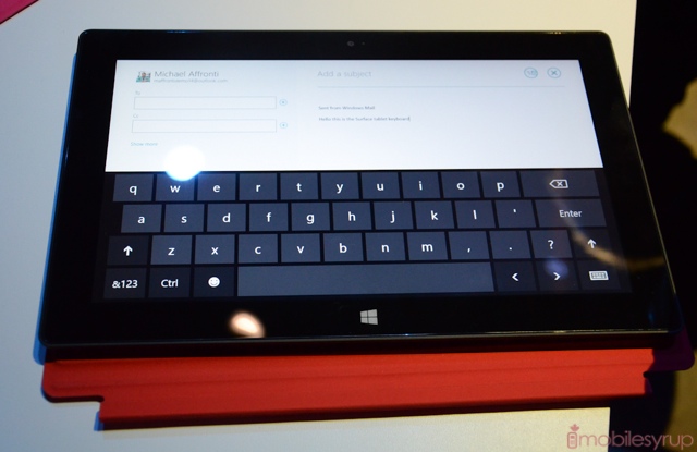
You can use the tablet without either of the covers, as Microsoft has built a very capable on-screen keyboard. The company touts Windows 8 (and RT) as a “no-compromise” solution, so it’s no surprise that the moment you attach a mouse to the tablet with a USB cable — or use the built-in touchpad — a familiar mouse cursor appears on the screen. The on-screen keyboard doesn’t offer any autocorrect like you’d see on Android, though it will make corrections based on a learning algorithm, much like Apple does in iOS. Aesthetically the keyboard looks a lot like the one on Android tablets, but the keys appear wider.
The 10.6-inch display on the Surface is extremely vivid, but with a relatively low resolution of 1366×768 Microsoft is going to have its hands full trying to explain why one would purchase this over the equivalent iPad. Colour fidelity and viewing angles are excellent, and touch responsiveness superb, but it’s a shame Microsoft couldn’t secure a higher density for its first go at producing a tablet. Perhaps it’s the Tegra 3 chip inside — the same SoC that resides in the majority of today’s high-end Android devices — or the compromise for 10 hours of battery life, but there is no doubt the next generation Surface tablet will have a sharper display. That being said, the tablet is relatively, thin, light and well-made, and includes a full-sized USB port in addition to a microSD slot, so it ends up being a lot more versatile than the equivalent iPad, whatever resolution its screen.
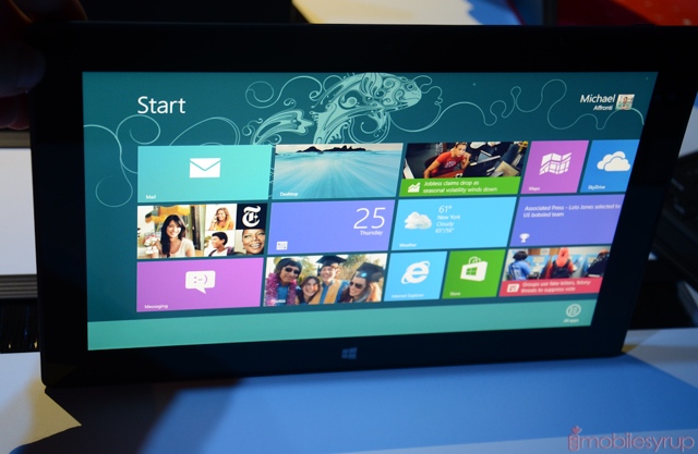
We’ll bring you a full review of the Surface in the coming days, including a look at the Windows Store and its launch-day apps. There’s also Xbox Music, which brings free and unlimited music streaming to Canadians.
MobileSyrup may earn a commission from purchases made via our links, which helps fund the journalism we provide free on our website. These links do not influence our editorial content. Support us here.


