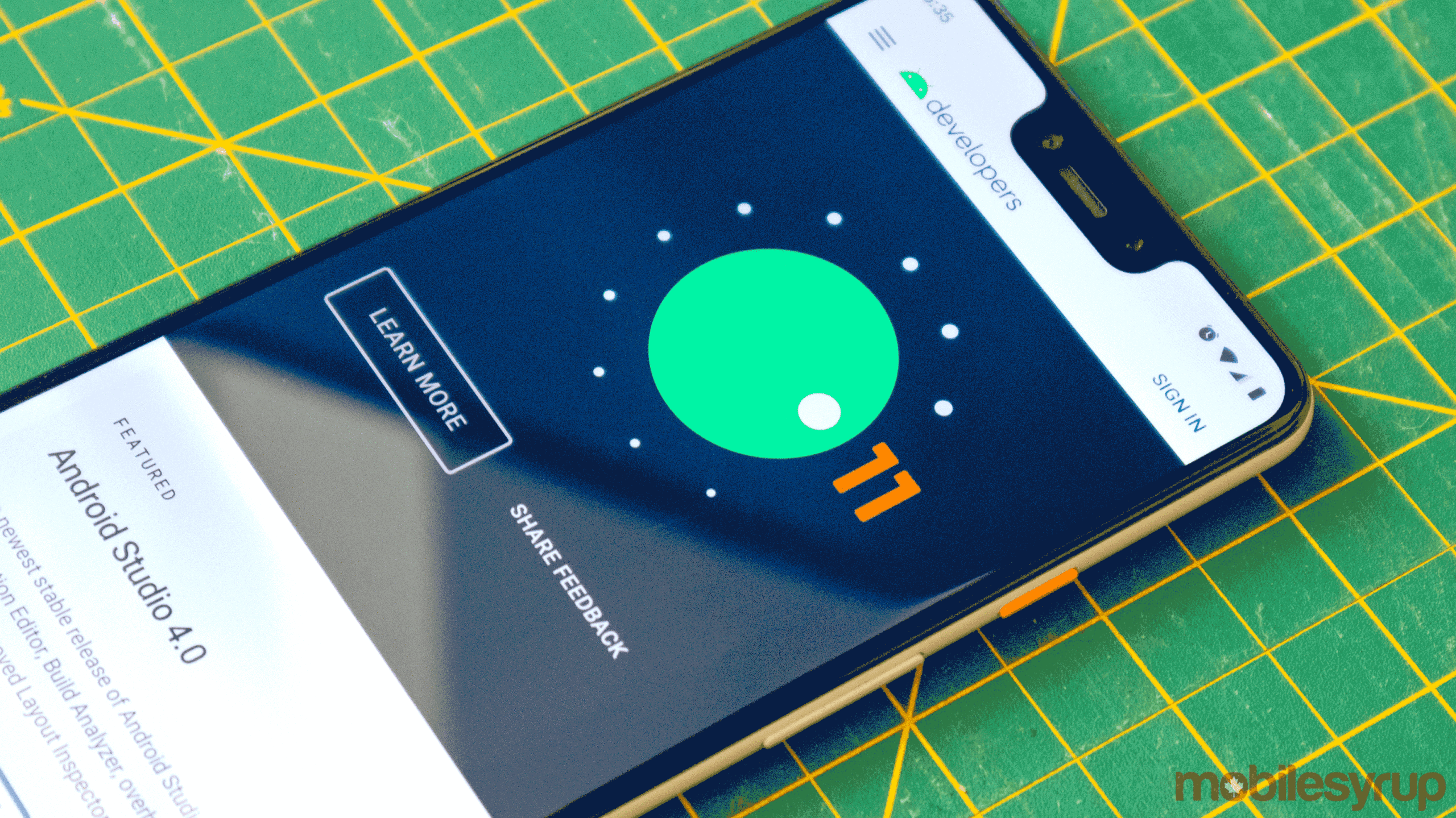
In the Android 11 beta 3, users can now swipe away the new media control centre in the ‘Quick Toggle’ shade as if the controls are still a traditional notification.
When the first Android 11 beta arrived, it features a new media playback control widget in the Android Quick Toggles shade, but users were unable to get rid of it when they stopped listening to music or podcasts.
Now in the third version of the beta, users can swipe away the media controls, according to Android Police. While this is a bit odd since it’s in the ‘Quick Settings’ toggle zone, it should be familiar to Android fans who have been swiping away the media controls notification in prior builds of Android.
This implementation isn’t exactly straightforward, though. When you swipe away the music control panel, it disappears from the basic notification/quick toggle area. However, when you pull down to expand the quick toggles, the playback controls are still there, just hidden slightly.
That also means that when you swipe them away, whatever audio you’re listening too still plays.
Android Police also notes that there’s an option within the ‘Sound’ settings that can be enabled to make the music controls disappear whenever audio stops playing.
Overall, this is a step in the right direction towards making this new control scheme more user friendly, but let’s hope Google irons it out a bit more before the full version of Android 11 ships this fall. It’s also unclear if all manufacturers are going to use this new control scheme. I was running the Android 11 beta on a OnePlus 8 Pro for a while before it got too buggy and I had to revert back to stable Android 10. The beta didn’t feature these new controls.
Source: Android Police
MobileSyrup may earn a commission from purchases made via our links, which helps fund the journalism we provide free on our website. These links do not influence our editorial content. Support us here.


