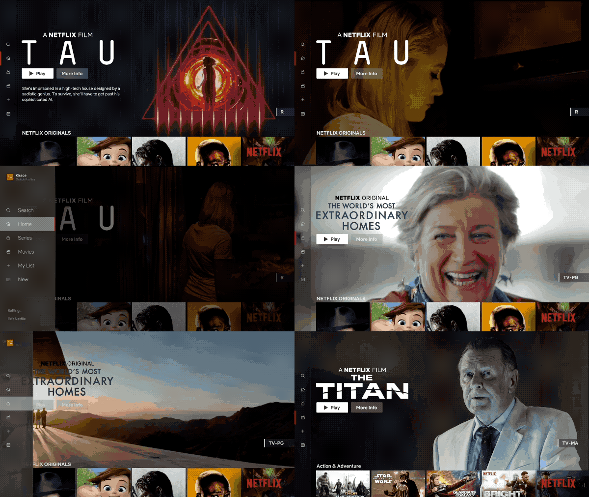
Netflix has unveiled a new design for what the streaming giant is calling its “TV experience.”
The new interface, which Netflix claims is based on “rigorous research and testing,” is focused on making it easier to find content through a smart TV with a restrictive remote that doesn’t feature many buttons. Netflix says it will begin rolling out globally to members today.

Netflix says it’s now easier to search and view new content that’s been added to the platform thanks to larger, easier-to-view tiles as well as an emphasis on recommendations. The UI for browsing a specific series or movie has also been revamped, according to the streaming service. Further, ‘My List,’ a feature that allows users to save content for viewing later, has been altered to be easier to navigate as well.
“While this may feel like an obvious update to some, validating that this TV experience was better for our members took extensive research, testing and technology improvements,” writes Netflix in a recent blog post about the update.
While relatively minor changes, it’s good to see Netflix paying attention to its TV operating system app given it’s likely the way many people consume content on the streaming service.
It’s unclear specifically what television operating systems and manufacturers the redesigned app is rolling out to, but we’ve reached out to the streaming platform for additional information.
Source: Netflix
MobileSyrup may earn a commission from purchases made via our links, which helps fund the journalism we provide free on our website. These links do not influence our editorial content. Support us here.


