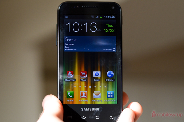
Almost six months after the initial release of the Samsung Galaxy S II we have the Galaxy S Glide. For specs, it sits somewhere in the middle of the original Rogers Galaxy S Captivate and Galaxy S II LTE. In terms of modern features, the Glide checks them all off: dual-core chip, 21Mbps HSPA+ baseband, 8MP camera. But it’s running the slightly older Tegra 2 CPU and has the same 4-inch 480×800 Super AMOLED screen as the Captivate.
Though it may not be the market’s hottest phone, it has a fantastic slide-out QWERTY keyboard that just needs to be used to appreciate. Can the Glide charm its chubby way into your heart? Read on to find out.
Specs:
– Android 2.3.5 with TouchWIZ 4
– 480 x 800 pixel Super AMOLED display
– 1Ghz Tegra 2 dual-core processor
– 1GB RAM / 8GB internal storage
– 8MP camera with flash / 1.3MP front-facing camera
– 720p video capabilities
– WiFi (b/g/n), Bluetooth 2.1 w/ A2DP, A-GPS
– 124.5 x 63.5 x 12.7mm
– 147.4 grams
– 21Mbps HSPA+ (850/1900/2100Mhz)
– 1650mAh battery
The Phone
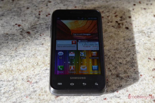
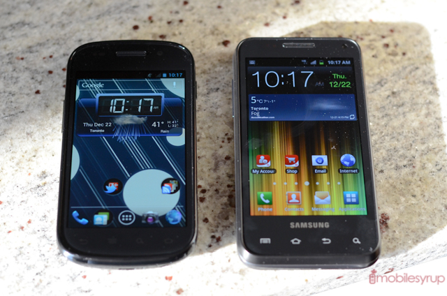
There is no way around it: the Galaxy S Glide is a bit on the heavy side. While not the thickest QWERTY device we’ve used, it’s 4-inch 5:3 ratio’d screen gives it more of a oblong appearance than any device in recent memory. It’s not what we’d call thick, either — not in any way that would overload your pocket — but it’s stout, with a moderate heft that runs a fine line between “just right” and bulky.
Unlike other Samsung devices which curve slightly at the sides, and avow themselves with a lithe profile, the front of the Glide is remarkably plain. There is a sizeable area below the four capacitive touch buttons that is meant to accommodate the extra width of the keyboard underneath, but when viewed straight on it looks awkward, like Samsung swung and missed.
But my goodness does the Glide feel lovely in the hand. I have said it time and time again: 4-inches is the sweet spot for smartphones, and the added thickness actually makes the device more comfortable to hold. It’s hard to explain, but Samsung has done a great job balancing the device when held in portrait or in landscape when the keyboard is open, which may end up being its most common orientation.
When you turn on the screen (via the right-side power button) you’re greeted with a product of 2010: a WVGA Super AMOLED display replete with a PenTile pixel distribution. Two years ago the screen was the best in the business, but as we’ve been exposed to sharper, smoother and far less aliased displays, with higher resolutions and brighter brights, the Glide’s LCD looks dated. The fundamental characteristics are still there, and largely positive: great contrast, excellent colour saturation, best-in-class viewing angles. But whites, especially at moderate brightness, have a blue tint, and text is often difficult to read when zoomed out.
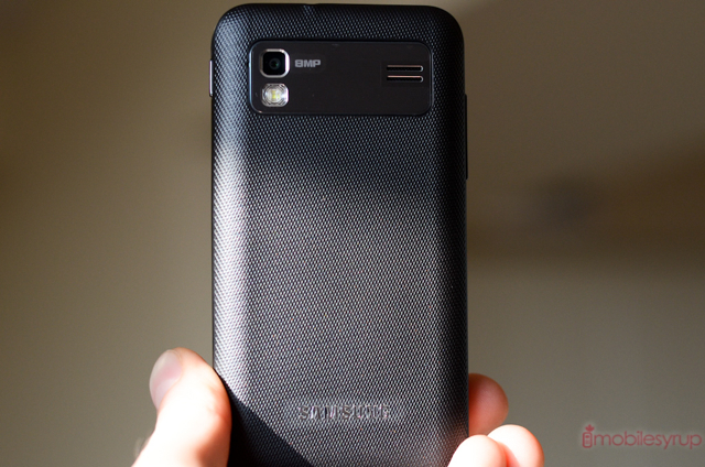
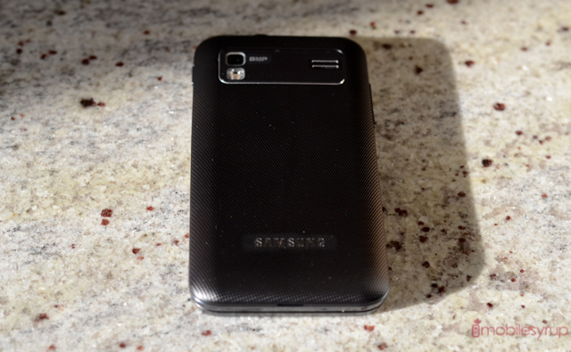
Ports are where you’d expect them on a Samsung device: besides the aforementioned power button, there is a headphone jack on top and, next to it, a USB port covered by a sliding drawer. Behind the device the 8MP camera sensor peeks out next to a LED flash. The backing is plastic and feels somewhat flimsy, but has a ribbed texture that aides in keeping the phone secure during those marathon texting sessions. Which brings us to…
The Keyboard
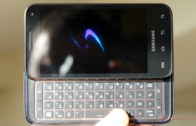
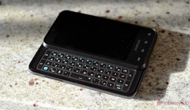
The showstopper here is what Samsung has achieved with its slide-out keyboard. I have used a lot of HTC and Motorola landscape sliders in my day, but this is my first from Samsung and it doesn’t disappoint. At first glance the individual keys appear shallow and square — much like the often-derided original Motorola Milestone — but they are spaced apart enough to provide plenty of room for big thumbs. Each button, which is made of a rubbery plastic, has enough give to provide assuredness at each press.
The layout is well thought-out and effective. Despite having only four rows (so unfortunately no dedicated number row) there are plenty of auxiliary keys, like a dedicated www/.com, ? and period. They’ve also managed to fit four directional keys and and an OK button for those who prefer to do their letter selection with the keyboard instead of the screen (and since this is running Gingerbread, they are a lifesaver). The four Android buttons are emulated on either side of the ‘board, too, allowing you to live in landscape mode, for all intents and purposes.
Typing quickly on the Glide turned out to be more pleasant than I initially thought possible. Samsung finely balances the key depth, so while your thumb sinks down just enough to feel impactful, it takes no time at all to come back up and find that next button. The keys are also big enough that you can press down your entire thumb, and not just their edges, on a key, resulting in less finger strain and ultimately smoother typing. I’d have liked the keys to be slightly offset, since it’s easy to lose your initial landmark position and end up needing to re-shift your thumbs, but for the most part this was not an issue.
I’d have liked to see a second ALT button on the right side of the keyboard for those awkward situations where you need to move your right thumb to the far left side of the device to hit that single number. This can be avoided by double-tapping on the ALT button to activate Numlock, but for one or two presses that should not be necessary.
The Glide’s sliding mechanism is strong and nimble, so opening the phone with one hand is not a problem. It is, however, a bit loose once opened, but you won’t feel it until you close it from an open position — it doesn’t affect regular use.
Performance & Software
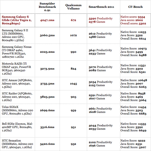
The 1Ghz Tegra 2 processor inside the Galaxy S Glide is no slouch, but a year after its debut in the Motorola Atrix can now be considered a mid-range part. Not only has the once-mighty NVIDIA chipset been bested by its competition in Qualcomm, Texas Instruments and Samsung itself, but by the upcoming quad-core Tegra 3, which should be hitting smartphones en masse early next year.
Despite that fact, I have a fondness for the Tegra 2: it produces some of the smoothest overall Android performance I’ve seen yet, and while it doesn’t compete with the newer guys for sheer power, its tendency to be ultra-stable and super-smooth is a recipe for harmony. Though the benchmarks say otherwise, I was not able to see, or feel, a discernible difference in UI performance between the Galaxy S Glide and the Galaxy S II LTE which runs a 1.2Ghz dual-core Qualcomm Snapdragon processor. Pinch-to-zoom in the hardware-accelerated browser is buttery smooth, and there is less of a delay between the time I press the home or back button than in any other Android device in recent memory. If the hardware itself isn’t as fast, the software has been heavily optimized to make up for it.
The TouchWIZ skin is fairly lightweight, at least by performance standards, and there is no appreciable slowdown throughout the OS. I have grown quite fond of Samsung’s overlay, which replaces the stock Gingerbread launcher long-press behaviour with one that’s more akin to Google’s newer Ice Cream Sandwich. To add a widget, for example, you hold down anywhere on the home screen and after a second a dock appears below a zoomed-out layer, allowing you to scroll horizontally through your list. To add it, just select and drag to the area on the home screen you want it to go.
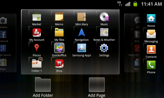
The app drawer has also been tweaked: it is a dynamic horizontal list with excellent support for tweaking and getting your icons the way you want them. You can add folders and uninstall apps in two steps; you can add or delete whole pages and move them around at will. Many of these features were added to the stock launcher experience in Ice Cream Sandwich, but the Samsung implementation has an extra layer of polish that I really appreciate. Too bad you cannot adjust it for vertical scrolling, but I digress.
Preinstalled apps run the gamut from useful (QuickOffice) to plain unnecessary (Mini diary) and there is a lot of fluff in between. Rogers and Samsung are both heavily pushing their own agenda here. For example, Samsung has a Games Hub powered by mobage, which competes with the Android Marketplace, while Rogers has its UrMusic service to sell you MP3s, ringtones and concert tickets. Both can be useful, certainly, but they tie the user to either the brand (Samsung) or the carrier (Rogers). It’s a mismash of confusing services and self-serving revenue schemes that users will balk at.
A ray of sunshine among the software mess is Rogers Live, nee Rogers on Demand, which allows you to watch movies and Rogers-sourced TV shows on your phone for $5/month. The selection is limited — mostly news and snippets of shows from Rogers-owned subsidiaries and some NBC and CBC fare like The Office and Strombo, but it’s nice to be able to check the latest headlines or the weather without turning on the television. There a fair amount of free content, too, but it’s mainly music videos and interviews. And while you can’t uninstall any of the pre-installed system apps, you can place them in a folder and never look at them again.
Samsung does a good job bringing decent functionality to their replacement Android apps, such as its Messaging and Email apps. The interfaces are simple and fairly consistent throughout, and but for a minor issue authenticating the SSL certificate on our IMAP account, everything worked as expected. This is a great phone for constant communicators — the ones who can’t seem to put down his or her phone before receiving another text or needing to compose another email — and the interface is plenty conducive to that. With the keyboard, text selection is flawless and only slightly finicky when copying-and-pasting due to the reliance on the touchscreen for activating it in the first place. And because you can press back, menu, home and search from the keyboard in landscape mode, it negates the need to constantly be returning your phone back to portrait for those menial Android tasks.
—
From the We Can’t Believe It’s Not Ice Cream Sandwich department, there are only a few things I miss from Android 4.0, as Samsung nicely fills in those gaps. Being unable to swipe away individual notifications is frustrating, and the now-antique multitasking menu feels so inefficient compared to the dynamic list from ICS. The native Gmail app in Gingerbread is still better than anything you’ll use on another platform, but after using many of the built-in apps on the Glide I pined for the effortless swipe-and-scroll dynamic of the Galaxy Nexus.
Though the Glide will likely receive an Android 4.0 upgrade, we are certain it will utilize an updated form of TouchWIZ. The colourful palette and cartoony widget selection is a stark contrast from Ice Cream Sandwich’s lovely blue-and-black scheme, but the beauty of Android is that with a bit of work you can make it look and work how you want. If you don’t like TouchWIZ, download Launcher Pro or ADW Launcher EX from the Marketplace and forget about it. All your apps will look the same, but you won’t have to deal with the majority of Samsung’s interface.
Camera
Like all the optics in the latest round of Galaxy S devices, the Glide is capable of taking great photos. Its 8MP camera is fast, accurate and mostly intelligent, adjusting to different lighting scenarios with aplomb. While its shutter speed leaves smething to be desired (a trait I found on all Tegra 2 devices) its autofocus generally finds its mark, and if you’re patient enough, photos are plenty detailed.
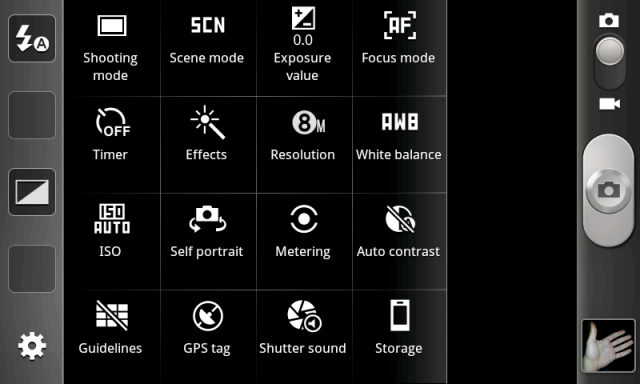
With a fantastic macro mode and tons of scene options, there is nothing really bad about the Glide’s camera. That being said, I find the Samsung software to be clunky and slow, full of menus and submenus that eschew graphics in favour of cold hard text. Its one redeeming feature is its ability to add four custom shortcuts to the left side of the interface, making it easy to turn on and off the flash, add an effect or adjusting white balance settings on the fly.
Though technically capable of higher, the Glide can only capture video at 720p, something of a disappointment considering the similarly-equipped LG Optimus 2X can do 1080p. We’re not certain the reason for the limitation, but it probably had to do with wanting to ensure a consistent frame rate, something that the Tegra 2 often has trouble with under strenuous lighting conditions.
As always, though, the video quality is fantastic, with smooth pans and tons of detail. My only concern was with the mediocre sound quality captured by the built-in microphone.
Network Speed and Call Quality
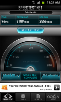
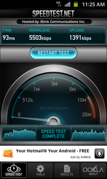
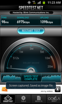
Like the Bell Galaxy S II, the Glide can pull off decent HSPA+ speeds of up to 21Mbps in the downstream and 5.76Mbps up. These translate to excellent browsing performance over the Rogers network with low enough ping times as to be virtually indistinguishable from its 42Mbps Galaxy S II X counterpart. When compared to its Rogers Galaxy S II LTE variant, however, the differences are more noticeable and the performance lag mounts up, but considering the Glide is priced below many of the high-end smartphones on the market we have little to complain about.
We achieved a stunning 5-8Mbps down and a healthy 1-2.5Mbps up in most of our tests, but the real boon to page load times were the graciously low pings of under 100ms.
Call quality was fine over the Rogers network. Samsung traditionally utilizes earpieces with slightly low output, and the Glide is no exception. I had no trouble hearing our callers in a quiet room but when walking down a busy street it was more difficult. They could here me just fine, and there is a second microphone installed on the back for noise cancellation.
I was also disappointed with the quality of the mono speaker on the Glide. Located near the camera on the rear, it emitted shrill, formless sound at adequate volumes. Though it should suffice for conference calls and such, it does not fare well when listening to music.
Battery Life
I wanted to call this the Little Droid that Could, because the Glide just wouldn’t die. The battery life on the device is stellar, almost too good considering the components inside. Granted there is a 1650mAh battery powering a relatively small, lower-resolution AMOLED display, but I was able to get nearly two full days of use from the device.
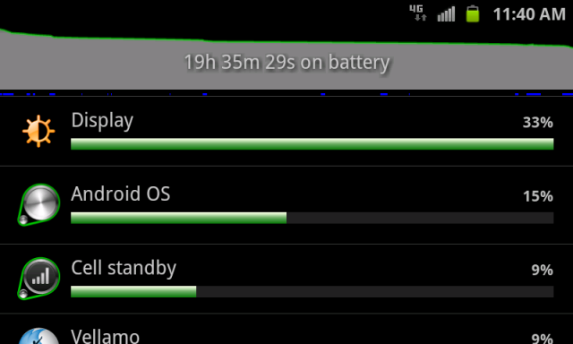
Putting the Glide through my usual rigorous battery tests, which involve a fair amount of “normal” activities like browsing, calling, tweeting, emailing and YouTubing, it lasted me longer than any other Android device to date. Likely due to the combination of Samsung’s TouchWIZ not running many background tasks, the low-powered Tegra 2 chipset and a proportionally large battery, you’ll likely be very happy with the Glide’s longevity.
Plus, Samsung has added a helpful Power Saving Mode, whereby it will turn off power-hungry hardware features like WiFi, GPS, Bluetooth and background updates at a pre-set battery percentage.
Wrap-up
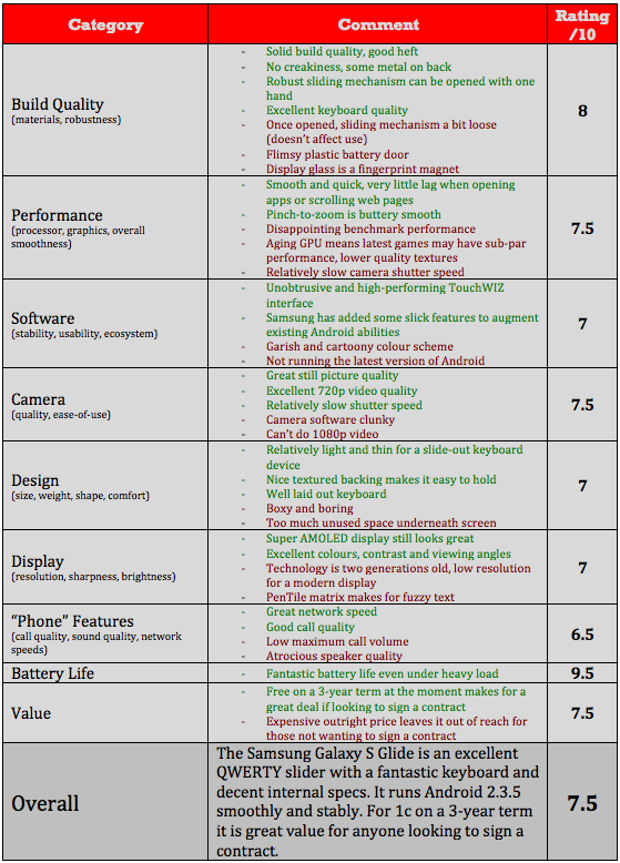
There isn’t much new about the Galaxy S Glide, but what it does it does very well. Considering it can currently be purchased for 1c on a 3-year term (though its outright price of $549.99 is a bit high for my tastes) it’s a bargain if you’re looking for a competitive messaging smartphone. Its keyboard is one of the best I’ve used on an Android device, with plenty of room for larger thumbs and a conscientious button layout, while performance on aging hardware is surprisingly spritely.
While it lacks the bells and whistles of many modern day Android devices, there is no arguing that the Galaxy S Glide is a full package, and an efficiency animal. It appeals equally to text-hungry teens and business-hungry professionals, while staying slim enough to be attractive many people in between.
MobileSyrup may earn a commission from purchases made via our links, which helps fund the journalism we provide free on our website. These links do not influence our editorial content. Support us here.


