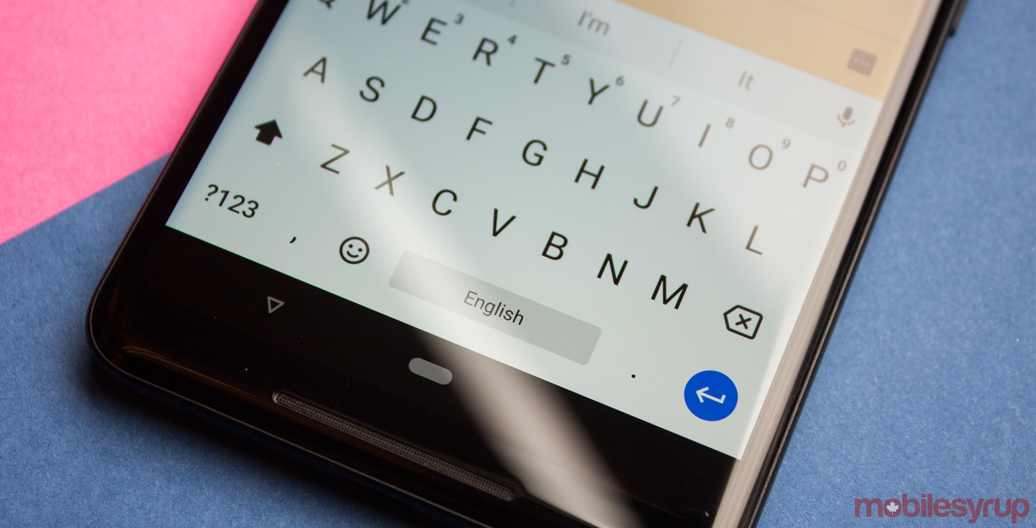
A Reddit user shared a GIF of a small Material Design change Google should make to its keyboard on Android.
The GIF highlights a discrepancy between the current Google keyboard (Gboard) animation and Google’s Material Design standards. Currently, opening Gboard on an Android device triggers this weird animation where the keyboard slides into position while becoming opaque.
Android needs to update their keyboard animation
byu/Alibasher inAndroid
The sliding isn’t really the issue here. Material Design wants to act like a material, using transitions that slide in and affect other elements on the screen. One of the principles of Material Design is motion.
Googles Material.io website describes using meaningful motion:
“As elements appear on screen, they transform and reorganize the environment, with interactions generating new transformations.”
Gboard, however, doesn’t do this.
Instead, Gboard transitions from transparent to opaque. It doesn’t transform and reorganize the environment. Gboard appears suddenly, forcing other elements to leap out of the way lest they be crushed beneath it. When the user closes the keyboard, it takes on this ephemeral quality, vanishing into the void like a ghost.
In Reddit user Alibasher’s GIF, the keyboard slides up onto the screen subtly. Elements on the screen move with the keyboard, sliding out of the way. There’s no weird transparency changes. It also looks much smoother.
It may be a longshot to hope Google will make a change to the Gboard animation, but a man can dream.
Source: Reddit
MobileSyrup may earn a commission from purchases made via our links, which helps fund the journalism we provide free on our website. These links do not influence our editorial content. Support us here.


