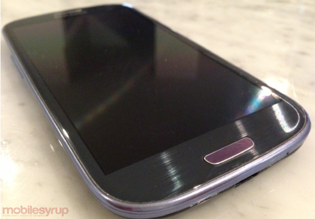
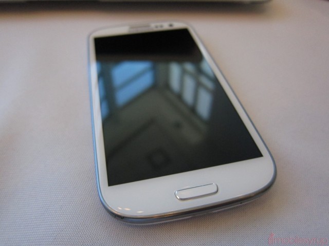
Having sold millions of Galaxy S II’s around the world, in more variations than one can keep track of, Samsung knew it had a lot of work to do in making a worthy successor. In many ways, the device we have before us bears little resemblance to the GT-i9100 released on Bell in July 2011 but the lineage is obvious: big, colourful icons, a squared-off home button and, perhaps most notably, one of the most powerful processors on the market.
Being released on almost every major carrier in Canada, is the Galaxy S III worth your time and money? And does the LTE version match up to the international variety? Let’s take a look.
Specs:
– Android 4.0.4 Ice Cream Sandwich w/ TouchWIZ Nature UX
– 4.8-inch 720 x 1280 HD Super AMOLED display
– 1.5Ghz dual-core Qualcomm Snapdragon S4 processor w/ Adreno 225 GPU
– 2GB RAM / 16-32GB internal storage (plus expandable microSD card slot)
– 8MP back camera w/ autofocus, burst mode and flash / 1.9MP front-facing camera
– 1080p video capture w/ auto stabilization
– 2100mAh removable battery
– HSDPA 850 / 1900 / 2100 Mhz, LTE 700 / 1700 / 2100 Mhz
– 136.6 x 70.6 x 8.6 mm
– 134g
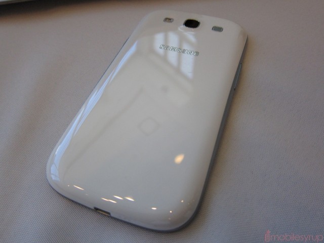
Design
There is something immediately comfortable about holding the Galaxy S III. Samsung’s focus on making the device more “human” may seem like a bunch of hoopla but it actually translates into a far more ergonomic device than any they’ve released.
Despite the 4.8-inch screen the manufacturer has managed to almost disappear the bezel, resulting in as compact a flagship I’ve ever used. The ports are all in their Samsung-approved locations – power on the right side, near the top; microUSB on the bottom middle; volume rocker on the left side; headphone port on the top.
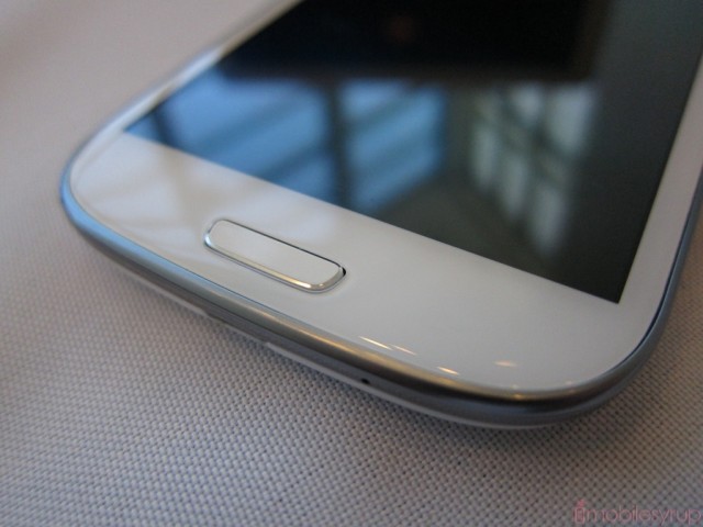
One of the more divisive aspects of the Galaxy S III may be the new home button. Luckily all models are going to ship with the button intact — no more four-capacitive button variants — but due to the design it is occasionally difficult to press. Because of the phone’s height, the hand is often holding it around the back middle; to action the home button you need to shift your thumb down quite a way, potentially unbalancing the phone in the process. It takes a while to get used to, but I’d have preferred something more akin to the larger and symmetrical button from the Galaxy S II.
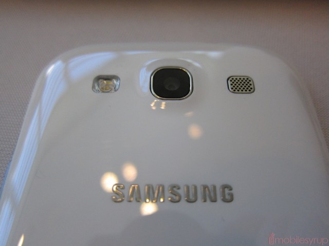
Taking a page from the Galaxy Nexus, the SGS3 is equipped with a stunning notification LED that pulses and glows, emanating like magic from behind the white (or blue) façade. The effect is about as satisfying as you’ll find on a smartphone and something we’d love to see on more Samsung devices.
And despite the plastic build, Samsung has actually done a great job improving the durability of the Galaxy S III’s exterior. It’s not perfect – my demo picked up some errant scratches on the chrome bezel and battery cover fairly easily – but it’s a serious improvement over its predecessor. That you can replace the battery cover, unlike the iPhone 4S and HTC One X, is a benefit too.
Display
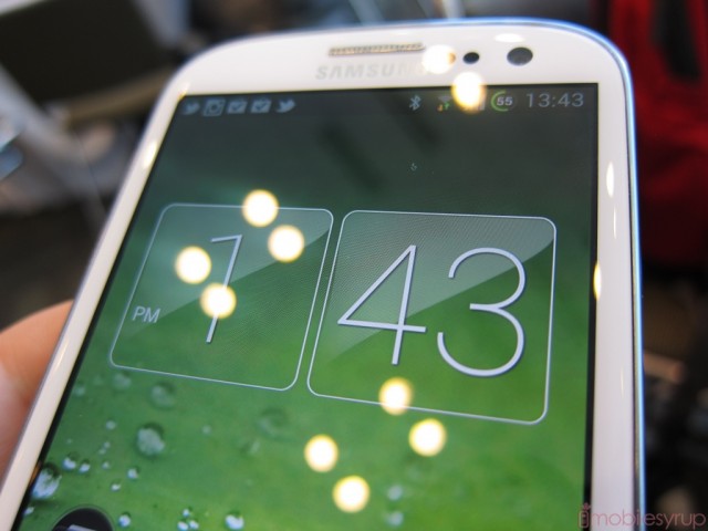
Forget PenTile, really. We’re at the point where pixels are small enough that subpixel array shouldn’t matter to the naked eye. Indeed, I had a very difficult time finding anything to complain about in regards to the Galaxy S III’s display.
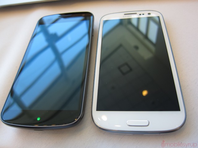
At 720 x 1280, text is sharp and pleasant to read; Samsung promised us they made improvements to the display since the Galaxy Nexus and despite similar characteristics I noticed right away better colour uniformity, whiter whites and a generally superior calibration.
Comparing the display to the HTC One X, my current favourite smartphone display, there are some areas of improvement to be found. Due to its AMOLED nature, there is still a slight bluish tint to whites and greys. Text, too, contains minute aberrations owed to the PenTile subpixel array. Most users won’t notice a difference until you see the two screens side-by-side, but it’s there. We hope Samsung graduates to HD Super AMOLED Plus as soon as possible.
Like all AMOLED-based displays, black levels are wonderfully deep, and viewing angles superlative. I can’t say that the Galaxy S III has the best display on the market, but it’s not far behind the One X and, as a rule, I like to look at the whole package rather than the individual parts. We’ll see later on there is a lot more to like about the SGS3 than just its exterior.
Performance
The North American Galaxy S III is equipped with a Qualcomm Snapdragon S4 processor clocked at 1.5Ghz. It’s the identical part to the One X but due to optimizations made to the software it appears to respond slightly faster in day-to-day tasks.
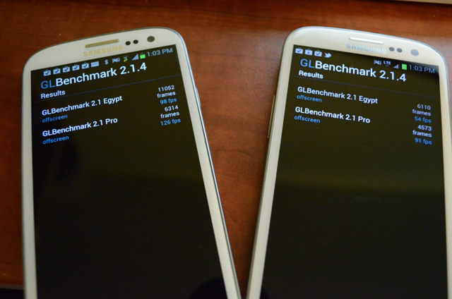
I took the liberty of benchmarking the device against an international Galaxy S III i9300 and the two devices were neck and neck in most CPU-bound tests; GPU-intensive tasks favoured the Mali-400MP inside the international variant.
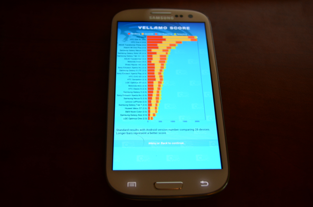
It’s important to note that the North American Galaxy S III is among the fastest Android phones ever released. During most day-to-day tasks, including loading apps, games and navigating through the user interface, I felt no appreciable difference between the i747 (Snapdragon S4) and i9300. For all intents and purposes they are the same phone.
But one area in which the North American version trounces the international is in data speeds. The i9300 is limited to speeds of 21Mbps down and 5.76Mbps up. As we’ll see later, this limitation is killer, especially in a city like Toronto with largely saturated HSPA+ networks. The extra legroom of Rogers’, Bell’s or TELUS’ LTE network is sure to be a key differentiator for many users, and I’d recommend the version sold in Canada for that very reason.
Samsung decided to offset any perceived performance disadvantage of the Snapdragon S4 by including 2GB of DDR2 RAM inside the North American version of the device. From a benchmark perspective it doesn’t seem to offer much advantage, but multitasking was clearly improved over the One X, which comes with just 1GB. Apps resume quickly, tabs inside Chrome for Android or the default Browser don’t often reload and you can have more apps running in the background without a performance hit. Android is still a mobile OS, however, and limits background activities to perfunctory tasks that don’t use too much RAM anyway. While not to say that we won’t see future versions of Android make more use of 1GB+ of RAM, at the moment it’s more an insurance policy than an essential feature.
Software
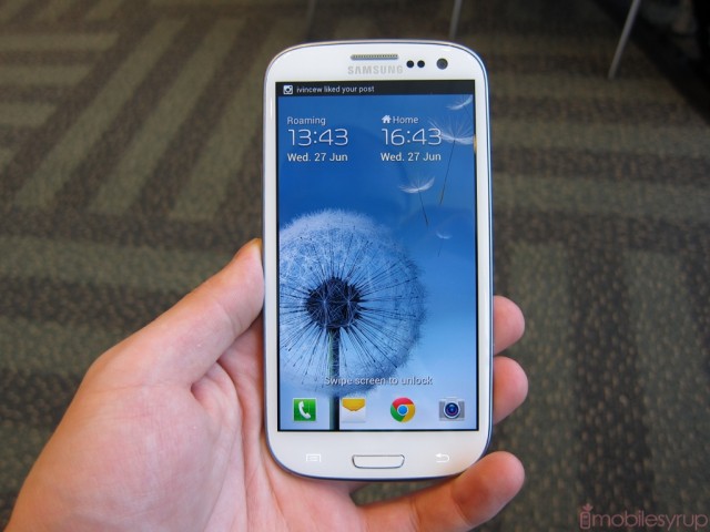
The Galaxy S III runs Android 4.0.4 with TouchWIZ Nature UX, an evolution of last year’s TouchWIZ 4. In many ways it looks and performs quite similarly: there’s a dock at the bottom of the home screen with four customizable icons and one permanent app drawer button. The app drawer itself is horizontal and is more user-friendly than previous Samsung launchers. Not to say it’s perfect: there are annoyances still, such as the need to press “Save” after moving icons around inside the launcher. Samsung also doesn’t let you create folders by dragging an icon onto another; you have to press “Menu” and “Create folder,” a two-step process that shouldn’t have been difficult to prevent.
Smoothness is a huge factor here: the Galaxy S III is by far the best-performing Android phone I’ve ever used. There is no slowdown whatsoever, as everything seems to have been optimized for hardware acceleration.
Samsung has also emphasized unique features on the Galaxy S III to differentiate it from the rest of the pack. We’ve reached a stage in the Android universe where most high-end devices perform at breakneck speeds. Samsung realized there needed to be something else to keep users interested, and to populate its marketing campaigns. There are a lot of buzz words – Smart Stay, S Voice, S Beam, etc. – but let’s separate the wheat from the chaff.
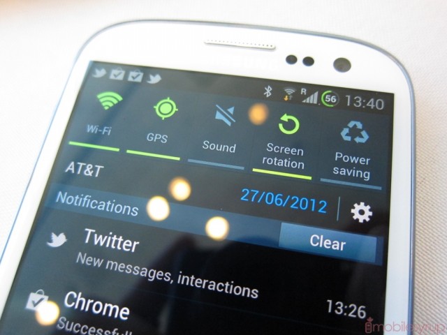
Smart Stay: One of the premiere features of the Galaxy S III, it uses the front-facing camera to check whether your eyes are looking at the screen at pre-determined intervals. I found the feature to work well in areas of sufficient light, though the company warns you that it won’t work in the dark or dim rooms.
S Beam: The evolution of Android Beam, the NFC-based data transfer system works quite well, as it initiates a connection without another device and then, if it supports the protocol, performs the actual transfer using WiFi Direct. This increases the speed tenfold over NFC itself and aides in the transfer of larger files. Unfortunately the S Beam feature is limited at the moment to other Galaxy S III owners; it falls back to Android Beam for other NFC-supported devices.

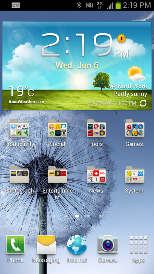
S Voice: This Siri competitor needs a lot of work. Powered by Vlingo, it is able to understand many basic semantic enquiries, but for the most part it pales in comparison to the linguistic versatility of Apple’s product. It’s also quite good at misinterpreting what you’re saying: calls made to one person would routinely be mistaken for another, and many times it wouldn’t understand what I was saying at all.
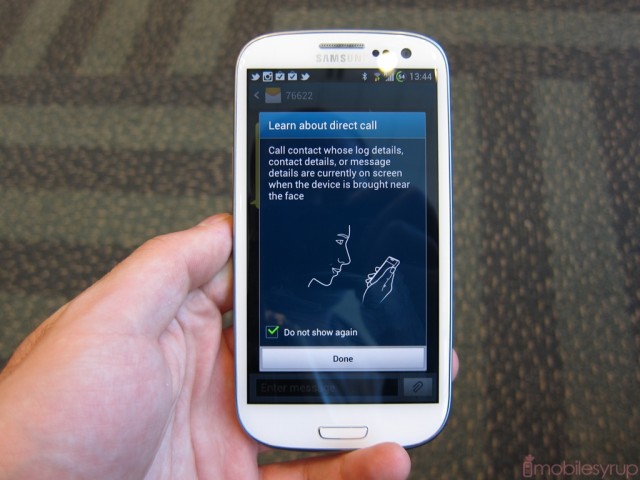
Gestures and Motion: These features have been one of the best reasons, in my eyes, to purchase a Galaxy S III. They make arduous tasks that much more simple. For example, swiping your palm across the display glass takes a screenshot. When receiving a phone call, turning the display over mutes the ringer. When inside a text message screen, putting the phone to your ear initiates a call.
One of my favourite gestures has been the ability to hold down your thumb on the lock screen and rotate the phone 90 degrees to open the camera app. You can also bring the phone to your face to unlock it.
Some of these gestures have been carried over from TouchWIZ 4, such as swiping to the right to make a call and to the left to create a text message when inside the Contacts hub. But the way that Samsung has integrated them all together into a cohesive whole makes the Galaxy S III feel, for the first time, like an ecosystem rather than a disparate use of flashy add-ons.
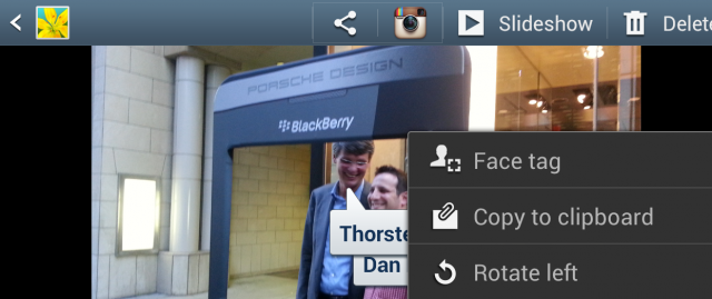
Social Tag: The ability to apply tags to your friends and family from within the Gallery is actually quite helpful, especially since it links up with their contact information. You can upload those photos directly to Facebook, for example, without having to tag again.
Lock screen shortcuts: Like Sense UI, Samsung allows you to assign four shortcuts to your lock screen for quick entry. By default they are Phone, Messaging, S Voice and Camera, but they can be changed. You can also add a Yahoo-powered news ticker to the bottom of the screen, though it takes away from the uncluttered visual aesthetic.
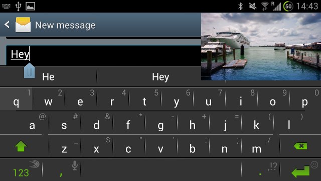
Picture-in-picture: What at first emerges as a gimmick emerges as a useful and, dare I say, essential feature on the Galaxy S III. The ability to “pull out” a video to the home screen and open other apps while continuing to watch may have huge implications in future versions of TouchWIZ, but its current limitations keep it from being more than a party trick. Since you can only use the feature from within the default video app, it precludes YouTube videos, TED Talks or anything else one would decide to stream. As it stands, you’ll have to transfer video files manually to your device to use PIP.
I did manage to watch an episode of Mad Men while reading my RSS feeds one morning, and the experience was pretty positive.
By default, the Nature UX extends not only to visual elements of the software – the water ripple on the lock screen, for example – but also to the default sounds. While at first hearing the artificial sounds of water droplets can be soothing, by the hundredth time they begin to take a toll.
I would be remiss to note that a Movies Hub, in addition to the requisite Music and Social hubs, ships with the Galaxy S III, allowing users to purchase films at prices equivalent to iTunes or Google Play. There’s also 50GB of free Dropbox storage for two years, a wonderful (and potentially cost-saving) inclusion.
Camera
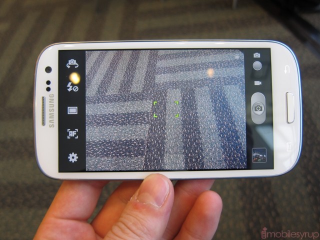
When iFixit took the Galaxy S III apart for the world to see, they announced the handset used “essentially the same” 8MP camera module as the iPhone 4S. While we found that quality between the two devices to be similar, the camera experience on the SGS3 is notably superior. (We’ll be comparing the cameras of some of the top smartphones in a future post.)
Users can now take multiple shots – burst shot, if you will – in short succession, and choose one or a number of the photos taken. I found that the device was able to keep focus better than the One X under the same circumstances, and the results were regularly usable.
The camera UI has been slightly tweaked from TouchWIZ 4, but maintains much of the same stolid aesthetic we wish Samsung would undertake to overhaul. Not to say it’s bad, but Sense 4.0 improved things for the Android crowd by such a margin it’s hard to compete. That’s not to say the results are superior, but HTC did some serious consolidation of what they considered to be superfluous features, and the result was a superlative still/video experience.
Samsung shines, however, in the marriage of hardware and software. Whereas the One X feels bulky and awkward to hold in one hand, the Galaxy S III is tight and compact and the shutter button big and responsive. You can also tweak shortcuts on the left side of the device for quick access to features like autofocus metering, ISO and exposure settings and photo size. Samsung’s Gallery app is, like the stock Android version, quick and minimal, with basic editing features like crop and rotate built right in.
You can zoom in on a subject by pinching outwards anywhere on the viewfinder; to re-focus, just tap the screen. I rarely had a problem with focusing, even on close-up objects, and despite the narrower aperture macro shots often turned out better on the Galaxy S III than the One X.
Overall photo quality is amazing. I really have little to complain about: colours pop, artificial sharpening algorithms do not mar detail and even low-light quality is excellent. What the Galaxy S II started the GS3 finishes: Android users finally have a camera experience – that’s quality and UI combined – to rival, and occasional surpass, the iPhone 4S.
Similarly, video quality on the Galaxy S III is superb. There’s no doubt that Samsung had big shoes to fill after last year, but the new flagship delivers. From image stabilization to overall detail, the camera doesn’t let us down. There were times in lower-light situations the phone would lose focus on a subject for a few seconds, but it happened too few times to be more than a passing notice.
Where Samsung really struggled to improve over last year’s model, and in fact seemed to regress slightly, was audio capture. Tinny and thin, the sound captured when shooting a video often made the footage unusable. Keep that in mind if you’re planning on filming outside: the microphones are extremely sensitive to wind and other nearby aberrations your ears may not be able to pick up.
Like most other smartphone, the front-facing camera is largely superfluous, though on the SGS3 it is more useful than others for its Smart Stay. At 1.9MP, the quality was good enough for Skype calls and vanity photos, but we wouldn’t go much further than that.
Battery Life
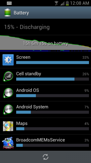
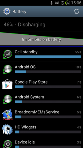
The 2100mAh battery inside the Galaxy S III is replaceable and the S4 chip is reasonably power-friendly, so I wasn’t surprised to see the device last more than a day and a half on a charge without too much trouble.
In fact, when compared to the quad-core Exynos chip inside the international variant, the North American version lasted around 6-8 hours longer on a single charge.
That the battery is replaceable is a huge advantage over the closed-in HTC One X, and Samsung sells a second battery plus charger, making it possible to keep the GS3 going indefinitely while travelling. For anyone upgrading from a last-generation device, or even a Galaxy Nexus, the Galaxy S III even running on LTE is likely to last significantly longer per charge.
Network Speeds, Call Quality & Audio
I was able to try the Galaxy S III on all three networks, including TELUS, Bell and Rogers, and the results were fairly similar to previous LTE tests. I averaged between 15Mbps and 35Mbps down , 8Mbps and 30Mbps up. I truly believe Samsung made the right move ensuring the Canadian version was LTE-compatible. Even when falling back to HSPA+ the baseband is capable of 42Mbps, but I averaged around 8-12Mbps depending on the network and area.
These results are significantly faster than what the international variant can do; I was never able to exceed 6Mbps on any network.
Call quality on the Galaxy S III has also been improved over its predecessor, which was known to sound soft and thin. Voice calls came through clearly and without a hint of sibilance, something that occasionally affects most high-end smartphones.
Audio quality was not quite as good as the international variant, as Qualcomm uses its own DSP in the i747, whereas the i9300 uses a newer Wolfson Audio chip. Volume and soundstage was reasonably loud and wide, respectively, and I noticed no detectable hiss or buzz even from high ohm headphones. In fact, the amp was able to power my 250ohm Beyerdynamic DT770s to sufficient volumes while maintaining a decent amount of dynamic range.
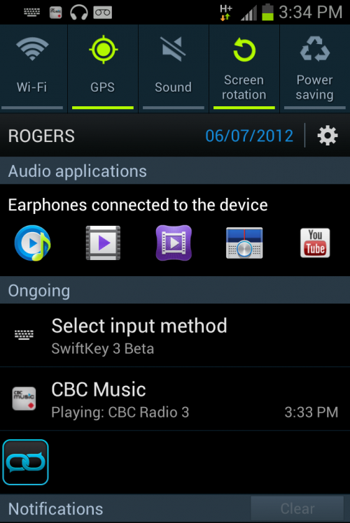
One issue I had with the Galaxy S III was with the audio interface itself. The device detects when a pair of headphones has been inserted, and offers quick access to the FM radio, Music Player and Music Hub from the notification bar. These are not customizable, unfortunately, so you can’t insert Rdio or your favourite audio app in their stead.
And occasionally audio apps would close of their own volition after a few minutes, often mid-song and without prompting. I hope this is a software issue that can be corrected in a future update because it became very frustrating very quickly.
Conclusion
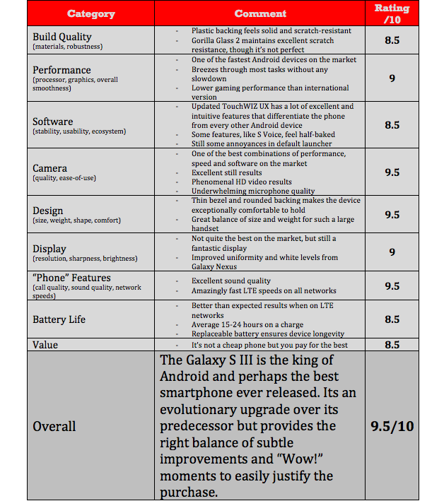
The Galaxy S III is currently the best Android phone on the market, perhaps not by a large margin – the One X pales only slightly in battery life and overall usability, while beating Samsung in build quality — but the overall package comes together exceptionally well.
The hardware doesn’t shake things up too much – it’s actually thicker than its predecessor by a tiny bit – but it feels great in the hand. The screen resolution is top-notch despite its PenTile makeup, and the HyperGlaze coating protects against surface-level scratches.
Available in white and blue in a variety of sizes, Samsung accomplished something great by convincing all the carriers to accept a single design. It’s an understated, fast and beautiful handset that is sure to be instantly recognizable in a few months.
MobileSyrup may earn a commission from purchases made via our links, which helps fund the journalism we provide free on our website. These links do not influence our editorial content. Support us here.


