The Pros
- 90Hz display is quite smooth
- Excellent battery life
- Solid performance
The Cons
- Camera quality is hit-and-miss
- Display edge has some discolouration
- Quite expensive
The Motorola Edge+ is a surprisingly great phone. When it launched back in April, I had some apprehensions about it. Motorola has been out of the flagship phone game for years, instead focussing on mid-range and budget options. In that time, the smartphone industry changed a lot, so I wondered if the Edge+ would have the chops to compete.
On paper, it does. Spec for spec, it matches up to the best from Samsung and OnePlus, and it will likely contend with flagships set to come out later this year from Google and LG. Sure, there are a few areas where the numbers may seem less — for example, the 1080 x 2340 pixel resolution Edge+ display compared to the Samsung S20’s higher resolution 1440 x 3,200 pixel screen — but in real-world use, that difference is negligible.
Plus, if you consider that the S20’s screen can’t be used at full resolution while running the higher refresh rate mode, the difference is even less noticeable
Ultimately, I think my concerns about Motorola’s ability to compete at the flagship level were perhaps overblown. The company did a fantastic job of fusing all the latest flagship smartphone trends — for better and worse — into the Edge+, and even snuck in a few relics of the smartphone golden days in at the same time (looking at you, 3.5mm headphone jack).
The question remains if that’s enough to justify the Edge+ over the other flagships available today, or if Motorola needed to do more to set itself apart.
Motorola Edge+
Display
6.7-inch FHD+ OLED Endless Edge display, 90Hz refresh rate, HDR10+
Processor
Qualcomm Snapdragon 865
RAM
12GB DDR5
Storage
256GB UFS3.0 with Turbo Write
Dimensions (in.)
161.1 x 71.4 x 9.6mm
Weight
203g
Rear Facing Camera
108-megapixel f/1.8 Quad Pixel with OIS | 16-megapixel f/2.2 Ultra-wide angle and Macro Vision | 8-megapixel f/2.4 telephoto 3x optical zoom and OIS | time of flight sensor
Front Facing Camera
25-megapixel f/2.0 Quad Pixel
OS
Android 10
Battery
5,000mAh
Network Connectivity
5G: mmWave and Sub-6 | LTE/UMTS/HSPA+/GSM/EDGE/CDMA
Sensors
In-display fingerprint reader, accelerometer, gyroscope, proximity, ambient light, sensor hub, barometer
SIM Type
Nano SIM
Launch Date
April 22, 2020
Misc
Colours: Smoky Sangria, Thunder Grey
Display
Motorola Edge+
6.7-inch FHD+ OLED Endless Edge display, 90Hz refresh rate, HDR10+
Processor
Motorola Edge+
Qualcomm Snapdragon 865
RAM
Motorola Edge+
12GB DDR5
Storage
Motorola Edge+
256GB UFS3.0 with Turbo Write
Dimensions (in.)
Motorola Edge+
161.1 x 71.4 x 9.6mm
Weight
Motorola Edge+
203g
Rear Facing Camera
Motorola Edge+
108-megapixel f/1.8 Quad Pixel with OIS | 16-megapixel f/2.2 Ultra-wide angle and Macro Vision | 8-megapixel f/2.4 telephoto 3x optical zoom and OIS | time of flight sensor
Front Facing Camera
Motorola Edge+
25-megapixel f/2.0 Quad Pixel
OS
Motorola Edge+
Android 10
Battery
Motorola Edge+
5,000mAh
Network Connectivity
Motorola Edge+
5G: mmWave and Sub-6 | LTE/UMTS/HSPA+/GSM/EDGE/CDMA
Sensors
Motorola Edge+
In-display fingerprint reader, accelerometer, gyroscope, proximity, ambient light, sensor hub, barometer
SIM Type
Motorola Edge+
Nano SIM
Launch Date
Motorola Edge+
April 22, 2020
Misc
Motorola Edge+
Colours: Smoky Sangria, Thunder Grey
They call it ‘Edge’ for a reason
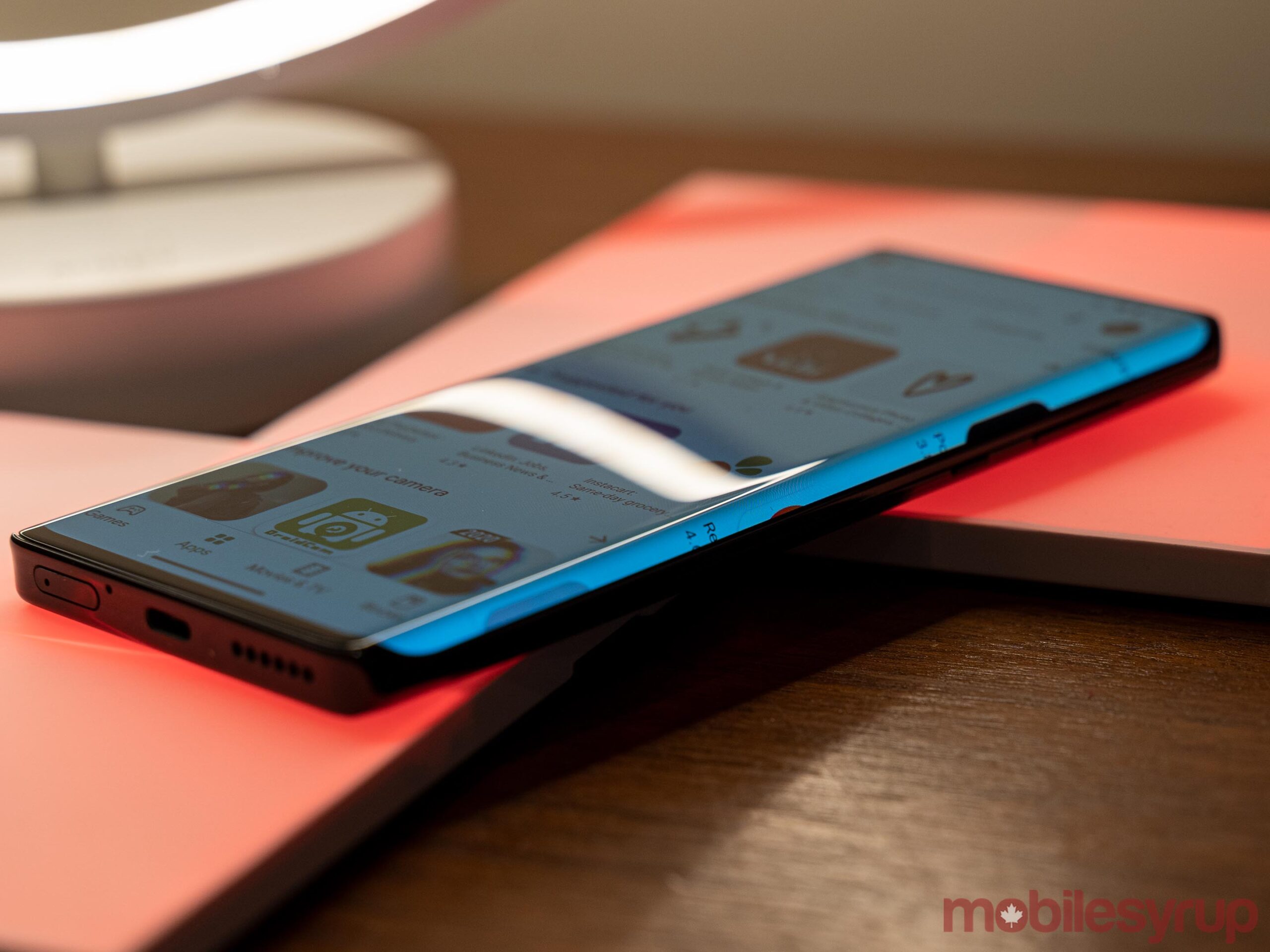
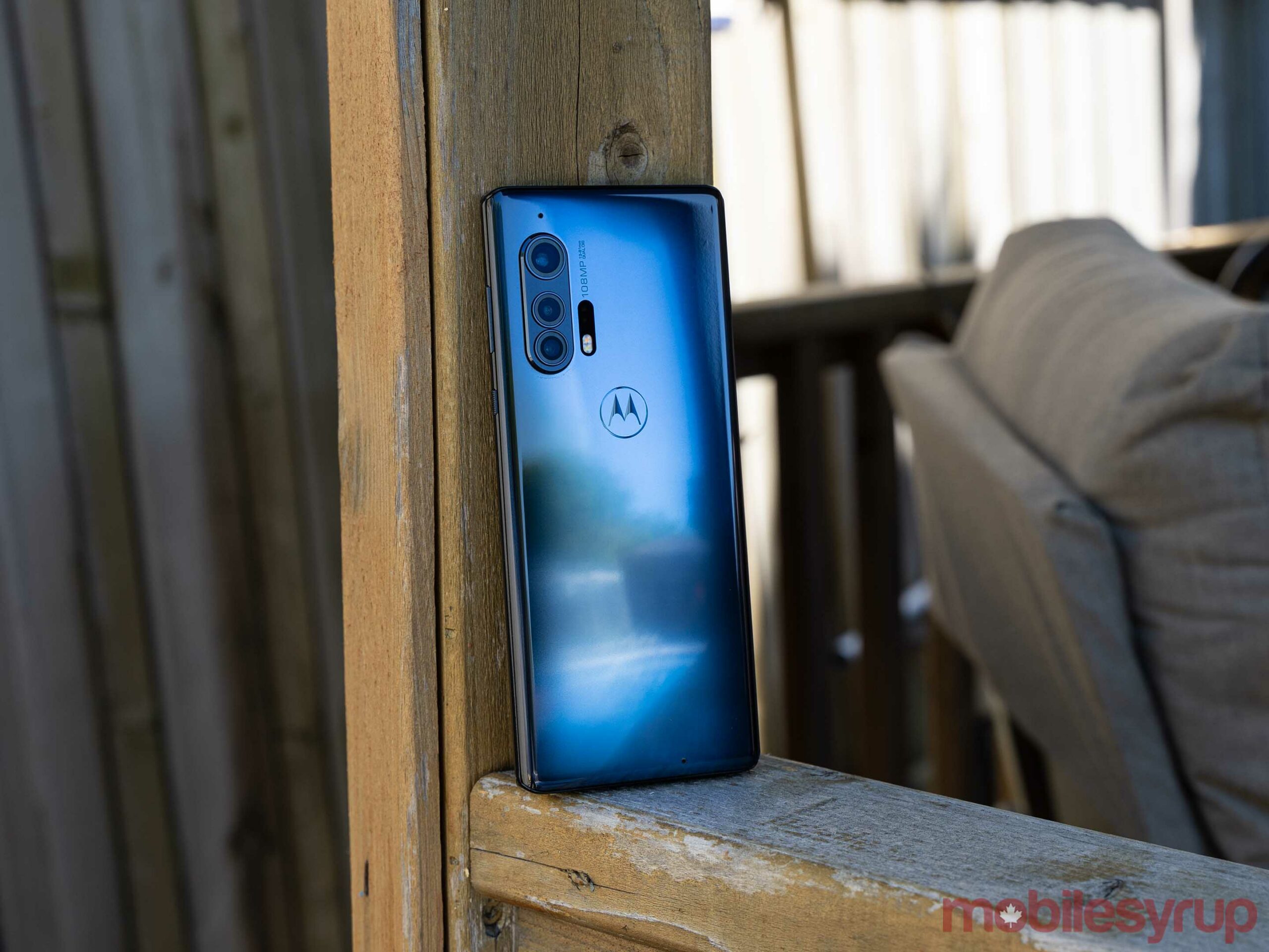
Let’s start with the screen as it’s probably the most divisive part of the phone. If you hate curved edge displays like me, you’ll likely abhor the Motorola Edge+. Or at least, I thought I would. However, when I first picked up the Motorola Edge+, I found I wasn’t immediately turned off by the edge display.
My biggest issue with curved displays like this is that it’s easy to register accidental touches and they often feel awkward in the hand. For me, the Edge+ felt like an accidental touch magnet. No matter how I held it, I was constantly registering touches by accident. However, the phone didn’t have the awkward feel that other curved displays have.
In part, I think this is because of the thin, long nature of the Edge+. More than any other phone — including the S20 — the Edge+ is a tall and narrow device. For me, the width made it feel great in my hand, while the curved edges made it feel like one uniform piece of glass.
Unfortunately, aside from the feel, I had other issues with the curved display. My biggest problem was that on any bright colour like white or yellow, the curved glass distorts the colour. The result is the curve sports an ugly greyish hue from the distorted light. If you run the phone in dark mode, the grey hue is less visible.
As a result, I almost exclusively used the Edge+ with dark mode, which made it feel super futuristic. If you don’t like dark mode, and if you think the grey discolouring will bug you, I’d advise avoiding this phone.
Software can mitigate issues with the edge
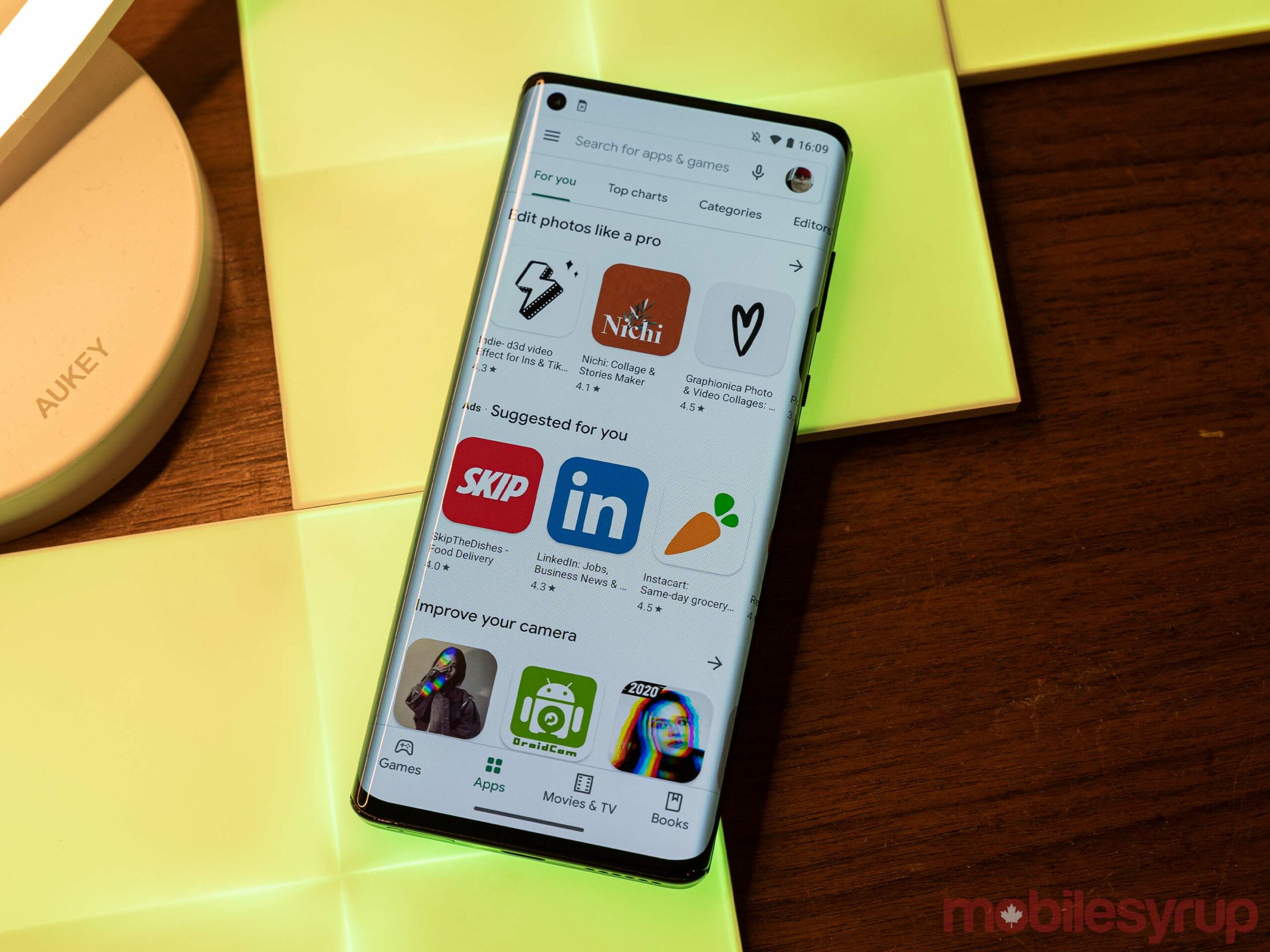
Motorola also includes software features to help mitigate issues with the edge display. For example, the ‘Edge display’ menu lets users disable the curved display on a per-app basis. I found this helpful for video apps like YouTube and Netflix since it kept content from wrapping around the side of the screen and prevented me from accidentally touching the screen and skipping ahead in a show.
Along with the Edge display menu, Motorola included a ‘Full screen’ menu for controlling which apps can take full advantage of the display and show content around the camera cutout. By default, no apps can use full screen mode. I didn’t feel a need to use it, but if you want to make full use of the display, enabling this for apps video apps will let then display from top to bottom edge. The only downside is that the camera hole will cover some of the content, but some people don’t mind that.
Software aside, the display on the Motorola Edge+ is excellent. It’s buttery smooth thanks to the 90Hz refresh rate, has great colours and is all-around fantastic. Plus, I don’t mind the FHD+ resolution — in practice, I didn’t notice the difference, and I’d argue the lower resolution is well worth it for a higher refresh rate.
It’s worth noting here that some users have had issues with their Edge+ displays. While I was working on this review, several users reported issues with green tints and purple or grey splotches covering large sections of the screen. I didn’t encounter anything like that in my testing, but it’s something to be aware of.
Screaming fast
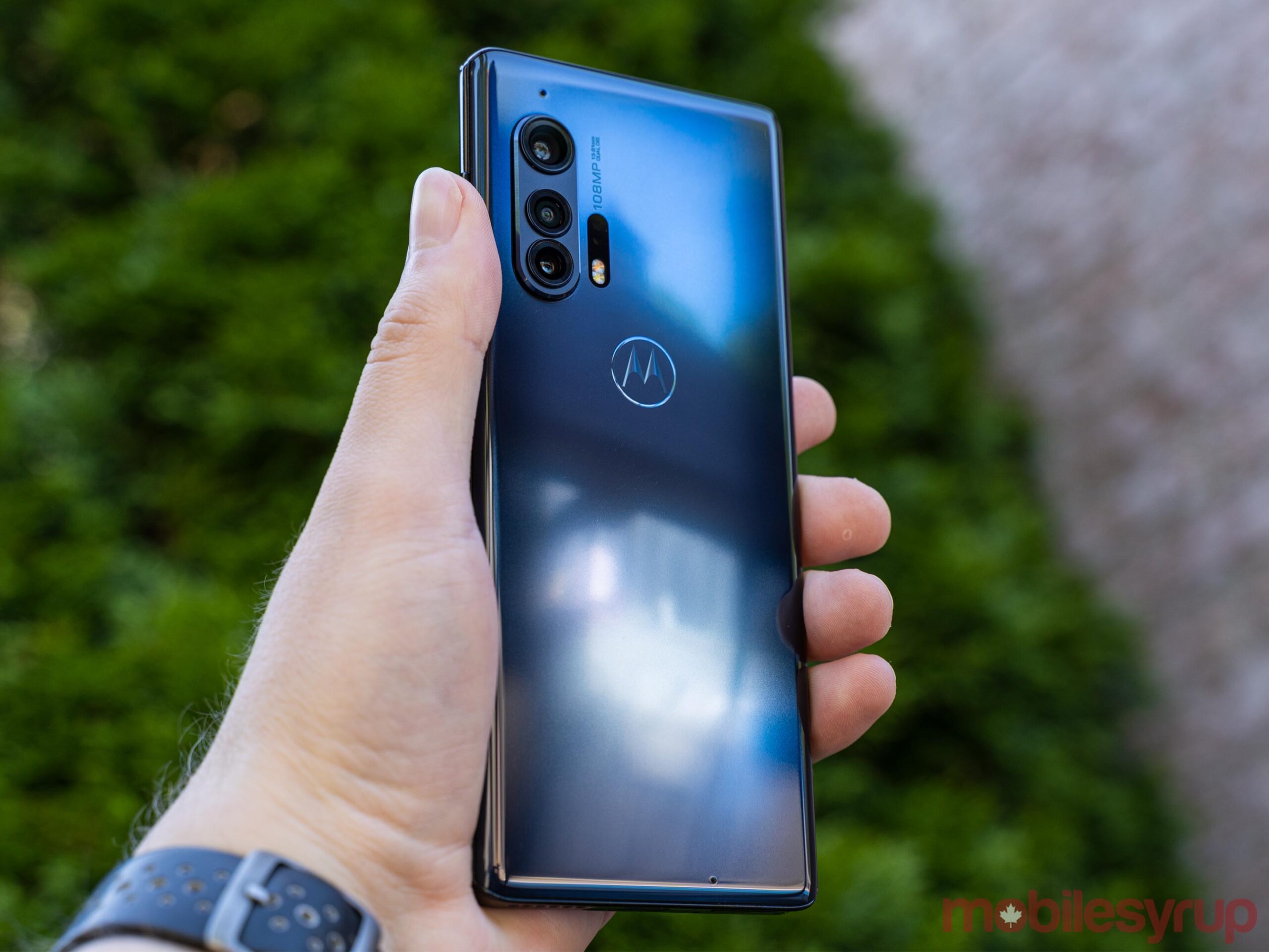
Unsurprisingly, the Motorola Edge+ is blazing fast. A combination of the 90Hz display, the Snapdragon 865 and the 12GB of RAM meant that apps opened nearly instantly and stayed open for a long time.
In my regular usage switching between social media apps like Instagram and Twitter, checking email, browsing the web, using Slack and watching videos on Netflix, I didn’t encounter any slowdowns or issues with apps getting dropped from memory.
A good part of this is likely that the phone needs less power to push the FHD+ display, but also that Motorola has outdone itself on the software side.
The Edge+ sports an almost Pixel-like software experience with very little changed save the addition of some Motorola-specific software and tweaks. Outside of the pre-installed Amazon app, there was no bloatware on the Edge+. The launcher is, for all intents and purposes, the Pixel Launcher sans Google search bar. It uses the Google Messages app and Google Phone app by default and there are no duplicates — i.e. running both Google’s Calculator app as well as a calculator app made by Motorola, something that many other Android manufacturers do (ahem, Samsung).
All in all, the experience of using the Motorola Edge+ felt like a Pixel in a Samsung or Huawei body. If you’re a fan of Google’s pared-down software experience, that means the Edge+ will likely impress you. However, fans of more customized systems like Samsung’s One UI may find the experience barebones. For me, the Edge+ was the Android experience I’ve always wanted from a non-Pixel phone.
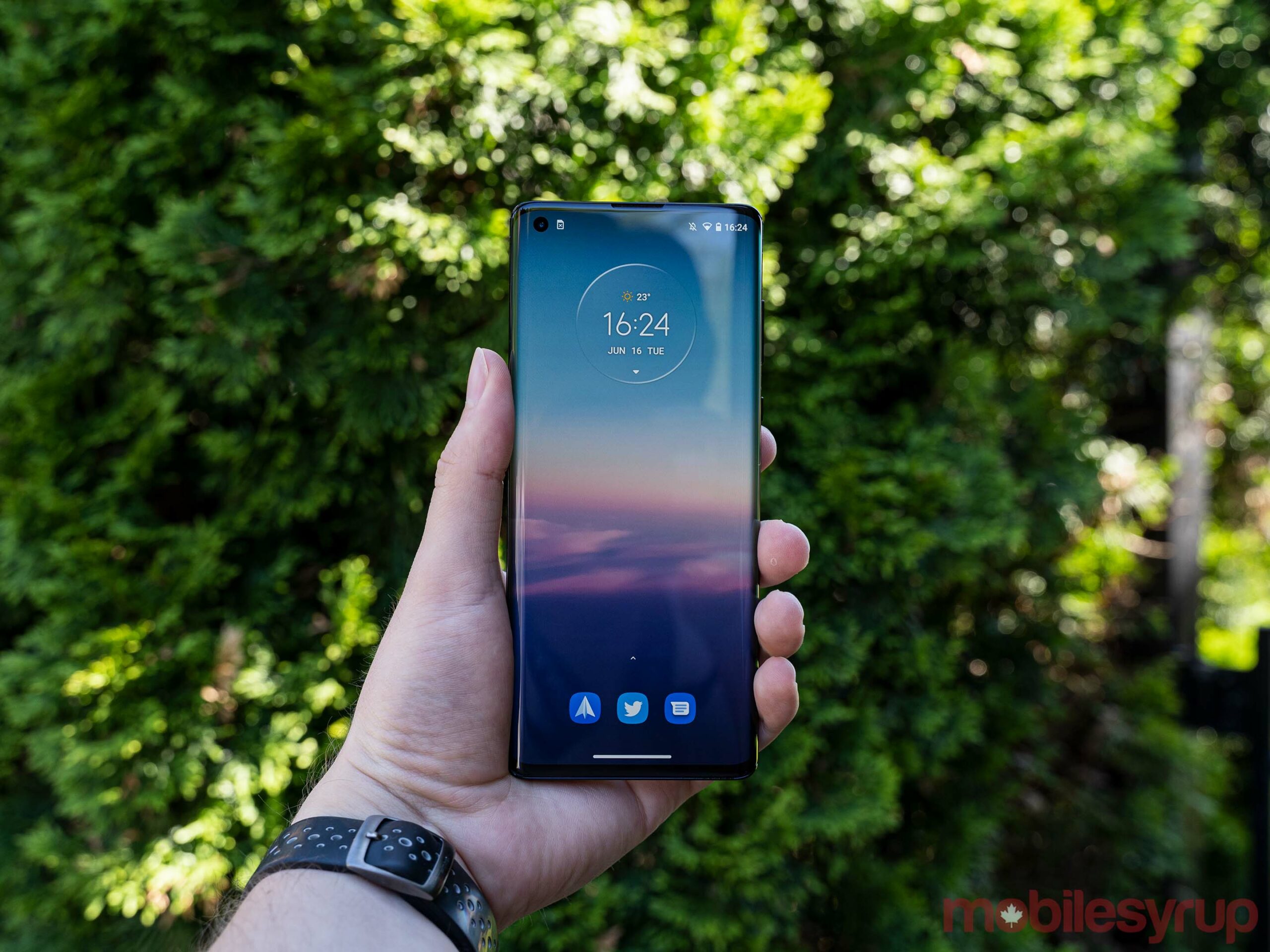
Unfortunately, not everything with software is Pixel-like, for better and worse. Some of the ‘betters’ include a reliable — if slow — in-display fingerprint scanner with several customizable animations and a retooled always-on display that lets you interact with some notifications by pressing its bubble and sliding your finger around the screen. This worked great for Spotify as I could quickly tap-and-slide to play or pause music. It also hooked into the fingerprint scanner well as you could select a message notification and swipe to the fingerprint scanner to unlock the phone and open it. However, if you like to hide sensitive information on the lock screen as I do, you can’t read any messages until you unlock the phone, which makes the feature less helpful.
Perhaps Motorola’s most egregious mistake with the Edge+ was its software update policy. At launch, it promised one major OS upgrade, which would be Android 11. That’s unacceptable on any modern mobile device, let alone a flagship tier smartphone.
Motorola has since backpedalled on that decision and is now promising at least two OS upgrades, but arguably a phone of this price and calibre should offer much more support.
Just won’t die
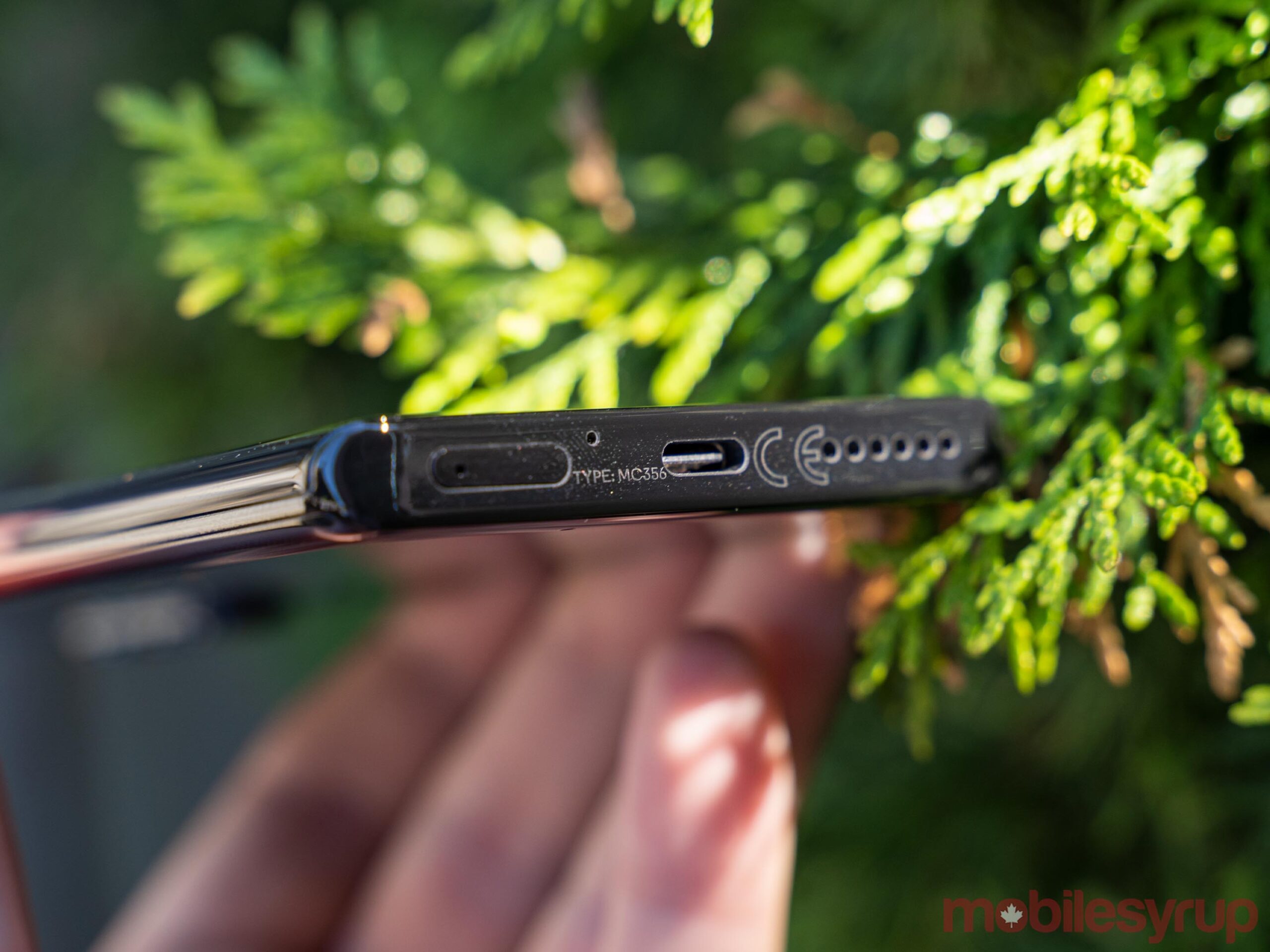
I also found myself impressed by the Motorola Edge+’s battery life. In my testing, I could comfortably stretch the phone into two days, although I’d often have to charge it by the end of the second workday.
Still, that’s much better than I’ve experienced on most other phones. For me, the biggest measure is screen-on time, which better reflects the usage of the phone than just how long it lasts between charges. One the Edge+, I was often able to log over seven hours of screen-on time before needing to charge it again, a far cry from the four hours I got from a Pixel 4 in a best-case scenario.
However, I’m curious to see if this would change at all in a more regular use scenario. Unfortunately because of the ongoing pandemic, I couldn’t test the device in a more regular daily routine including commuting and other events. I’m not sure the battery would fare significantly worse in that situation.
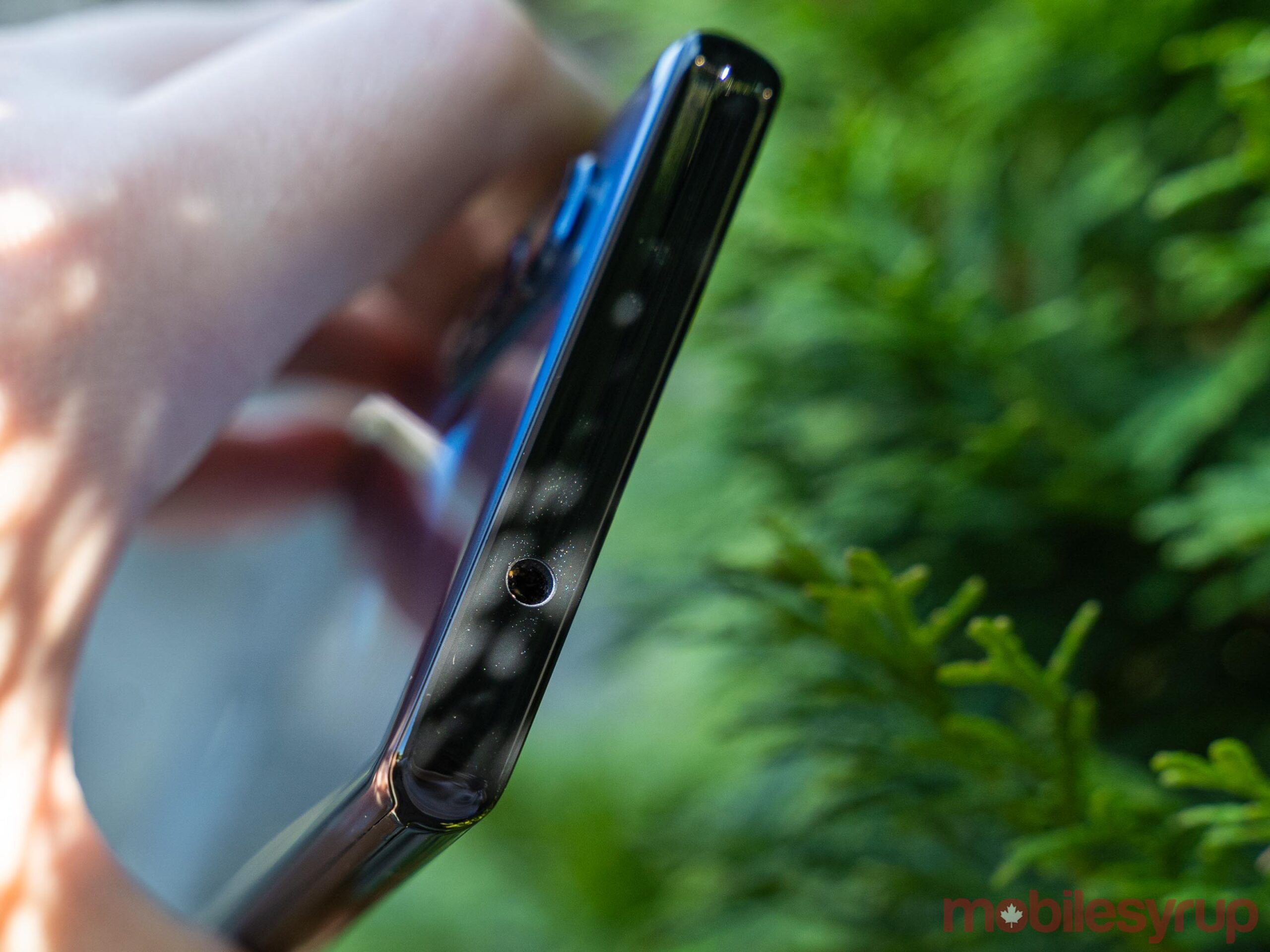
The one downside to the battery life is that the Edge+ doesn’t charge particularly fast. In my testing, the included charging brick increased the charge by about 40 percent in two hours, but slowed down significantly after that. And if you like to use wireless charging, it’s even slower.
This isn’t a huge problem if you always charge it overnight. However, I found I often ended the day with enough juice that it wasn’t worth charging overnight, but then I’d need to charge it during the next day and the timing sometimes wasn’t convenient because it’d take a while.
Middling camera sours the experience
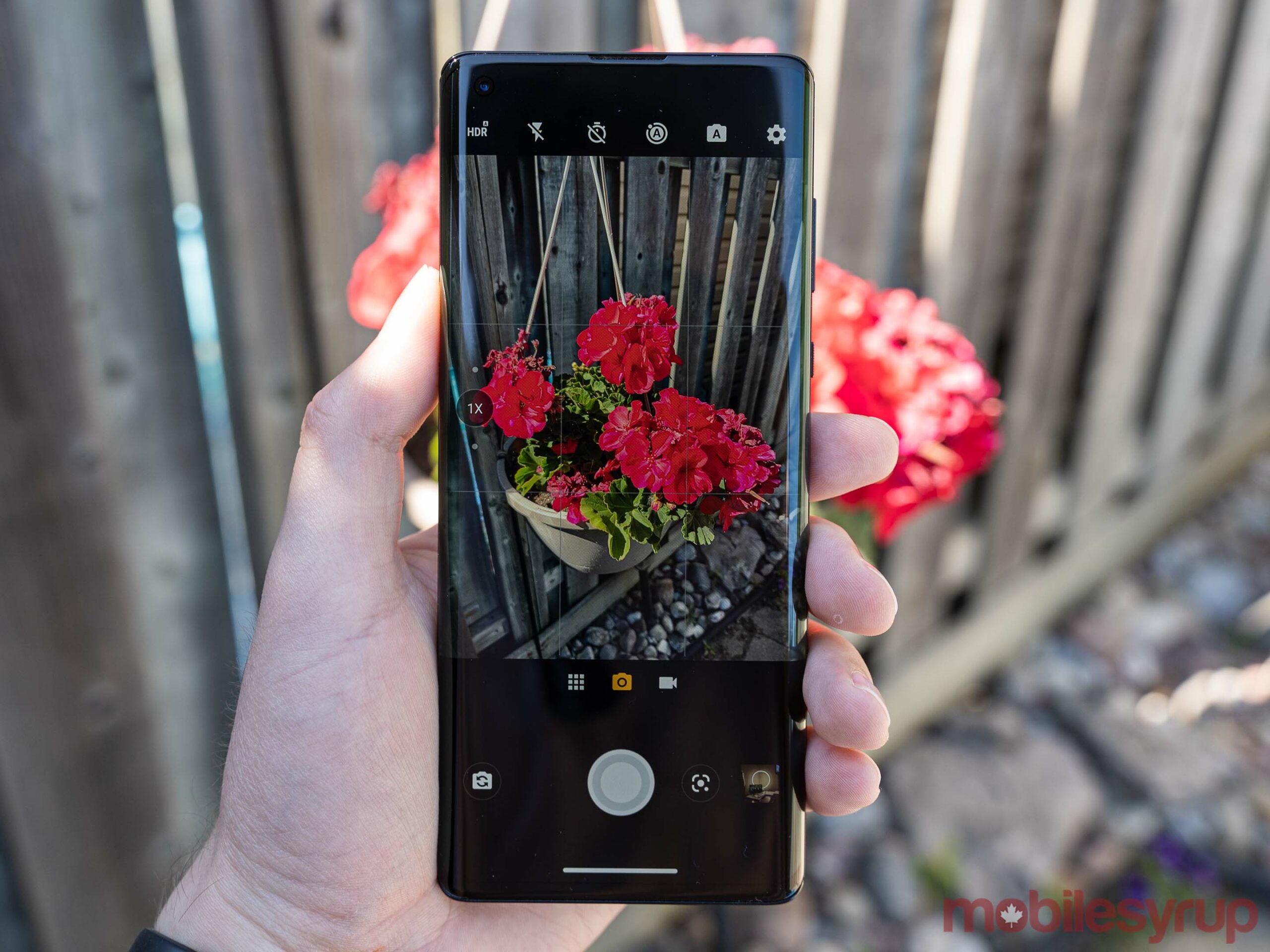
Unfortunately, the camera was perhaps one of the biggest letdowns of the Edge+. Motorola talked a big game about its 108-megapixel main sensor and Quad Pixel technology, which condenses images into 27-megapixel photos.
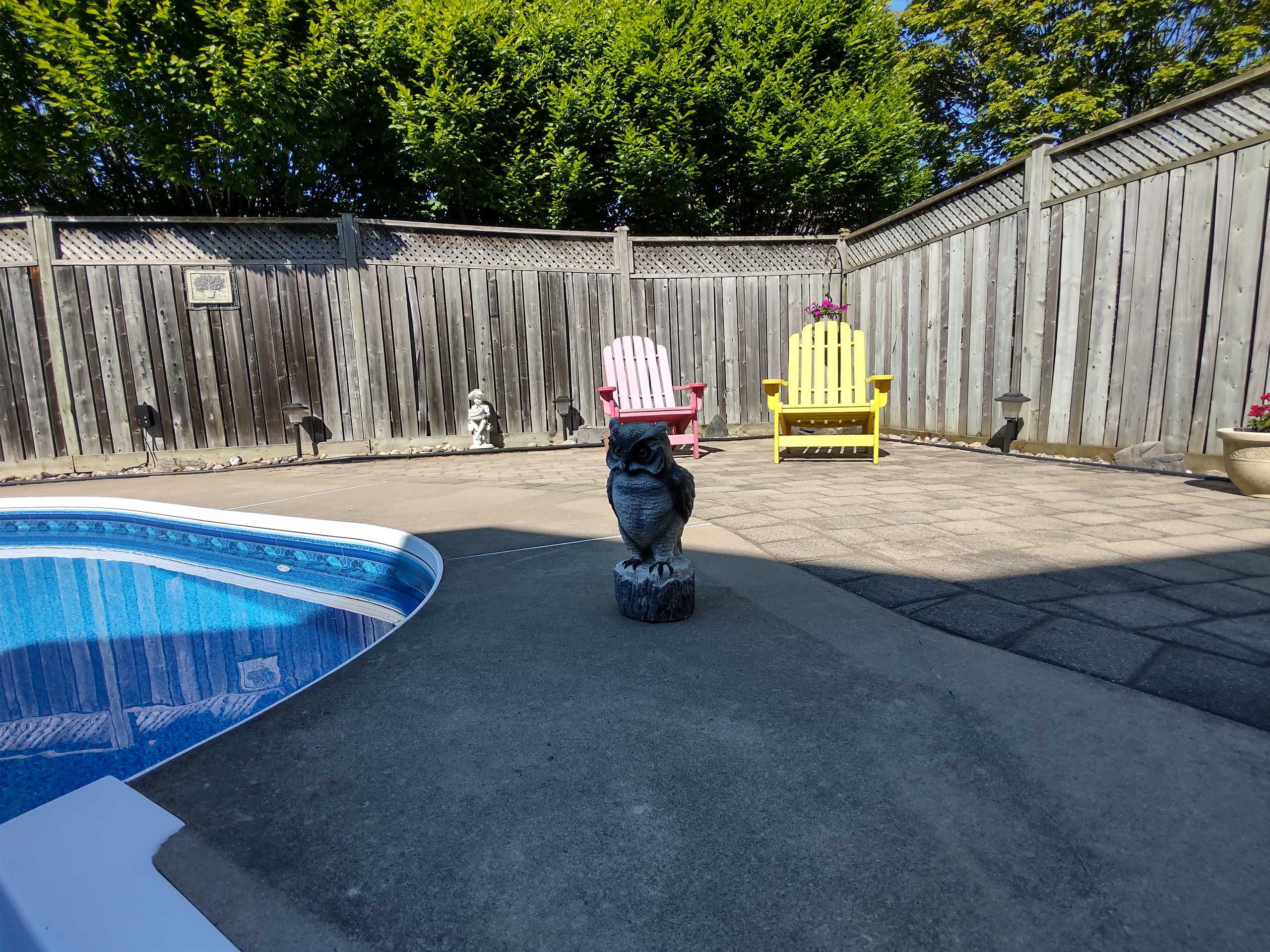
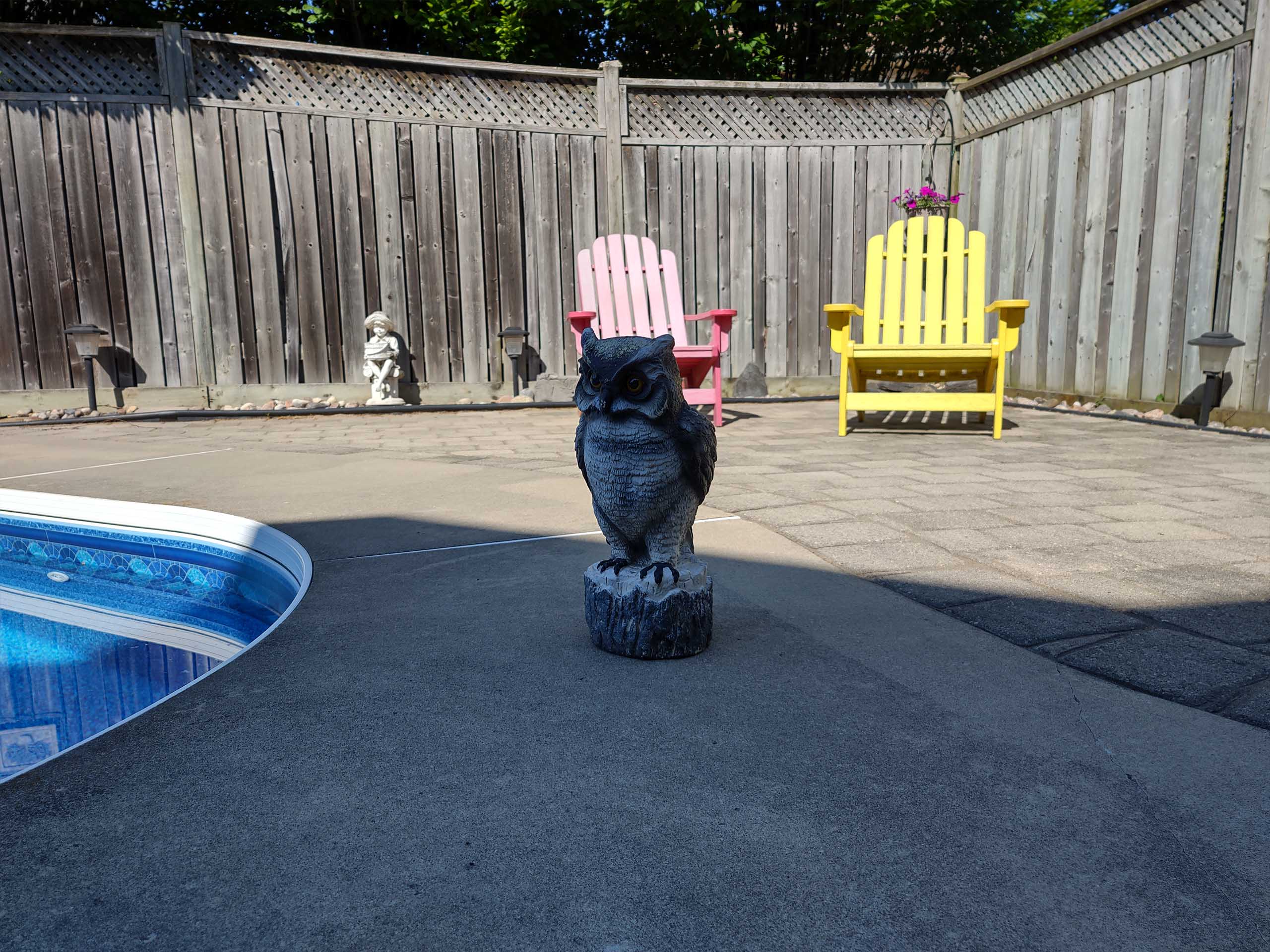
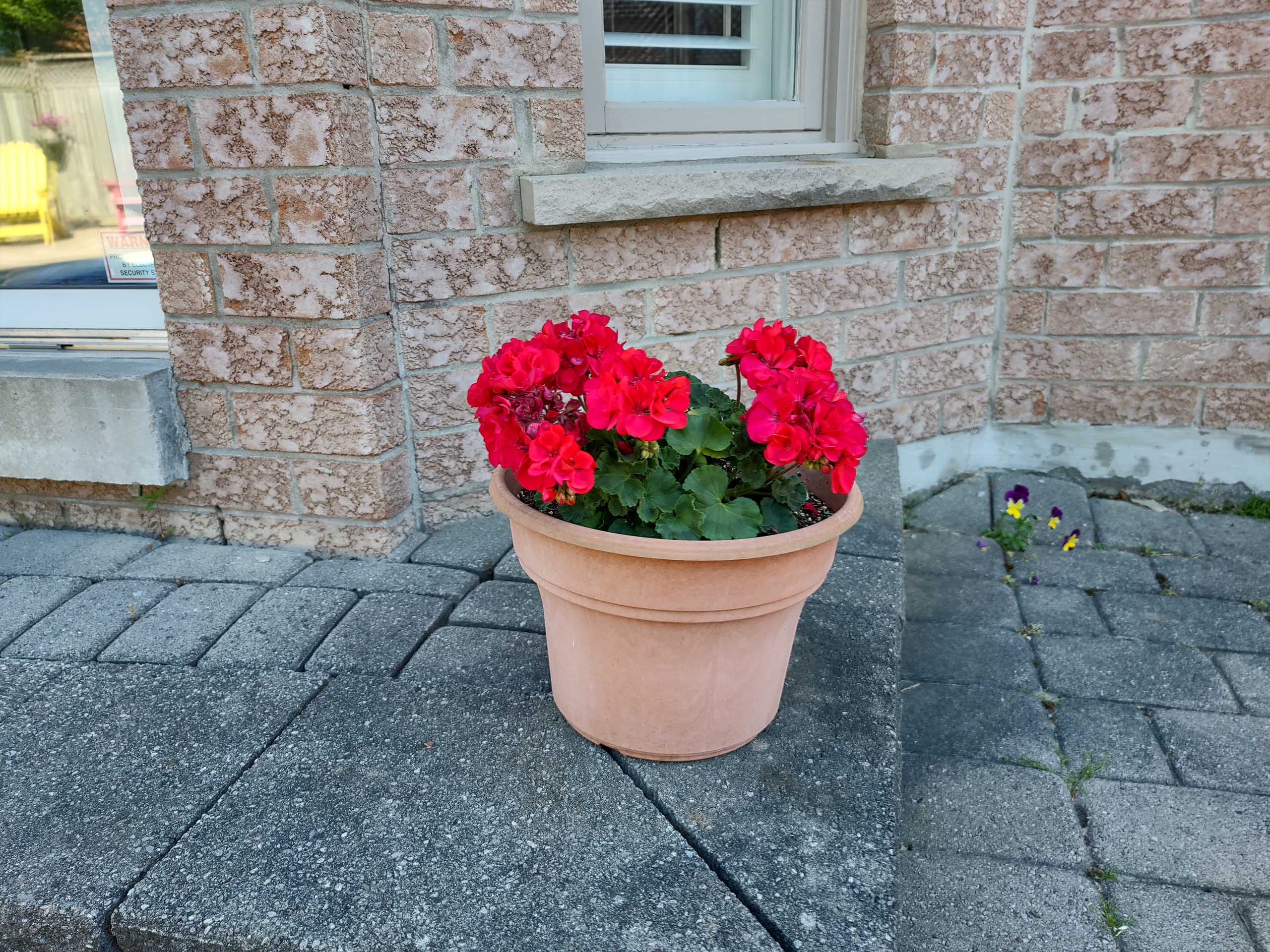
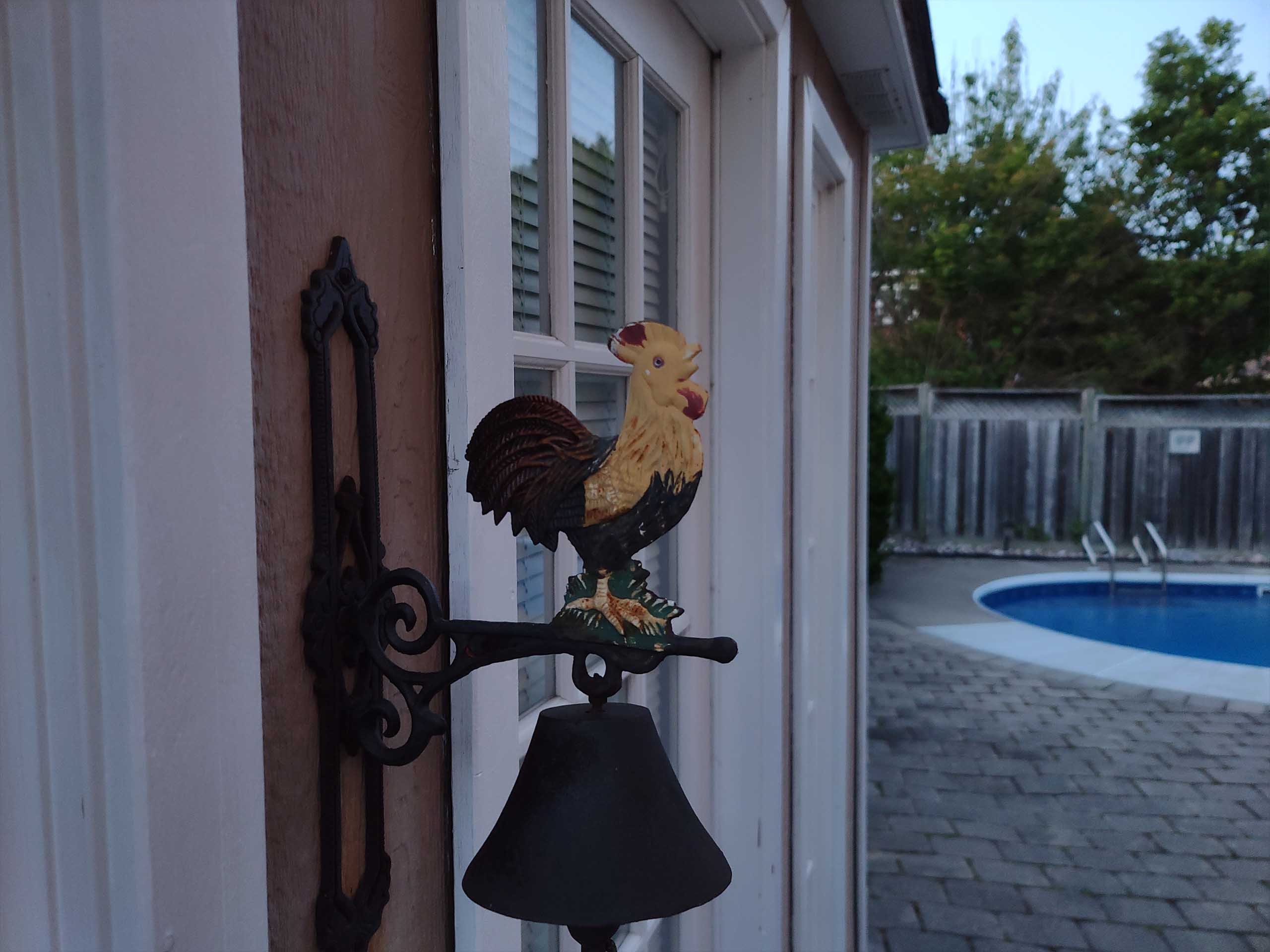
In practice, I found the main sensor was relatively hit-and-miss. It did super well with some shots, producing great colours, detail and range, while other photos it blew out the highlights. The worst problem I encountered was a smudgy or blurry halo-like effect that appeared around objects in some images, especially close-up photos.
The halo looks almost like its a poorly-implemented software bokeh applied to close-up images, but the same feature didn’t show up in actual portrait shots I took with the camera or in the phone’s macro image mode, which lets you take photos up to 2cm away from the object.
Still, the camera wasn’t all bad and actually produced some very nice shots. I felt it captured detail incredibly well and, as long as you kept a distance so the blurry effect didn’t occur, captured sharp pictures.
Additionally, you can take photos in a ‘high-res’ mode that uses the full 108-megapixel sensor, but it takes a while to capture an image this way and, to me at least, didn’t significantly improve the output over the 27-megapixel Quad Pixel standard mode unless you zoomed way in and examined the finer details of each photo.

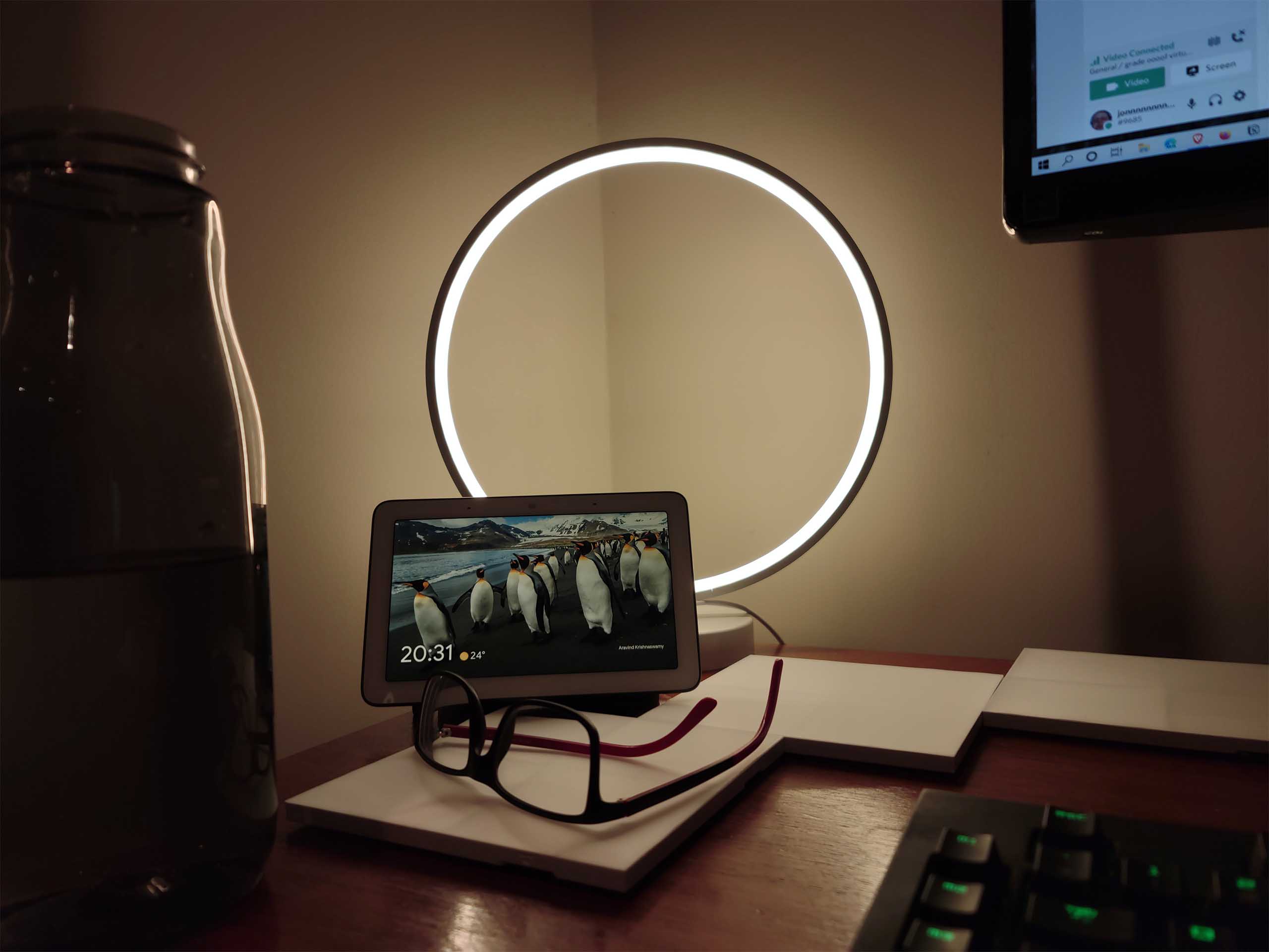
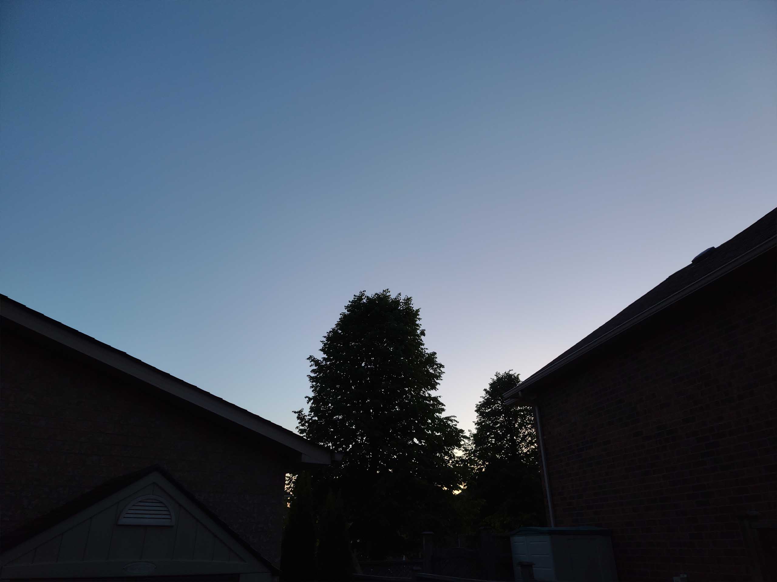
One of the big claims that Motorola made about the Quad Pixel technology in the Edge+ was that it would help with low light photography. However, in practice, it did not handle low light well in my testing. Without using the night mode, the camera performed okay in dim lighting but as it got darker, it really began to struggle. The night mode performed passably but wasn’t able to brighten the scene as much as a Pixel 4. Additionally, I found the Edge+ struggled with focus while using night mode and had to take multiple shots to get it right.
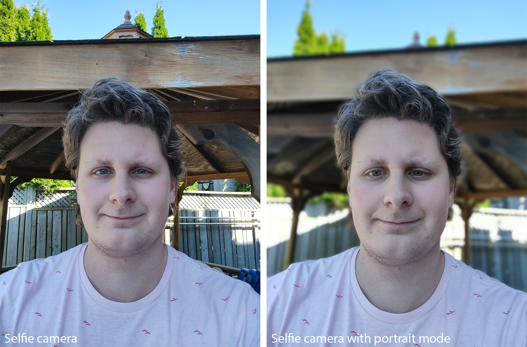
All in all, I was disappointed with the results of the Edge+ camera, but I still had fun with it. The portrait mode worked fine and it handled general, medium-distance photography well. Plus, the zoom, ultra-wide and macro lenses and modes made for some fun experimentation.
If photography is important to you, I think you’d do well to invest in other phones. However, if you’re the type of person that doesn’t much care for your phone’s camera, you likely will find the Edge+ is fine.
If it weren’t for the camera, this would be an easy recommendation
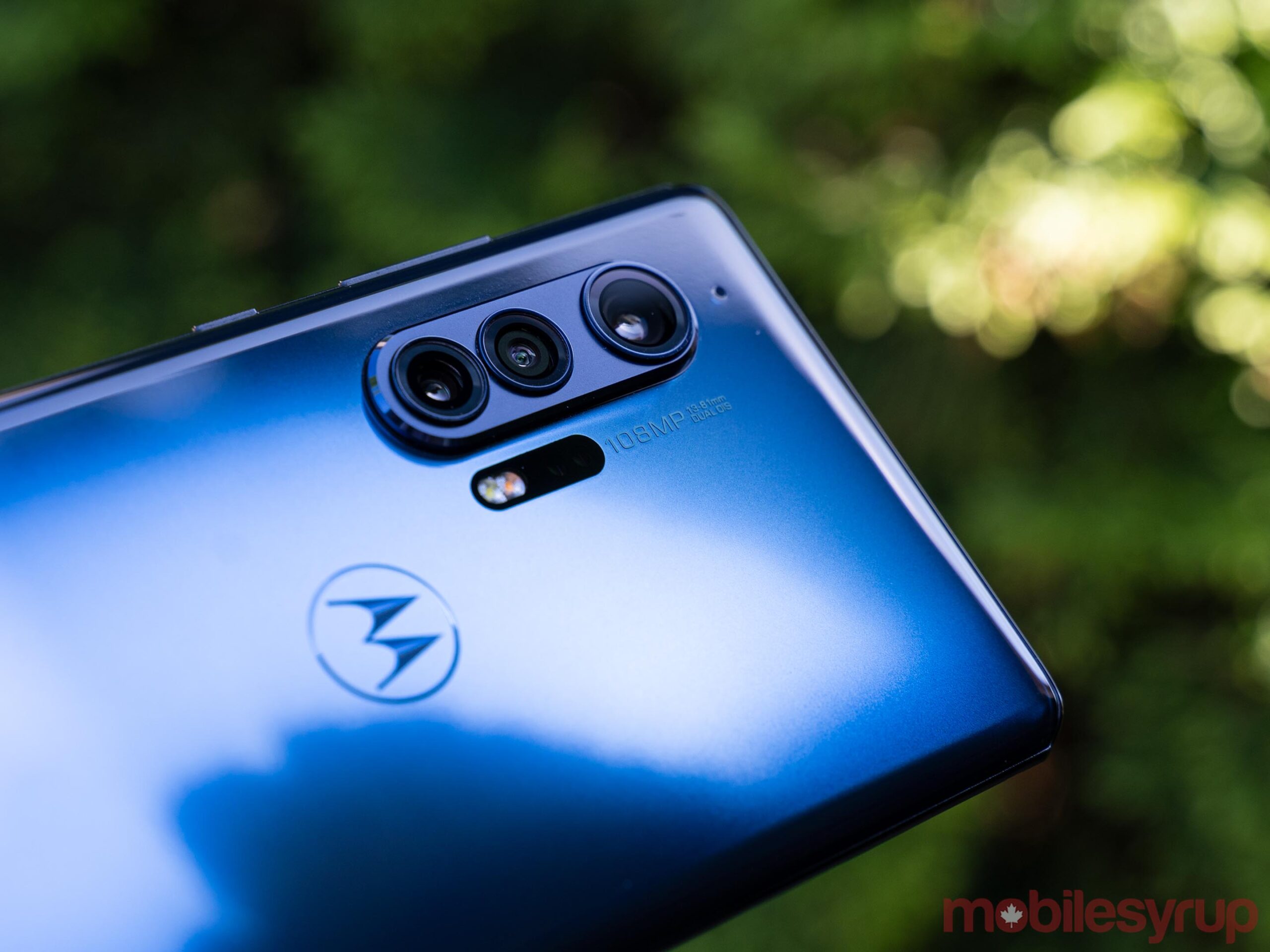
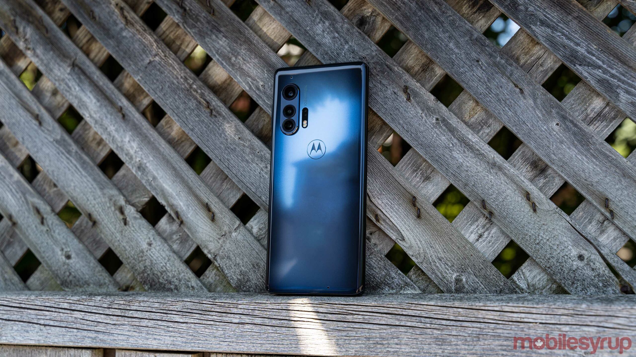
All in all, my experience with the Motorola Edge+ was quite positive. I thoroughly enjoyed using the phone and, for the first time, didn’t hate having a curved display. The Edge+ feels incredible in the hand despite its glossy and slippery back, and it looks great too. I do wish that Motorola brought the ‘Smoky Sangria’ colour to Canada along with the excellent — if a little boring — ‘Thunder Grey.’
However, as much as I enjoyed using the Edge+, some major issues stand between it and a strong recommendation. First and foremost is the software situation. While Motorola has promised another OS upgrade for the phone, I still think that Motorola’s promised software support is lacking, especially compared to others. The current standard appears to be two years of OS upgrades and three years of security updates. That’s acceptably, but I believe manufacturers should be offering much, much more, especially at these prices. That Motorola comes in below that standard is disappointing, especially considering the Pixel-like software experience.
The other significant drawback is the camera performance. As I said above, I had fun with the camera and its different modes, but I found it to be unreliable at best. If you’re willing to take the time to learn the ins and outs of the Edge+ camera system, I’m sure you can produce some stellar shots. However, if you’re looking for a reliable shooter you can take out of your pocket, snap a quick photo, and not have to worry if it turned out, the Motorola Edge+ isn’t for you.
As for the price, it’s hard to tell where the Edge+ actually stands. In part, this is because the Edge+ is only available through carriers in Canada, which often increase the upfront cost of the phone.
At Telus, for example, the Edge+ costs $1,575 upfront -- although you can only purchase it on one of Telus’ device financing options. To compare, the Samsung Galaxy S20 costs $1,570 at Telus (if you buy it from Samsung directly, it costs $1,219.99). The final comparison is the OnePlus 8 Pro, which costs $1,549 for the 12GB model, although you can get it for less if you don’t need that much RAM.
In other words, the cost of the Motorola Edge+ looks to be in-line with other high-end flagship devices. While in many ways the Edge+ justifies that cost, it also doesn’t meet the mark when it comes to camera performance.
Ultimately, I’d recommend the Edge+ to anyone who likes a Pixel-like software experience, but hates Google’s smartphone hardware and doesn’t care much for camera performance. You’ll likely love the Edge+, especially if you can get it on sale. Outside of that niche, the Edge+ may be a difficult device to love.
The Motorola Edge+ is great for anyone who likes a Pixel-like software experience, but hates Google’s smartphone hardware and doesn’t care much for camera performance.
MobileSyrup may earn a commission from purchases made via our links, which helps fund the journalism we provide free on our website. These links do not influence our editorial content. Support us here.


