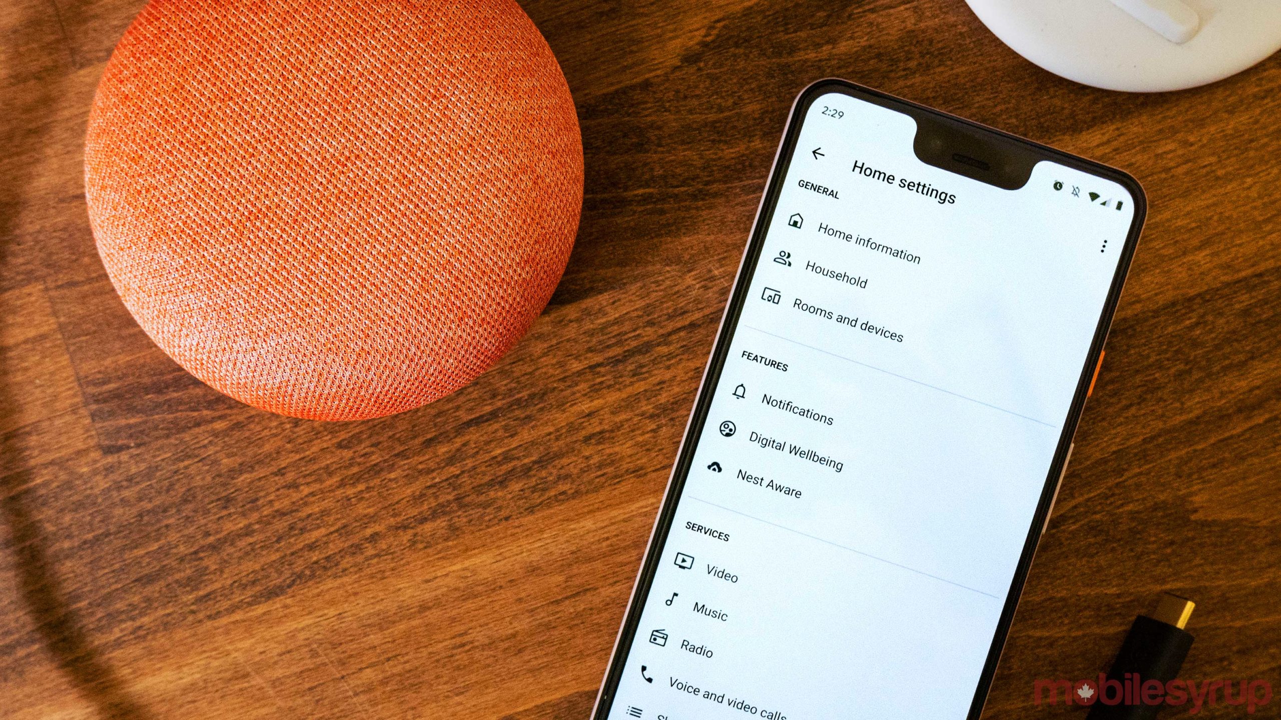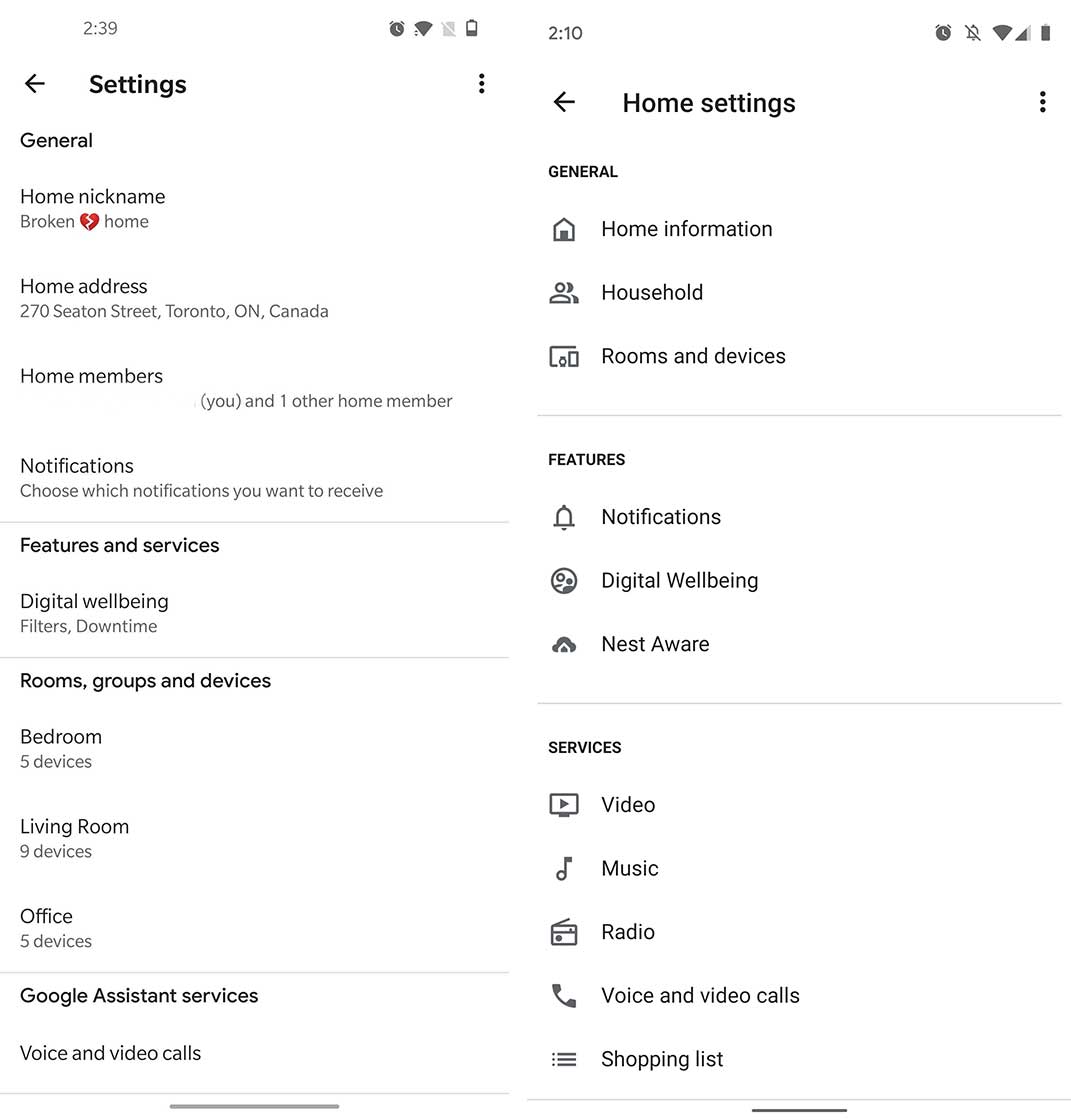
The latest Google Home update helps make the Settings menu easier to understand at a glance.
There isn’t too much to say, but Google is adding more icons to the Settings menu that help make each section more defined. There are also a few more line breaks to help define the categories.
To further define the app, Google condensed all of your devices and ‘Rooms’ into the ‘Rooms and devices’ sub-setting. It would have been nice to see the new iconography carry over once you delve in to tweak the settings, but overall it’s not bad.
The update has been rolling out over the last few days, so most people should have it now. I have it on my Pixel 3XL, and the version of the app is ‘2.22.1.11.’
Even though Google has put in some work to make the app’s settings make more sense, this isn’t the perfect update. Google could still do some work to make the sub-setting titles a little more straight forward. Now all the tech giant needs to do is roll out independent lighting groups to make the app much better.
Via: Android Police
MobileSyrup may earn a commission from purchases made via our links, which helps fund the journalism we provide free on our website. These links do not influence our editorial content. Support us here.


