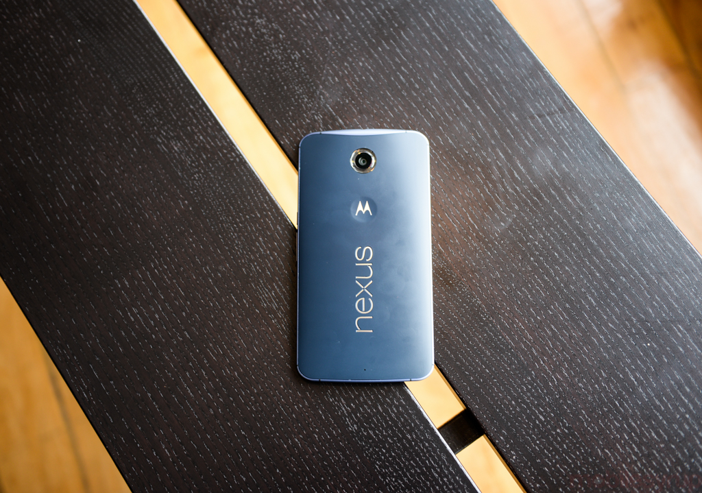
“I’m going to drop this thing for sure,” I thought the first time I held the Nexus 6.
The sixth Nexus is duly termed: it’s a large phone, with a 5.96-inch screen size; it’s also a massive investment, over double the price of last year’s Nexus 5. But being bigger, it also has an opportunity to overcome many of the criticisms levied against former Google-branded devices. Does the Nexus 6 have an excellent camera? Does its battery last the day? Can it reliably match the latest Samsung, LG, Sony or HTC device spec for spec?
This year, it can.
Specs
- Android 5.0 Lollipop
- 5.96-inch 2560×1440 pixel AMOLED display (493ppi), Gorilla Glass 3
- 2.7Ghz quad-core Qualcomm Snapdragon 805 SoC w/ Adreno 420 GPU
- 3GB RAM / 32-64GB internal storage
- 13MP IMX214 sensor, F2.0 lens, Optical Image Stabilization rear camera w/ dual ring flash
- 2MP front-facing camera
- 3840 x 2160 pixel (4K UHD) video capture
- WiFi-ac 2×2 MIMO, Bluetooth 4.1
- 3220mAh internal battery, wireless charging
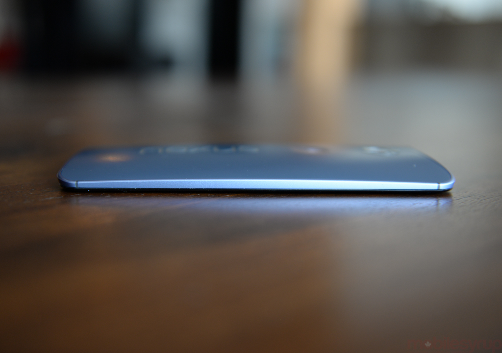
- 159.3 x 83 x 10.1 mm
- 184 grams
- LTE Bands 2, 3, 4, 5, 7, 12, 13, 17, 25, 26, 29, 41
Introduction
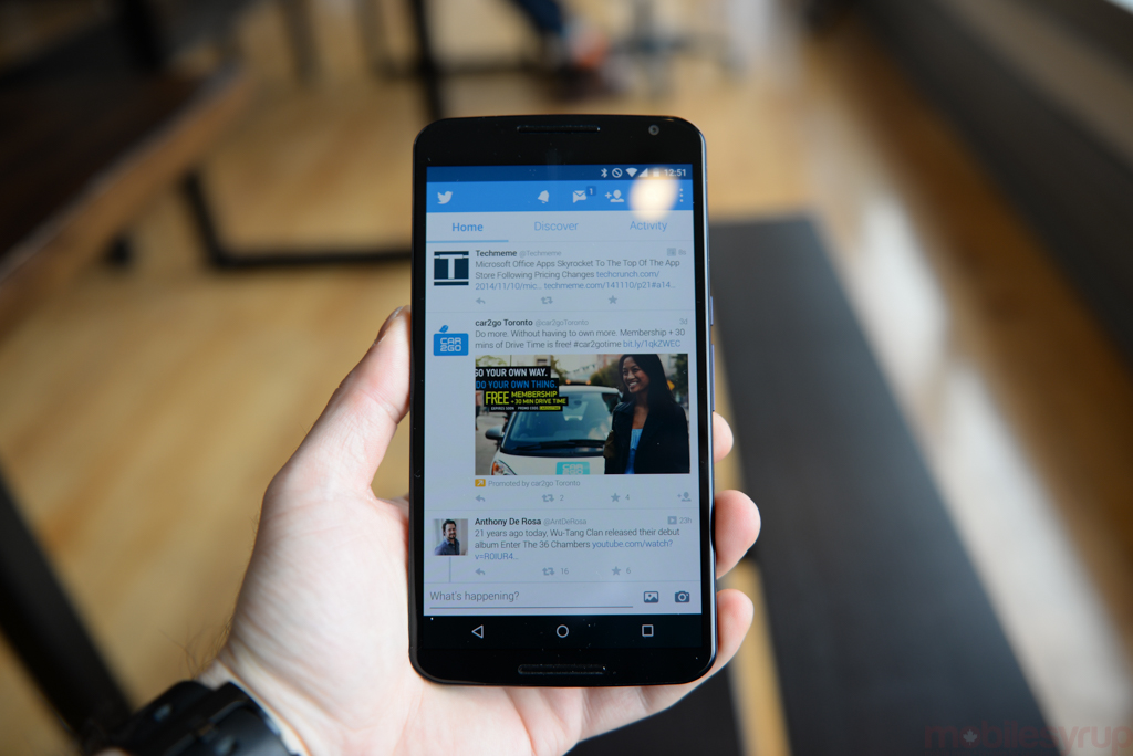
When the Nexus 6 was announced, and its price revealed, I could hear the virtual gasp of sticker shock permeating the internet. People were not used to an ultra-expensive Nexus device, and were outraged that Motorola and Google would betray its cost-conscious user base.
But Google’s VP of Android Engineering, Hiroshi Lockheimer, recently said in an interview that the Nexus program is not really for consumers — it’s for Google employees. “We’re not trying to compete with Samsung or HTC or LG. We’re not competing with ourselves. The main reason we do Nexus is to show [how Android software works], internally, for ourselves, without doing it in the abstract.”
Given such knowledge, is it possible to look at the Nexus 6 as merely an appropriate canvas for Google’s most important Android update yet, Lollipop? Can its price be forgiven knowing that Lollipop’s smoothness was built with next-generation hardware in mind?
“The main reason we do Nexus is to show [how Android software works], internally, for ourselves, without doing it in the abstract.”
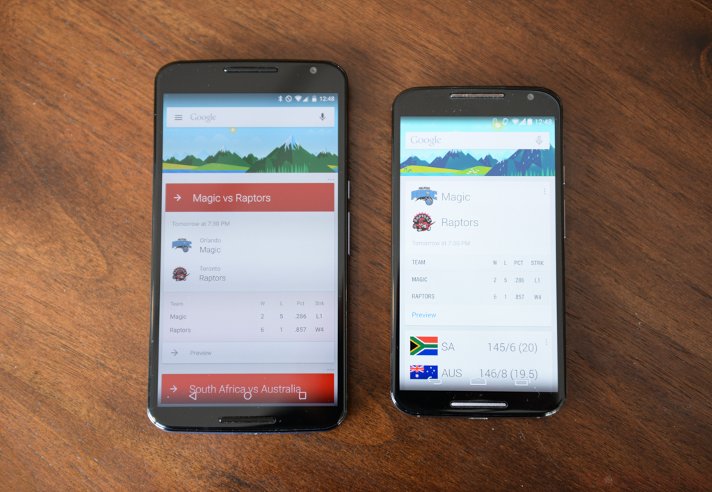
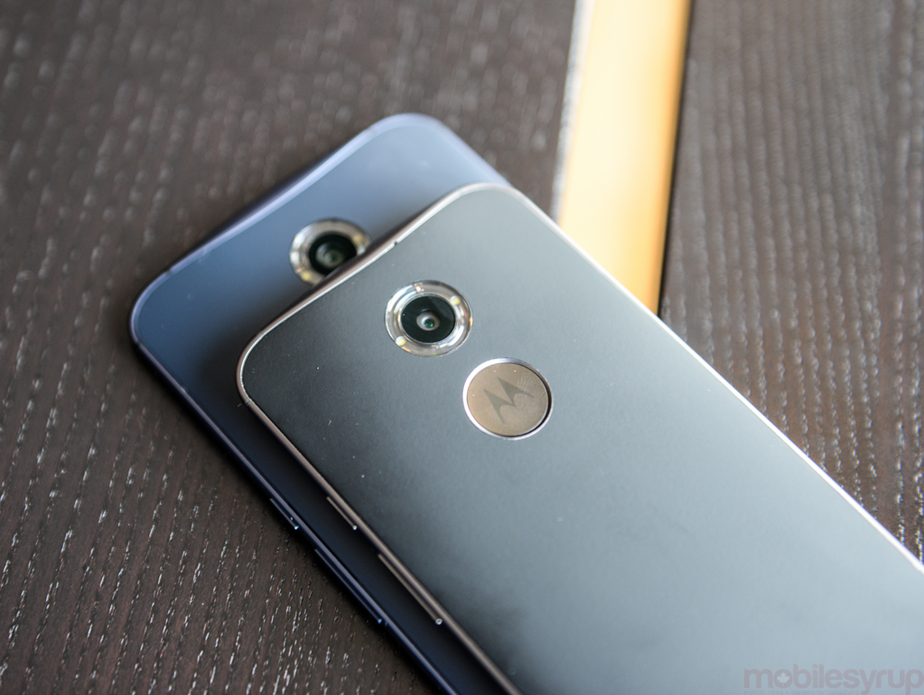
One reason for comfort with Google’s decision to price the Nexus 6 so high is that, at least on the surface, the device is nearly identical to its Moto X counterpart. Surely one can forgive the lower-resolution screen, smaller battery, moderately older CPU, different camera module and other minor differences. Surely.
But that forgiveness does not come so easily. The new Moto X, an excellent smartphone, is hampered by the same deficiencies as last year’s Nexus 5: a poor camera and disappointing battery life. To achieve its zen, the Nexus 6’s whale-like size was almost a self-fulfilling prophecy. As we’ll see, there is reason to celebrate: the Nexus 6 improves upon its predecessor’s camera by a wide margin (though not enough), and battery life is finally no longer a cause for concern.
But the device is still rife with flaws, both on the hardware and software size, and with the speed at which OEMs appear to be rolling out Lollipop updates to its devices — the LG G3, Moto X, even the Galaxy S5 — Nexus’s software advantages won’t last long.
Design & Display
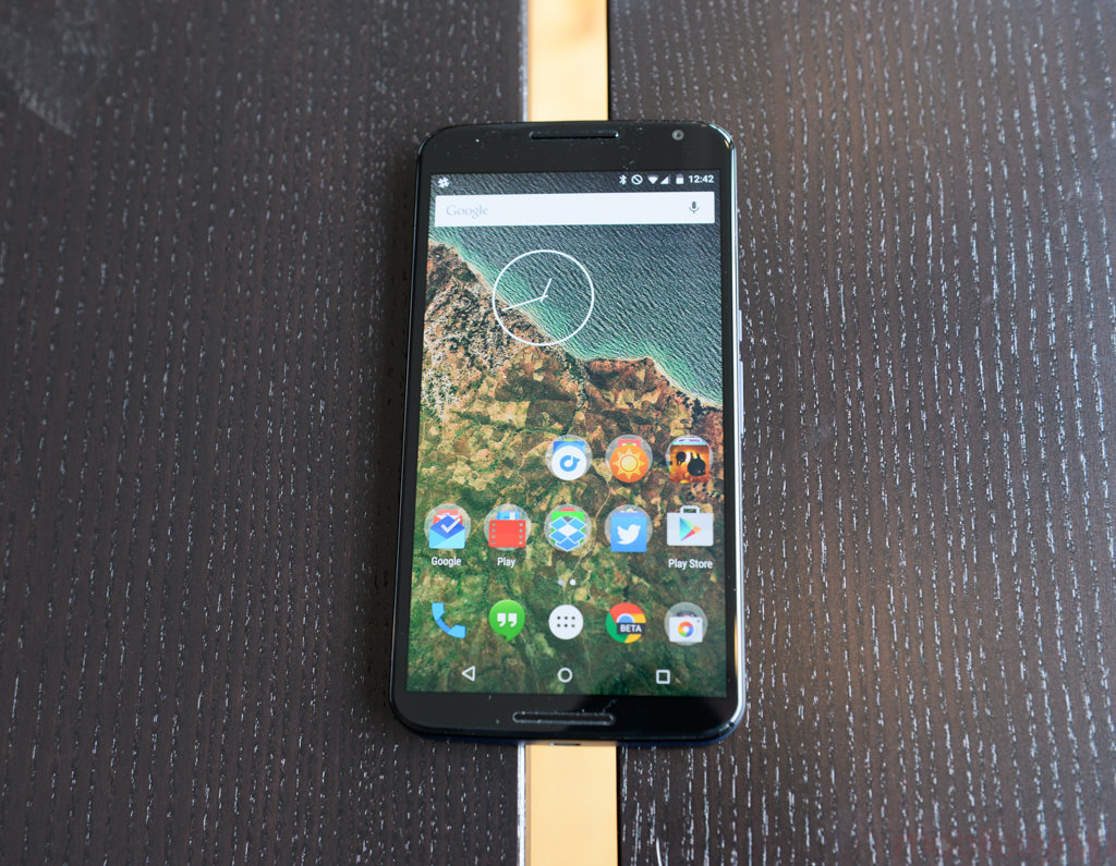
The Nexus goes big. That’s the sentiment one can glean from the device’s spec sheet, starting with the 5.96-inch QHD display. The 2560 x 1440 pixel AMOLED display uses the same technology as the Samsung Galaxy Note 4, but it doesn’t reach the same heights.
At 493 pixels per inch, it’s one of the densest displays on the market, making it nearly impossible to discern individual pixels. But the high-res AMOLED display lacks the accurate colour calibration of Samsung’s superlative Note 4 display, which is clearly a newer part, and misses the maximum brightness of LG’s IPS-based G3.
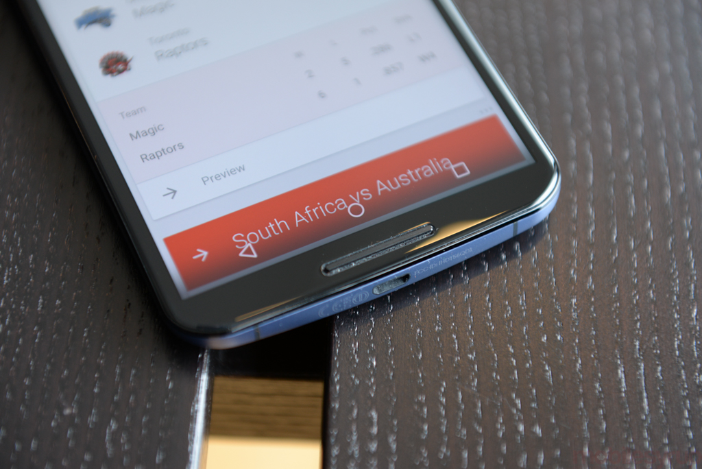
Viewing angles on the Nexus 6, like most of its metrics, fall in the “good, not great” category; I believe that it would have been a better move for Motorola to keep the display at a still-sharp 1920×1080 resolution (396ppi), but the market would have rejected it after Samsung and LG moved to a QHD standard.
The pressure to move to QHD — which, to be clear, is more pixels than your 60-inch TV — is yet another example of the limited differentiation available to Android OEMs. Motorola and Google should have resisted this, just as Apple did with the iPhone 6 Plus.
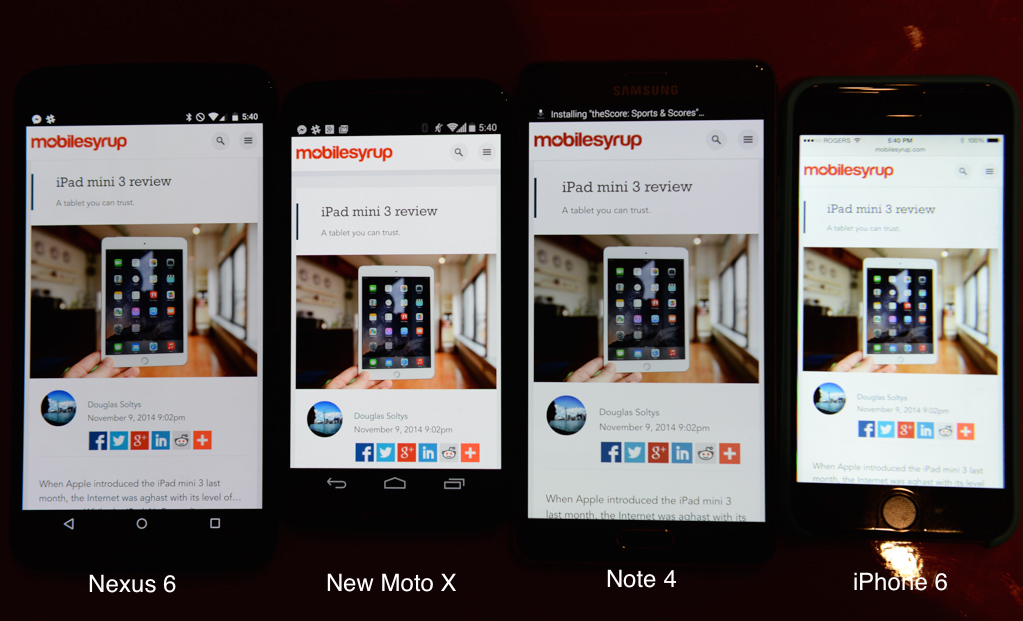
Brightness is the major issue here: unlike many modern LCD displays, the Nexus 6 is practically unusable in sunlight. It also suffers from white balance that appears more yellow than the new Moto X or Galaxy Note 4, and its maximum brightness is lower than both. More troubling is the lack of brightness uniformity, at least on my review unit. Looking on a blank white screen at any brightness level — though at a higher gauge it was less noticeable — the bottom of the unit took on a muddy, reddish hue. I’ve seen this issue before on older AMOLED screens — pre-Note 3 generation — but this was worse than I remember.
In all, it’s not a bad display, but it’s clear there are still numerous sacrifices OEMs make for the sake of screen density, and in this case the drawbacks are too obvious to ignore.
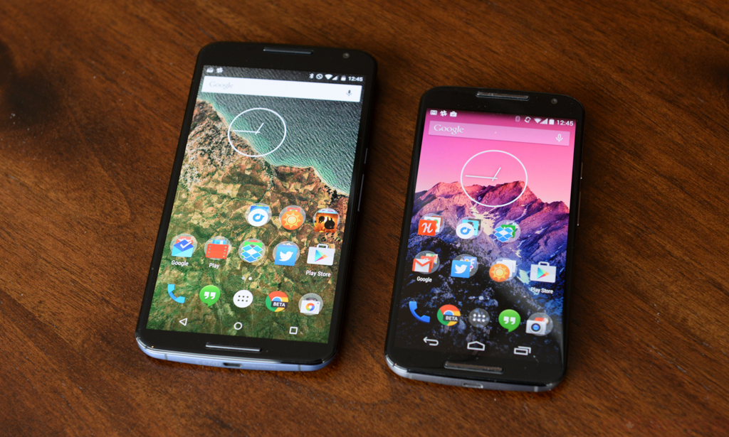
The Nexus 6 is also enormous. It’s taller, wider and thicker than the other recently-released massive smartphone, the iPhone 6 Plus, and significantly more cumbersome than the Galaxy Note 4. It also dwarfs its smaller counterpart, the new Moto X.
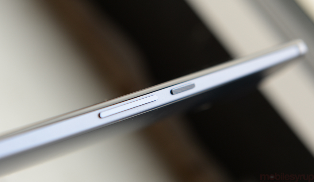
Indeed, as well made as the Nexus 6 is, its biggest drawback is its size. Nearly impossible to use with one hand, it’s almost like Google designed the phone around the name and not the other way around. Big phones are no stranger to store shelves, and the Nexus 6 does not fall under the weight of its nature, but its size necessitates using it very differently than its predecessor.
I have what many would consider regular-sized male hands. Wrapping one around the Nexus 6 as I would any other phone is easy enough, but reaching the opposite size of the screen — the “Q” key, or the redesigned virtual back button, for instance — requires a dextrousness that my single-jointed nature does not allow.
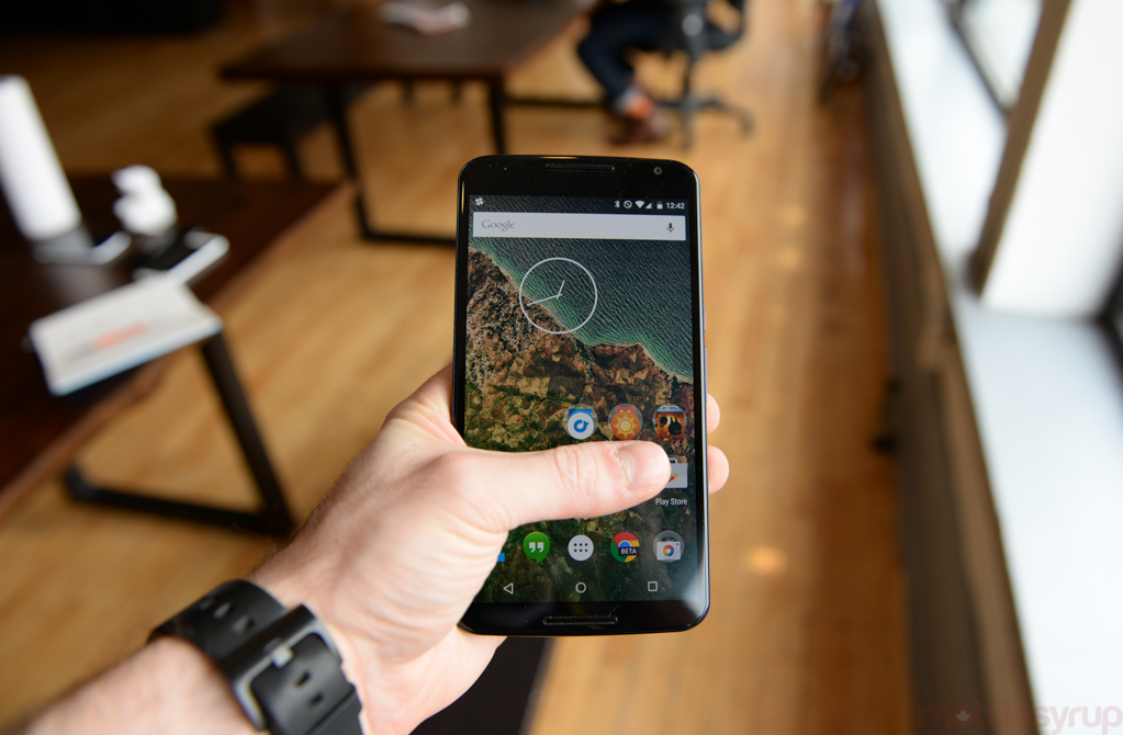
Worse yet is that Google makes no concessions for one-handed use. While I wouldn’t say the Note 4’s one-handed upgrades are elegant, they’re present in a pinch; the Nexus 6, and Lollipop in general, provides no such help. That means you’ll be using the Nexus 6 with two hands in all but the most casual of situations — scrolling through a Facebook feed, for instance — and will have to put down the coffee cup when more interaction is required.
This may not be a bad thing for users in the long run, though. Having to stop what you’re doing to give full attention to your phone may prevent the “head-down-while-walking” scenario I see daily on Toronto’s sidewalks, but there were numerous instances where I almost dropped the Nexus 6 merely shifting it in my palm. By comparison, the 5.2-inch new Moto X finds just the right compromise between screen size and useability.
<BEGIN RANT>
“But I have massive, bear-like paws that could fit a Nexus 6 (and your puny head) in my hands!” you scream. “How dare you rail against a consumer device just for being a size you find distasteful!”
Well, Bear Man, fair enough. But this isn’t a problem that affects just me. As I said, I have normal, non bear-like human hands, and over the past three years, as phones have swelled from an average of 3.5-inches to just above 5, I’ve noticed two parallel trends: a consolidation of activity onto a single device; and a resentment of that fact. It may be nice, on paper, to do everything with one device, but that doesn’t mean you should. The embiggening of the smartphone to phablet size may appeal to people that want a single Device To Rule Them All, but I don’t: I want a mainstream handset with top-notch specs, a great 1080p screen and one-handed usage. I guess what I’m saying is that I want a Sony Xperia Z3 Compact with a 1080p screen and stock Android.
An argument also exists that the Nexus 6 was designed to encourage users to offload some of their workload to the wrist, through a smartwatch. I don’t buy that thesis: Android Wear, as useful as it can be, is not close to being a smartphone replacement, and since I’ve begun using one have not cut down on my handset usage.
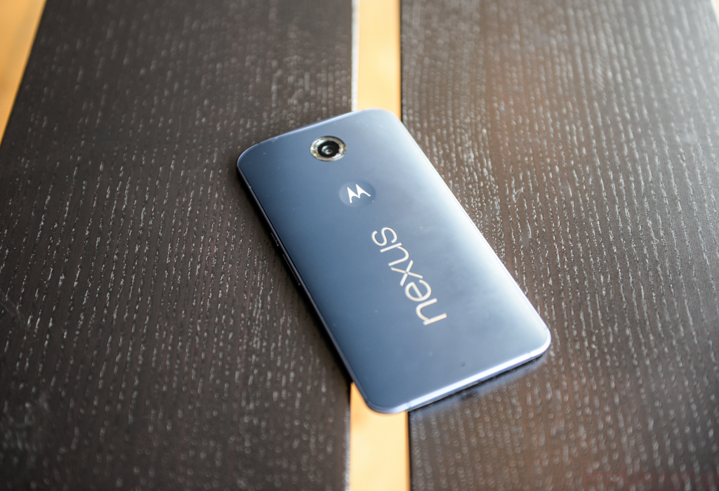
But specifics aside, I find the Nexus 6 to be a curious diversion from what would typically be a Nexus product, and I think I know why: it wasn’t actually meant to be one. ‘Shamu’, as the Nexus 6 was codenamed, was meant to be Motorola’s Android Silver flagship, a carrier-sold device that was to complement the new Moto X without overshadowing it. It would run stock Lollipop, a build not too dissimilar from Motorola’s own Android melange, and act as the iPhone 6 Plus to the Moto X’s iPhone 6. Instead, Android Silver got shelved and the Nexus 6 was born — or carved into a rock.
Either way, the Nexus 6 doesn’t feel like a true Nexus, and that’s troubling.
</END RANT>
Performance & Battery Life
A combination of Android’s new ART runtime and the fastest 32-bit chip on the market, the Snapdragon 805, was sure to produce some exceptional performance, and the Nexus 6 doesn’t let us down.
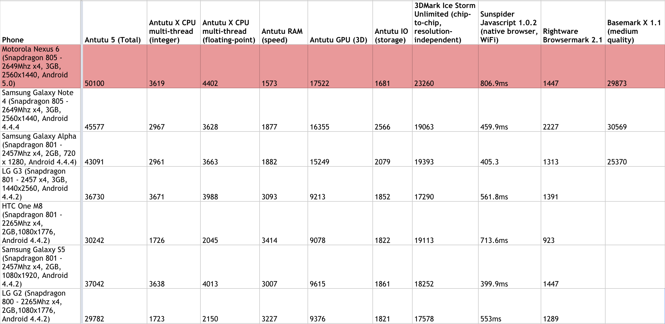
While lingering software bugs hampered smoothness around the operating system, the Nexus 6 proved amenable to anything and everything I threw at it. It flew through synthetic benchmarks, besting the Samsung Galaxy Note in CPU and GPU-based benchmarks, likely a side effect of ART and new OpenGL ES support, which benefit AnTuTu and 3DMark respectively. It couldn’t quite best the 64-bit Tegra K1 inside the Nexus 9, but the scores still proved to be the best I’ve seen from a smartphone.
The benefits of the larger, sharper screen become obvious here, too, when watching video or reading fine renders like magazines and books. The Nexus has always been used as a benchmark for developers to create optimized software experiences, so once again Google looked to a Qualcomm solution — this time, the top-of-the-line Snapdragon SoC — to facilitate such advances.
Subjectively, the Nexus 6 was not noticeably faster than the Nexus 5 running on the latest Lollipop preview, through animations were consistently smoother. The Lollipop build on the Nexus 6 was dated October 24th, and many of the stability issues — and there were plenty — can likely be chalked up to early software. Recall the Nexus 9 was issued an emergency bug fix update the day before it was released; Google will probably do the same with the Nexus 6 shortly after it goes on sale.
One thing to note about Lollipop is that it finally feels like it’s taking advantage of the overachieving hardware on high-end devices. When it’s difficult to subjectively tell the difference in performance between a $700 Galaxy S5 and a $250 Moto G, it’s clear software is no longer keeping pace with hardware. Though I’ve yet to see Android 5.0 running on older hardware, it should restore some of that hierarchy; ensuring a smooth 60fps experience throughout the OS requires horsepower, and the Nexus 6 delivers.
The new runtime has caused a few problems for apps and games that have not been recompiled to support it. Some apps and games either don’t start, or display extensive visual aberrations, but those experiences are uncommon. For the most part, I found software I used daily — Twitter, Evernote, Rdio, Feedly and others — to run modestly faster than they did on the equivalent hardware running KitKat (the Note 4 again), so existing hardware will immediately benefit from the bump to Android 5.0.
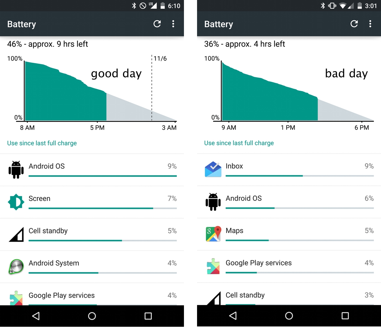
One thing former Nexus smartphone users no longer need to complain about is battery life. With a 3,220mAh battery and an optional Battery Saver mode built into the OS, the Nexus 6 lasted a full work day — 8am-12am — for a straight two weeks. With a cell the same size as the Note 4, I was expecting similar results, and while the Note lasted slightly longer in our video looping tests — 11 hours to the Nexus 6’s 10 hours 30 minutes — I was exceptionally pleased with the results.
Last year, the Nexus 5 shared many similarities with its G2 counterpart, but battery life was not one of them. Both shared the same 2.26Ghz quad-core Snapdragon 800 SoC and 2GB of RAM, but the Nexus had a cell 30% smaller, and battery life scaled. The Nexus 6, a larger device in every respect, delivers battery life on par or better than the majority of current flagships, though the improvements are less about software nuance and more about brute horsepower.
There were some days, like you’ll see above, where a particular app spent too long doing things in the background, but it’s easy enough to isolate such an offender and shut it down.
The new battery section in Lollipop’s settings also projects the cell’s remaining uptime and, when plugged in, notifies you how long it will take to recharge.
Battery Saver mode, a feature built into most phones sold by OEMs like Sony, HTC, LG and Samsung, lowers CPU speed, turns off background data, and limits wireless connectivity in order to eke out, on average, an extra 90 minutes. It works in a pinch, but I never actually needed to use it.
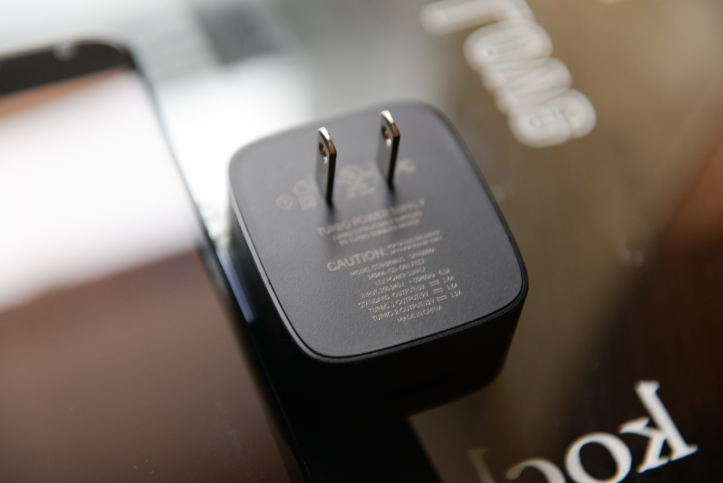
The included Turbo Charger is the Nexus 6’s battery-saving grace, able to boost the device from almost depleted to over 50% in just over an hour. Even if you do get close to killing the battery, the included charger needs just a few minutes to work its magic and get you going again for a few more hours. Combine that with the Battery Saver mode and you’ve got yourself the first Nexus smartphone built to last the day — or two.
Finally, the Nexus 6 supports Qi wireless charging, so spreading a few inexpensive charging plates around the house or office is an easy way to trickle-charge the device on the go. It may not sound like a big deal, but being able to “place” rather than “plug” is a remarkable time-saver.
The Nexus 6’s battery life should actually improve over time, too. Project Volta, a series of new APIs for developers and inherent battery efficiencies built into Lollipop, allows apps to update in the background only when necessary, preventing a single one from getting stuck in what Android enthusiasts call “Wakelock hell” cycles.
Wakelocks are used by developers to prevent an Android phone from sleeping, often to maintain a connection to a network or ensure a task completes before the system wipes it away. While few apps have been updated to take advantage of Volta, over the next few months you’ll be seeing a lot more about its benefits — and potential battery savings.
Software
This is the reason you buy a Nexus: the software. Not the software itself — that’s good, too — but the early access to the newest software. Such is the reality of Android’s carrier-beholden update ecosystem.
The Nexus 6 ships with Android 5.0 Lollipop, Google’s biggest mobile overhaul since Ice Cream Sandwich three years ago. It’s brighter, cleaner, snappier and considerably more user-friendly. It also has an accompanying tenet of design principles, aptly titled Material Design, that developers can use to create modern-looking, responsive apps across multiple screen sizes.
There are numerous upgrades when jumping from Android 4.x to 5.0, but rest assured novices and veterans alike will feel immediately comfortable in this world.

From the first time you turn on the device to seeing the soft monochrome fade of a depressed power button, Google has managed to improve nearly every aspect of its mobile OS.
Let’s start at the beginning: upon booting a new Lollipop device, users are greeted with a brand new streamlined onboarding experience.
Using NFC, it’s now possible to pair two handsets and begin a cloud-based transfer of the older device’s specific settings and apps. Moreover, it’s possible to not install certain apps, so that Samsung-only bloatware can stay put while the real goods transfer over.
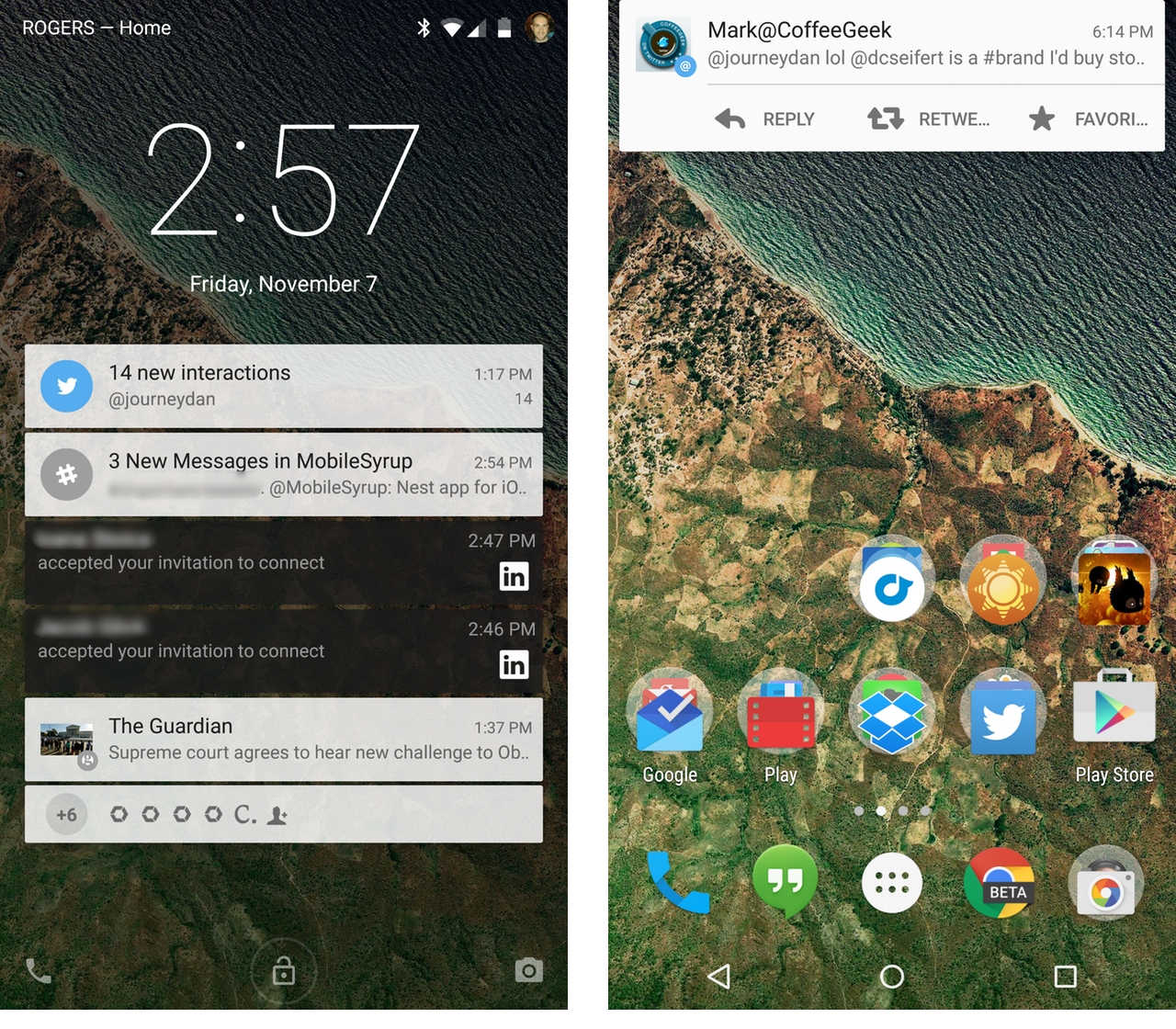 Once on the lock screen, users will see actionable notifications. Swiping one away does what one would expect; double-tapping actions it and heads right into the app. Most look great, conforming to the black-text-on-white-background Lollipop style. Some though, like LinkedIn, remain stubbornly Holo-esque and will need to be updated.
Developers can differentiate between content viewable on the lock screen and in the redesigned notification shade itself, so the contents of a text message can be hidden on the former while visible on the latter.
After briefly using the Nexus 6, it became quickly apparent how invaluable lock screen notifications really are. Third-party solutions have been trying to solve this puzzle on Android for years, but the elegance and quick synchronization of Lollipop’s interpretation feels well-considered.
Indeed, while notifications have been excellent on Android for a long time, Lollipop gives the user a macro level of control no other mobile OS can. For example, lockscreen notifications can be disabled on a per-app basis, or universally, based on privacy settings. There are also new lockscreen shortcuts for the camera and redesigned phone app.
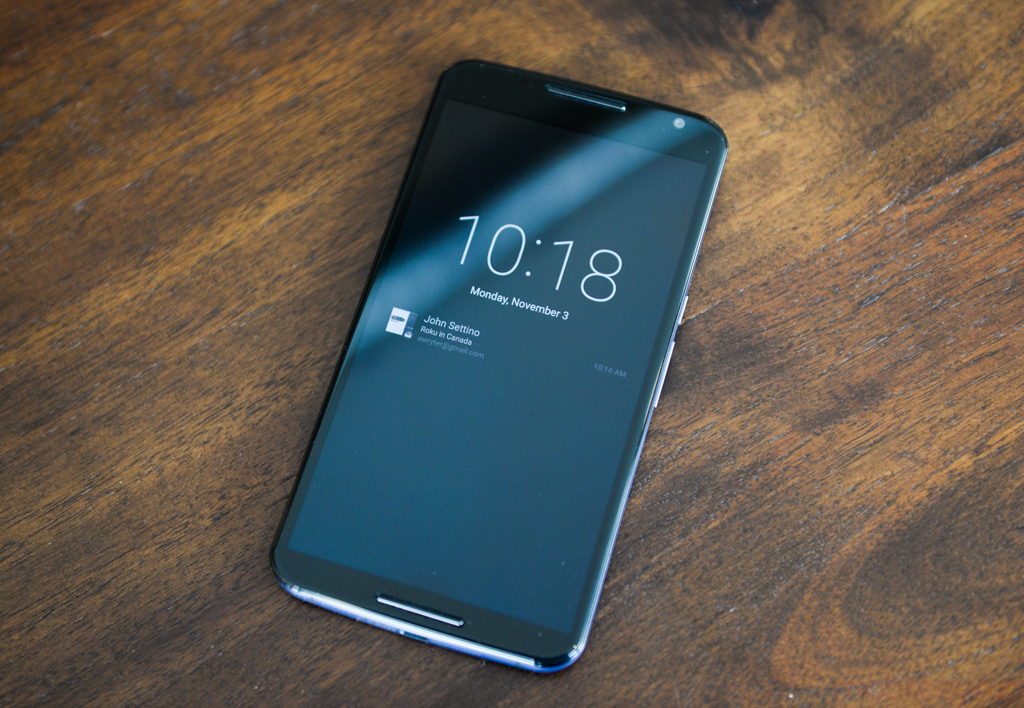
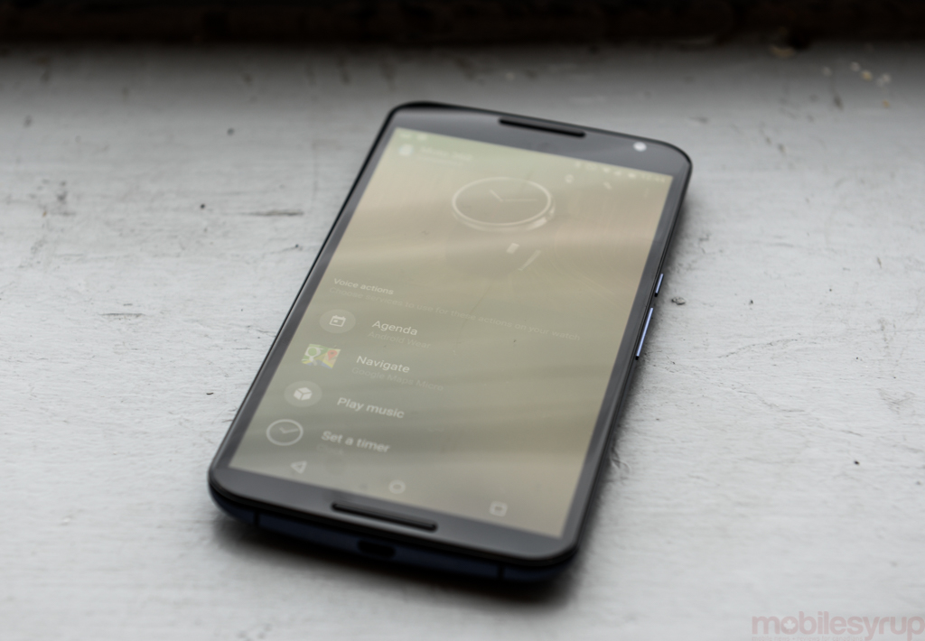
Adding to that convenience is something called Ambient Mode, a feature built into Android 5.0 itself and first enabled on the Nexus 6. Like Motorola’s Moto Display, it takes advantage of the Nexus 6’s low-power AMOLED screen to pulse awaiting notifications. When picked up from a table or removed from a pocket, the screen glows a soft monochrome, teasing the content within. Tapping the screen wakes it up, ready to work.
Though it conveys more information than Moto Display, it’s neither as convenient nor as useful, since it’s not possible to preview the notification without turning on the screen. The Nexus 6 also lacks the new Moto X’s IR sensors, so the phone must be physically moved for the screen to pulse.
Ambient Display is a Lollipop-wide feature, so all devices with compatible hardware can use it. Considering Moto Display was one of the core reasons I fell for the Moto X, seeing similar functionality on more devices can only be a boon to the Android ecosystem.
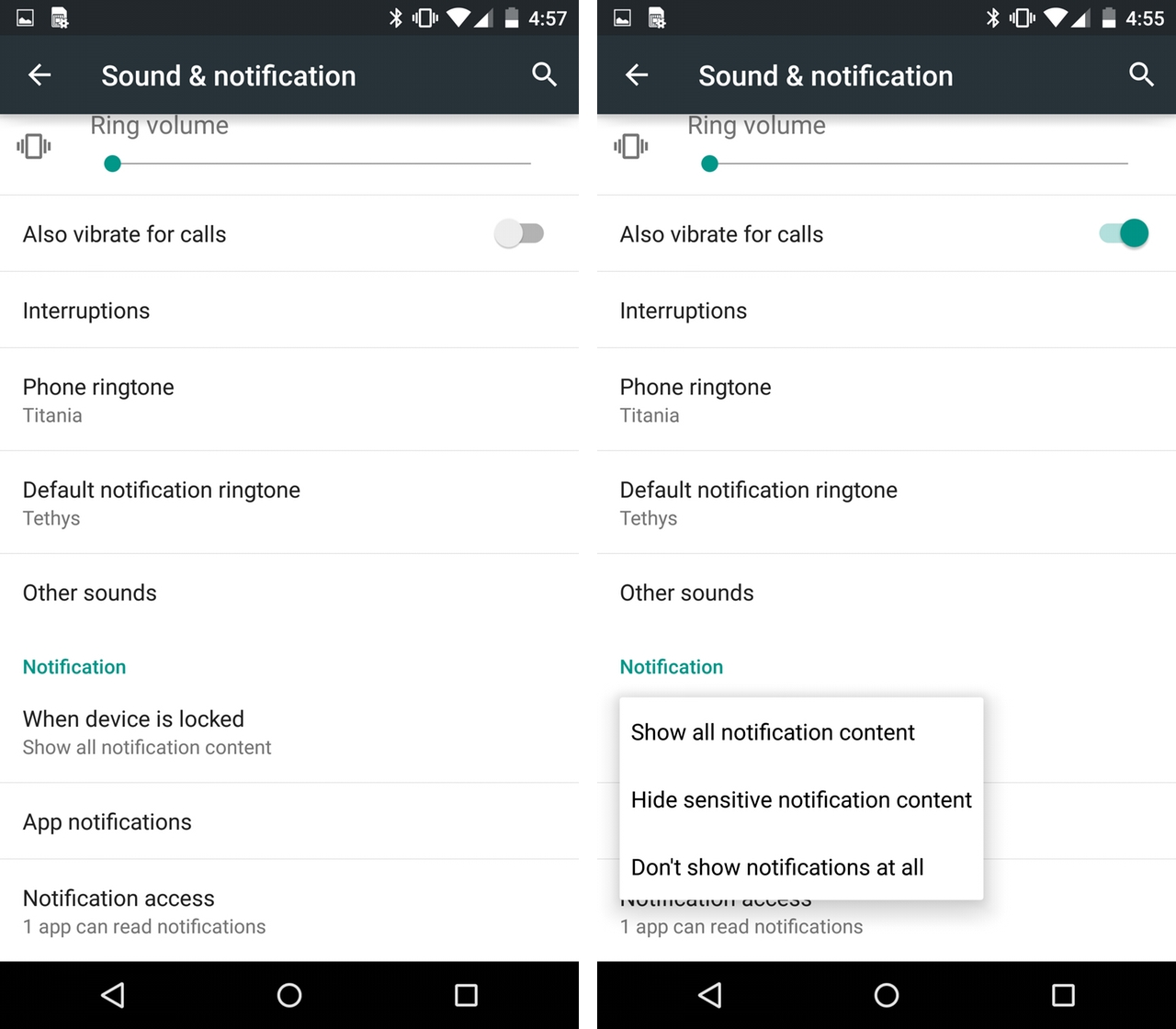
A new Priority mode, similar to Samsung’s Blocking Mode or Apple’s Do Not Disturb, blocks all incoming notifications except those the user explicitly allows. By default, events and reminders are whitelisted (alarms, for example), as well as calls from favourite contacts, and downtime can be scheduled.
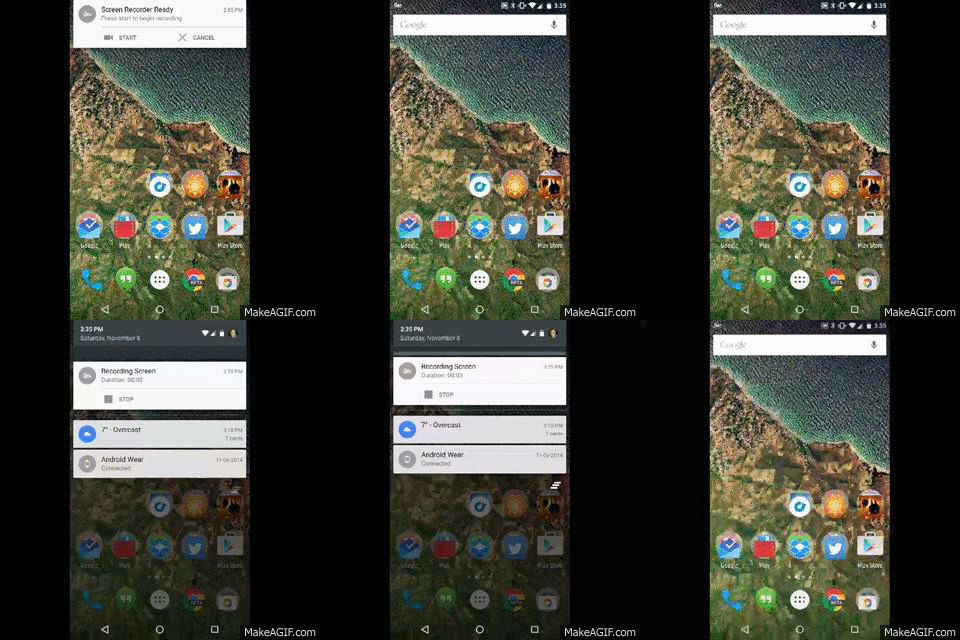
The notification shade has also been redesigned, with a new white-and-grey colour scheme and the ability to hold down on a particular notification to manage that app’s behaviour. Swiping further on the drop-down displays the new Quick Settings menu, with one-touch controls for WiFi, Bluetooth, Airplane Mode, Rotation, Flashlight, Location and real-time Casting (screen mirroring). It would be nice to be able to control what shows up here, like on a Samsung device, but the new shortcut is both attractive and functional.
Protip: Double-tapping on the top menu bar drops you into the notification shade. Triple-tapping quickly opens the Quick Settings panel.
Casting is akin to Apple’s AirPlay Mirroring, allowing users to perform real-time recreations of their screens to a Chromecast or Android TV-connected television. Unlike Miracast, which has always proven unreliable, I was able to Cast high-definition video with no distortion or buffering issues. This is a great feature for apps that don’t have explicit Cast streaming support, and I ended up using it to display vacation photos to a room of people.
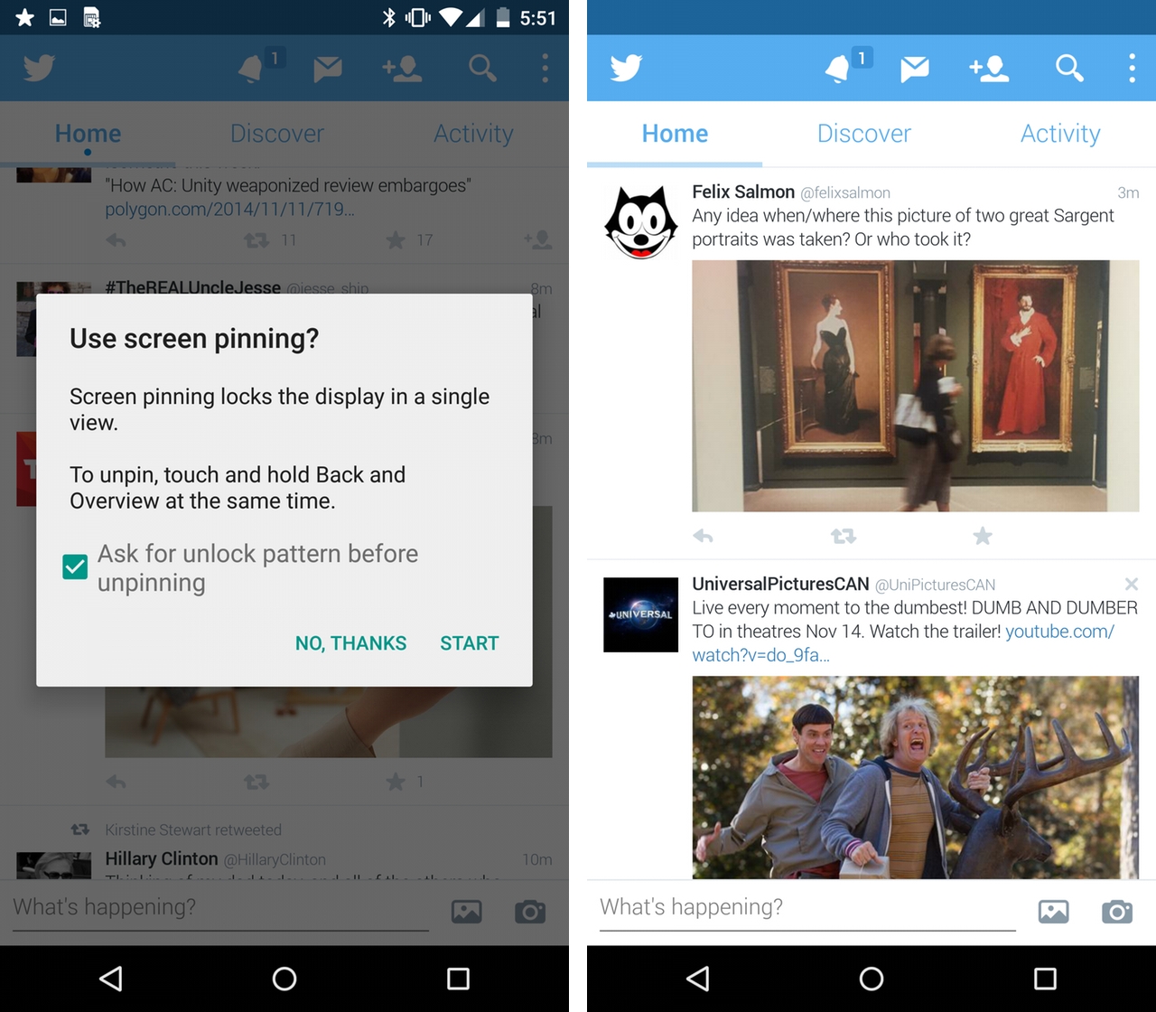
There is more newness still. Screen Pinning rides alongside Guest Mode to offer security when sharing your phone with others. The former allows you to “pin” an app to the foreground, disabling the back and home buttons until a combination of keys has been pressed.
Also known as Demo Mode, Screen Pinning can require a security code to disable, ensuring that giving your kid Netflix won’t accidentally cost you an errant text to your boss. Guest Mode does double duty, isolating one’s home screen and app settings.
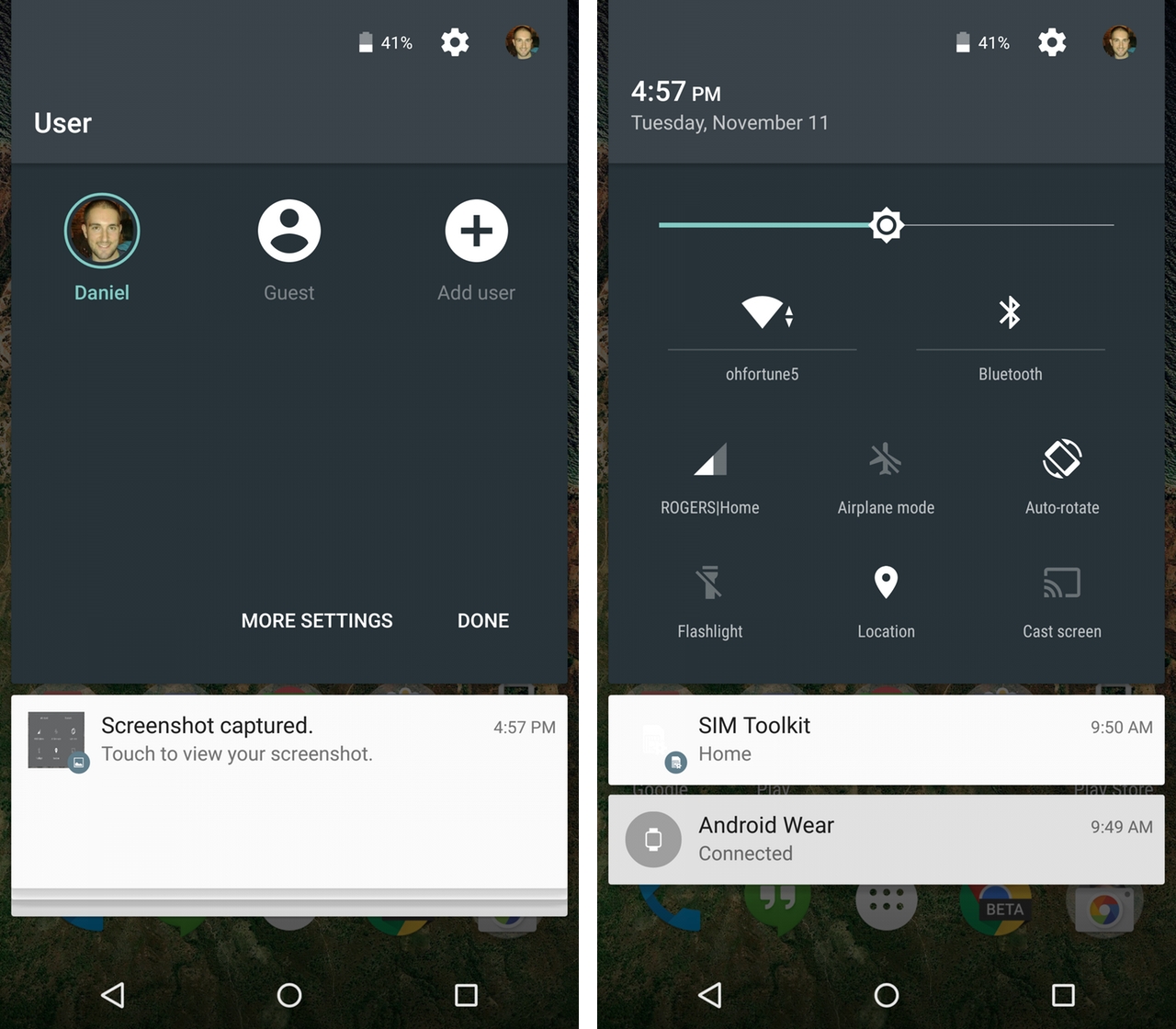
User accounts have been present on Android for some time, but this is the first time we’ve seen it on a smartphone, and the one-tap experience is seamless.
The Nexus 6 is big enough to share between family members as if it were a small tablet, but I don’t see it being used for that purpose very much; phones are incredibly personal objects, their owners typically terrified of sacrificing even the most minute bit of privacy. Instead, Guest Mode will be used when someone asks, “Can I use your phone?” and because it’s so simple to enable, the inconvenience factor is eliminated.
Possibly more interesting is the ability to quickly set up a new account on a friend’s phone. If, say, your phone is stolen and you need to dial a number stored in the cloud, it’s possible to access it on any Lollipop device, syncing just your contacts.
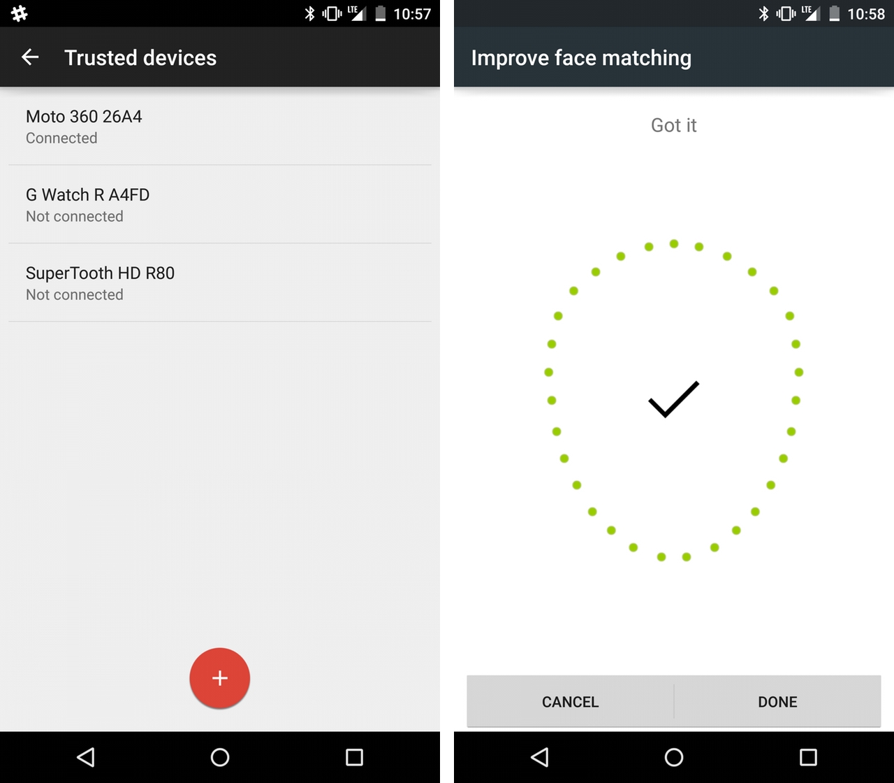
Security is another big aspect of Android 5.0. Not only do new devices come with encryption already enabled to prevent data theft, there’s a new feature called Smart Lock that uses nearby Bluetooth devices — smartwatches, a car stereo, portable speakers — and NFC tags to temporarily override lockscreen security.
A feature that debuted in earnest on the Moto X, its presence on stock Android means it, like all of these improvements, is ostensibly available to OEMs. Whether they will choose to continue integrating their own often-clunkier solutions remains to be seen — some typically follow Google’s example, many others don’t.
Trusted Face, a bad name for a great feature, improves upon Face Unlock, which debuted on Jelly Bean. Instead of having to wait for the lockscreen to find and detect your visage, Trusted Face begins looking for defining features the moment the power button is pressed. If it detects you are you, it will show a small “unlock” icon at the bottom of the screen and temporarily disable security.
Trusted Face and Trusted Devices work together to ensure that unlocking a phone is easy, but breaking into one is hard.

Though we’ve already discussed many of Google’s Material Design app updates, from Gmail to Calendar to Maps to Play Music, Books and Newsstand, it’s worth mentioning once more just how great they look. There are app-to-app design inconsistencies, but on the whole they’re big improvements over their Holo predecessors. They also scale well on screens large and small, and we’ll begin seeing those changes on Android Wear smartwatches in the months to come.
The Nexus 6 comes with an unexpected bit of Material Design in the form of a new Messenger app, a replacement for a replacement. Recall that a year ago, Hangouts was updated to include SMS support, which for many users became their default text message app. Google quickly heard that the integration was half-baked and confusing, and promised to replace its aging Messages app with something both simple and modern.
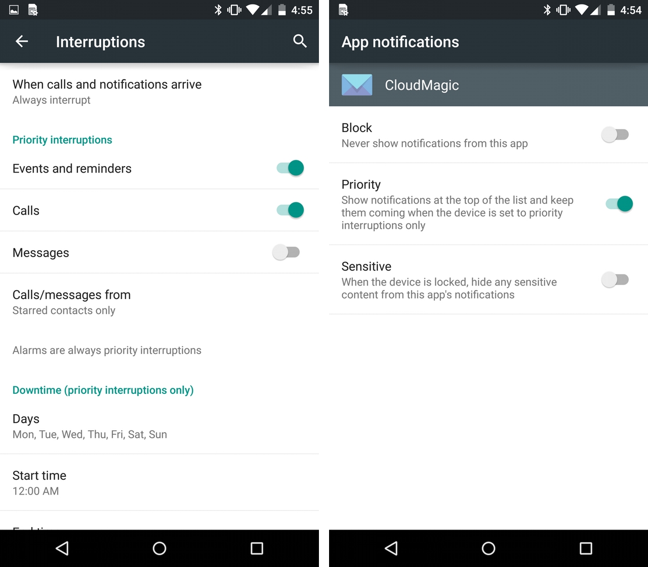
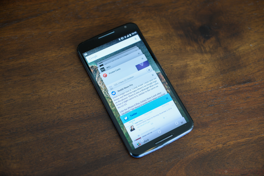
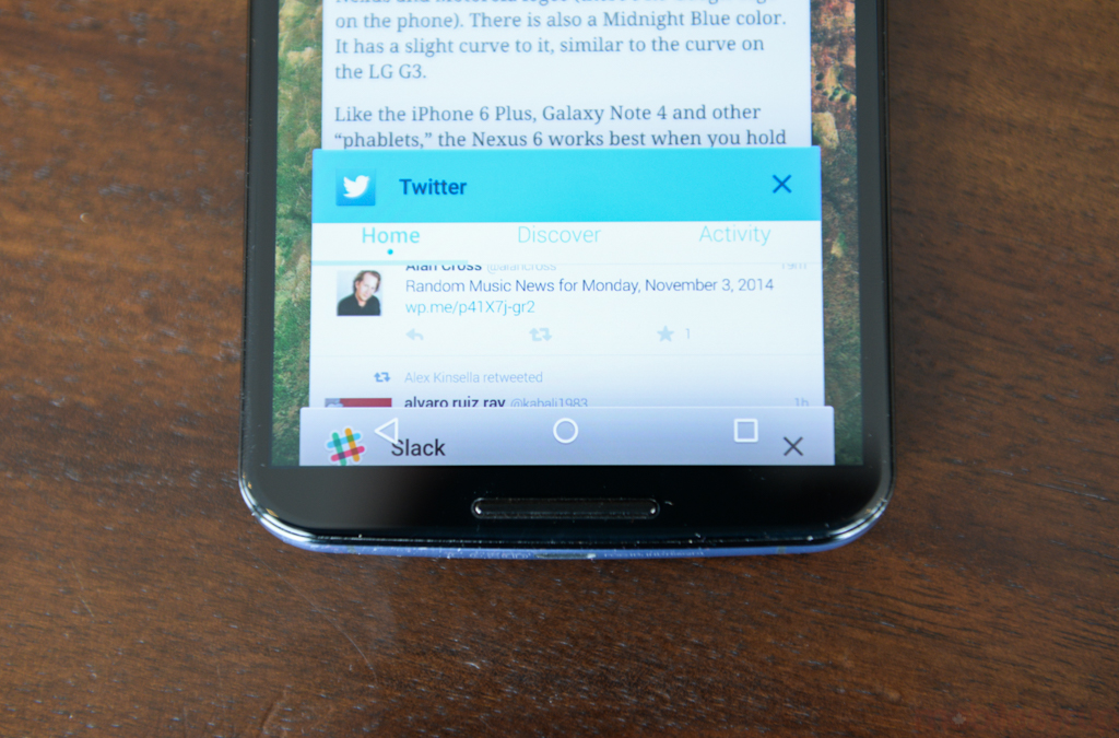
The Phone and Contacts apps have also received worthy redesigns; colourful and spirited, they scroll and glide to the subtlest movement of one’s finger. The new app drawer, now with a white background, expands from the home screen like an ebullient bouncy castle. The overhauled Multitasking menu, now called Overview, simultaneously acts as Google’s native app and webpage consolidator, an example of Lollipop’s lofty gait.
Small animation flourishes, like the effortless expansion of a plain white box that expands to fill the whole screen, are a few of the myriad examples where Google has matched modern design with movement. Lollipop adds approximately 7,000 new developer APIs, and included are animation libraries that make it easy to create fluid, good-looking apps from those static design recommendations.
Third-party apps, like Buzzfeed and Journey, are two examples of a growing number of apps that have been subtly updated to comply with Material Design. The thing to note is that while certain features require Lollipop, many basic tenets, such as new colour schemes, updated typography and improved usability, are inherent in Material Design and will find their way to older Android versions.
Lollipop and Material Design are two separate tenets of Google’s design future, but they offer similar macro scales. The former, a version of Android, represents fluidity, security and performance; it is considerably less prone to stuttering and instability, and the new security measures, along with support for 64-bit chips and ART, future-proofs the OS itself.
Then there’s the design aspirations of Material Design, found throughout the OS itself, within Google’s apps and those of its developer partners. Material Design will not be limited to Android, however: it is already found on iOS in the form of Google Maps, Play Music, Inbox and others. Similarly, it has made its way to the desktop in the form of Inbox for web, and will continue to add colour to Google’s expanding product lineup.
Both are big changes, and combine to form the best version of Android yet. There are still kinks to sort out, and questions remain about how adulterated the core features will be when they arrive on devices from Samsung, LG, HTC and others. It took KitKat over a year to reach merely 30% of total Android handsets, and Lollipop, an even bigger undertaking, is unlikely to be disseminated much faster (despite raucous claims otherwise).
While flagships like the Galaxy S5 and Note 4, G3, One M8, new Moto X and a few others will get Lollipop in the coming months, thousands of others will remain on Jelly Bean or KitKat, never reaching their full computational potential.
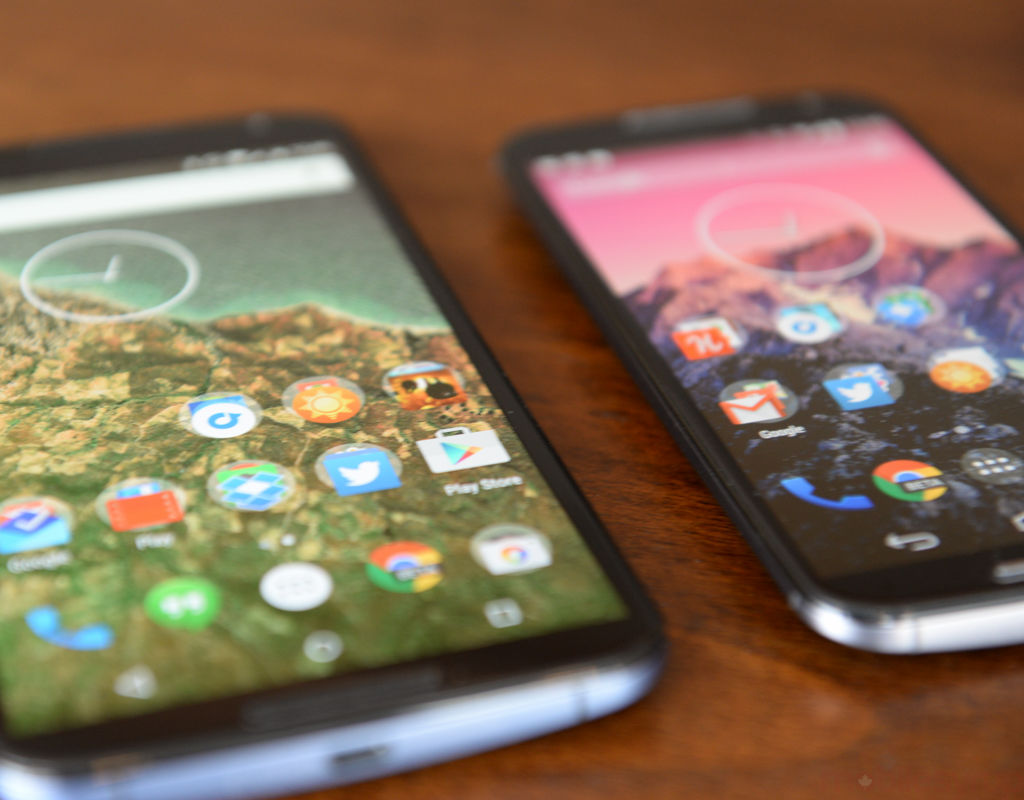
Lollipop on the Nexus 6, however, is the version Google envisioned when it set out to recreate Android itself. It is fast and beautiful, full of improvements large and small that instantly ages KitKat. The combination of lockscreen notifications and Ambient Display alone is worth the price of admission.
Google also guarantees that the Nexus 6 will be among the first smartphones to receive new Android versions, including all-important bug fixes, when they’re available. We’ll see how long Google takes to roll out its first OTA update, however — a sorely-needed bit of code to fix app crashes, camera slowness and more.
Camera
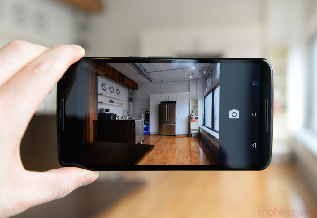
Second behind battery life in criticisms lobbied against former Nexus smartphones has always been camera quality. Google did what it could to boost optics on the Nexus 5, adding new shooting algorithms, a better sensor, sharper lens, and a new camera app with HDR+, but it wasn’t enough to compete with the iPhones and Galaxys of the world.
That ultra-simple camera app, Material Redesigned, has found its way to the Nexus 6, along with a new 13MP IMX214 sensor, F2.0 lens and optical image stabilization module. Practically the same optical solution that’s found in the OnePlus One (with the addition of OIS), the Nexus 6 promises greatly improved results from over its predecessor, and in many ways delivers.
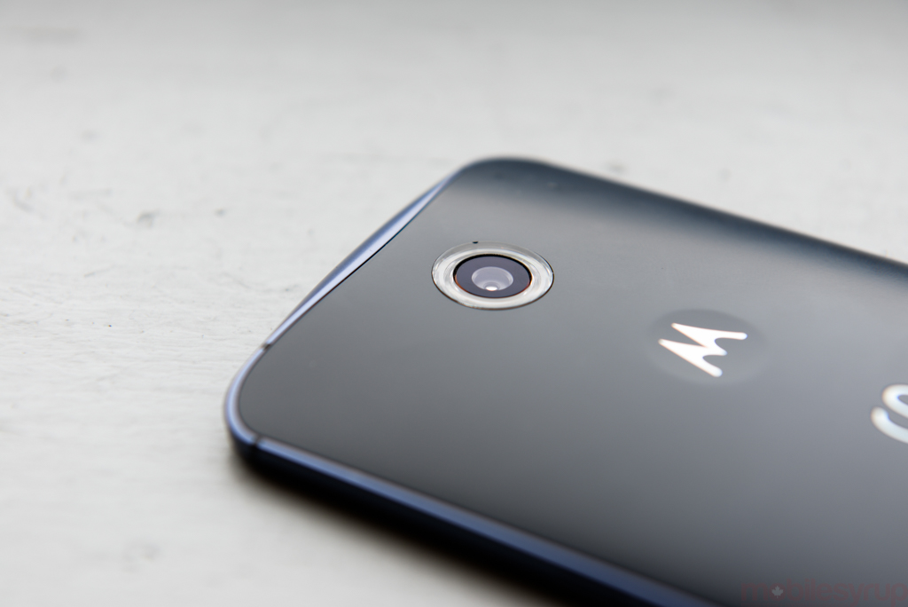
First, let’s get this out of the way: this is by no means a great camera. Like every Nexus smartphone before it, poor loading times and inconsistent shutter performance damper what could be a superlative photo-taking experience. Accompanying the software are algorithms that limit shutter speeds to 1/10 of a second and sensitivity to ISO 1200, even in the poorest-lit conditions. Why is this important? Because as we’ve seen with the iPhone 6 Plus, trusting OIS to compensate for the inevitable blurriness of longer exposures is a tradeoff worth making, and the IMX214 sensor inside the Nexus 6 doesn’t get to show off its best work.
In daylight situations, the Nexus 6 can take some excellent photos, and I got many keepers, from landscape shots with perfect dynamic range to macro shots with an absurd amount of detail. Colours were rendered accurately, and though the sensor often overexposed a sunlit scene, I was usually happy with daytime photos.
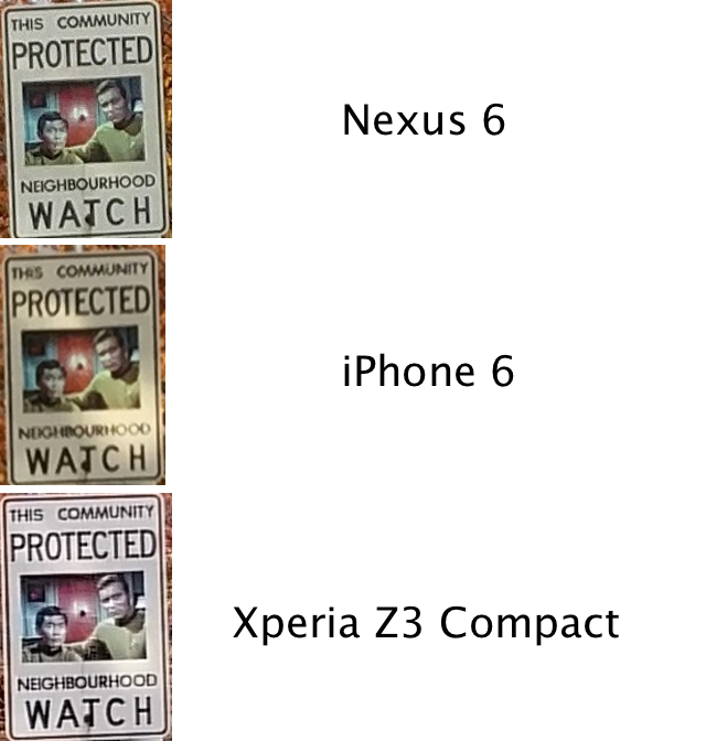
Comparing detailed output between the 8MP iPhone 6, 13MP Nexus 6 and 20.7MP Xperia Z3 Compact shows the Nexus capturing a high amount of detail, and compromises well between sharpness and colour reproduction. Such situations, where cropping is necessary, shows the limitations of the iPhone 6’s spacial resolution, and in the case of the Xperia, the unnecessary sharpening used to compensate for small sensors at high resolutions.
Moving indoors, it appears that Motorola’s desire to minimize grain by limiting ISO levels comes into play nearly as often as it did on the new Moto X. The same dual-LED ring flash is present on the Nexus 6, and while competent is no substitute for a steady hand and an open shutter. The 1/3.06″ sensor sports 1.12 micron pixels, and is a minor upgrade over the IMX135 found inside LG G3, Galaxy S4 and many others. Says Sony: “A reduced backside optical stack helps to improve the color crosstalk and angular sensitivity over the 1st generation stacked sensor IMX135:”
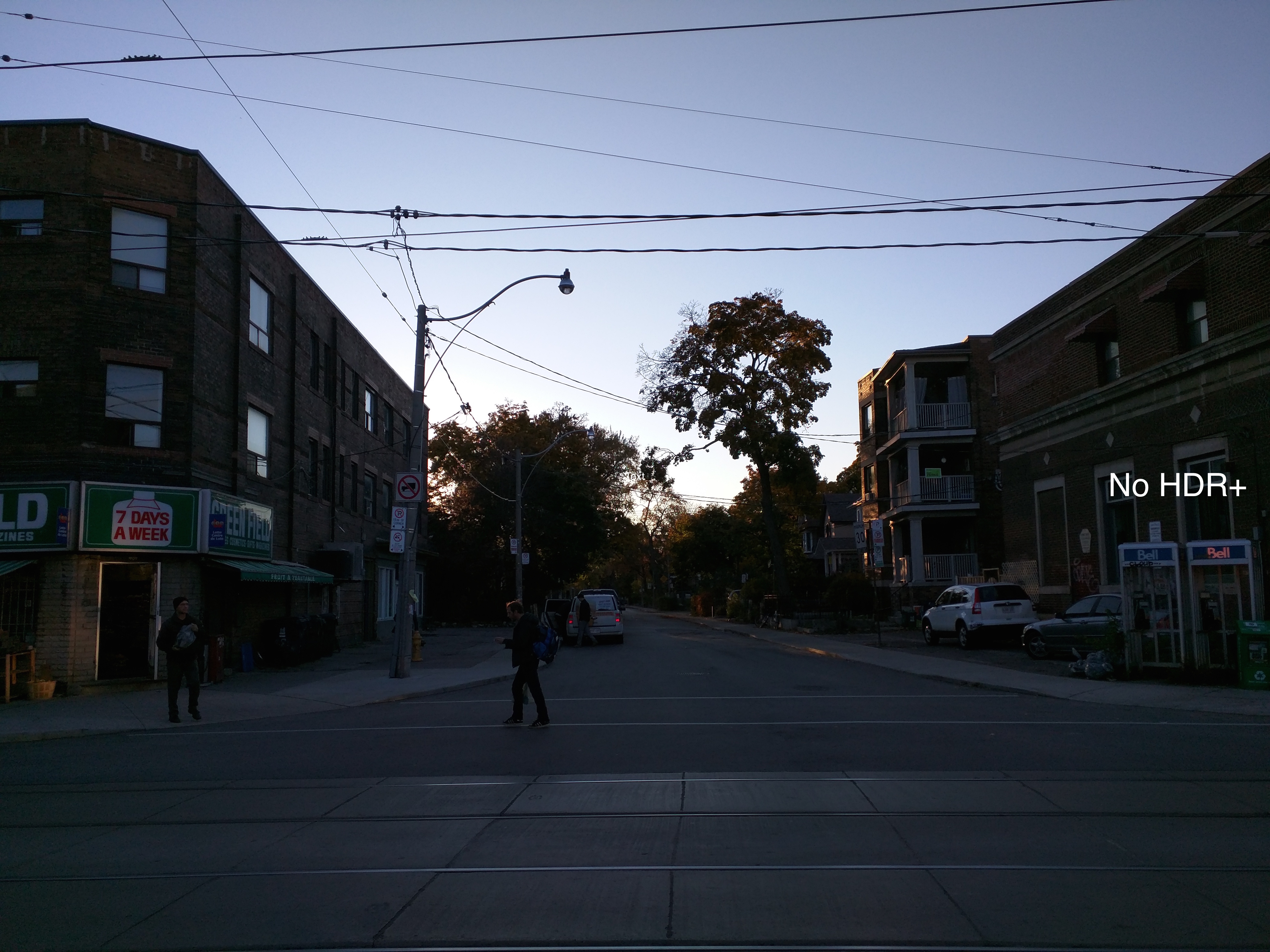
Where things improve over the IMX135, as Sony promises, is with HDR content. The ability to quickly combine multiple exposures at once using a combination of continuous capture and advanced algorithms ensures that photos taken with HDR+ on the Nexus 6 are leaps and bounds better than their unadorned equivalents. Indeed, even photos taken in daylight using HDR+ had noticeably superior dynamic range and exposure compensation. Low-light shots had moderately more detail, but still paled next to devices like the iPhone 6 and 6 Plus.
Google promised a new camera API with Lollipop, with full manual controls and the option to output in RAW. At the moment, though, no Play Store apps support the new API.
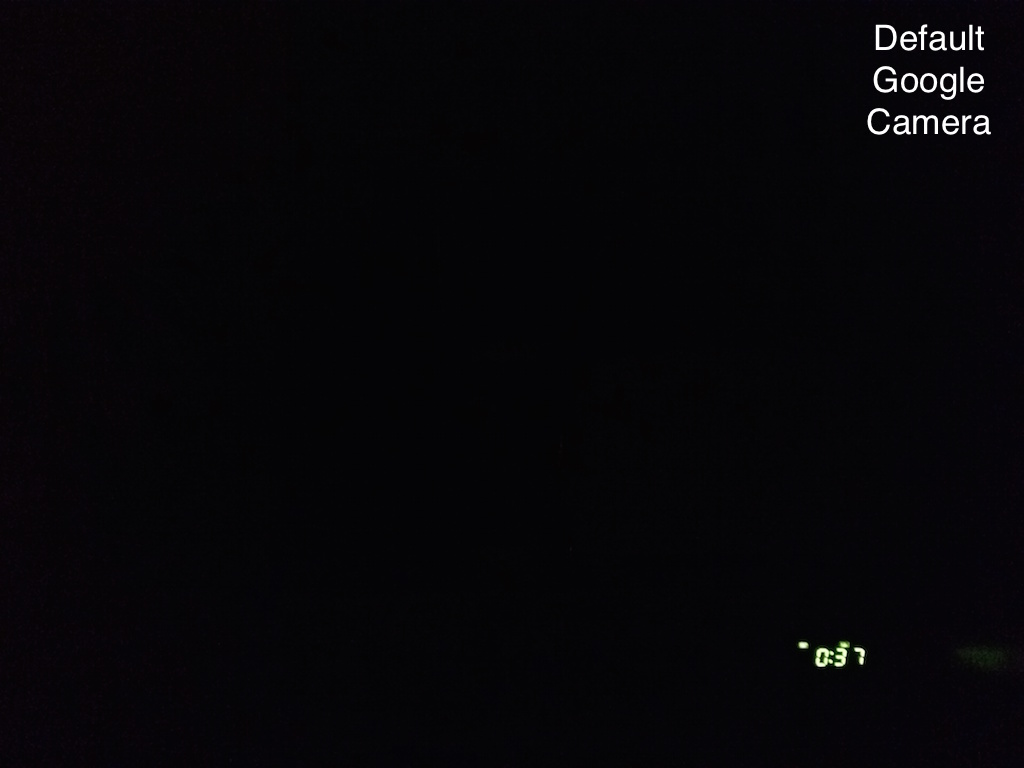
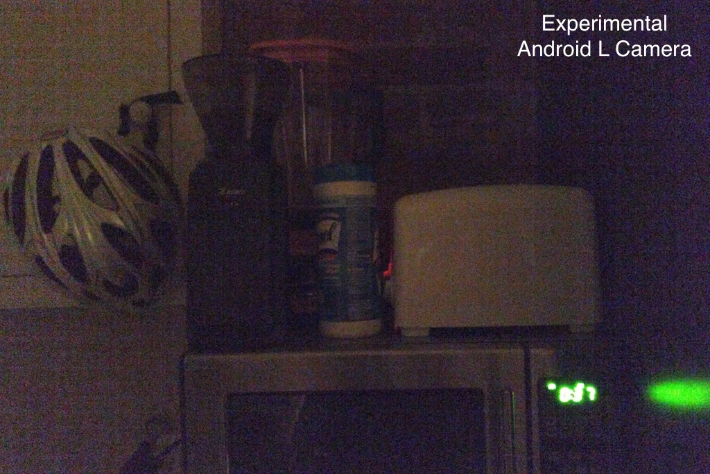
One app, aptly named L Camera, does use a preview version of the new Android Camera2 API, and below you’ll see the output from the sensor using manual controls. In a nearly pitch-black kitchen, using manual mode set to 1/2s (half a second) and ISO 4000, I was able to glean an admittedly grainy and nearly-unusable photo. Using the Google Camera app, all you see is the sickly glow of the microwave clock.
Would you rather have a grainy photo over a pitch-black one? Of course. Neither is suitable for sharing, and both represent two extremes, but the above photo proves that the Nexus 6 is capable of capturing better photos than its default camera app allows.
The real problem with Google’s camera app limitations is that is prevents the device’s OIS module from truly shining. Where there is ample light, the Nexus 6 rarely takes a blurry photo, but glitches in the software itself often result in a shutter delay or app crash.
Turning to the front of the device, the Nexus 6 sports an underwhelming 2MP selfie cam that’s competent for everyday use, but deserves no more than a passing mention.
The device also captures 4K video at 30fps with a bitrate of 42Mbits. The quality is good, and there is less pronounced shake while the module is moving, but the stability pales next to Apple’s software-based stabilization algorithms on the iPhone 6 and 6 Plus.
In other words, the Nexus 6 has a very average camera. The experience is middling, the software frustrating and the output binary. On the one hand, the IMX214 sensor is a newer version of one we’ve seen in devices from the Galaxy S4 to the LG G3. Like most smartphones are expected to, it offers excellent photos in the daytime, and Google’s HDR+ feature can capture a darn good sunset. But until apps are available to take advantage of Lollipop’s updated Camera API, the Nexus 6 will fail to live up to its optical potential.
Connectivity
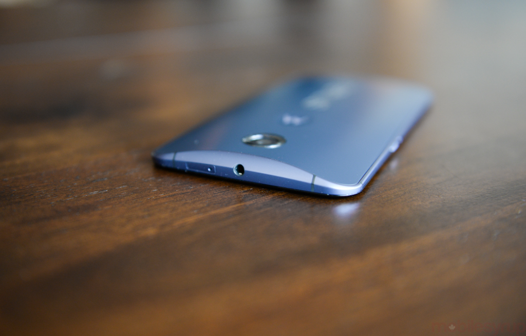
Like most devices released over the past nine months, the Nexus 6 is a Cat-4 LTE device that supports download speeds up to 150Mbps. I tested the unlocked device — and all Nexus 6’s, even those sold at the carrier level, will remain unlocked and unmolested by carrier bloatware — on Rogers, Bell and TELUS, and the device remained solid throughout.
Curiously, the Nexus 6 is just the second device with Canadian availability (the Note 4 was first) to support Band 12 over LTE, a combination of A- and B-block 700Mhz spectrum that Rogers calls its “beachfront” airwaves. The company has yet to deploy any service over the newly-issued license, as so few devices support it, but it will come in handy in 2015 and beyond.
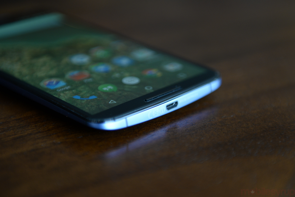
As large and cumbersome as the phone was to hold, phone calls were clear and loud, both through the headpiece and stereo speakers. Yes, the Nexus 6 has front-facing stereo speakers, and they’re surprisingly good. While they lack the clarity and nuance of HTC’s BoomSound, they go louder, and can easily fill a small room with tinny, sibilant wailing. You probably won’t want to, but it’s an option.
Lollipop also adds a new feature, which came in handy on the Nexus 6, that prevents a device from connecting to WiFi if the signal is weaker than the current cellular connection. There’s also improved handoff IQ between WiFi and cellular, ensuring that VoIP calls or video streams won’t suddenly drop when transitioning from one to the other. Apple brought this to the iPhone and iPad with iOS 7, and it’s nice to see Android implementing it too.
Competition & Pricing
At time of publication, we still don’t know how much the Nexus 6 will cost on contract. I suspect it will be in the realm of $250-$300 on a 2-year term, similar to the 16GB iPhone 6 or 32GB Galaxy Note 4.
What we do know is this: the Nexus 6 is by far the most expensive Nexus smartphone since the brand’s inception, and more than double the cost of last year’s Nexus 5 when purchased outright. At $749 for the 32GB model, it’s in line with the outright price of most high-end smartphones today, and is therefore made to compete in other areas. The 64GB model, a first for the Nexus line, goes for $799.
Such a large and expensive phone will immediately alienate a certain section of former Nexus buyers, some for its size and others for its price. Developers may choose to stay away from this year’s Nexus for the same reasons.
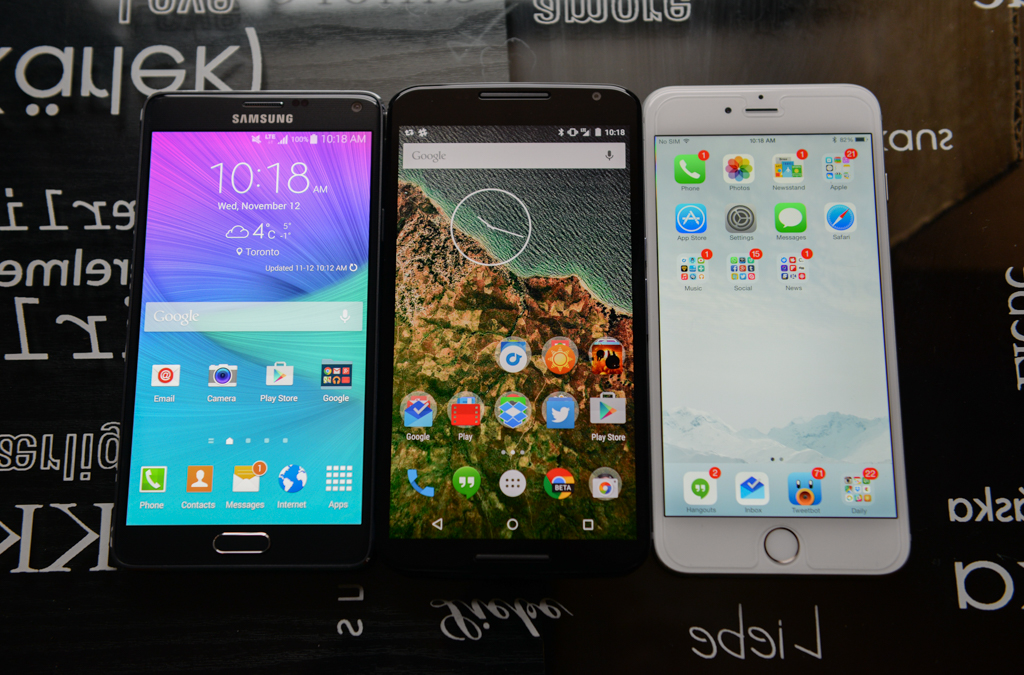
But if the size is right and the price is reasonable, there are a few more options you should look at before taking the plunge. The Samsung Galaxy Note 4 is the nearest competitor, with similar specs, a nicer screen, better camera, more compact frame and a sometimes-handy stylus. It lacks Google’s nuanced portrayal of Android, and will receive updates far later than any Nexus product, but unless an unlocked device is paramount, it’s probably a better choice for mainstream smartphone users.
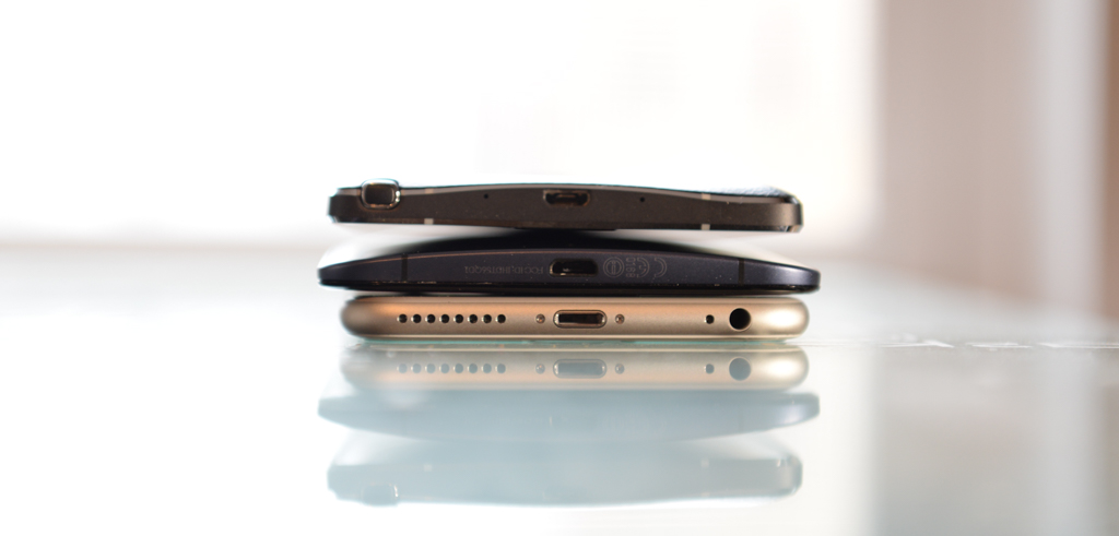
Then there’s the iPhone 6 Plus, another enormous phone misjudged for its size. Apple’s largest iPhone provides the best camera experience on the market, bar none, and complements its all-aluminum build (which sometimes bends) with an app ecosystem that is still marginally superior to Android. iOS lacks the customization of Android 5.0, but these days there are more similarities between the two operating systems than differences.
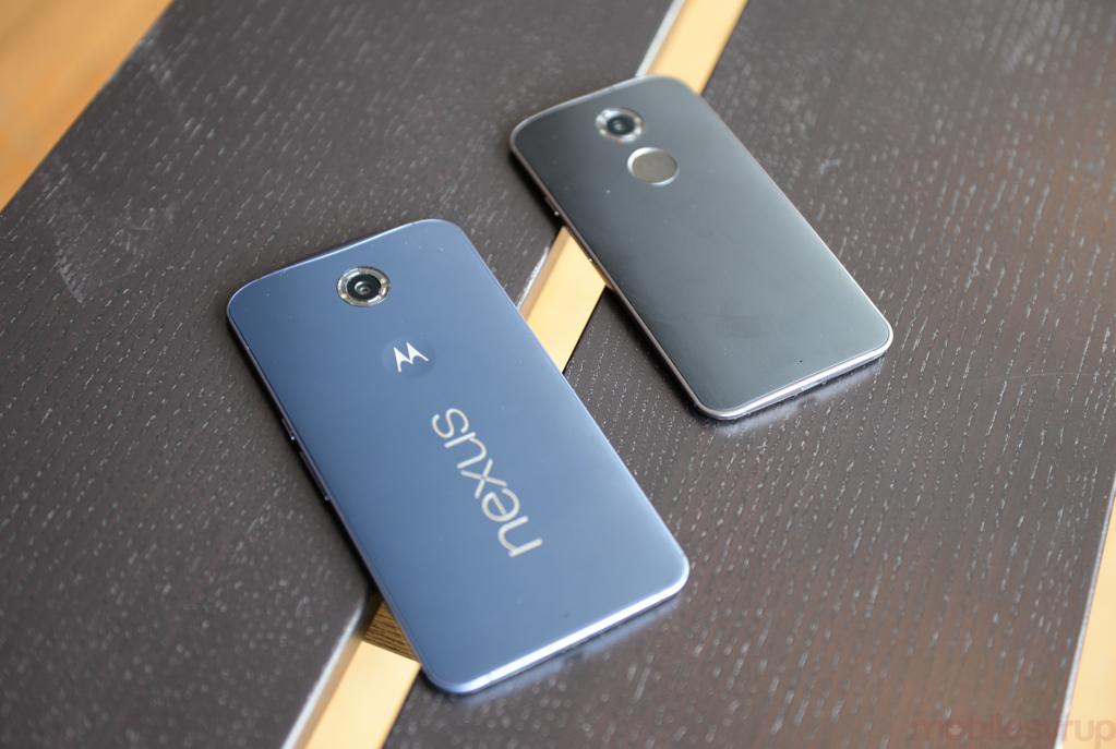
Finally, if you’re looking for something like the Nexus 6 without the size, the Moto X is by far the best choice. My current favourite Android device, it’s a Nexus 6 for the one-handed user. It may lack the on-paper specs of its larger counterpart, but its 1080p screen is better in every way but resolution, and its Moto software, as close to stock Android as it gets, will be updated to Lollipop faster than any other carrier-sold device.
Keep in mind that if you propose to compare the Nexus 6 not to the Nexus 5’s ultra-value price but to the outright cost of the average flagship smartphone it is still relatively well-priced. The Note 4, for example, costs $799 off-contract for the 32GB model; the equivalent Nexus 6, which lacks expandable storage and a removable battery, costs $50 less. An unlocked 64GB iPhone 6 Plus, by comparison, is $969.
Conclusion
The Nexus 6 is a really great smartphone, but it’s going to be too big for most people. It’s well-constructed, and great for content consumption, but one-handed usage is a non-starter. I learned to love it, faults and all, but it wasn’t the hardware that hooked me.
No, it was Lollipop, with its user-friendly-but-still-fundamentally-Android approach to mobile, that made me a believer. Most apps have yet to update to Material Design, and some never will, but Google’s own suite of apps afford a preview of Android’s future, while the Nexus 6 provides a large, blank, long-lasting canvas.
MobileSyrup may earn a commission from purchases made via our links, which helps fund the journalism we provide free on our website. These links do not influence our editorial content. Support us here.


