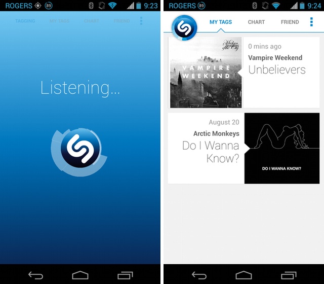
Shazam’s Android app hasn’t quite kept up with its iOS counterpart, both in looks and features. The company means to correct that with its latest 4.0 release, giving the UI an overhaul and adding tablet support.
While not a big change to the feature set, the Tag button now hides in the top left corner when browsing through other parts of the app, ready to spring to action. The interface has been spruced up, with a flat grey and blue colour scheme that feels more modern and natural on Android. The app also uses the new virtual menu button, eliminating the awful legacy action. You can swipe between sections now, too, something that makes navigating the app a lot more fluid.
But with Shazam’s push towards being the king app of the second screen — it’s not just about music anymore but television shows and commercials, too — it was inevitable that the company would eventually bring tablet support to Android devices. The app isn’t quite as full-featured as the iOS version, but with more breathing room users can see more of the popular songs worldwide and their latest.
[source]Google Play[/source]
MobileSyrup may earn a commission from purchases made via our links, which helps fund the journalism we provide free on our website. These links do not influence our editorial content. Support us here.


