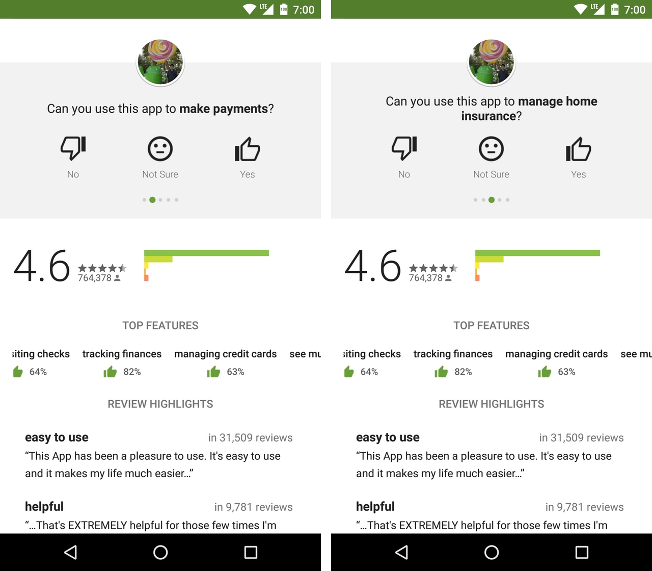
In what looks to be part of a larger overhaul of the Play Store, some Android users have reported noticing a new top features section at the top of specific app pages.
Based on screenshots shared by Android Police, it looks like the new design element is meant to give users a quick overview of an app’s main functionality. For instance, in relation to Chase’s mobile banking app, the relevant store page now has tags like “making payments” and “tracking finances,” followed by a thumbs up and percentage.
According to Android Police, whose readers first spotted the change, the element is part of a new review process wherein users are asked to verify whether an app has specific features and whether those features are to their satisfaction. In the instance of the Chase app, the Play Store asked a number of users whether the app allowed them to manage their finances, with 82 percent of reviewers confirming positively.
For the time being, it appears Google is testing this feature with the help of major developers like Facebook and Spotify, and with a limited amount of users. When I went to Play Store with my OnePlus 3, I wasn’t able to see the tags, even when I went to look at the apps mentioned by Android Police.
Last week, the website’s readers also noticed they were able to post a review to the Play Store without a Google+ account.
[source]Android Police[/source]
MobileSyrup may earn a commission from purchases made via our links, which helps fund the journalism we provide free on our website. These links do not influence our editorial content. Support us here.


