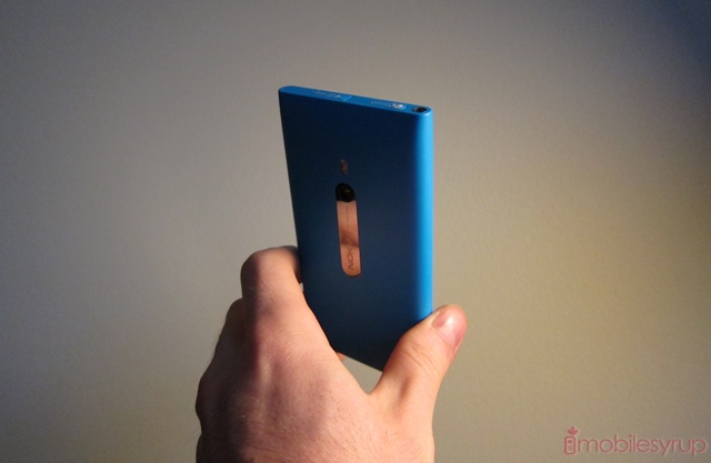
The TELUS Nokia Lumia debuts weeks after Rogers released the excellent and inexpensive Lumia 710, and weeks before the same carrier will release the LTE-powered 4.3-inch Lumia 900.
But the Lumia 800 was always the main event in my eyes since I laid eyes on it in October at Nokia World. It was a revelation, and though not a surprise per se — it maintains many of the design tenets of the MeeGo-powered N9 — it still managed to floor me with its stunning build quality and fluid operation.
Here we are six months later and TELUS has released the first North American version of the Windows Phone-powered device. How does it stack up to the competition? Does it manage to pry our eyes — and fingers — away from the iPhone and various high-end Androids in our lives? Read on to find out.
Specs
– Windows Phone 7.5 Mango
– 3.7-inch 800×480 pixel ClearBlack AMOLED display
– 1.4Ghz single-core Qualcomm Snapdragon MSM8255 processor
– 512MB RAM / 16GB internal storage (no microSD card slot)
– 8MP back camera with dual LED flash, Carl Zeiss optics
– WiFi (b/g/n), Bluetooth 2.1, A-GPS
– HSDPA 14.4Mbps, HSUPA 5.76Mbps
– 2G: 850/900/1800/1900Mhz 3G: 850/1900/2100Mhz
– 116.5 x 61.2 x 12.1 mm
– 142g
– 1450mAh internal battery (non-removable)
Design, Colour, Screen and PenTile
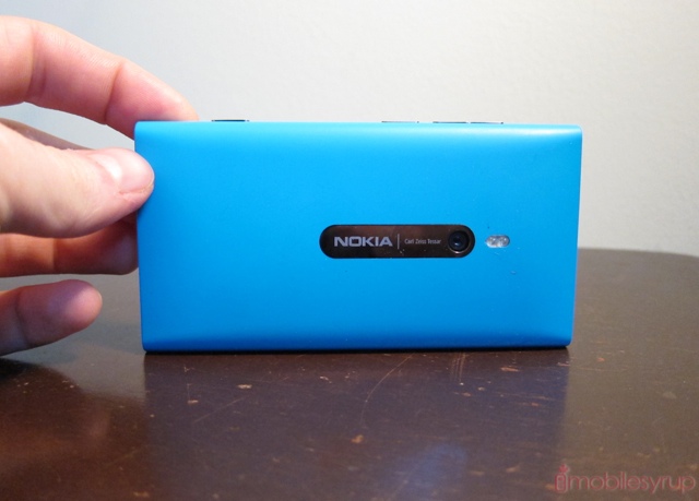
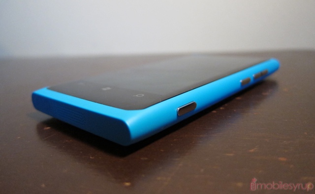
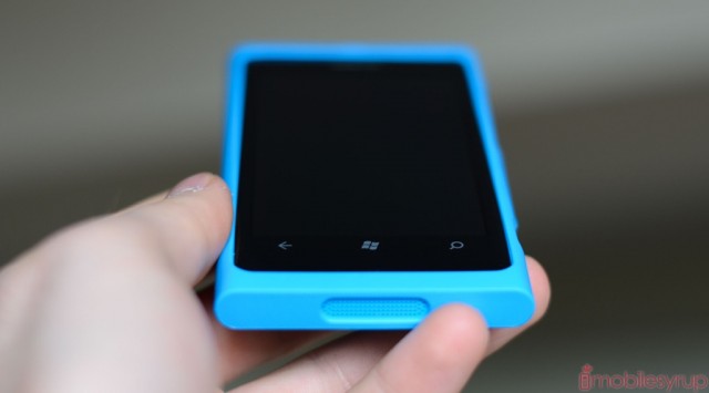
I’m not going to comment too much on the design, as we went over that extensively in the Hands-On, but suffice it to say if you enjoyed the black model, the coloured equivalents — either cyan or magenta — will make you a fan of pastel-hued phones. Both colours are not garish, and blend extremely well with the customizable colours of the Windows Phone OS itself.
The size of the phone is, to me, a perfect compromise of usability and screen real estate. It passes the “thumb test” by allowing me to reach my right thumb over to the top left of the screen without having to readjust the device in my hand. The latest Android devices, most of which are above 4.3-inches in size, pose a difficulty when passing the same test. Its relatively small screen size also preserves a higher-than-average 252ppi pixel density with a WVGA resolution.
Despite having a high-quality ClearBlack AMOLED display, which does improve contrast and decrease reflections, the actual pixels are made up of the dreaded RGBG PenTile variety, which adds two green subpixels for every blue and red. This is supposed to be decrease battery consumption while maintaining an acceptable level of luminance as the human eye is more sensitive to green than either primary colour. A side effect of this subpixel distribution is a lack of clarity and a noticeable aliasing on text assets. At low zoom levels, such as in a browser, this is most noticeable, and while the quality is far better than the HTC Nexus One or Motorola RAZR, the two most offensive examples of badly-implemented PenTile, the Lumia 800 is similarly disadvantaged.
Like most other AMOLED displays, colour reproduction is superlative, with bright and vivid reds, deep and lovely blues, and subtle greens. The relatively monochromatic palette of Windows Phone makes such bright tones stand out. As a result, both form and function come together very well on the Lumia 800. It may sound strange to say, but it is one of those devices that makes me feel lucky to work in the technology industry, to try out truly unique and advantageous industrial designs.
Performance
The Lumia 800 performs as well as any other Windows Phone on the market. Whether you’re sympathetic to its cause is one of the fundamental philosphical questions in life: are you an optimist, a realist or a pessimist?
The optimist looks at the smooth scrolling of the Lumia 800, the relatively fast page loads in Internet Explorer, the hundreds of cool little games you can pay (too much) for in the Marketplace, the endless possibilities. Windows Phone, they say, doesn’t need dual-core, as everything works fine without it. But we haven’t seen a dual-core Windows Phone in action yet to know how much faster apps could load, pages could render and video could be captured.
The realist looks at the overall experience of the Lumia and understands that he/she is not buying into the Android hype of specs, specs, specs. Just because Android needs exponentially higher-clocked processors and graphics units to render an increasingly-complicated array of OS elements doesn’t mean Windows Phone has to. Microsoft has developed a lean, quiet V6 Hybrid to Android’s loud V8 turbocharged Hemi. And just look at battery life: Windows Phone boasts far better idle and on-load battery performance than Android, right? (We’ll see later that’s not necessarily true).
The pessimist looks at the relatively poor multitasking system, the inconsistent “Resume” screens, the lacklustre choice of 3D games in the Marketplace, and the poor benchmark performance and says, Smooth and fluid, maybe — the OS is beautiful (even a pessimist agrees on that) — but objectively the Lumia 800, and all Windows Phones, are not powerful enough for tomorrow’s tasks, and are limited today by an underpowered GPU, single-core CPU and low RAM counts.
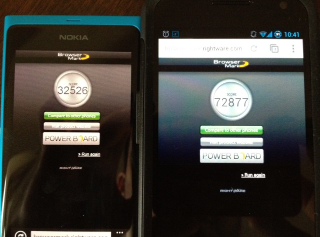
Our gorgeous Lumia 800 is powered by a 1.4Ghz single-core Snapdragon S2 processor (the same one that’s in the HTC Desire HD, Sony Ericsson Xperia arc, etc.). As you can see above, one of the few cross-platform benchmarks is Rightware’s Browsermark, on which the Lumia scores less than half of the Galaxy Nexus (itself clocked at a slower-than-normal 1Ghz).
The iPhone 4S gets away with a dual-core chip each clocked at 800Mhz, and a miserly 512MB RAM, so what right do I have to be complaining about performance? It’s in the little things: slow Javascript performance, stuttering app resumes, and the inability to record 1080p video. But as I’ve said before, I am not the average smartphone user, and am very sensitive to disruptions in “the chain” of performance. Even iOS 5 suffers from this now and again, but as smooth as Windows Phone Mango is, it could use some beefier hardware. And I think Microsoft knows it, too.
Judging the Lumia 800 on its own merits, it scores quite well in the performance department, though no better or worse than any second-generation Windows Phone. The optimist might opine that this means all Windows Phone devices perform well; the realist may qualify the poor benchmark scores by claiming that they have no real-world application; lastly, the pessimist might ignore the throngs of defenders and say that a flagship device has no place coming to market with such underpowered internals, regardless of how efficient is the operating system.
Battery Life
The Lumia 800 has an non-removable 1450mAh battery which usually lasts at least 8-10 hours of regular use. This is good, since that’s how long I can usually go without being in front of a charging port. But there is s glaring and unforgivable fault that is expected to be patched in an upcoming update: the Lumia 800 uses an exorbitant amount of power when idled. With the screen off, and the phone left to its own devices, it will go from 100-0% in less than 12 hours. This shouldn’t be such a big problem if you constantly use the device, but for the average person a large portion of the 1450mAh cell is going to dissipate by just being turned on. Most other phones can idle for days with 3G turned on and the screen off, and for weeks with no cellular activity.
I was grateful that the Lumia 800 can be recharged very quickly, often returning from zero to 70% in under an hour. In our battery tests, which loops a locally-stored video with WiFi turned on, we achieved 6 hours 48 minutes. This is singnificantly better than the Lumia 710’s 5hr 24 min result.
Camera
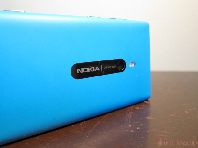
The Carl Zeiss optics paired with the Lumia 800 are very, very good. The whole system combines an 8MP sensor, a 28mm lens with a f/2.2 aperture. The lens itself is slightly wider than most fixed-length phone cameras, so you’ll get more in the shot, and the low aperture makes for a more light-sensitive operation, with less grain and excellent low-light performance.
This is all puctunated by one of Windows Phone’s best features, the fantastic camera UI that can be accessed by holding down the shutter key on the right of the phone at any time. There are a number of exquisitely laid out settings for the tinkerers — White Balance, Exposure Value, ISO (which goes up to 800), Metering Mode, Contrast, Saturation, Focus Mode, along with real-time effects like B&W, Sepia and more.
For the most part, though, you won’t need to touch any of them: the Lumia takes some of the best camera photos I’ve seen from a mobile device. Colours are accurate, grain is low even at high ISOs, and you can even emulate a modicum of true depth of field when in macro mode. You can touch the screen to focus, or hold down the shutter halfway. Compared to the iPhone 4S, colours do seem a bit muted, but I prefer accuracy to excess colour.
In terms of video, the 720p performance is great: smooth, fast and detailed. But this is where we butt up against one of the device’s hardware limitations. Its Snapdragon processor cannot encode 1080p video and we are left questioning, yet again, why a device being so heavily promoted on its photo and video chops is not able to meet all of its major competitors in video capabilities. We know why, but it’s no easier to stomach.
And, while we’re on the topic of without, the Lumia is without a front-facing camera. While certainly not the dramatic equivalent of not having 1080p video, it prevents video calls in the new Skype app. This omission is going to be corrected in the upcoming Lumia 900, but even that model won’t shoot 1080p video.
Software
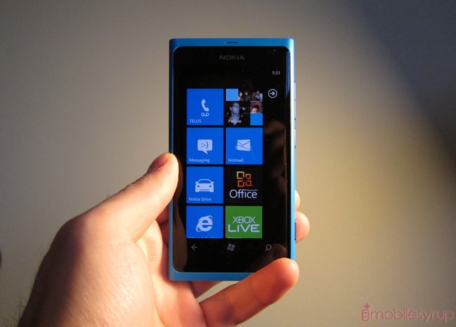
The TELUS Lumia 800 uses the next-to-newest version of Windows Phone Mango, the one that fixes many of the biggest bugs that emerged from WP 7.5 in October. For example, the dreaded “disappearing keyboard” issue is nowhere to be found. For the most part, apps ran smoothly and quickly.
I’ve gone over Windows Phone Mango many, many times, and because Microsoft prevents OEMs from altering the lay of the land too drastically, the build running here is going to look familiar to anyone who’s used the platform. There are plusses and minuses, as we’ve discussed, including the irritating and half-baked notification system, poor third-party app selection and over-emphasis on native feature implementation while locking out third-party developers to those APIs.
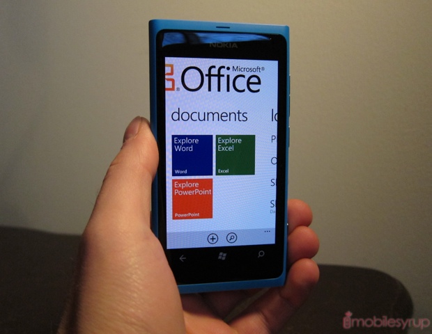
But no mobile OS provides as robust a social network integration (Facebook, Twitter, Windows Live) as Windows Phone, and certainly nothing comes close to the airy, refreshing Live Tile UX. By fastening these squares to your home screen you can obtain relevant and truly helpful information. I constantly tell people: if you don’t want to fight with your OS, go with Windows Phone. There’s very little that can go wrong, since you are so limited to what you can do outside of Microsoft-sanctioned activities.
For example, Windows Phone’s keyboard is one of the best in the business. It’s fast, fluid and smart. But you can’t replace it — no SwiftKey, no Swype. Same with a number of first-party apps, all of which are good — Mail, Music, Messaging, etc. — but, like iOS, none of them can be replaced by downloads. Like Apple, Microsoft is taking the tack that it knows best, and that means its integrated apps are your best bet. This is not a bad thing, since Microsoft has engineered some powerful marvels of simplicity.
But as I said earlier, I get a sense that Microsoft can dress it up all it likes, but it only takes a trip off the main drag to experience the platform’s hardware limitations. All of Microsoft’s first-party apps perform superbly but install any app that relies on scrolling through large swaths of text, and you’ll be stuttering all the way to the bottom. Similarly, Nokia Drive, while beautifully laid-out, isn’t able to recreate the smooth and seamless 3D plane as Google’s Navigation app on Android. Moving through the meticulously-created maps is frustrating.
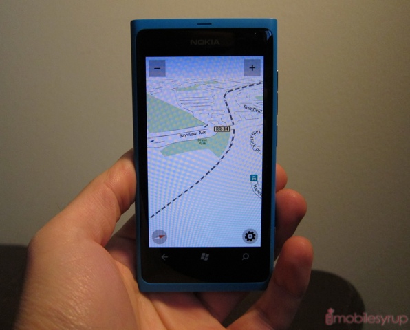
Speaking of Nokia Drive, as I said with the Lumia 710, if you drive at all Nokia’s devices are your best choice, period. Drive is an amazing thing: it downloads maps from all over the world, and directs you to those locations accurately. Unlike Google Navigation, Nokia Drive always found my location within seconds (sometimes less) and never lost me, even when I went underground (within reason). And with offline map capabilities coming soon in Drive 2.0 you won’t have to be connected to the internet to take advantage of the app, which is fantastic for roaming.
Nokia is doing a great job making quality exclusive apps for Windows Phone. Nokia Maps and Drive are two great examples of what I’m sure will be many further additions to the ecosystem. Nokia and Microsoft have combined their mapping assets, and because Nokia owns NAVTEQ, Maps and Drive can locate not only the most remote areas but all of the important landmarks on the way.
And though there are some fantastic third-party apps, it doesn’t look like developers are taking to the platform as one would hope. There are plenty of apps in the Marketplace, but most of them are terrible. The same can be said for Android and iOS, but on those platforms there are many great ones too. I can count the number of indispensable Windows Phone apps on four hands.
Call Quality & Network Performance
Like most Nokia devices, the Lumia 800 has exceptional call quality, both from the headpiece and the speaker. Calls came through loud and clear over TELUS’ network, with little distortion or grain, though voices occasionally sounded thin and sibilant, especially when connecting to other cellphones. The speaker encompasses much of the bottom of the device, which turns out to be a better solution in many ways than the traditional back-facing mono speaker. Sound travels either directly down in portrait, or to either side in landscape mode, and is relatively full and rich for a mobile device. Maximum volume could have stood to be a bit higher, though.
Network speeds are what you’d expect from a “faux-G” device: a maximum downlink of 14.4Mbps and uplink of 5.76Mbps means you’ll get roughly 3-5Mbps down and 1-2Mbps up in normal use. I never felt like the Lumia 800 was hampered by its last-generation baseband, and kept up with my iPhone 4S in most cases when loading web pages or buffering YouTube videos.

Experience
I don’t usually have an ‘Experience’ section of a review; it is usually self-evident from reading the Performance and Software portions. But I have been quite critical of the Lumia 800, and I want to emphasize a couple things about actually using the phone. I am a reviewer, and tend to focus on, or even overemphasize, the faults of a particular device in order to help our readers make as informed a decision as possible. While the Lumia may not have a front-facing camera, a dual-core processor or run an OS with a multitude of great apps, to use the phone is to love it.
From the first time I picked it up at Nokia World until I held it in my hands for review in Canada, there is something effortlessly beautiful, practical and fun about it that I only feel with cream-of-the-crop devices. This is the iPhone 4S of the Windows Phone world, and if you don’t believe me all you have to do is pick it up. Nokia is playing the hand they’re dealt: Microsoft’s OS, while quickly catching up, is still two years behind its competition, and they’ve done a great job ensuring that you can do most essential tasks without ever opening the app Marketplace.
One of my favourite “set it and leave it” features is the ability to auto-upload photos to Skydrive, Microsoft’s cloud service. Though off by default, you merely have to tap it once while in the Camera Roll and every photo you take is ready for you to share or archive. Microsoft offers 25GB storage for free to all Live users, and has dramatically improved the interface over the last couple of years. The same can be done with Office documents: Word, Powerpoint and Excel files created on the phone are saved by default to Skydrive, and can be edited using Microsoft full-featured browser-based Office suite.
But the perfect size, the gorgeous screen, the incredible build quality, the exceptional camera performance and overall smoothness is far greater than the sum of its individual parts. And likely once you use it, those lacks just become mostly irrelevant (with some aforementioned exceptions).
Conclusions
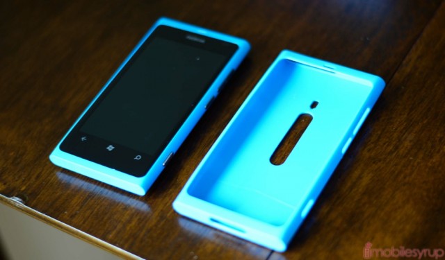
The Lumia 800 is not a perfect phone, but it appears so when first held in the hand. It’s about the conscientious in-box additions, including a colour-matching silicone case and one of the best-designed wall outlets I’ve seen. It’s about the otherworldly polycarbonate finish that repels stains and protects against scratches. It’s mainly about the fact that this company, which practically disappeared from North America, has rebounded in such a remarkable way. The Lumia 800 is the company’s first flagship Windows Phone, but it won’t be the last.
There are some glaring omissions in both software and hardware, but Nokia has definitely worked some magic here to ensure the Windows Phone experience is the best one you’re going to get right now. For the optimist in me, that is a huge feat.
With a newly-reduced price of $24.99 on a 3-year term, the Lumia 800 is a bargain, and shows that TELUS is taking its Windows Phone sales seriously. It’s priced below the 3-year contract price of the Lumia 710 on Rogers, but is more than double the cost to buy outright: $529.99 to $254.99. But most Canadian consumers will be entering into a new, or renewing an existing, contract and the Lumia is great value as both a smartphone and a fashion statement.
The TELUS Nokia Lumia 800 is currently available for $24.99 on a 3-year term and $529.99 outright. It is available in black, cyan and magenta.
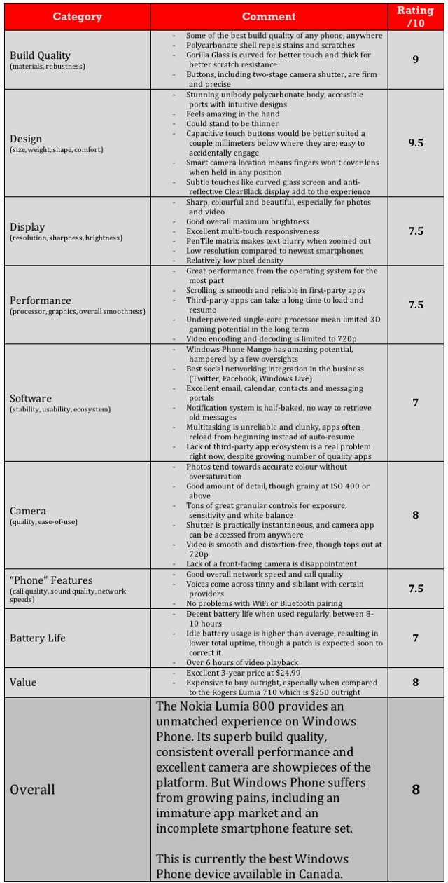
MobileSyrup may earn a commission from purchases made via our links, which helps fund the journalism we provide free on our website. These links do not influence our editorial content. Support us here.


