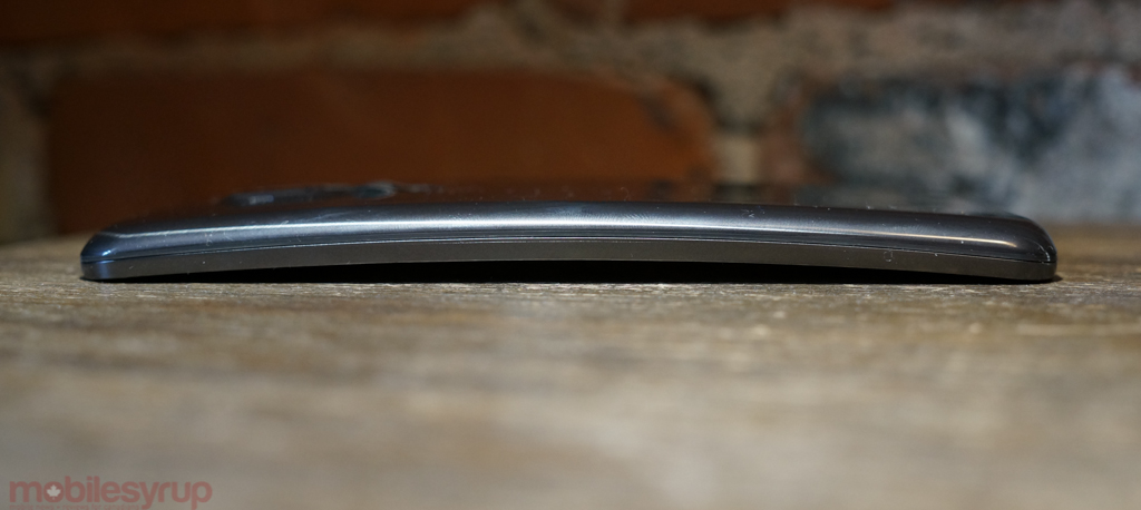
No one needs a curved phone. It’s almost certainly the latest gimmick in a litany of specs that seems to be the result of a maturing smart device market sucked dry of new ideas.
And yet the G Flex intrigues me. It’s not the best Android phone on the market, and it’s almost certainly too big to be considered by the average Rogers customer (it a carrier exclusive in Canada), but despite running an increasingly outdated codebase (4.2.2 Jelly Bean) it’s by no means a throwaway. In fact, the Flex is more than the sum of its gimmicks, propped up by capable hardware in nearly all other areas. It is start to finish a niche device, but that’s alright: it’s an experiment that succeeds, and considering its multitudinous idiosyncrasies, that’s no small feat.
Specs
- Android 4.2.2 Jelly Bean w/ custom LG skin
- 6-inch 1280×720 Curved Plastic OLED display (244ppi)
- 2.26Ghz Qualcomm Snapdragon 800 SoC w/ Adreno 330 GPU @ 450Mhz
- 2GB DDR3 RAM / 32GB internal storage
- 13MP rear camera / 2.1MP front-facing camera
- 3,500mAh non-removable battery (13.3Whr @ 3.8V)
- WiFi (b/g/n/a/ac), Bluetooth 4.0, NFC
- 160.5 x 81.6 x 7.9 – 8.7mm
- 177 grams
- LTE 700/AWS/2600Mhz, HSPA+ 850/1900Mhz
Design & Display
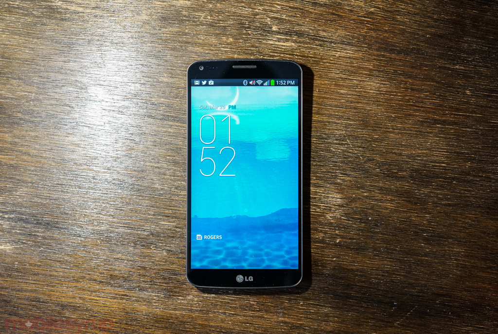
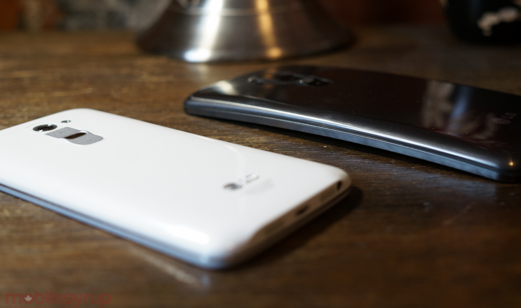
The G Flex’s curve is simultaneously understated and its only major distinguishing feature. There’s a subtle concavity that boosts the device’s thickness from 7.9mm in the middle to around 8.7mm at the edges, an insignificant expansion that would be more noticeable if the phone wasn’t already enormous.
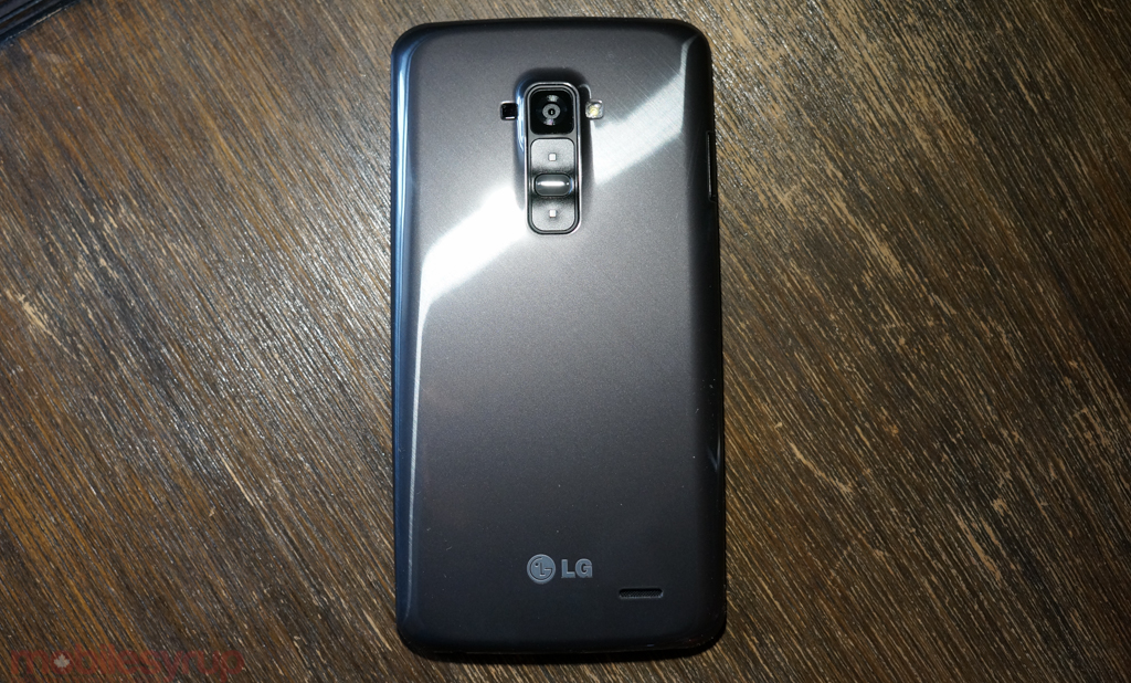
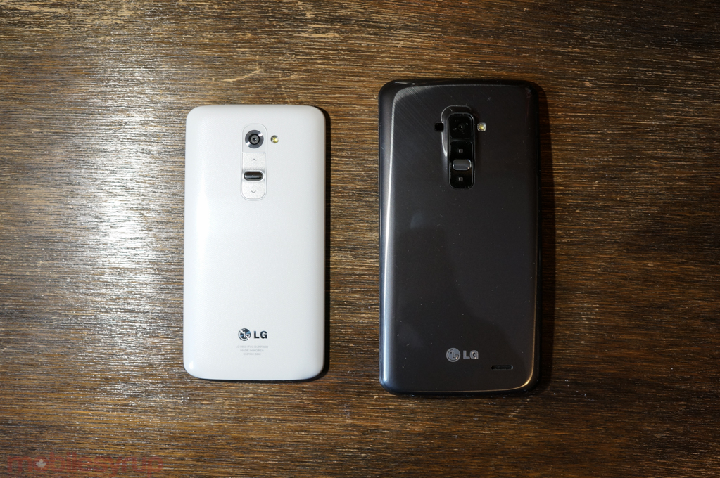
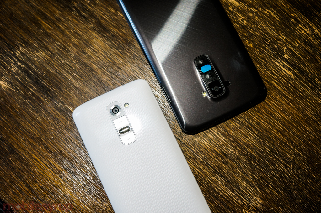
To accurately picture the G Flex in your mind, take the G2, flatten it like a pancake and then ever-so-slightly curl the edges like the worn pages of a book. The rest of the look, from the nearly bezel-free display to the rear volume and power buttons, is identical to its smaller counterpart. LG calls the chassis’ colour Titan Silver, but it’s a deep granite, working to complement the OLED display while differentiating it from the G2’s deep blacks. Samsung does something similar with the colour variations of its Galaxy lineup, subtly adjusting hues between the S and Note lines.
Here the slightly lighter colour scheme has function, too: it complements the self-healing backing, which LG advertises as being able to literally disappear minor surface abrasions. It doesn’t work as well as advertised, and the accompanying glaze is more slippery and fingerprint-happy than I’d like to see, but it’s certainly an interesting experiment. Unlike some other reviewers, I didn’t feel comfortable taking a set of keys to the device, but the excellent Marques Browlee did exactly that, and found the results to be underwhelming at best.
Indeed, much of the G Flex’s choices seem like they came from a board room meeting within LG, where the heads of each department threw their newest design and technological achievements on a table and agreed to create an Android phone from the disparate parts. That the Flex’s enormous 6-inch curved display (and subsequent curved battery) works so well is a testament to LG’s consummate abilities as a hardware manufacturer.
Aside from its marginally lower pixel density, the Plastic OLED (POLED) screen is stunning. It’s grainy in a glorious, paper-like way, with the actual content sitting so close to the surface as to make it appear tactile. Because of this, the lower resolution never bothered me; instead, it made me reflect on the pixel density race, this never-ending numbers game that, like the “Wattage Wars” of yesteryear, trace the preferences of marketers over users.
Give me an accurate, responsive 720p display with good viewing angles and well-calibrated colours, rich deep blacks and superb white balance over a 1080p screen with drunken metrics any day.
I did notice a few issues with ghosting — that is, lingering wisps of images from previous screens that slowly fade — but they dissipated quickly enough so as not to be a major concern. Still, I’ve heard from others that the issue is relatively pervasive, so it seems that LG’s plastic-based OLEDs need a bit of revision before becoming mainstream. It appears that, due to the more unstable nature of this type of OLED’s physical makeup, the individual pixels are slower to return to a “relaxed” state, retaining remnants of a former image for longer than the average OLED product.
This used to be a major issue with early-generation plasma televisions and OLED displays — remember the Nexus One? — but has been largely eliminated as manufacturing processes have matured. Hopefully LG can get a revision out in time to eliminate the occurrence of burn-in/ghosting before the second-generation Flex product.
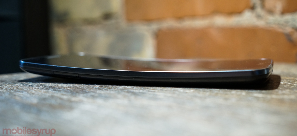
Holding the phone is not difficult, but it’s definitely for folks with larger paws. The 6-inch display isn’t couched much by the curvature and one-handed usage, even with a few UI enhancements built into LG’s Android 4.2.2 build, is not ideal. I felt the Flex was too big for most of my jeans’ pockets, and though the wave is great for back pockets, its inward bend does not lend itself to side pocket storage. The advantages, though, are evident when viewing media content: not only are contrast levels almost perfect, but the curved screen lends a sense of depth and cinema that other Android phones don’t have. But the top-down shape doesn’t exactly enhance regular phone usage; gaming, for instance, is neither impeded nor improved. It’s just slightly different.
That’s the conclusion I came to after using the Flex for a couple of weeks: it’s different, but not enough as to be substantially better or worse, and just odd enough as to be distracting. A curved phone display may have substantial benefits in the future, but right now neither the Android UI nor its myriad apps take advantage of the quickly-advancing technology.
Software and Performance
Running the identical specs and Android version as the G2, you’d expect the LG G Flex to mimic its smaller counterpart in performance and features. But despite the older version, LG has done a good job introducing some meaningful software improvements that, while not wholly original, are extremely useful.
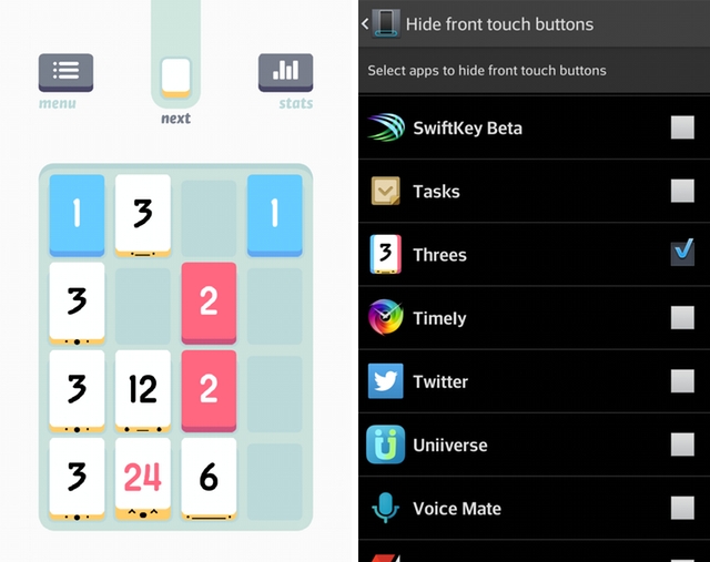
The large 6-inch screen, with its concave curvature, is practically begging to be used to consume media, and LG has added the option to hide, or at least minimize, the extrusion of the soft navigation buttons. While it doesn’t go as far as building out a custom API for developers, the Settings contains a whitelist of all apps installed on the phone, so you can force them to hide when running games or Netflix, while keeping them present when, for example, Facebook is open. It’s a useful, if slightly hack-like, solution to a problem that will be solved more gracefully when LG eventually updates the device to KitKat later this year.
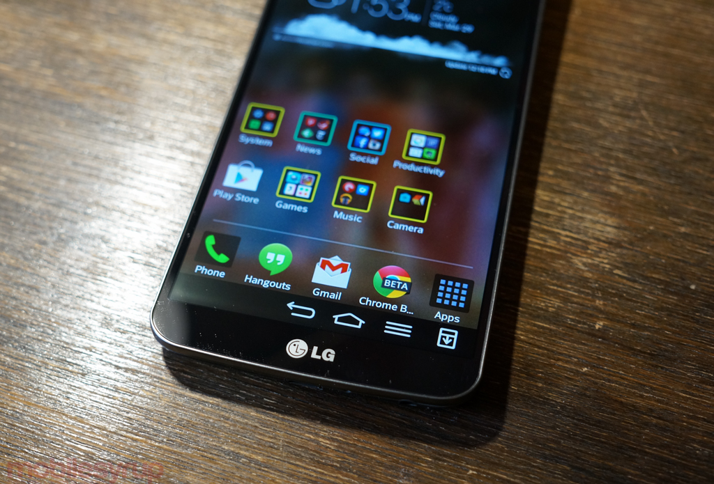
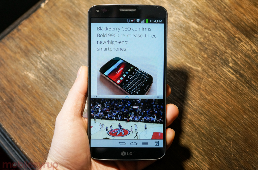
LG also realizes that a smartphone of this size needs a bit of a navigation adjustment for one-handed usage, so the virtual navigation buttons can be condensed to one side for easier tapping. Like the G2, there’s also an option to toggle the notification shade from the bottom of the screen — useful on the smaller 5.2-inch device, but an absolute necessity here.
Much of the UI, despite a slightly updated theme — it’s less colourful and more “techy” than the default G2 skin — is still Samsung circa 2011. Not only is it extremely disappointing to see a device launching in Canada in April 2014 with Android 4.2.2 — was rolled out in February 2013 (Android 4.2 itself was announced alongside the Nexus 4 in October 2012) — but many of the proprietary system enhancements are superfluous and distracting.
LG’s KnockOn, once a unique feature, has now been replicated by HTC and a number of other OEMs, and works to activate the screen when the power button is not readily accessible. Dual Window, a riff on Samsung’s Multi Window, lets you open two apps at the same time, but because the SDK is not open to third-party developers, only a few apps support the feature. It’s great to scroll through Chrome while watching a YouTube video on the enormous 6-inch screen, and recalling a Google Map while jotting a note in the Memo app is useful enough, but the feature never felt compelling enough to use on a regular basis.
Same with Slide Aside, which purports to “store” up to three apps in memory with the swipe of your fingers over the display. LG never presented a captivating reason to use Slide Aside over Android’s already-excellent memory-managed multitasking menu, and since the G2’s launch I can’t recall a single time I’ve taken advantage of it.
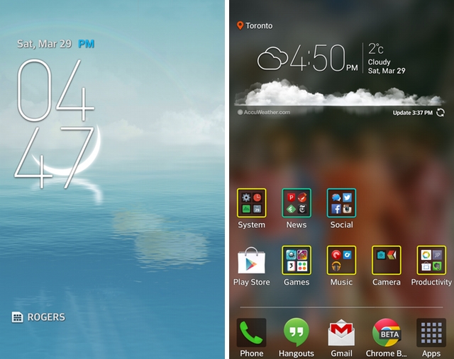
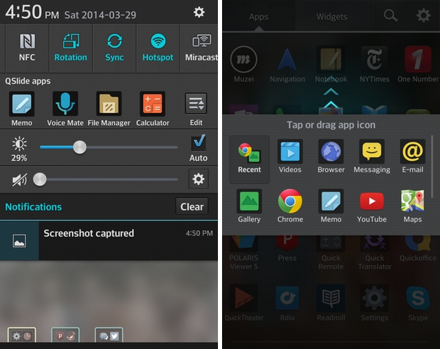
LG has taken care to improve many of its first-party apps from the time the G2 was released, at least. The Gallery app has received a much-needed minimalist overhaul and the Notebook app is a great way to jot a few thoughts with the keyboard or a finger. But many of LG’s apps lack any sort of design at all, existing in the space between utilitarian and downright ugly. Notebook, for example, retains a design paradigm from the Gingerbread era, and the company’s Q Slide overlays, which present small apps like a calculator or calendar in a movable, resizable window, go overboard on the skeumorphism. After using iOS 7, Sense 6.0 and Samsung’s attractive new TouchWIZ UI, it’s even more apparent that LG needs to take its Android design a lot more seriously.
The contradiction of the G Flex’s design-heavy exterior and underwhelming interior can be largely forgiven when the smartphone’s performance is parsed. Like the G2 before it, the Snapdragon 800 SoC and 2GB of RAM combine for a fast, stable Android experience. The encumbrance of Android 4.2 didn’t rear its head as often as it did on the G2 (before it was updated) but lack of compatibility with many Bluetooth LE-based devices, which rely on Android 4.3 or higher, was unfortunate.
Performance was further reinforced by the seemingly-endless supply of battery capacity; LG Chem, one of the company’s subsidiaries, created a custom curved 3,500mAh battery cell for the G Flex, and the result was multi-day uptime on a consistent basis. The 720p OLED display, matched with an extremely efficient processor in the Krait 400 CPU, rarely seemed to stress the internals. The lower native resolution also played nicely with games, most of which look fantastic on the large, bright display. We clocked around 16 hours of continual video playback on the G2 at medium battery levels, connected to WiFi, which is significantly higher than even the G2, our previous battery champ at 12 hours.
Real-world usage was excellent, presenting the first instance of never having to worry about battery levels, even with heavy use, at the end of a long day.
Despite the comparatively good performance, the G Flex often felt slower than the Nexus 5 and updated G2. LG claimed an average of 17% performance improvement moving from Android 4.2.2 to 4.4.2 on the smaller G2, so we’re looking forward to re-testing what the device can do when it too receives the KitKat update later this year.
Camera
The G Flex has the same 13MP camera module as the G2, with one major caveat: it lacks optical image stabilization. The consequence of this is not immediately apparent when taking photos in good lighting conditions, but enter a slightly darkened room, or quest to capture some 1080p video (there’s no 4K support here) and you’re going to increase the risk of blurry, wasted photos.
Still, the f/2.4 lens focused quickly enough for my average-difficult capture tests, and more than not rewarded me with some great photos. As we said with the G2, LG’s 13MP sensor is in the middle of the pack; it lacks the low-light excellence of both HTC One models, and pales next to the Samsung Galaxy S4 and Apple iPhone 5s in regular lighting, but it can produce some excellent results when excercising extra care.
Like Samsung, LG packs its flagships with a seemingly endless supply of camera modes, from HDR to Panorama to Dual Camera (a shot taken with both lenses at once), a decent Night mode with digital stabilization, a Burst Shot mode which takes 20 shots in succession, and Intelligent Auto, which chooses the best mode for the job. The app also allows users to change the ISO, white balance, focus mode (which includes Face tracking, a feature unique to the G Flex that works only half the time) and more.
LG pushes you to take advantage of the rear volume keys as hardware shutter buttons, but they generally only work effectively when using the 2.1MP front-facing camera.
While I was disappointed to discover the omission of optical image stabilization in the G Flex, one of the G2’s saving graces when it came to low-light photo capture due to the relatively small aperture and tight sensor pixel density, I can’t fault the company too much for leaving it out. The shape of the G Flex would be difficult for any engineer to work with, and even without OIS I was pleasantly surprised with many of the shots I took with the device.
Connectivity
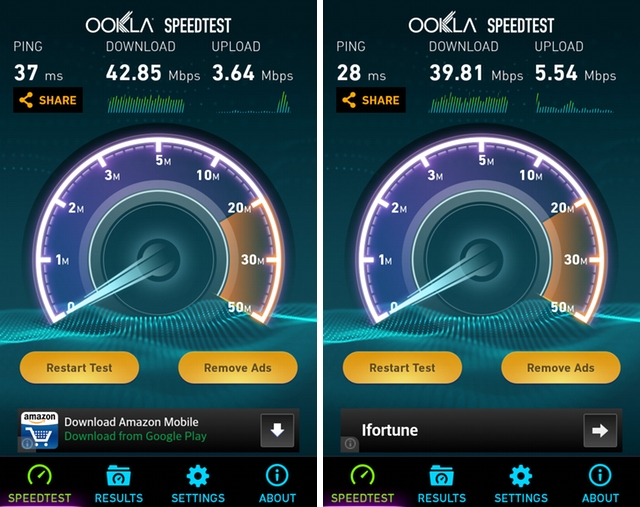
The G Flex connects to the Rogers LTE network on both AWS and 2600Mhz depending on the signal strength of each tower, and results were, as expected, very fast. With theoretical maximum downlink speeds of 150Mbps, the G Flex didn’t quite max its potential, but the Rogers LTE network isn’t quite as empty as it was a year ago, and we can no longer take for granted that large cities like Toronto will deliver 50+Mbps in the downlink.
While I generally clocked 30-40Mbps in downtown Toronto, uplink speeds never rose about 6Mbps, which means that either Rogers has implemented stricter QoS rules, like they have with cable internet, or the towers I generally connected to were overloaded in that direction.
Call quality, both through the headpiece and rear mono speaker, was as good as can be expected over Rogers’ 3G network. Music, played through the speaker, was adequately loud. Holding the phone to your ear, while comfortable, is funny-looking, and I got more than a few stares from onlookers confused by the curved tablet being held to my ear.
Conclusions
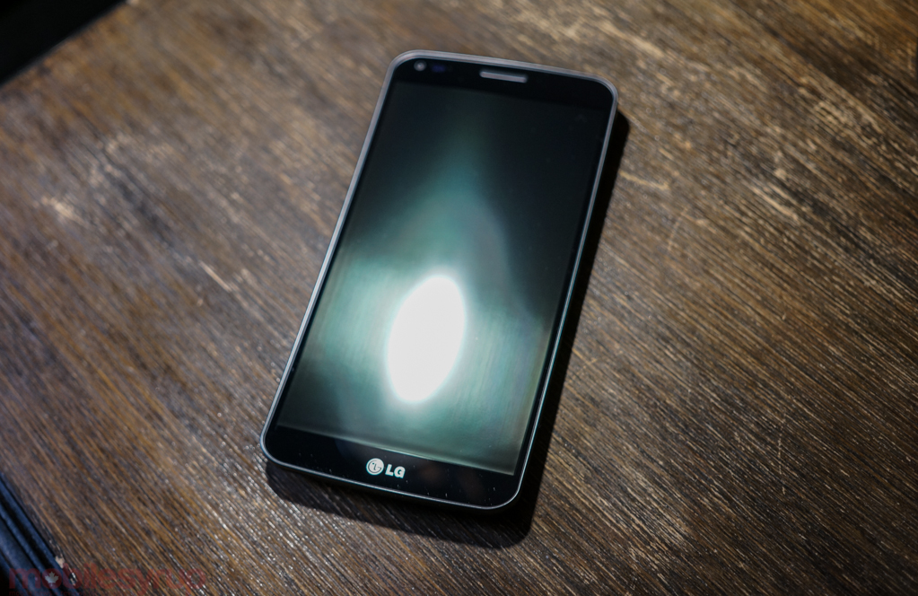
The G Flex is a successful experiment from a company that likely never expected it to expand far beyond its Korean borders. While it’s hard to recommend on the hardware differentiation alone — the curve is interesting but not that useful — the device is a great all-round performer, with excellent battery life, a decent camera and a competent, if boring, Android skin.
At $199.99, it’s $100 more expensive on contract than the Galaxy Note 3, which at this point is better at almost everything but ergonomics. The “self-healing” backing is largely useless when paired with anything sharper than a few errant coins in a pocket, and the top-down curve, while comfortable, is purely aesthetic until software takes advantage of inward-leaning edges. I’m a big fan of the 720p display, but it’s hard to argue that it’s better than the 1080p Super AMOLED display of the Note 3, or even the now-cheaper G2.
MobileSyrup may earn a commission from purchases made via our links, which helps fund the journalism we provide free on our website. These links do not influence our editorial content. Support us here.


