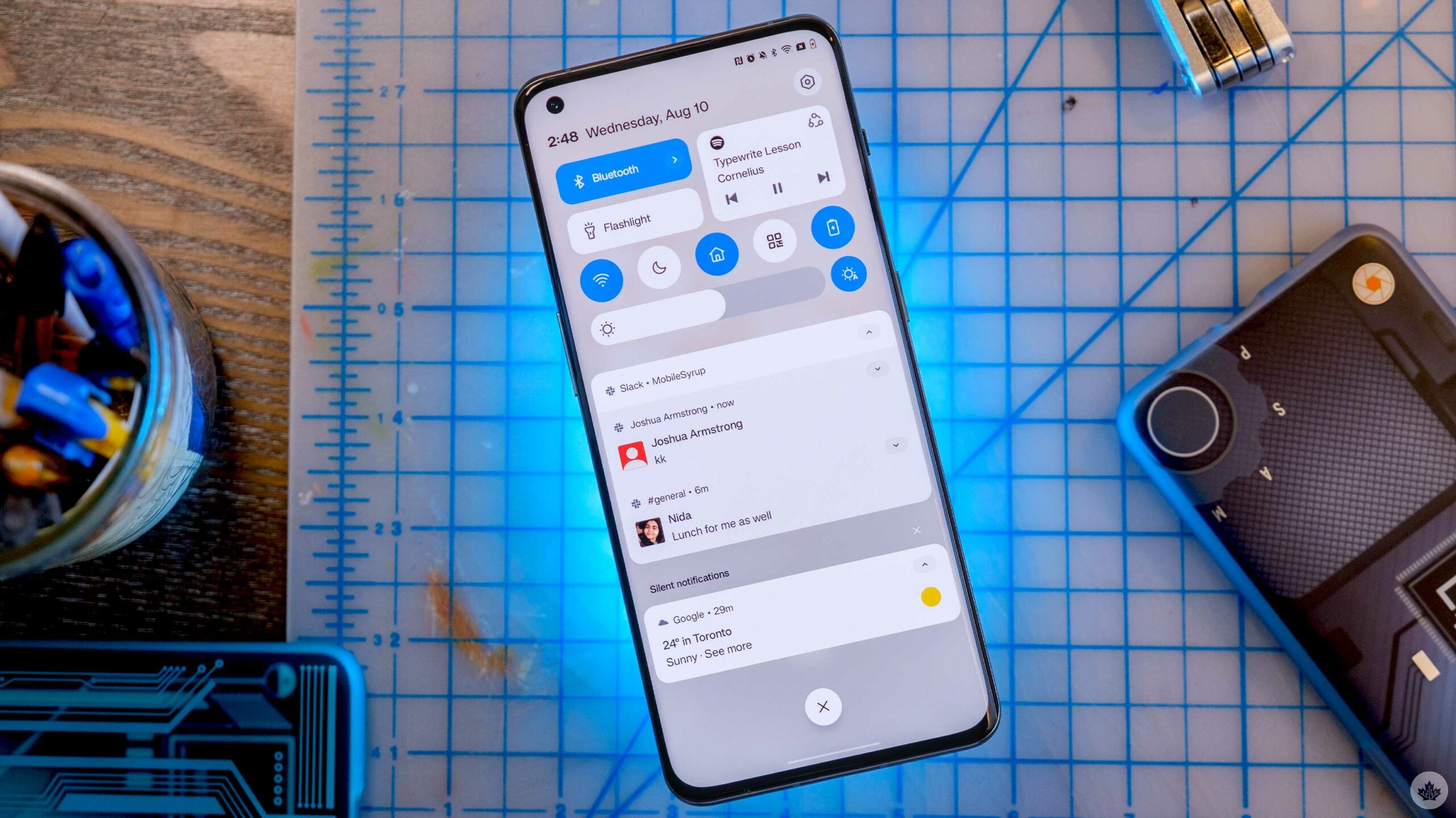
OnePlus isn’t giving its hardcore fans exactly what they wanted with OxygenOS 13, but there’s still a lot to love about it.
I recently downloaded the first OxygenOS 13 beta (Android 13) on my OnePlus 10 Pro, and there’s quite a bit to unpack. By default, you can write this update off as OnePlus finally going full Oppo and completely embracing ColorOS.
Let’s dive in.
The new notification centre
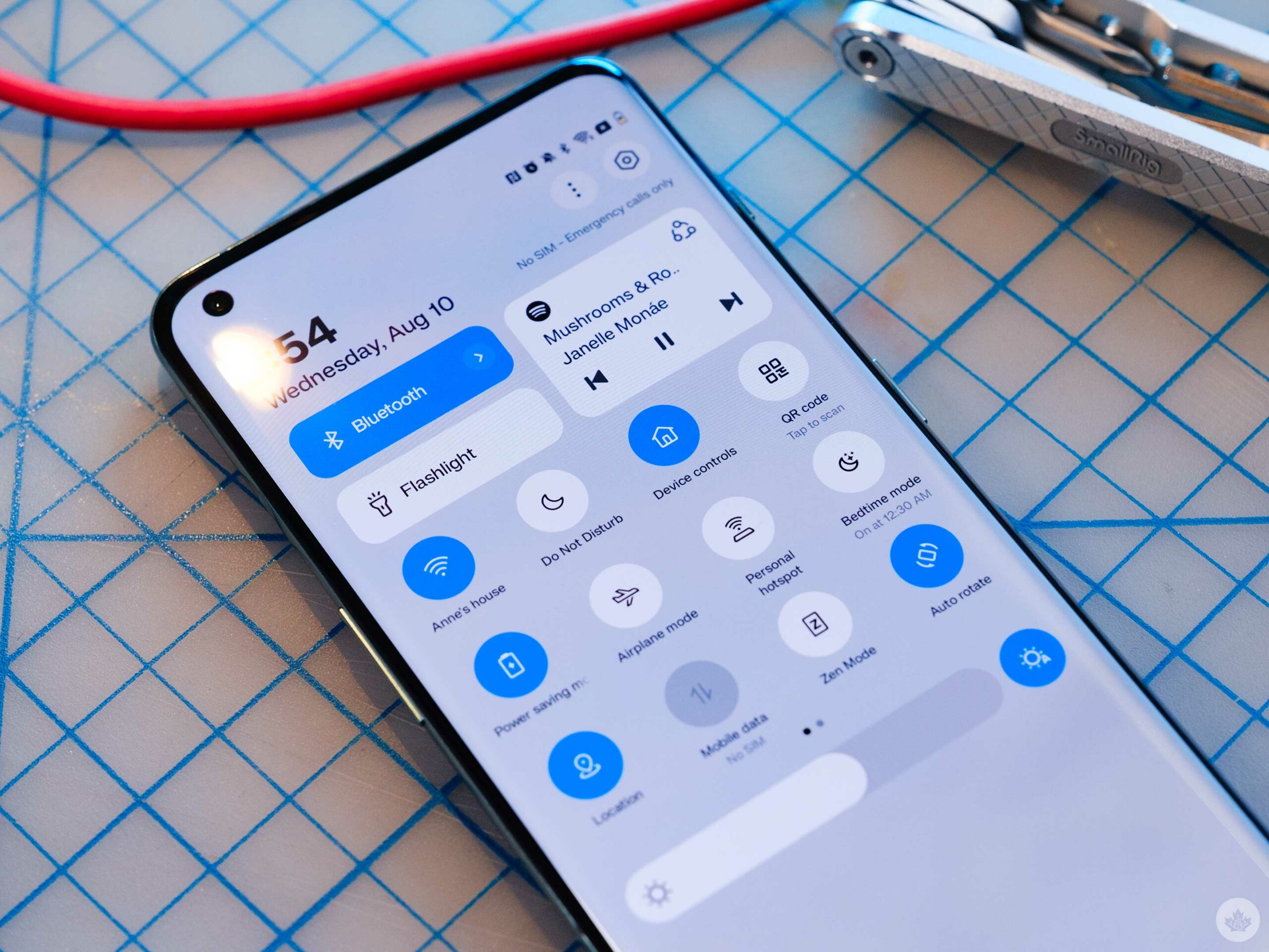
Stepping back from all the hype and the strange callouts to nature OnePlus did during the launch event, I really appreciate the new look and utility of the notification shade in OxygenOS 13.
The new version adapts to your wallpaper colours and follows Google’s ‘Material You’ principles. This is well received, but it’s buggy and doesn’t seem to work correctly in the beta.
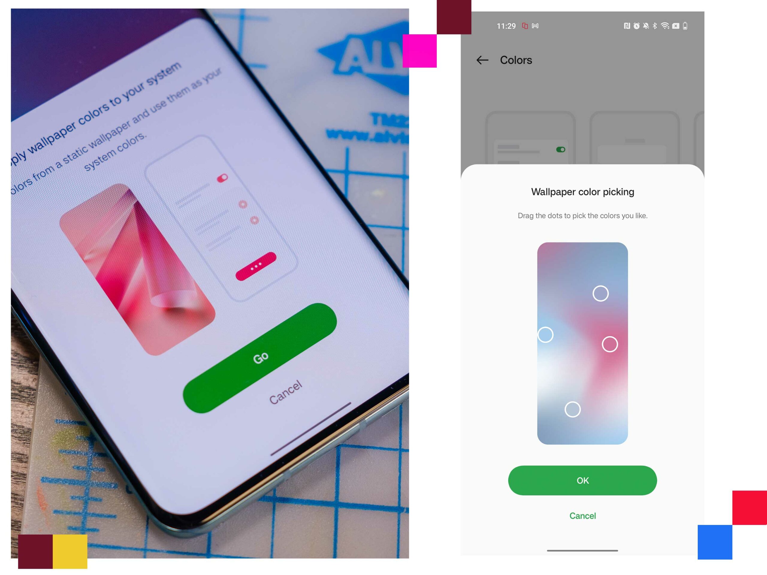
Like with Samsung’s OneUI, users can open the settings and adjust the colours with more control. If you want to pick colours from your wallpaper, you’re presented with four options, but so far, I’ve found that only one gets used.
Ideally, this will be fixed in the full release of the OS with more subtle use of the colours throughout the phone.
This slideshow requires JavaScript.
OxygenOS 12 on the left and OS 13 on the right.
While OnePlus has shoehorned its gaudy red clock into the top left, the rest of the notification panel looks refreshed and ultra-modern compared to OxygenOS 12. Quick toggle actions are larger, plus the now playing interface, flashlight and Bluetooth zones are given a bit of style compared to the older version. If you want, you can swap out the Bluetooth or Flashlight buttons too.
I’m also pleasantly surprised by the use of a fogged layer to separate the notification area from the home screen. Some of the icons in this area have changed as well, but it’s pretty subtle. This is the area where the most visual changes have taken place, and I’m here for it.
Big folder energy
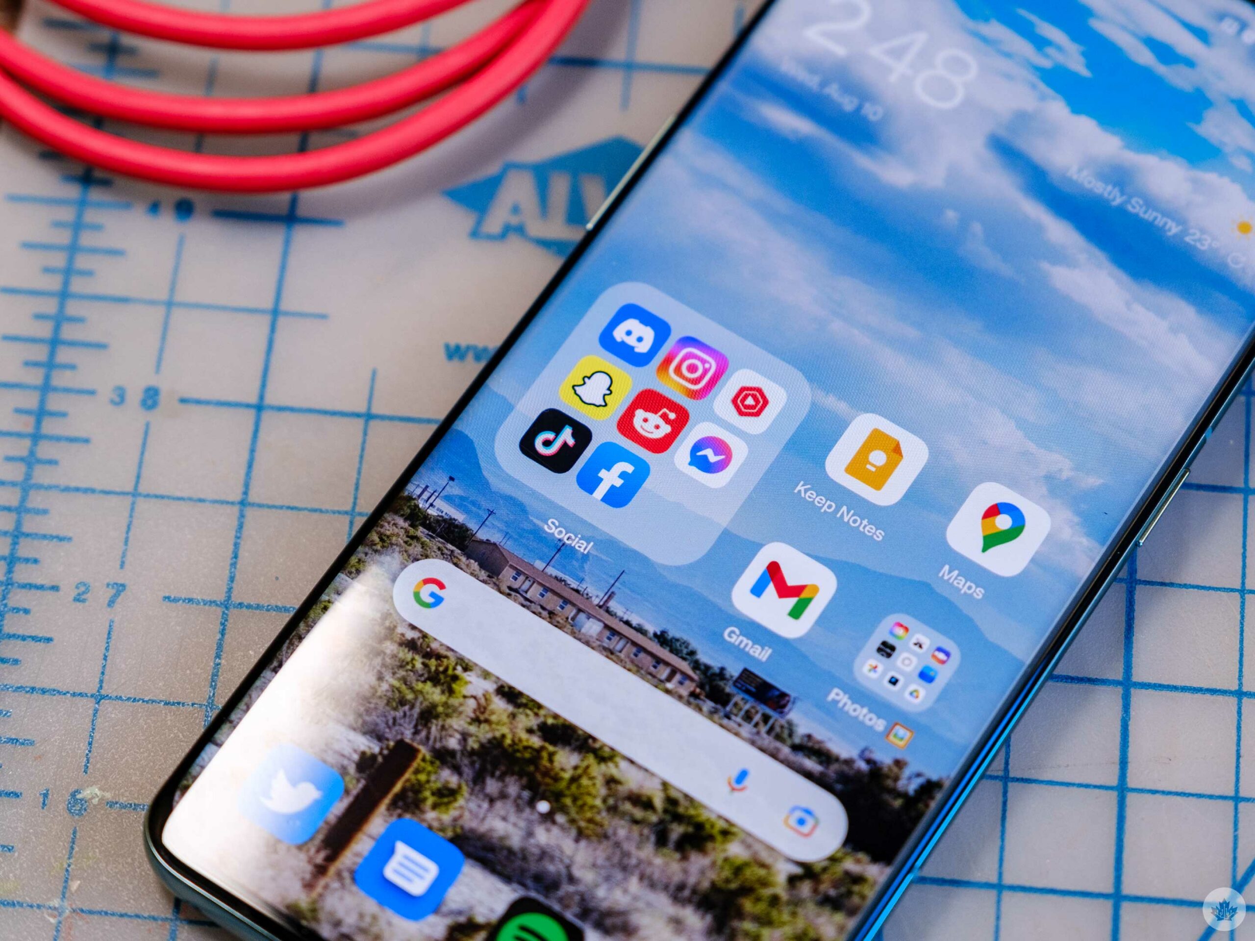
Big apps and folders seem to be the vibe heading into 2023, and OnePlus has gotten the memo.
In OxygenOS 13, you can tap and hold on a folder to expand it to take up a 4×4 space on your home screen. When the folder is large like this, you can tap on each app icon without needing to open the folder, which is pretty convenient. You can even swipe across and store more apps to be easily accessible.
That said, there’s a bug holding this feature back as well. At least, I think there is. If your home screen layout isn’t set to 4×6, the folder will be a rectangle instead of a square. I’m sure some people will be able to work this into their layouts, but I find the square option is the only good-looking version, and it’s not even enabled by default.
Alongside the new folders, there are new animations throughout the operating system that look nice, but seem to take longer than they do on OxygenOS 12 which goes against the ‘fast and smooth’ mantra that OnePlus often touts.
Multitasking, the Samsung way
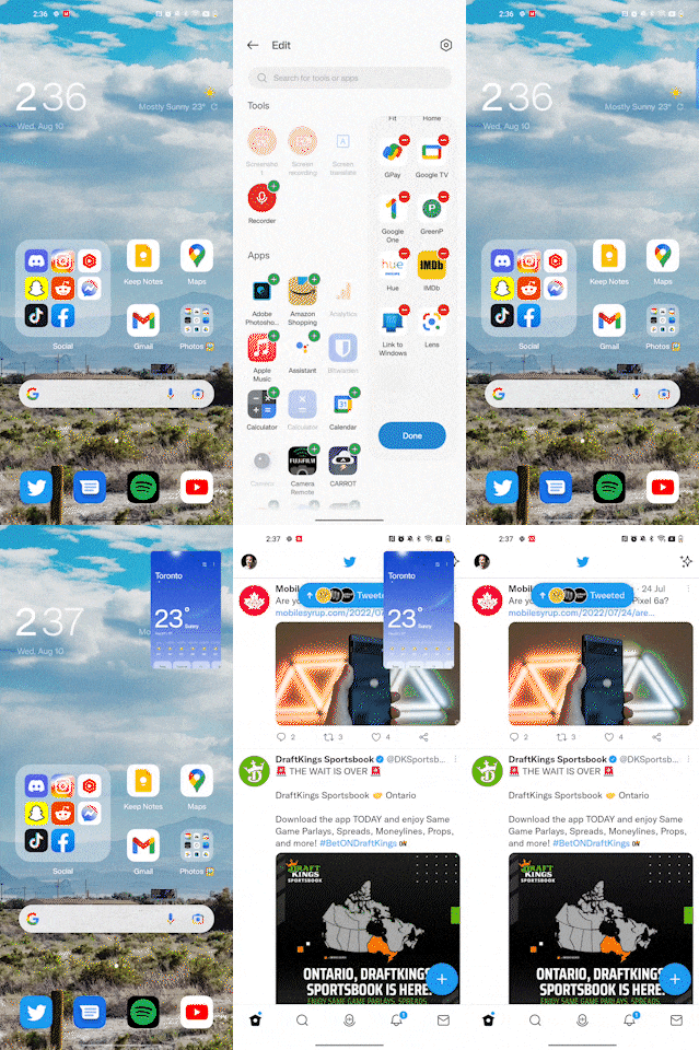 While I may not like OnePlus shying away from digital minimalism, I know there are a few people that are going to be very excited to see OnePlus adopt a Samsung-esque form of multitasking and efficacy throughout OxygenOS 13.
This all starts with the new ‘Smart Sidebar.’ Much like Samsung’s ‘Edge Panels,’ you can store apps here to make your most used apps most comfortable to grab with one hand. OnePlus allows you to store up to 16 apps, plus there are toggles to screen record or take a screenshot.
Interestingly, you can also hide this drawer so it will be invisible until you swipe in from the spot where you tucked it away off-screen. This only works along the top half of the screen since the bottom half is always reserved for the back gesture.
Alongside the new sidebar OnePlus has also revamped multitasking on the phone with new mini-windows. (It’s what happens to the weather app in the Gif above).
Ever since I subscribed to YouTube Premium and have been an avid phone multitasker. I always have a YouTube window open and on top of my other apps. Because of this, I was really excited to try out the new multi-window multitasking in OxygenOS 13.
Some supported apps (not many) can be dragged to the top of the screen from the multitasking interface and tucked into a small window. Then when you need to access it, you tap on it, and the window snaps to be a little bit larger so you can interact with it. You can also drag and drop the window, so each app only takes up half the screen like traditional android multitasking.
Big and small app refreshes
Calculator
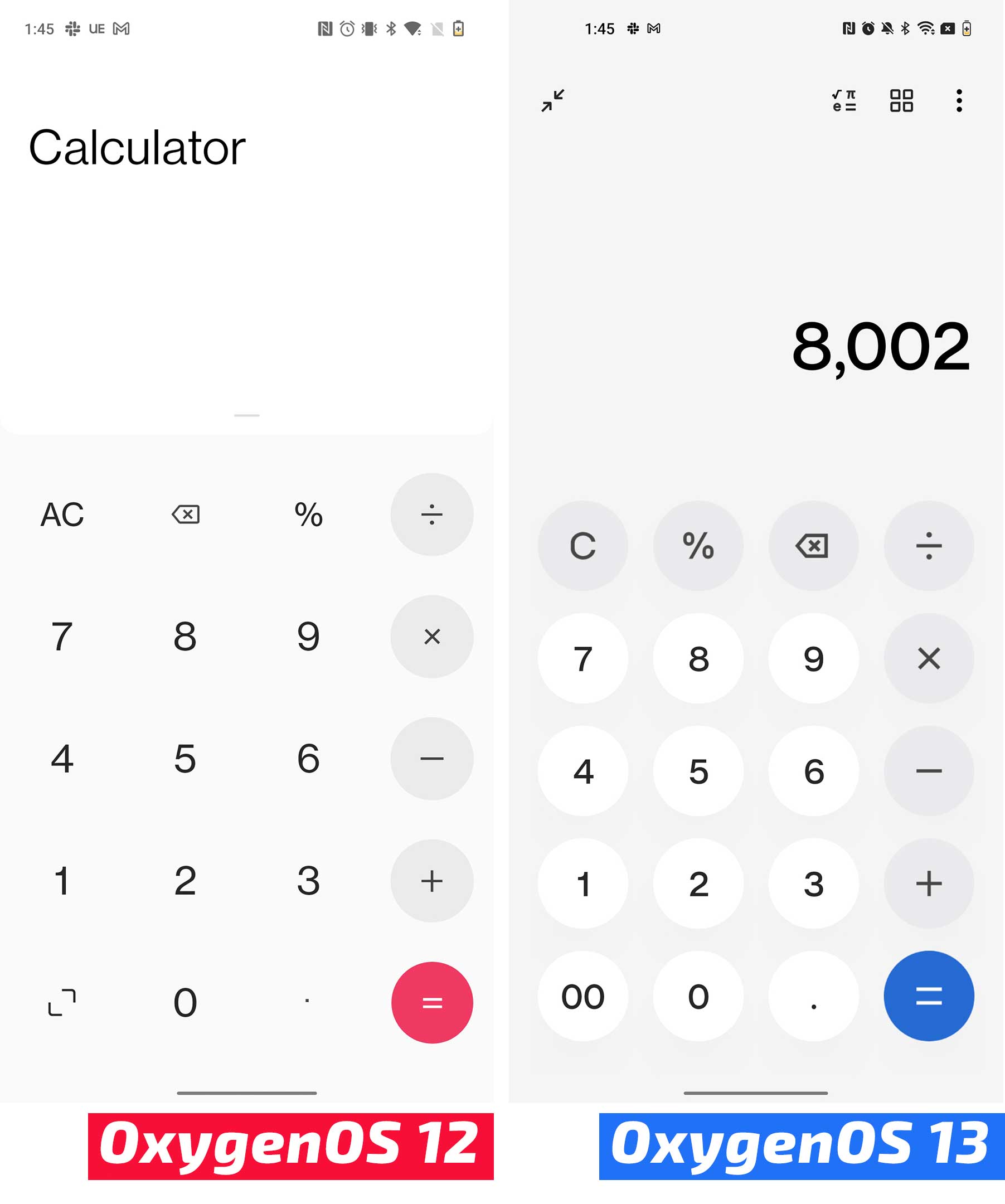
OnePlus also added buttons for quick unit conversions and more calculator buttons along the top of the app in OxygenOS 13.
Clock app
This slideshow requires JavaScript.
OxygenOS 12 on the left and OS 13 on the right.
The clock has changed pretty minimally but tucked into the new Alarm setting screen, there’s a new Alarm sound that changes based on the weather that I’ve found pretty interesting.
Other than that, there are small changes throughout the app, but the most functional among them is the ability to add preset timers to make it easy to time recurring tasks like brushing your teeth.
Weather
This slideshow requires JavaScript.
The weather app has been given one of the freshest coats of paint out of all the apps, but functionally it’s the same as before.
It’s not a bad weather app, but for all its polish, it’s pretty annoying to click on something and get booted to a Chrome window loading Weather.com instead of having more detailed information in the app.
Files
This slideshow requires JavaScript.
I’d like to start this section by saying that I passionately hate OnePlus naming its files app ‘My Files.’
Beyond rubbing more salt in that wound, the new version of My Files has a more visual Recents section and some new iconography on the main app page.
Settings
This slideshow requires JavaScript.
App drawer
MobileSyrup may earn a commission from purchases made via our links, which helps fund the journalism we provide free on our website. These links do not influence our editorial content. Support us here.


