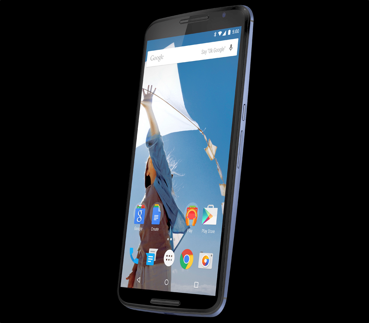
We’ve heard rumours that the Nexus 6 would look a lot like the new Moto X, but our first full-resolution render of the device, courtesy of sometimes-retired @evleaks, confirms that report.
The device features a brand new set of icons, some of which have already made their way onto the Play Store, along with Android L’s new array of virtual navigation buttons.
As for the device itself, the Nexus 6 may feature the largest screen-to-device ratio we’ve ever seen, with barely a top or bottom bezel to speak of. The top and bottom grills are less pronounced than on the 2014 Moto X, but the textured power button and metal frame are unmistakably Motorola.
Also interesting is that it seems Google has recanted on its Google Hangouts SMS integration, reverting to a standard (though redesigned) Messages app.
[source]@evleaks[/source]
MobileSyrup may earn a commission from purchases made via our links, which helps fund the journalism we provide free on our website. These links do not influence our editorial content. Support us here.


