Google has made strides to unify Android’s design and look in Android Q, while still making it customizable for users. One of the more visible parts of that is the recently discovered Pixel Themes app, but there are plenty of little pieces as well.
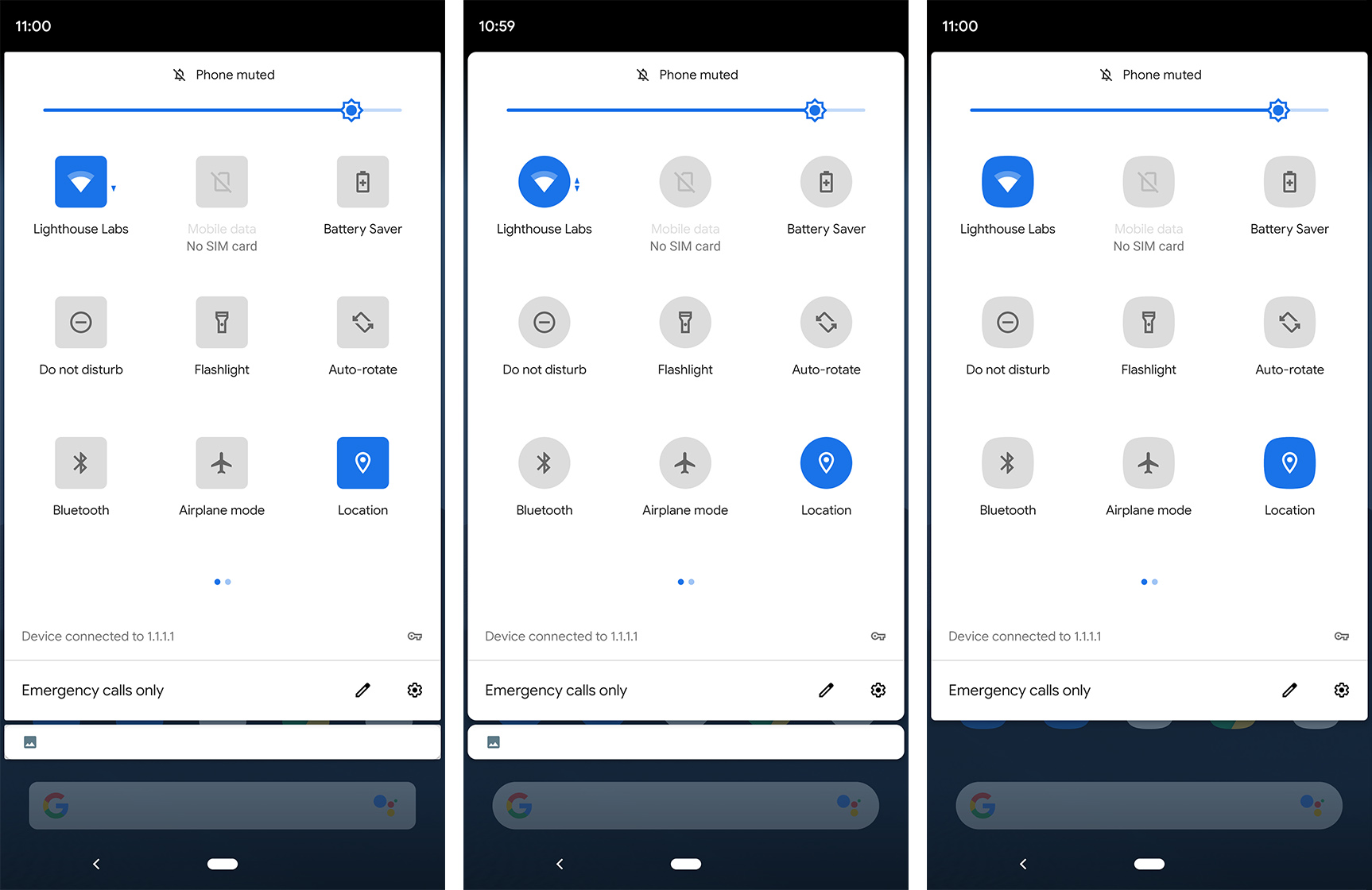
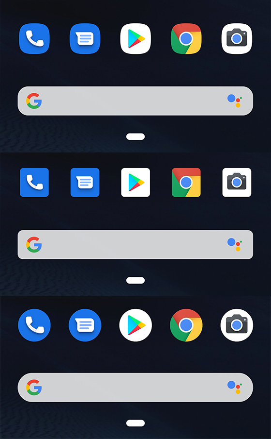
Playing around with Q today, I noticed that changing the app icon shape does a lot more than switch your home screen from rows of circles to rows of squares. It transforms the search bar, Settings icons and quick settings toggles too.
In Android Q Beta 2, you can adjust the icon shape in the Developer Options menu in Settings. All the regulars are here, including the device default (in my case, circles), ‘Teardrop,’ ‘Squircle,’ ‘Rounded Rectangle’ and ‘Square.’
Whichever shape you select, the quick settings toggles in the notification shade — and the notification shade itself — will adapt to that shape. Further, the coloured icons in the Settings menu also take on the style you choose.
It also looks like changing the icon shape subtly adjusts the roundness of the corners of the search bar and other elements in the Settings menu.
![]()
The search bar acts a little differently, however. Selecting either the default — circles — or the Teardrop setting makes the search bar corners very rounded. This fits the style we’re used to on Pixel phones, with the search bar looking like a stretched pill.
Further, using the Rounded Rectangle or Square setting makes the search bar rectangular with slightly rounded corners. To my eye, the rounding on display here matches the rounding present in Android’s dialogue windows, notification shade and more.

Finally, the Squircle option gives the search bar rounder corners than the Rounded Rectangle and Square settings, but not as round as the other settings. I found this one to be particularly buggy, and sometimes it would keep the previous search bar settings.
While ultimately these options are small, it shows greater attention to detail from Google. Having my icon shape match the shape of quick settings toggles and the search bar makes Q feel more together than past iterations of Android.
MobileSyrup may earn a commission from purchases made via our links, which helps fund the journalism we provide free on our website. These links do not influence our editorial content. Support us here.


