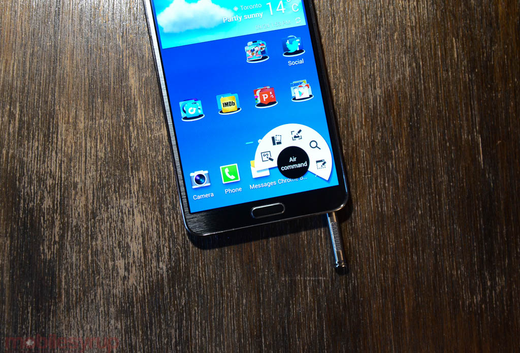
I had the treat to play with Samsung’s newest device line-up this week, the 5.7-inch Galaxy Note 3 and its companion in wearable tech, the Galaxy Gear smart watch.
Neither device was quite ready for production, but Samsung wanted us to get a feel for what will likely be a very potent technology combo when they launch together on October 4th.
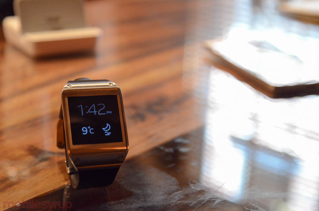
While we didn’t get a long time with the Gear, I can tell you that it’s a lot more usable than it appeared to be when launched at IFA earlier this year. The watch comes with a standard clasp band that, combined with the metal frame, lends it size and weight that I haven’t seen from another device in its category. One can make the argument that the Gear is too big to wear comfortably for hours at a time, but it didn’t appear to be that way on my average-width wrist.
The software took a bit of time to react to touch input, one of the main criticisms we’ve seen levelled against it in early previews, but for the most part it was an enjoyable experience to browse through the various apps and built-in functions. Taking a photo with the Gear is a bit strange, since you’re pointing to an object like Inspector Gadget, but changing watch faces and communicating with the Note 3’s Gear Manager app over Bluetooth is extremely simple.
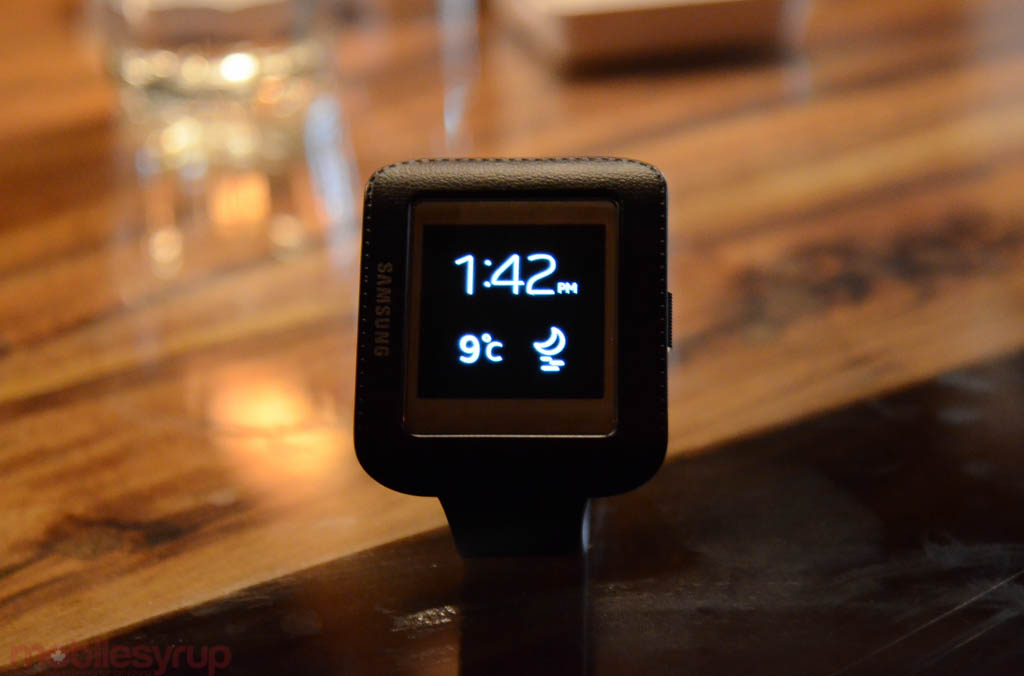 The device charges in a little clasp that allows it to stand upright and be used as a bedside alarm clock, for example. The default screen simply shows the time and weather on the OLED display, but there are at least a dozen faces to choose from.
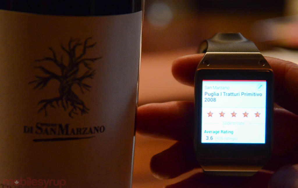
Many of the apps I saw, like this one from Vivino, are simple and single task-focused. While I am legitimately concerned that developers won’t take to the proprietary SDK as kindly as they would if it was an offshoot of the Android SDK, the Gear has a better chance of working than, say, Sony’s Smart Watch, which has struggled to attract big-name developers.
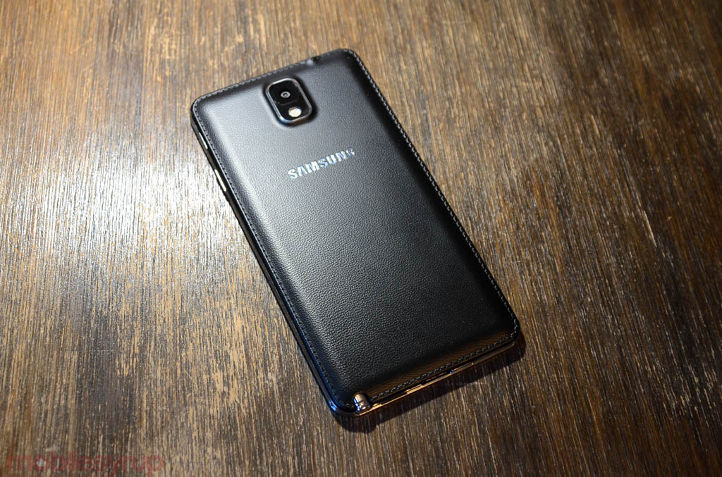 Moving onto the Galaxy Note 3, this is clearly a huge upgrade over last year’s model. Whereas the Note 2 was a more refined version of the original, the Note 3 introduces a higher-resolution screen, a much better S Pen, some of the fastest Android software I’ve seen to date, and a design that looks more classy than cheesy.
The new back cover, though removable, lends the 5.7-inch smartphone a real sense of professionalism, and finally moves Samsung away from the slippery Hyperglaze plastic we know and tolerate.
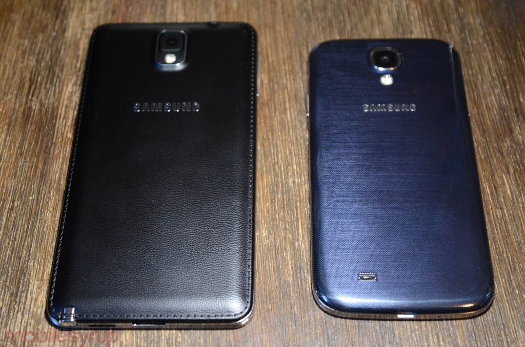
You can see the fundamental differences in build quality from the shot above. Whereas the Galaxy S4 shimmers and plays with the light (along with fingerprints), the Note 3 is a decidedly business affair. It feels no bigger than last year’s Note II, and is indeed only slightly taller, while being thinner and narrower.
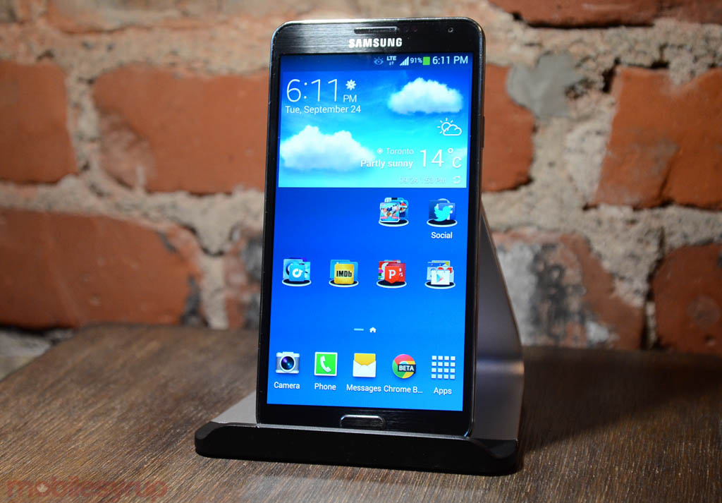
I’m not going to say the Note 3’s Super AMOLED screen is better than the G2’s, but it’s certainly an improvement over the S4, with more accurate colours and better maximum brightness.
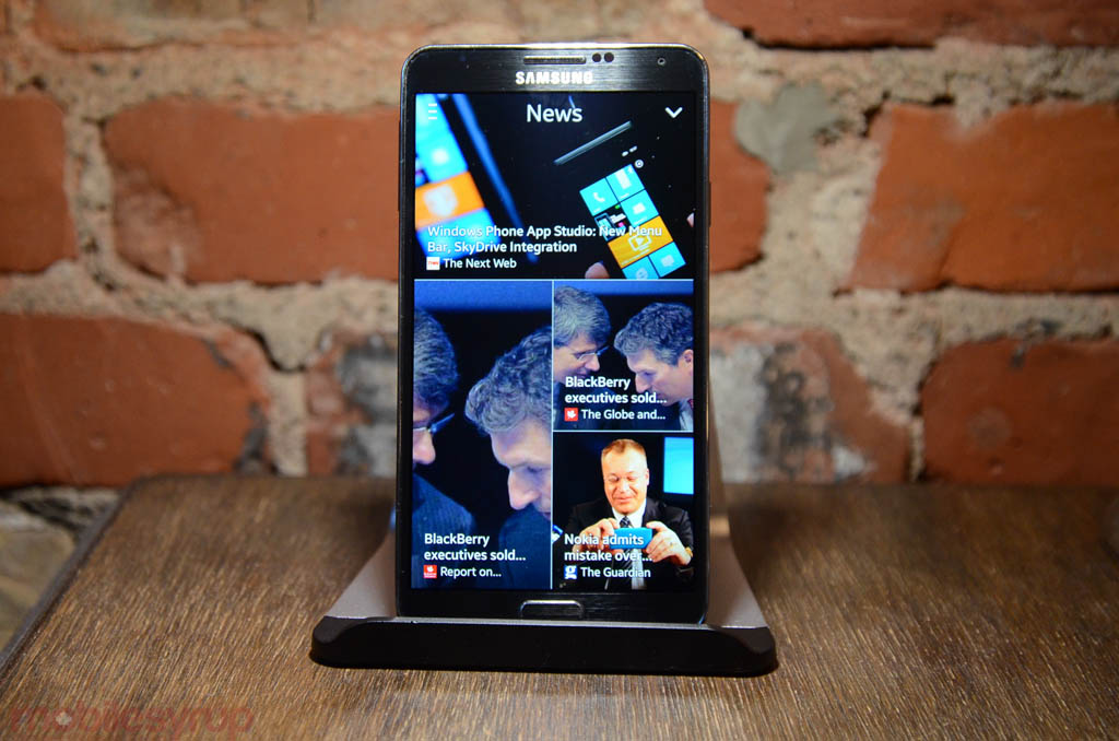 I won’t get into too much software stuff pre-review, but let’s just say that Samsung realized people didn’t want to sync their devices to a Samsung account any longer and added Evernote support to S Note. That, along with the improved touch response and more robust S Pen apps, makes the Note 3 a veritable notebook replacement, the first time I can say that with confidence in the product’s three-year life cycle.
We’ll have a review up in the next few weeks, so stay tuned.
MobileSyrup may earn a commission from purchases made via our links, which helps fund the journalism we provide free on our website. These links do not influence our editorial content. Support us here.


