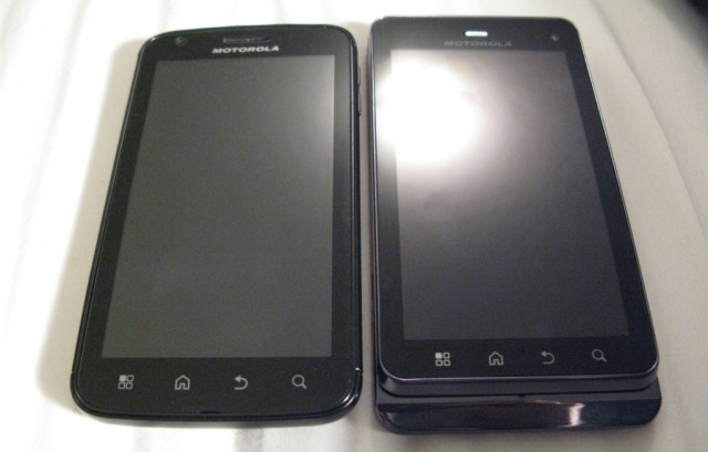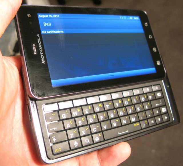
There is still a big market for phones with physical keyboards. I see them all the time, from teens with their affordable feature phones pecking away at text messages, to myriad BlackBerry users heads down on the subway reading their thousandth email. The slide-out QWERTY, at least in the Android space, owes most of its lineage to Motorola’s iconic Droid device, released in Canada on Telus as the Milestone in February 2010.
Now on its third iteration (though not referred to as the Milestone 3) Bell is releasing the XT860 as a member of its four-strong Superphone entourage. It’s a powerful device with some impressive internals, but a four inch screen and sizable dimensions may keep it from being a mainstream device. Follow us to see if the XT860 has what it takes to be your next device.
Specs:
– Android 2.3.4 with custom Motorola overlay
– 4″ 960×540 qHD PenTile LCD display
– 1Ghz Dual-core TI OMAP4430 processor
– 512MB RAM / 16GB Internal Storage (expandable to 48GB with microSD card)
– 8MP back camera w/ dual-LED flash / VGA front camera
– 1080p video capture @ 30fps
– WiFi (b/g/n) / Bluetooth 2.1 with A2DP support / A-GPS, S-GPS
– Micro HDMI output
– 1540mAh battery
– 124 x 64 x 13 mm
– 184g
– GSM 850, 900, 1800, 1900 (2G) / UMTS 850/1900/2100 (3G)
– 14.4Mbps HSDPA / 5.76Mbps HSUPA
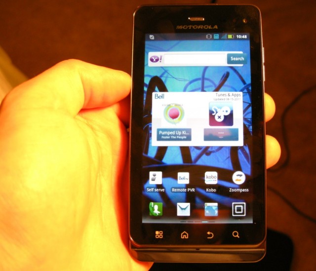
The Phone
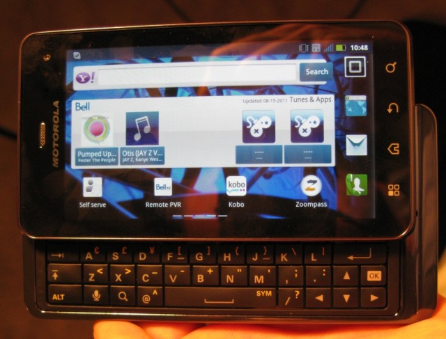
This is a big one. At 184g, it’s significantly heavier than most Android devices, though surprisingly only four grams over the Desire Z, which appears tiny next to the XT860. Graciously, though, it’s relatively thin: for a QWERTY slider Motorola have smartly been able to keep the thickness to under 13mm. We appreciated the contrast in size and thickness with the Galaxy S II, which, at 4.3″ is only 8.4mm thick, and so too with the XT860 has Motorola tricked us into thinking the device is smaller than it is.
It’s graphite-black all over, with a matte backing that we love and a stubborn sliding mechanism that we appreciate. The improvements to the Milestone’s design are numerous, but what is most significant is the relative cohesion of the entire body. When looked upon straight down there is no indication, other than the lip at the bottom, that there is a keyboard hiding underneath. There are few seams, and, unlike most QWERTY sliders there is little to no give on the top portion of the phone when wielding; the Desire Z would open, exposing its keyboard, with little more than a look. This tension is a result of a very tight sliding mechanism, and some clever engineering.
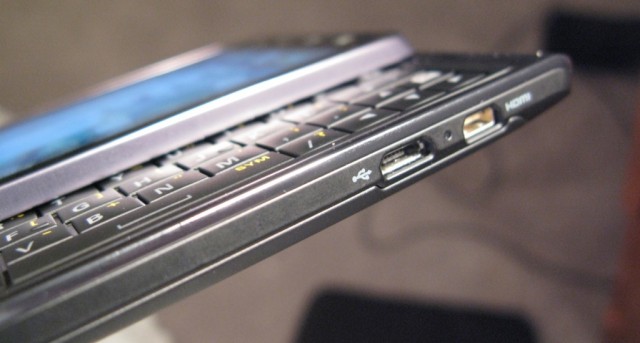
Most of the requisite ports and buttons are where we left them: the volume rocker is on the top right of the phone, with delineated portions that make it easy to click in the correct direction. The microUSB and mini HDMI ports are on the bottom left, and the power and 3.5mm jack are on the top. We really like the positioning of the power button, which is smack-dab in the middle, especially coming from the Atrix, which, though it had its reasons, was difficult to reach.
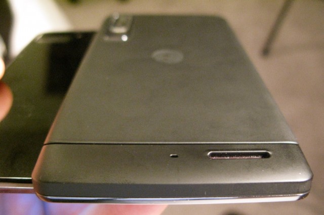
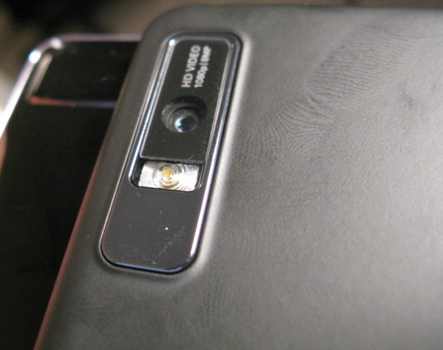
Unlike HTC, which prefers some flair in its headset grill, the XT860’s is rather unassuming, a small silver slit right in the middle above the screen. Next to it is a rather-disappointing VGA front-facing camera, and on the back the 8MP shooter runs vertically on the left side.
Opening the phone reveals a five-row keyboard with dedicated number panel. We cannot tell you how many times this has come in handy over the past few days — it’s surprising how often we use them — and though the rest of the keys aren’t separated there is enough of a raised distinction to be able to tell them apart without looking.
The keys have all the expected symbols on them, and even some that we didn’t: it’s nice to have a dedicated ‘OK’ button below ‘Enter’ and the inclusion of ‘@’ and ‘/’ keys are added bonuses. Keep in mind, however, that unless you require, for whatever reason, the hardware keyboard, the virtual keyboard onboard is quite capable, and third-party keyboards have come a long way since the original Droid was released a year and a half ago. It’s a great keyboard — one of the best, in fact — but for those who don’t need it, the Atrix may still be their best bet.
The Display
The qHD display on the XT860 has a resolution of 960×540 pixels, and as far as we can tell it’s the identical part to the one on the Atrix, which we, for the most part, liked a lot. Text is crisp and readable, and brightness levels are excellent. Whites seem evenly toned, and blacks the same, though like most non-AMOLED screens blacks come off a bit grey. Colours are really the only problem we have with the XT860’s screen, as calibration seems off-centre: bright greens come off as muted and dark; reds a shade left of orange; and blues all take a variable form of navy.
There is a reason, and a benefit, to the seemingly off-balance colour: PenTile. While most people who don’t know the technology deride it for being a nuisance at best, and a significant detriment to readability, there are a lot of benefits to Motorola using PenTile in their LCD displays. The technology, licensed by Samsung, adds a white subpixel to the regular red, green and blue (RGB+W) subpixels that form every one of the 960×540 pixels on the screen. As a result, general brightness is lower because the white subpixels provide their own source of light: the backlight has to work less hard. This saves battery life, and cuts costs for the manufacturer, but does come at a price to absolute sharpness. There are fewer overall subpixels on a PenTile display, making text look somewhat more grainy than their regular LCD counterparts. In contrast, Samsung, with their Galaxy S II, uses a regular RGB palette on its Super AMOLED Plus display, but packs 12 subpixels into every pixel, as opposed to eight on the XT860.
We did notice that, when zoomed out, text is a bit harder to read on the XT860 as opposed to other qHD displays like the Sensation, but the former has far better black levels, viewing angles and battery life, so we would be remiss to complain too much.
Performance
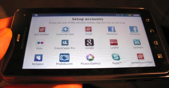
The XT860 runs Android 2.3.4, and forget about MOTOBLUR, that’s gone. When you start up your device, unlike in times or yore there is only one place you need to log in to, and it’s the same as all other Android phones: Google. That being said, Motorola has smartly kept all those excellent syncing services intact, so when you hit the Account app, you have the requisite email, Facebook, Twitter sync, but also more obscure ones like Picasa and Photobucket. We actually miss being able to sign into our Blur account and have all those services already there, ready to go, but it’s comforting to know the company was listening to their customers when they disavowed the much-hated Blur requirement.
The Android 2.3 of the XT860 is one of the most interesting we’ve seen among all the manufacturers. Clearly Motorola thinks the phone has enough horsepower to spare, as they’ve outfitted the UI with 3D transitions, garish glows on the perimeter of most screens, and a generally overzealous use of highlights. Normally we wouldn’t mind this but it does take a toll on overall performance: changing homescreens tends to be creaky, and often when we opened the app drawer or interacted with a widget there would be noticeable delays.
The TI OMAP 4430 SoC inside the device has two 1Ghz Cortex ARM9 cores and a healthy PowerVR SGX 540 GPU clocked to 304Mhz. This is the same graphics chip as in Samsung’s Hummingbird processor, but clocked over 30% faster. When the Galaxy S devices were released in mid-2010 it was remarkable how much ahead of their time they were in graphics benchmarks, blowing away all other Android devices on the market. A year later the tech is still powerful, but comes in about the same as its main competitors, namely nVidia’s Tegra 2 integrated graphics and the Adreno 220 in Qualcomm’s latest Snapdragon chips. To get a bit technical for a sec, this OMAP chipset has one clear advantage over Tegra 2: the ability to execute NEON commands. According to Wikipedia, NEON ” is a combined 64- and 128-bit single instruction multiple data (SIMD) instruction set that provides standardized acceleration for media and signal processing applications.” In other words, Android supports a bunch of graphics features that can be significantly enhanced if plugged into the NEON instruction set, providing an overall-smoother experience when decoding, encoding and processing movies, music and games.
The XT860 does not disappoint in this regard. Scoring a healthy 2039 in the Quadrant Benchmark Suite, it achieved one of the fastest Sunspider Javascript Benchmark scores we’ve seen (likely because the test supports some NEON calls) at 4009ms. This is second only to the Galaxy S II. And despite the disappointing 512MB of RAM, the device kept up with our multitasking proclivities. We did notice the occasional time RAM got a bit low, hovering below the 50MB mark, but Android’s built-in task manager adroitly closed unused background apps when necessary.
In earnest, the current crop of dual-core Android phones have more than enough power to get you through your most arduous tasks. The nice thing about this device is that it does them without feeling like a chore.
Cameras
There are two cameras on the XT860 and both are good enough for the average person. Unlike the newly-released HTC myTouch 4G Slide (which isn’t available in Canada…yet) there is little emphasis on this phone’s ocular abilities: the 8MP sensor on the back seems to be slightly better than the 5MP equivalent on the Atrix, and the VGA front-facing camera appears to be identical in quality. With adequate light the results are quite good — even great if you’re careful — with accurate colours, excellent detail and very little graininess. The lack of a dedicated shutter button is disappointing, as there is plenty of room to fit one on the back portion of the phone, but the software does a great job. Low-light shots are admittedly grainy, and darker than we’d like: it’s clear the aperture is fairly small, and there isn’t enough light coming into the optics. One area we’d like to see Motorola improve, especially with its purchase by Google, is in the quality of its camera optics.
The camera UI is very much a simple affair. The virtual shutter button is aligned right centre, though it doesn’t change orientation when you turn the phone. There are no hidden menus or quirky settings, just a single line of tweaks. All the regular stuff is here: brightness, scene mode, auto-flash, but there is a nifty panorama mode that stitches together three photos to make a very cool tapestry.
One of the neatest features about the camera app is the ability to configure an auto-upload destination. If you want to upload a photo or video to Facebook, or automatically email one after it’s taken, this can be configured in the Gallery app. It’s an aspect of the Google+ app we love, and it’s nice to see this integrated directly into the operating system.
Video is a nice 1080p @ 30fps, and while not the best quality we’ve seen, like the stills it looks great when there is enough light. Frame rates are smooth with jitter kept to a minimum, and even the microphones pick up some decent stereo sound.
The less that is said about the front-facing camera the better. This build of Android 2.3.4 inexplicably is not compatible with video calling in Google Talk, which is a huge oversight considering it was one of the most exciting features of the upgrade from 2.3.3. We tested Skype and that too had issues with video calling: we could see the other person but all they saw was a black screen when using either the front or back cameras. After 20 seconds or so, the app crashed. Not good, Motorola. Not good.
Android 2.3.4.infinity
This version of Android looks great. It really does. If Google were to purchase any OEM in 2011, we’re glad it was Motorola. They seem to have learned from their MOTOBLUR mistakes and have designed Android 2.3.4 to feel not only quick, but work well. That’s not to say we prefer it to stock Android, because we don’t, but it’s fast become our favourite skin.
What was once a mess of bland style, intrusive widgets and forced MOTOBLUR is now a unified and attractive skin replete with sci-fi elements. There is a blue glow, or hue, around most buttons, and the 3D effects, while CPU-taxing, are well produced. By default all animations are turned on, and with it is the only real concern we have with this new implementation: the transition animations, whereby the next screen “pops out” of the current one, is amateurish. We turned it off immediately, but that also turns off the Gingerbread CRT effect. There is no in-between, which hopefully Motorola will alter in an update. However, there is a lovely “rolling” animation employed when changing landscapes. We really, really wish we could turn off just the transition animation.
Like in Blur, there are numerous services offered for synchronization, from Corporate Exchange to Photobucket to Twitter and Facebook. These services are tied into relevant apps, so you can share your photos straight to any service from within the Gallery, or you can consolidate your social media in the Feeds widget. We want to give special mention to that Gallery app, which not only displays yours, and your various networks’, pictures in a cool 3D carousel, but there is one-touch access to DLNA services and all your individual services’ photos, all sortable to an enviable grainability.
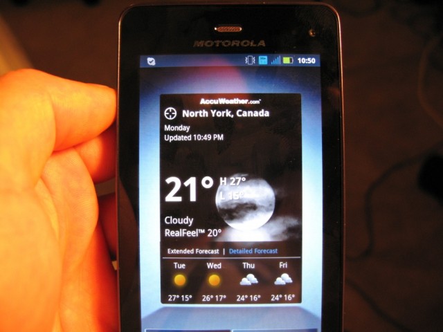
The weather and news widgets open to their own portals, and you can subscribe to different feeds from within the app. There is a permanent, though customizable, three-button dock at the bottom of the screen, and an app drawer button on the far right which opens to a horizontal list of your apps. We liked the implementation — it gives your apps space to breathe and be seen among the clutter — though we would have liked to option to make it vertical, or to remove the 3D effect which, when you have hundreds of apps, causes considerable slowdown. Apps can be sorted by frequently used or recently used as well as alphabetically, but our favourite feature was the ability to create categories within the app drawer, so to be able to isolate games, productivity apps, etc. There is a healthy 2GB of app storage among the 16GB that ships with the device, and since app sizes are getting bigger by the month, it is appreciated.
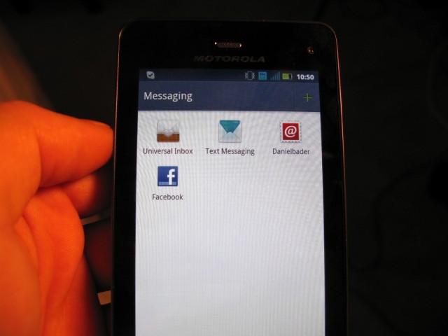
Motorola has kept most of the native Google apps well enough alone, and any changes are minor but significant. We love the email client, which has tons of options, supports a unified inbox as well as threaded messaging and push delivery. They’re also keen to keep the enterprise users happy, bringing every form of Exchange compatibility there is. We had no issues hooking up our corporate email, which often stumps other OEMs’ clients due to a seemingly-malformed security certificate, and delivery was almost instantaneous.
The included browser appears unchanged from stock, but we are happy to report that Flash videos, even at 720p, play with aplomb on the XT860. The music player, however, titled just Music, is deceptively feature-filled. Not only can you play your own local music, but there is built-in Shoutcast internet radio support along with a regular FM transceiver. A music video hub, along with TuneWiki community hub brings YouTube-based music videos directly to you with Top 50 charts, and to top it all off there is a Shazam-like Song Identification feature. Very cool.
We did have some stability issues with the YouTube app, and all videos, regardless of quality, had a green tinge and static lines through them, like a warped video tape. We isolated the problem to the app itself, and not all video, so it seems like an incompatibility problem with the device. All other video played smooth and looked great.
An interesting inclusion to the XT860’s growing business repertoire is MOTOPRINT, a WiFi-based network printing app that consolidates documents, photos and emails into one app. Most PostScript-compatible printers are compatible, and we had no issues finding the two network printers across our LAN. Because our printers do not support PostScript we had to use the MOTOPRINT Host Utility which is a simple download that sits in your tray waiting for input. The included help document states that the feature will be improved upon in a subsequent release, but for now the protocol supports most Microsoft Office documents, including Word, Powerpoint and Excel.
Furthering the business slant is the included Citrix Receiver app. Like GoToMeeting or LogMeIn, Citrix Receiver allows you to take control of a compatible PC across a Corporate network.
We were also quite enthralled with the boot animation, which shows a pulsing 3D Motorola logo. And we can’t forget the HDMI out, which mirrors the qHD screen up to 1080p, a must for presentations and the like. QuickOffice is pre-loaded onto the XT860 for creating Word-compatible documents.
Like all other Bell Android devices, there are a few apps pre-loaded such as a Tunes & Apps portal, TV & Radio app, a couple game demos, Zoompass and a Self Service portal. Nothing too offensive, except for the fact that they cannot be removed.
Battery Life
The XT860 comes with a 1540mAh battery, and we were very happy with the results. Lugging the beast around in our pockets, we used it daily for about two weeks, and for the most part we got between 18 and 24 hours of battery life with moderate use. Some days, when the emails were a barrage and the Twitter a-plenty the numbers dipped below 15 hours, but for a battery with some 400mAh less than the Atrix we were expecting a sizeable drop in juice, which was thankfully not to be.
Looping a movie we were able to score roughly eight hours of usage before the battery hit red, and that was with the 3G connection turned on. One of the nicest aspects of Motorola Android devices are their extensive battery saving modes, which allow for a custom battery percentage to be the trigger for turning off various radios. There is also a low-power “Sleep” mode that turns off the screen and all the radios, but powers back on instantly, which is great for leaving the device unplugged overnight, or to avoid unwanted notifications.
Call Quality and Network Speeds
One of Motorola’s strengths is in its radios, and the XT860 is thankfully no exception. Not only is talk time a whopping 10+ hours, but quality is fantastic over Bell’s HSPA+ network. With a second microphone for noise cancellation we, and our listeners, encountered no static or drops, even in places like the basement where signal usually degraded to one or two bars.
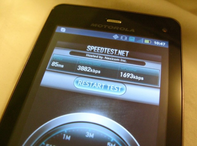
Network speeds, like the other Superphones in Bell’s line up, were quite good, averaging 3-4Mbps download speeds and 1-2Mbps upload in and around the Greater Toronto Area.
Conclusions
The final device in the Superphone quattro, the XT860 had the quietest release and the least fanfare. We have yet to see a single advertisement for a device that has nestled itself into our hearts over the past few weeks as one of the best QWERTY sliders ever released. What it lacks in finesse it makes up for in brute strength, and with fantastic build quality, aesthetics and an overhauled Android experience it’s THE choice for the business-minded looking to move away from the BlackBerry. And this is exactly who Moto is appealing to with its extensive enterprise, VPN and Exchange support.
On the other hand there is a robust social networking and messaging pedigree here, too, and as long as you can get over the weight, girth and overall intimidating nature of the beast, it’s easy enough to tame.
The Motorola XT860 is available now on Bell for $99.95 on a 3-year term, and $549.95 outright.
Rating: 8/10
Pros:
– Excellent build quality
– Best-in-class hardware keyboard
– Fast dual-core processor makes for smooth usability
– Good camera quality for stills and video alike
– Plenty of internal storage, plus microSD card support
– HDMI out, plus loads of business-oriented features make this an obvious BlackBerry alternative
– Nice improvements to Android
– Lots of services supported beyond the obvious ones, robust implementation
– Very good battery life, call quality, network speeds
– Cool auto-upload photo and video features
– Good entry price for 3-year term
Cons:
– May be too large for some hands
– Keyboard keys too close together, could gain more space by eliminating extraneous keys
– Some bugs made the occasional app crash and laggy performance
– PenTile screen may be too grainy for some
– Poor low-light camera performance
– 512MB RAM is too little for a modern smartphone (Atrix has 1GB and was released six months ago)
– Gets hot after moderate use
– High outright price
MobileSyrup may earn a commission from purchases made via our links, which helps fund the journalism we provide free on our website. These links do not influence our editorial content. Support us here.


