It’s been a good week for Google’s modern Material Design.
First, Google Keep is getting an update, and now, the Google Clock has the latest design too.
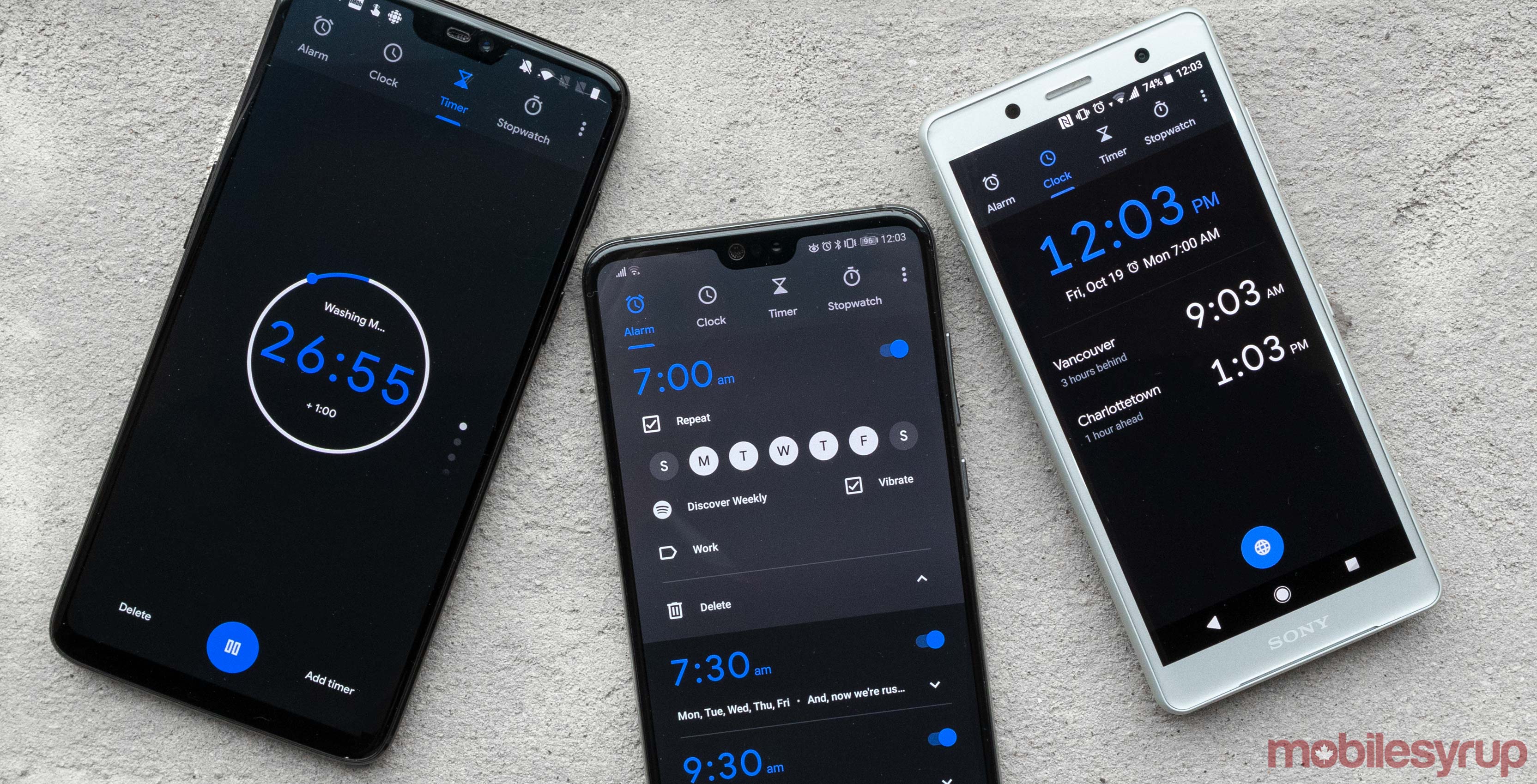
Android Police discovered the modern design for Clock on October 9th, and now, the live version of the app has the refreshed appearance.
Overall, the update adds the search company’s custom font, Google Sans. If you’re a Pixel 3 owner, then you also have the option to set the phone to brighten if it’s on a Pixel Stand before your alarm goes off.
For everyone that doesn’t have a Pixel 3 or a Pixel Stand, the app functions the same as before. Users can set alarms or timers, and use it as a stopwatch. Some of the app’s iconography has evolved. For example, in the clock tab there used to be a globe icon to add times from around the world. Now, the icon is more of a wire-frame sphere.
The screensaver mode is still around for users who want to place their phone on their nightstand and use it as a clock. It uses Google Sans too, so it looks more better than some third-party Ambient displays.
Even the alarm sounds screen has been tweaked slightly, and Spotify integration is still there.
It’s nice to see another Google app make its way to the new design. If you’re wondering what other apps are updated, then check out MobileSyrup’s guide to Google’s modern design.
Source: Google Play, Android Police
MobileSyrup may earn a commission from purchases made via our links, which helps fund the journalism we provide free on our website. These links do not influence our editorial content. Support us here.
