Google Maps is getting a small redesign on mobile. The changes come in the wake of Google sprucing up Maps with generative AI features.
Spotted by 9to5Google, the changes are minor but could go a long way to helping usability, especially with one hand or on bigger displays. None of these changes were live on my devices at the time of writing. 9to5 says the changes haven’t been rolled out widely on Android yet, but they are starting to appear for some users. The changes are expected to hit the iOS version of Maps in the future.
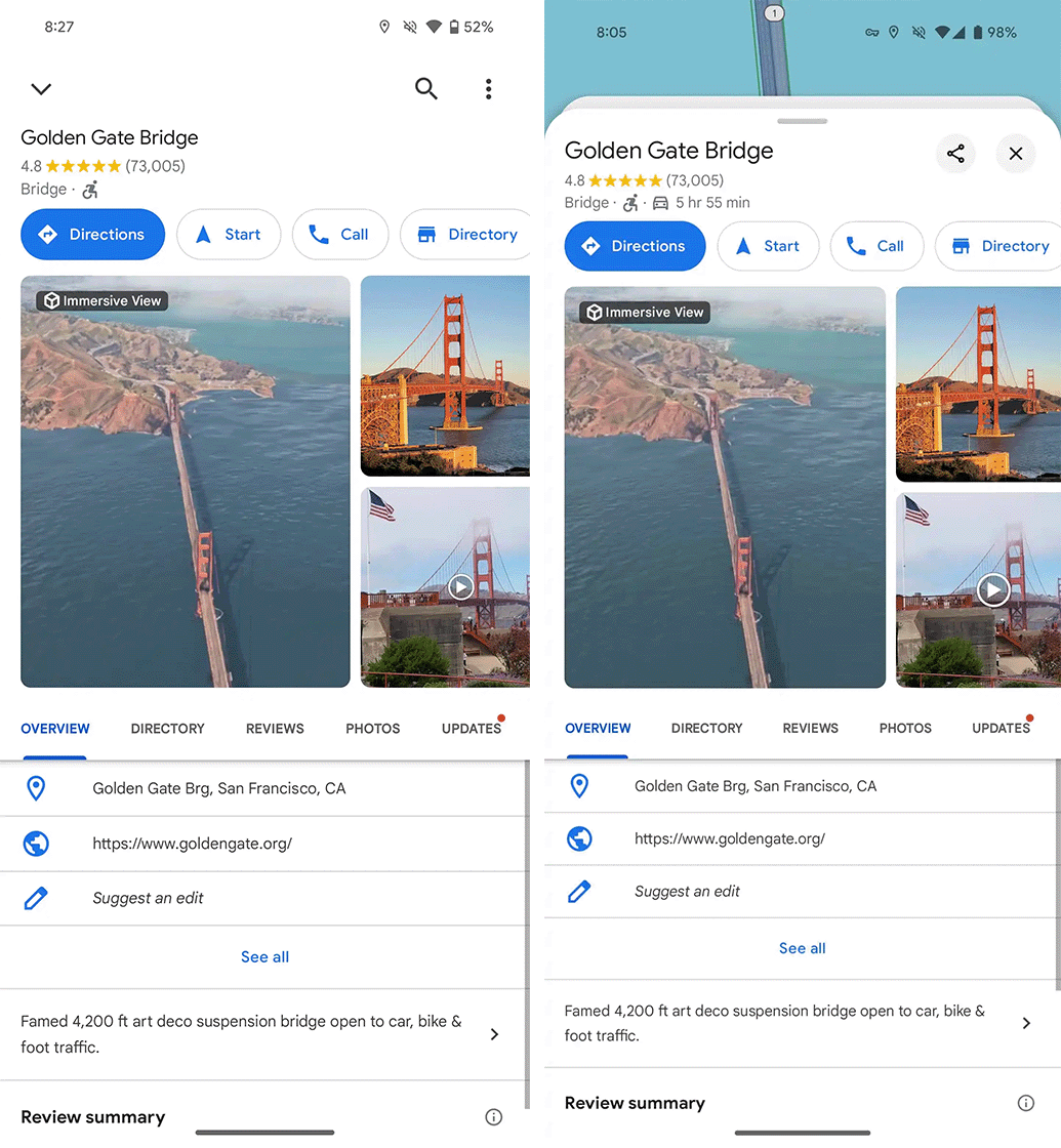
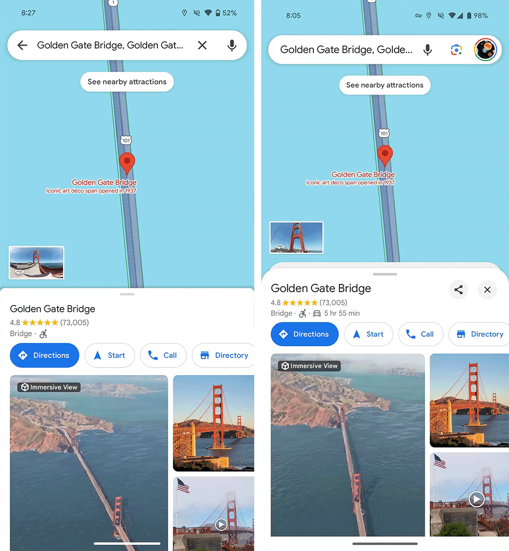
The biggest change is to the directions experience. In the existing Maps experience, you have your start and end destinations and transportation methods at the top of the screen and some trip info at the bottom, like how long it will take, along with action buttons to start the trip, view the steps, or pin it. This bottom piece can be swiped up to view more details. In the middle, you can see the trip route overlayed on the map.
With the new design, more of the trip information moves to the bottom of the screen, leaving only the destinations at the top. That should make it easier for people to reach and change their transportation options. Users can still see the map in the centre of the screen and can still swipe up the bottom card to reveal more details about the trip. However, the card no longer fills the screen and instead leaves a sliver of the map open at the top.
You can check out some comparison screenshots captured by 9to5 of the old (left) and new (right) designs below:
-
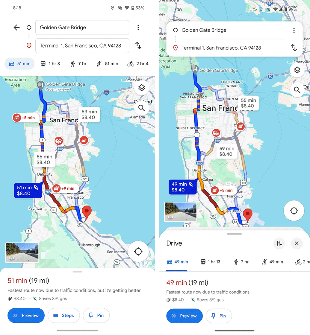
- Old (left) vs. new (right).
-
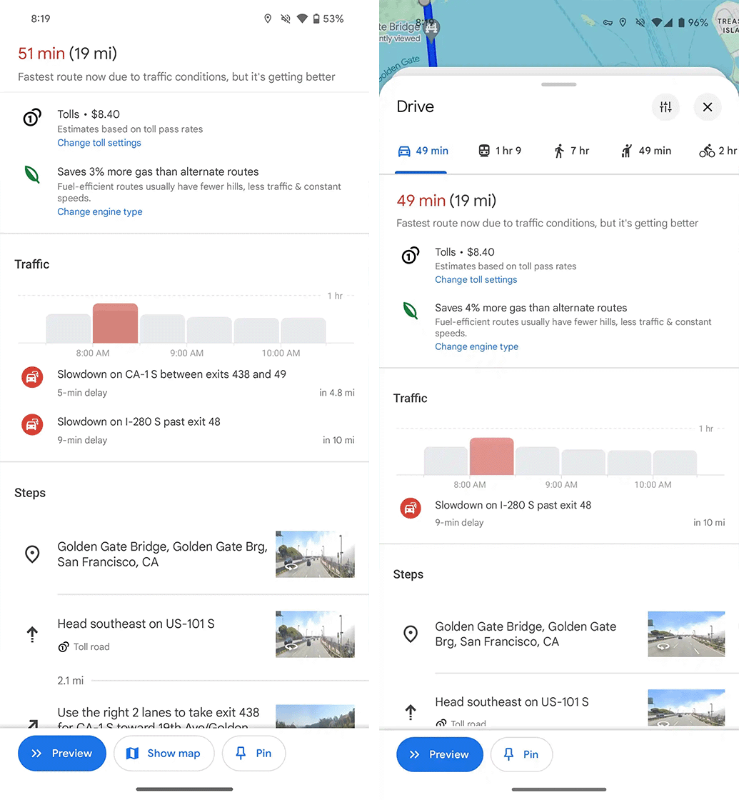
- Old (left) vs. new (right).
-
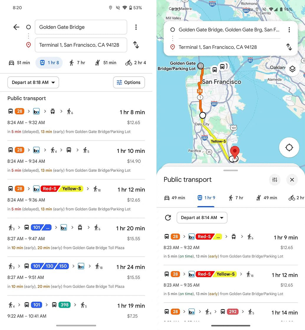
- Old (left) vs. new (right).
-
- Old (left) vs. new (right).
-
- Old (left) vs. new (right).
One of the more notable impacts of this is that the public transport options are now displayed closer to the bottom of the screen, which should make it easier for people to reach the various transit options listed there with one hand.
The new Maps design brings a similar change to the location cards you get when tapping on the map. These no longer expand to fill the screen and now have close and share buttons in the top-right corner.
Again, the changes aren’t huge, but should help with usability in some cases.
Images credit: 9to5Google
Source: 9to5Google
MobileSyrup may earn a commission from purchases made via our links, which helps fund the journalism we provide free on our website. These links do not influence our editorial content. Support us here.
