The last year or so has been a long, drawn-out experiment by Android OEMs to see whether they can rejuvenate their businesses, or at least add another stable revenue stream, to augment their slowing disappearing smartphone profits.
For those companies, Android Wear exists in an uneasy mush between control and compliance; unlike Android proper, they are not allowed to alter in any way the core functions of the experience, forcing them to differentiate on hardware.
But as we’ve seen from giants like LG, Huawei and Motorola, the early experimentation is finished, replaced with the notion that we all want one thing: round timepieces that actually look like watches.
Motorola was the first to achieve this with last year’s Moto 360, and this year its iteration is more like a watch than ever — something I’d want to wear as both a fashionable timepiece, and a tiny computer on my wrist.
About this review
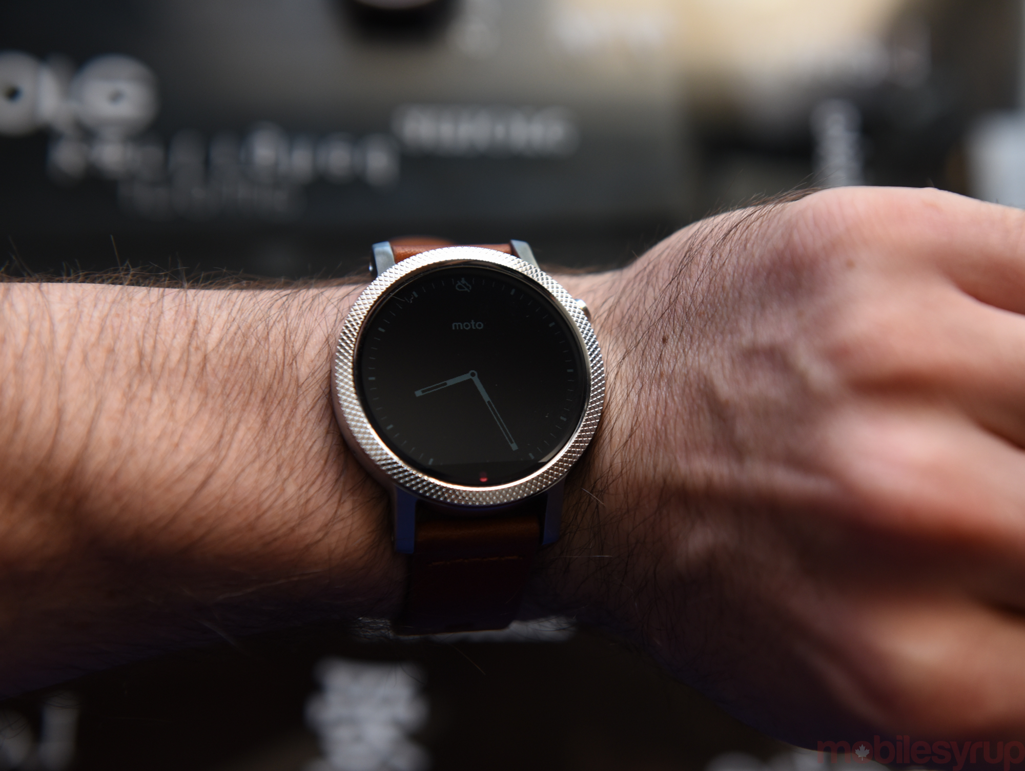
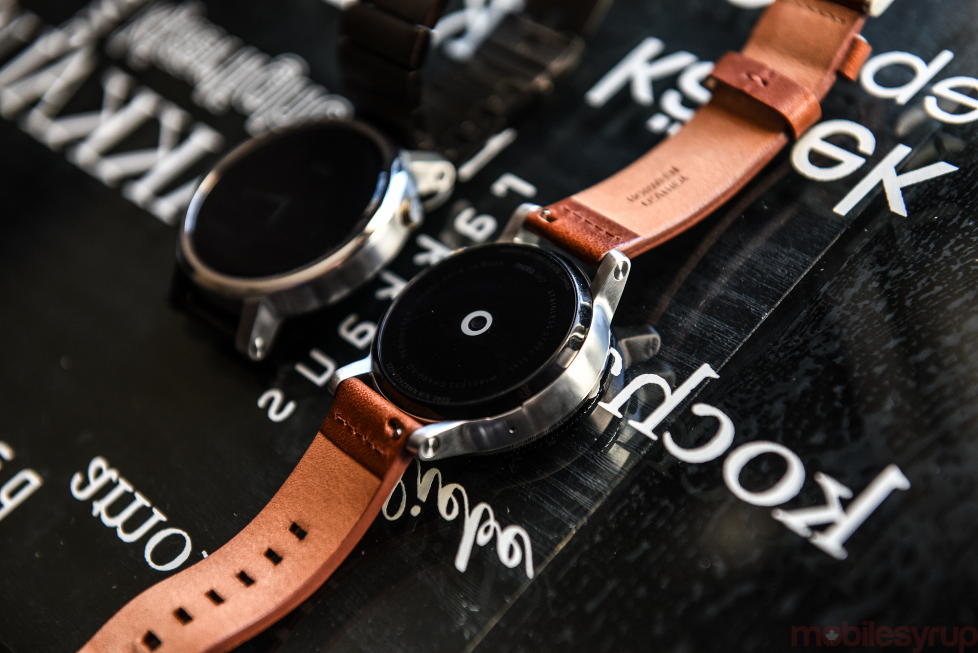
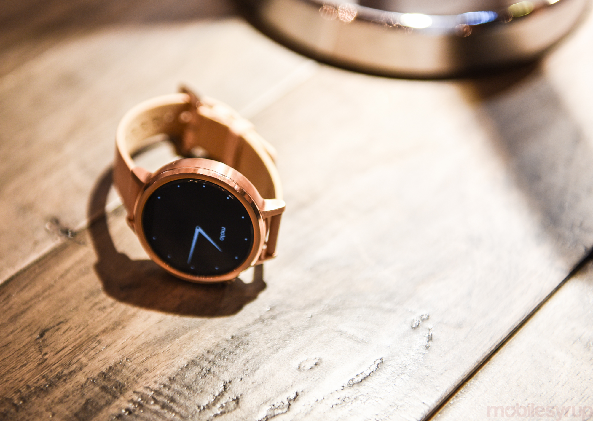
To complete this review, I used two different Moto 360 units: a custom 42mm men’s version with a silver case, silver Micro Knurl bezel, and 20mm cognac brown leather strap; and a larger 46mm men’s version with a silver case and accompanying 22mm stainless steel strap. Both were demo units provided by Motorola for the purpose of this review.
The round age
The first Moto 360 was a particularly notable achievement, given its maturity and refinement at a time when square and plastic were tantamount to building a successful wearable.
Motorola managed to minimize bezels around a stainless steel case, shipping with high-quality Horween leather or well-crafted metal straps. It was comfortable and attractive. But to achieve its relatively accessible cost, Motorola skimped on screen resolution and, most importantly, the processor that ran the whole show. That led to compromise: LG’s and Asus’s devices weren’t quite as attractive, but they were more powerful, a notion that, at the time, we weren’t used to talking about when differentiating a smartwatch.
Now, Motorola is on even footing with its competitors, all of whom have chosen to use a single Qualcomm chip: the Snapdragon 400. Along with 512MB of RAM and the requisite sensors and microphones, the second-generation Moto 360 competes only on aesthetics, and price.
The most important upgrade isn’t anything specific to materials, but to choice: Motorola now has two men’s case sizes, 46mm and 42mm, along with, for the first time, a women’s line, in a single 42mm case size. I was eager to try the smaller size, since I found most Android Wear products, including the first-generation Moto 360, too big for my wrist.
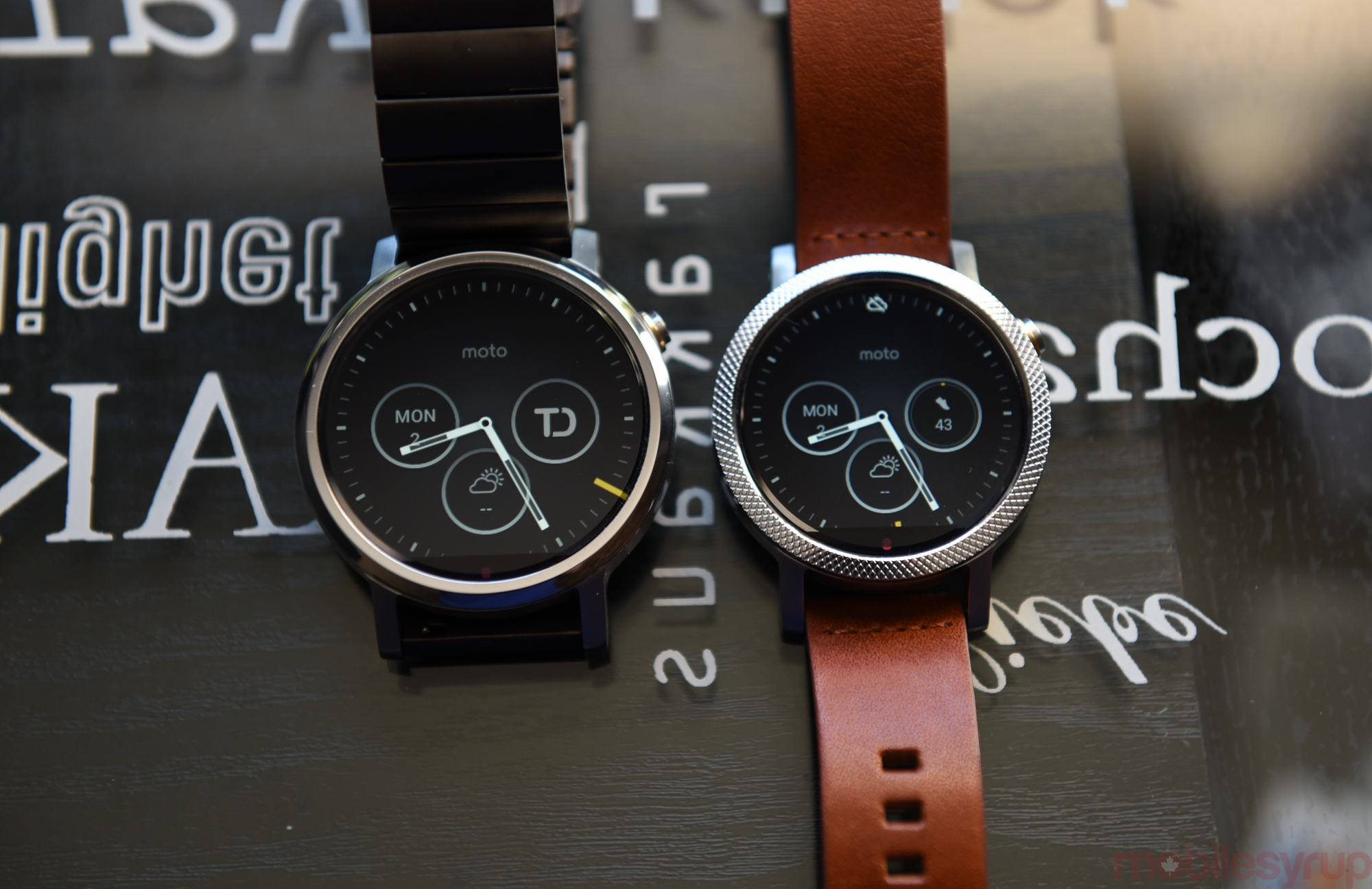
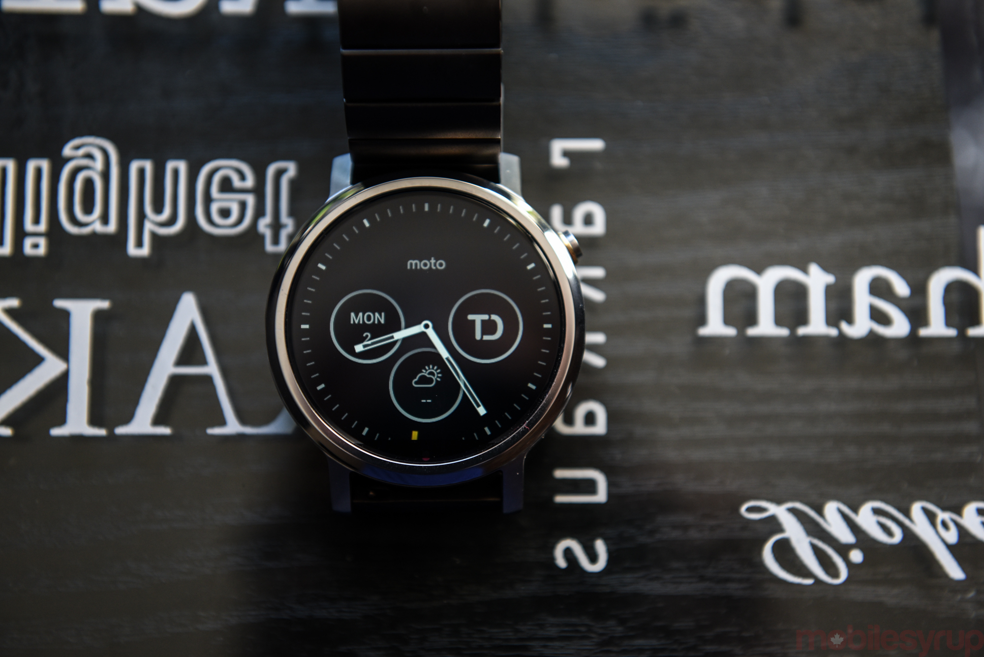
And so, upon receiving the unit, a silver case with cognac-coloured, treated Horween leather, the reality of jewelry, of which the Moto 360 should be considered, comes down to choice. I loved it. I enjoyed the narrower 20mm strap; I reveled in the sharper 360×325 pixel LCD display; I luxuriated in the excellent battery life, which despite being smaller than the first-generation version, managed to last even longer.
Mostly, I just enjoyed wearing it as a watch.
Though Android Wear has improved over the past year, it took until the second-gen Moto 360, and the smaller unit at that, to make me want to wear it every day. Both models have sharper displays than the original, though the larger 46mm version has jumped a moderate 28 percent, from 320×290(205ppi) to 360×330 (233ppi), whereas the smaller version’s 263ppi pixel density is closer to what most consider “retina.”
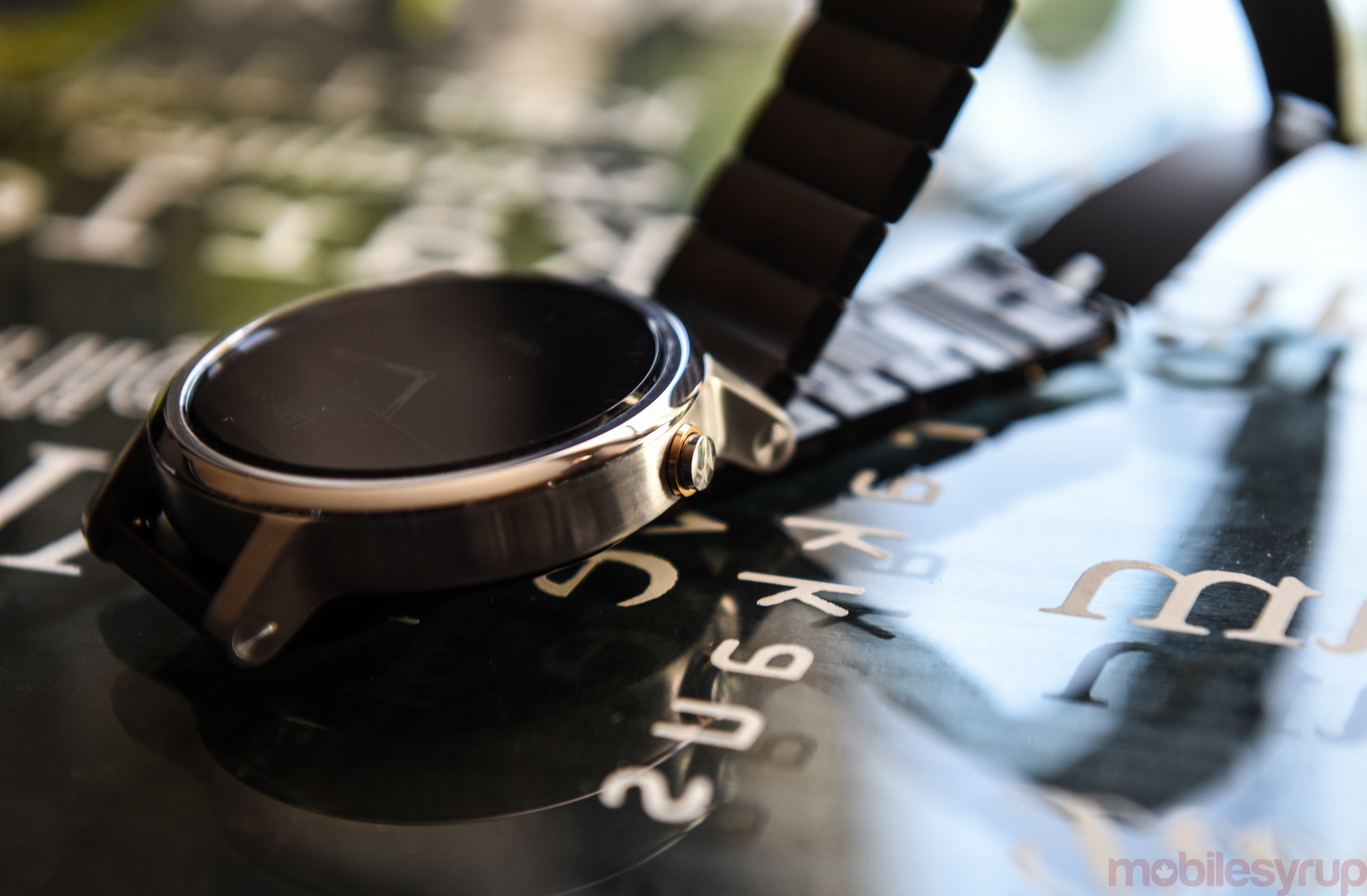
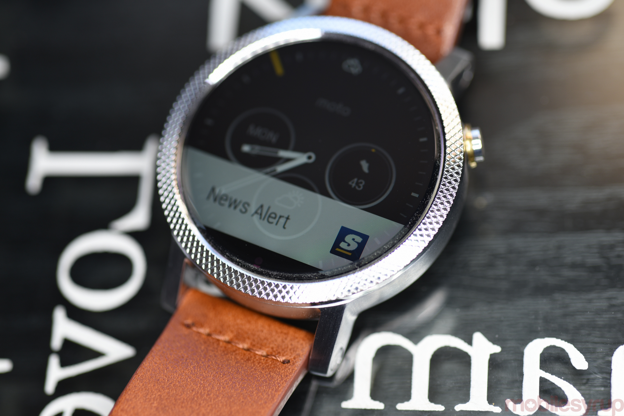
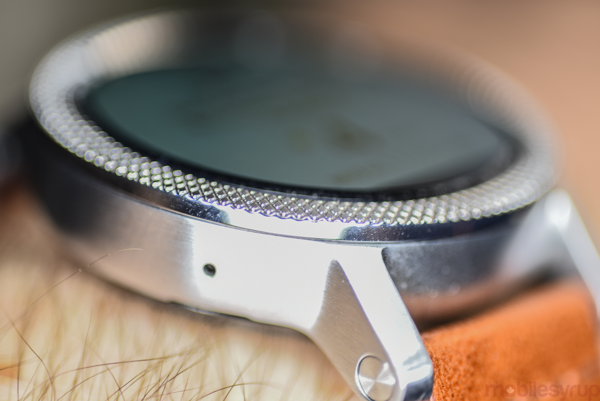
The displays aren’t the best I’ve seen — Samsung’s and Huawei’s higher-resolution AMOLED displays trounce the contrast and colour saturation on the new Moto 360s’ LCD panels — but they’re good enough for most people. And then there’s the so-called “shelf”, the small black cutout below the display that cuts off around five percent of its real estate for the front-facing sensors Motorola says is so important to the daily function of the product.
Motorola asserts that the new Moto 360 could have avoided the cutout, but those sensors would have found their way into the bezel, disrupting the “infinity” display that most analog watch wearers take for granted. Considering both Samsung and Huawei found ways around this, I don’t take Motorola’s words at face value — it’s likely an engineering problem that was too difficult, or expensive, to solve — but the truth is that I never noticed, on either model, while wearing the Moto 360.
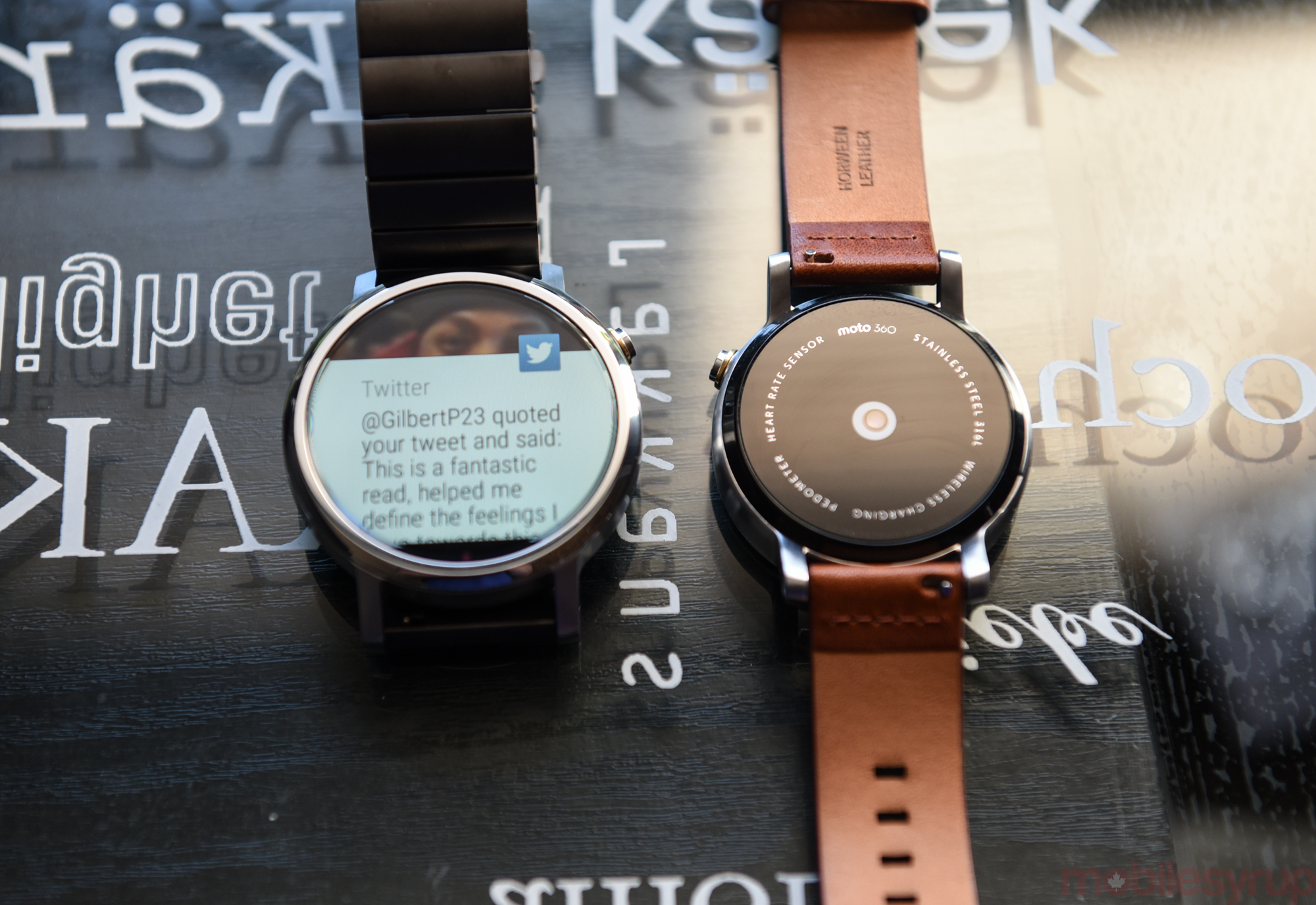
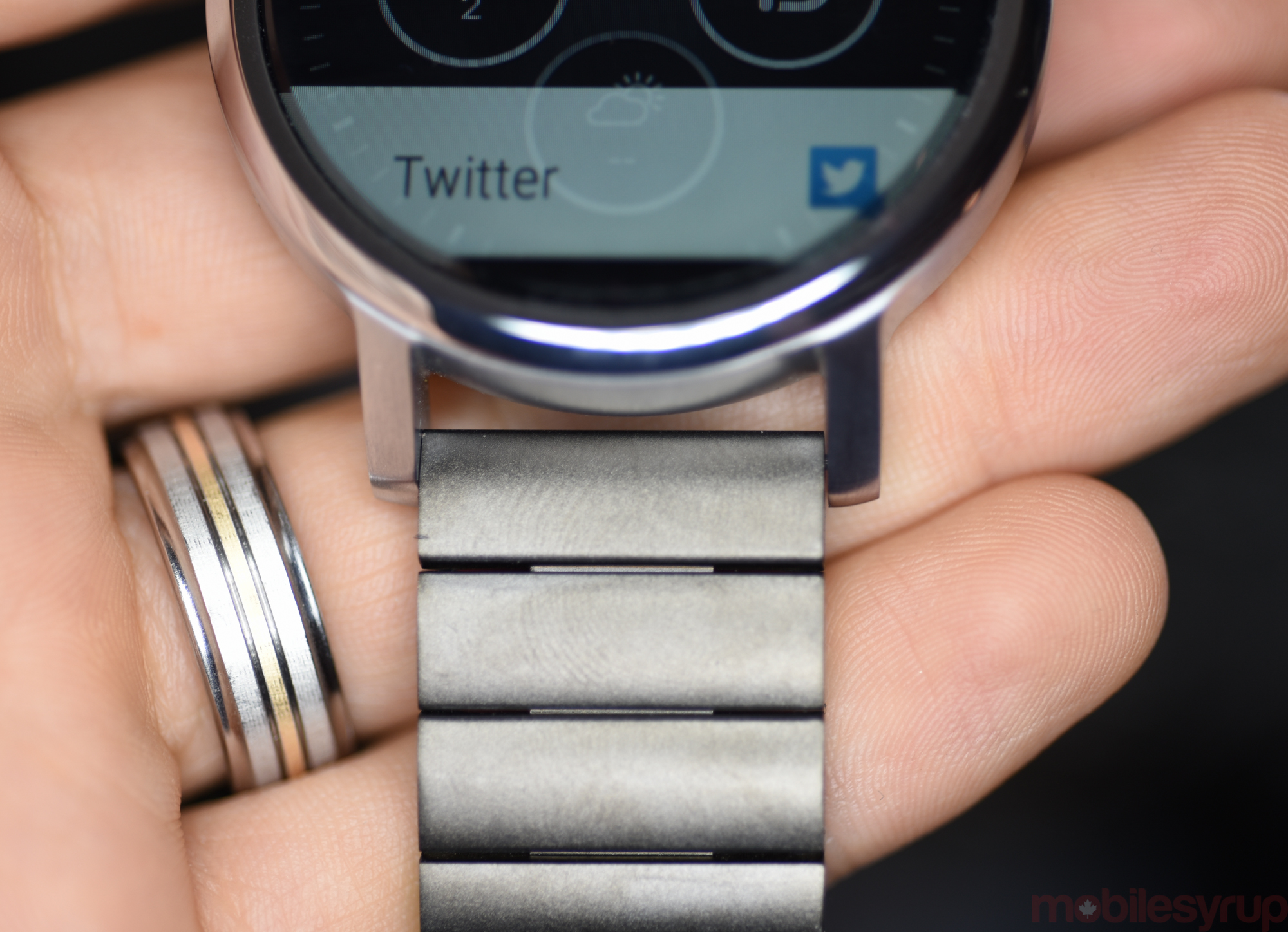
The new smartwatch also has exposed lugs, which not only add to the uniform aesthetic value behind Motorola’s quest to create a watch for everyone, but improves its practicality by making it easy to quickly replace bands. I was easily able to swap out my 22mm leather band on the larger Moto 360 with, ironically, the Pebble Time Steel’s beautifully-finished stainless steel band, with no tools and only a few frustrated minutes.
Because this year’s model is no thinner than last year’s, I still found the 46mm version, despite the improved brushed metal case and relocated two o’clock power button, too big to wear for long periods. Its clear benefit, though, is a larger 400mAh battery, which I found to last over a day and a half with Ambient Mode turned on. The 42mm version lasted just over a day of the same, even with the useful always-on Ambient Mode enabled.
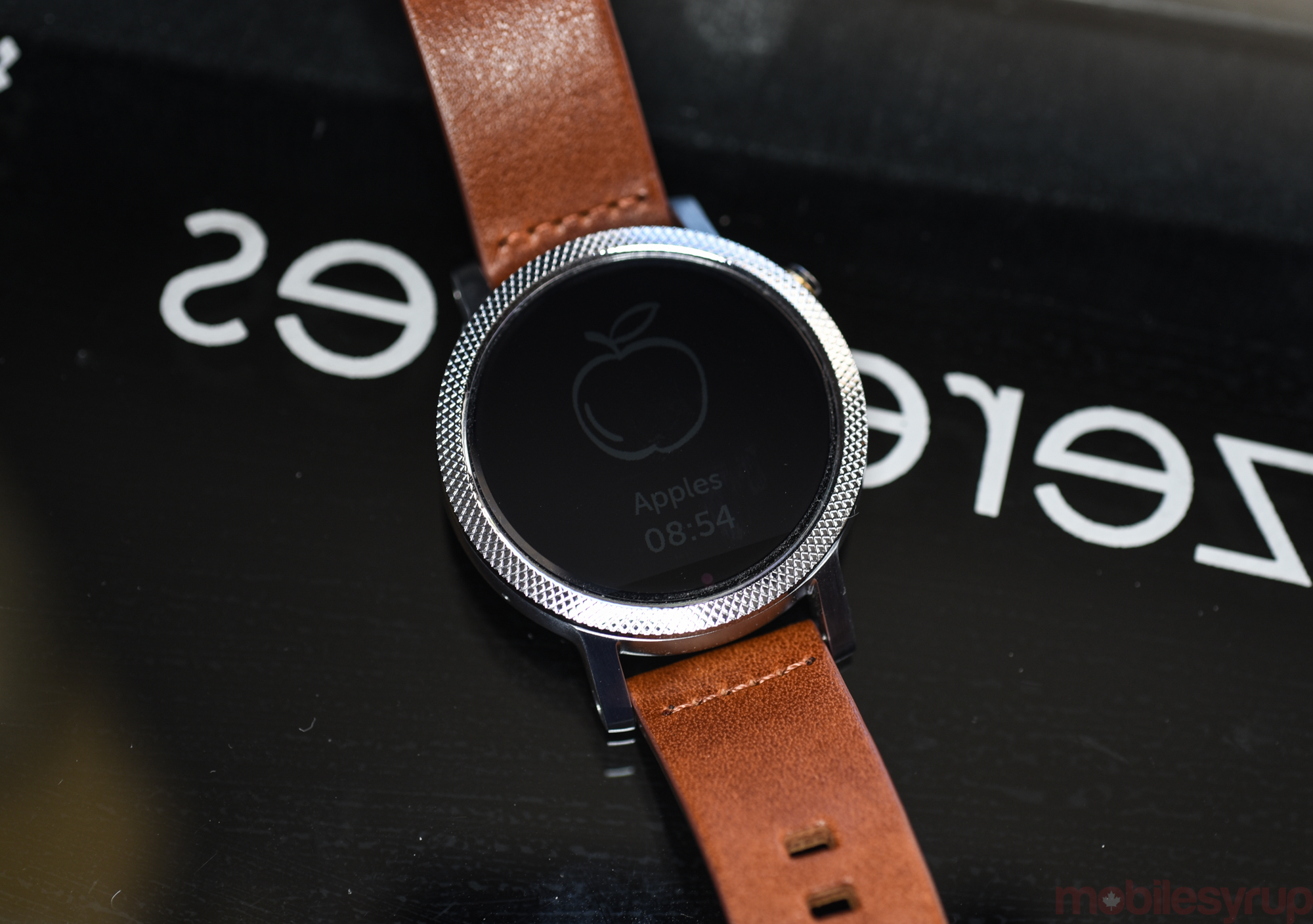
Android Wear itself is quite a different beast from when Jane reviewed it last summer, iPhone support notwithstanding. The platform has gone through three major updates, including a more recent one which added actionable widgets, or complications, that Motorola’s default watch faces put to good use. The third-party app ecosystem isn’t quite as robust as what you’d find on the Apple Watch, nor are the apps that are available nearly as useful, but there are some rough gems.
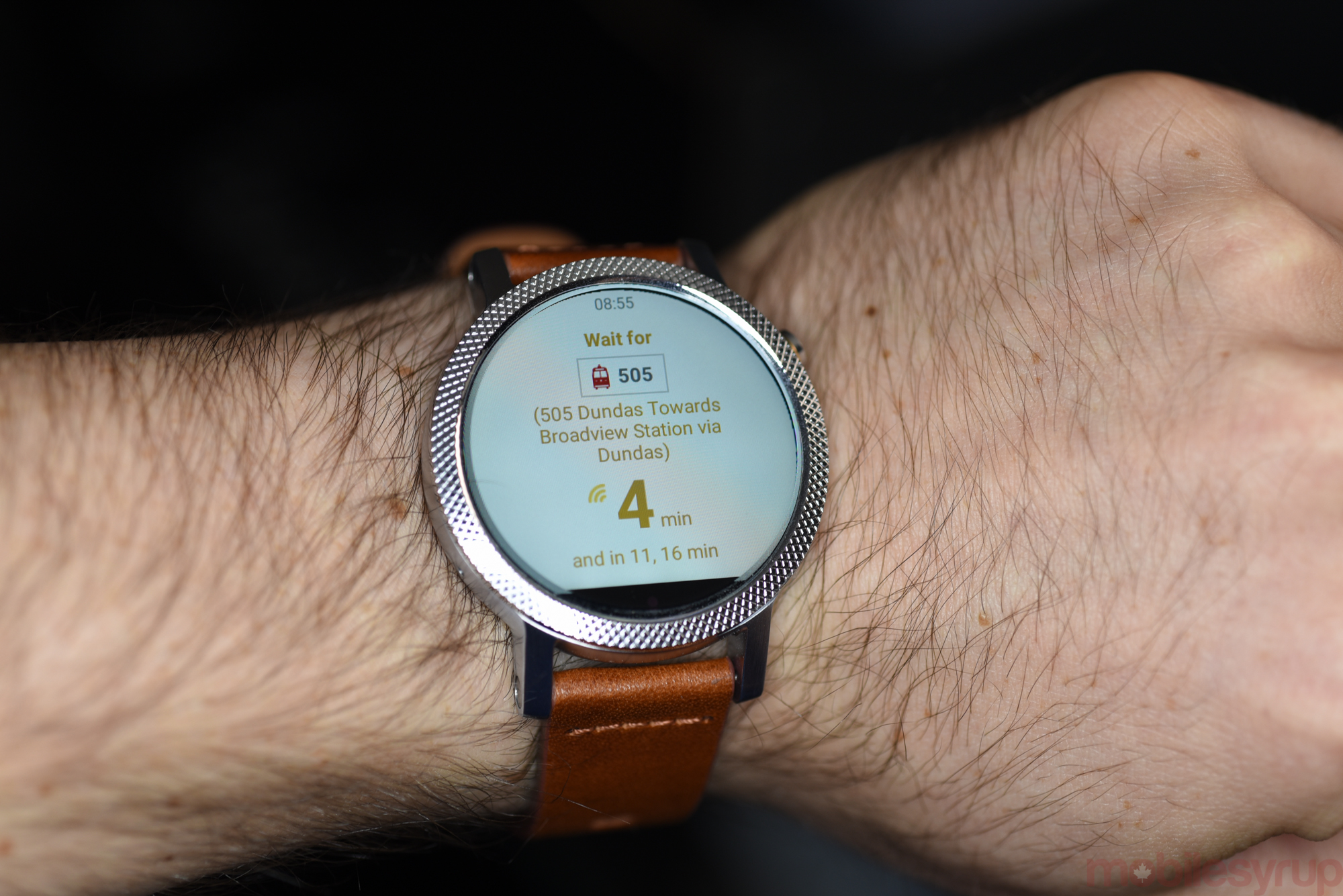
Transit app Citymapper, for instance, is one of the better examples of a company putting Google’s available APIs to great work. Entering an address on an Android phone, for instance, pushes the trip, with clear gesture-friendly commands to the watch.
Popular task manager, Wunderlist, offers a quick way to check and mark complete any outstanding tasks from the day. App developers are slowly taking to the platform, but the main draw of Android Wear is — other than the myriad watch faces which, you know, tell the time — notification triage.
This aspect of the platform is one I take biggest issue with, especially after using the Apple Watch and Pebble Time for a few months. Notifications themselves are not easy to solve for; when you get multiple notifications from an app, for instance, how do you group them? Some of Google’s apps, like Gmail, display individual but linked cards for incoming emails; others, unoptimized, like the official Twitter app, show snippets of incoming tweets that are less than useful.
These notifications slide in between Google Now cards, too, an aspect of the experience that hasn’t really improved. While it’s easy to swipe them away, Google pushes Now cards at seemingly random intervals, updating at imprecise, or even inconvenient, times. Some Google Now cards shouldn’t be pushed to the watch at all, but it’s a binary distinction: if they’re on the phone, they’re on the watch. I am happy to get sports updates, for instance, on my watch, but I’d rather leave stock updates to the phone. That granularity would come in handy in a future version.
Android Wear is also still very reliant on voice input as a way to respond to incoming messages, emails or in supported apps. And while there’s nothing wrong with this — Google’s voice transcription quality has improved — that you have to draw out emoji to respond in silence is a frustrating and unwelcome addition. Let me cycle through canned responses and emoji, stubby drawing finger be damned.
These are aspects of Android Wear that appear to be in flux. Google seems to have made a general commitment to the platform’s design and user experience, but nothing seems final, or mature. That’s alright though, because its core competency, namely fielding incoming notifications, is, even in its awkwardness, a complete and usable feature.
Fitness tracking, another one of Motorola’s vaulted advantages over its competitors, falls short with the Moto 360. While the watch has maintained its wrist-mounted heart rate monitor, it is temperamental at best, and still doesn’t track properly during exercise, which is where it is most convenient. Competitors like Fitbit, Apple, Basis, TomTom and Garmin have this figured out, so it appears to be an issue specifically with Android Wear OEMs.
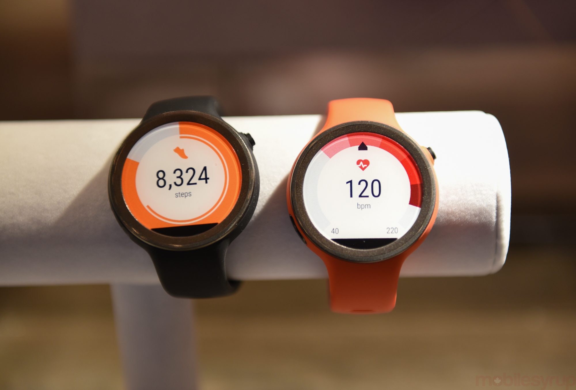
Hopefully Motorola’s upcoming fitness-focused Moto 360 Sport will approach the market with more finesse, but as of now the Moto 360 is little more than a glorified step tracker, a metric whose efficacy reported in isolation has been discounted countless times. This is disappointing given that Motorola has finally written a dedicated Android app, Moto Body, to augment its fitness regimen, but it’s just plain not useful on this product. Motorola should have saved some money, and passed along those savings to the customer, by removing the heart rate monitor entirely.
Price is also a factor in determining the Moto 360’s place in the market. At $379.99 for the least expensive of the smaller model, the investment is no longer trivial — nor was it at $279.99, or the first-gen’s current $199.99 price — but it is especially potent given the surplus of viable alternatives. The 46mm version begins at a hefty $429.99, and can currently only be sought from Best Buy; Google Store and Telus, the other Canadian retailers selling the Moto 360, only have the smaller 42mm version.
As for the women’s version, I’ll leave it to another to talk about it, but the models I saw I thought were both distinguished and attractive.
Despite the recent addition of iOS support, I would not recommend the Moto 360 for that purpose, cautioning against a barebones experience that would be better met by a cheaper Pebble Time, which goes for $199.99, or the far more functional Apple Watch, which begins at $519.99 CAD.
The new Moto 360 is best at its smaller size, in either black steel on black leather, or silver steel brown leather. I think the latter combination is one of the best I’ve seen on a smartwatch to date, and is something I’d be happy to wear as timepiece or a mini computer. You decide.
Pros
- Striking, elegant design
- Finally, size choices
- Great first party analog watch faces
- Easy to change bands
Cons
- More expensive than previous version (even with exchange rate factored in)
- Android Wear still has problems
- Poor fitness tracking features
MobileSyrup may earn a commission from purchases made via our links, which helps fund the journalism we provide free on our website. These links do not influence our editorial content. Support us here.