If you opened Instagram today to find things looking a little different, you’re not alone.
The Facebook-owned photo and video-sharing social network recently tweeted that it’s testing new layouts for the app. The refreshed layouts add new tabs to the bottom navigation bar: Reels and Shop. ‘Reels’ is Instagram’s TikTok competitor, while the ‘Shop’ tab acts as a dedicated space for brands to share products and customers to browse items they may want to buy.
*Testing, testing* different versions of the home screen. ✨
Open Instagram and you’ll soon see a Reels and Shop tab in one of these layouts.
These updates represent how people are using the app and giving extra love to creators, videos and shopping. ??? pic.twitter.com/Rnyf37ddQb
— Instagram (@instagram) September 9, 2020
So far the test appears to be limited and server-side. One layout showed up on my device, although other phones I tested didn’t have it. Further, my MobileSyrup colleagues don’t have the new layouts either.
In my case, the new layout removes the Explore (magnifying glass icon) and Activity (heart icon) tabs from the bottom bar and places them at the top of the screen next to direct messages (DMs). Further, the layout ditches the camera icon in the top-left corner of the screen, although users can still swipe right to open the camera to create a Story.
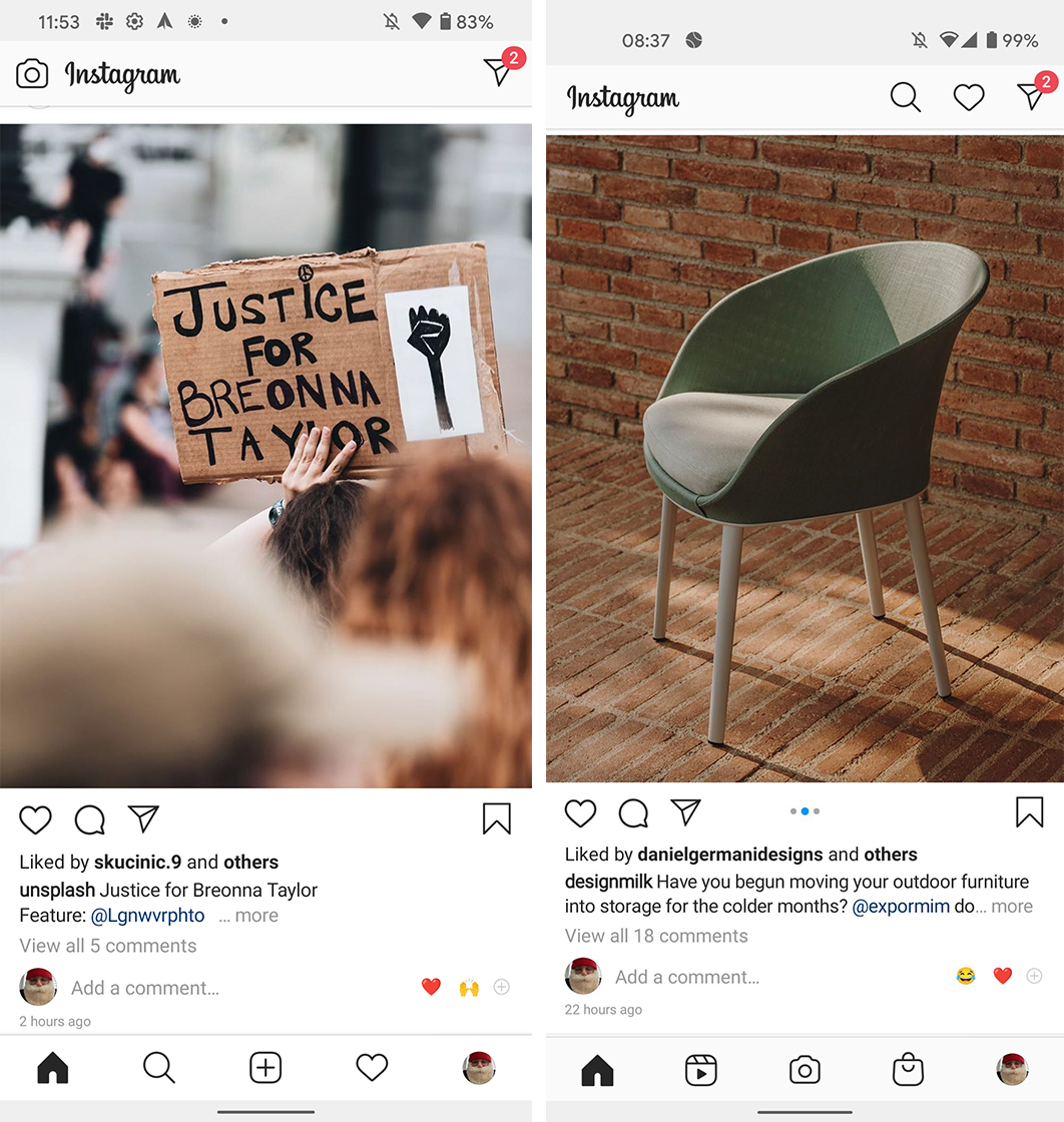
Left: Instagram’s old layout. Right: One of the new layouts.
The new Reels and Shop tabs replaced Explore and Activity in the bottom bar. It’s worth noting that before the change, I didn’t have direct access to Reels in my Instagram app, but I could get to Shop through the ‘Explore’ page.
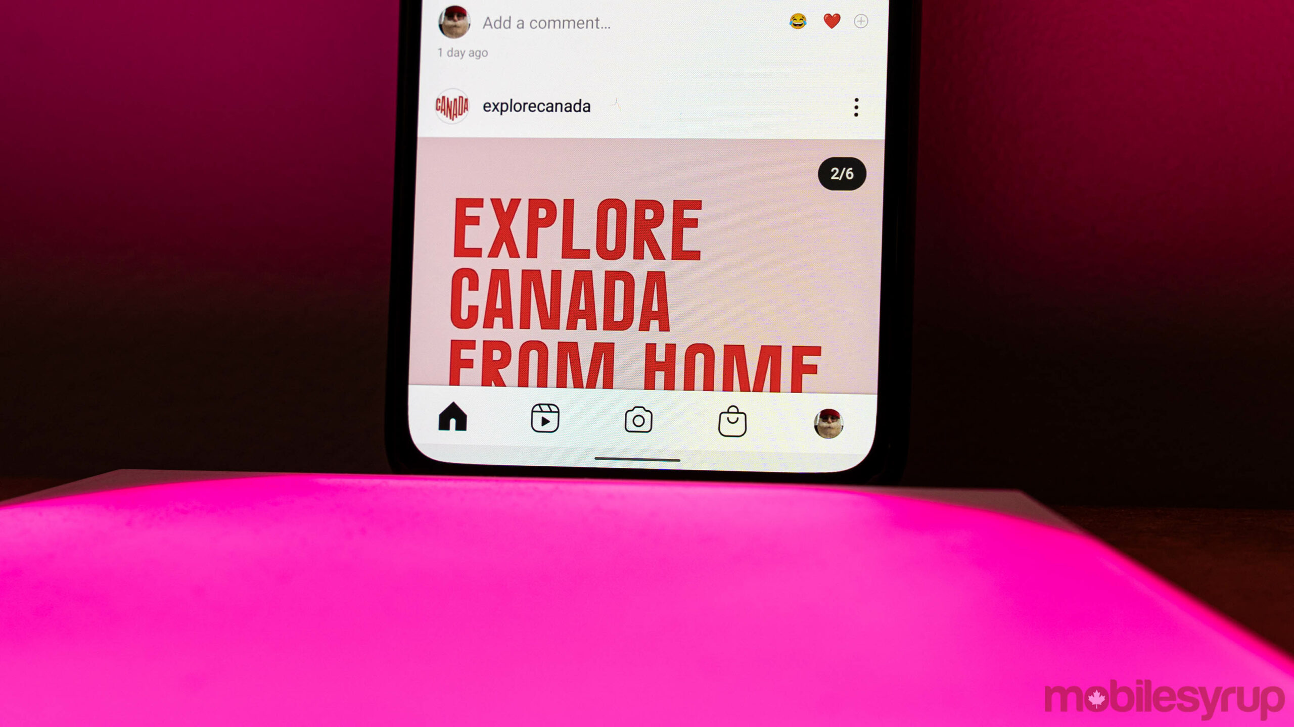
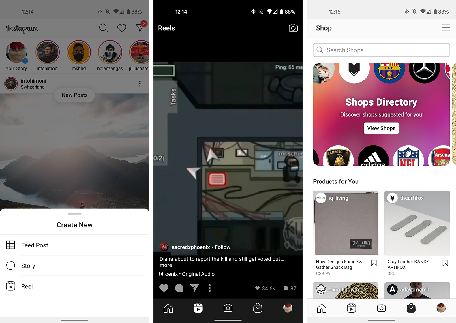
The other significant change is the centre ‘+’ icon for creating a new post is gone. Instead, the new layout sports a camera icon that opens a list of new content to create. With a quick tap, I can jump into making a new ‘Feed Post,’ Story or a Reel.
Multiple layouts in testing
Although that’s the extent of changes for me, Instagram’s tweet teased two alternate layouts. One keeps the Explore tab in the bottom row, turns the top-left camera icon into a ‘+’ icon that presumably opens the same list of new posts as my layout, and puts Reels front-and-centre in the bottom row. Further, Activity moves to the top next to DMs.
The other layout adds an extra tab to the bottom bar, giving users access to ‘Home,’ Explore, Reels, Shop, Activity and the user’s profile. The ‘+’ icon for creating new posts lands at the top of the screen next to DMs, and the top-left corner only features the Instagram logo.
Of the three new layouts, the one that landed on my device makes the most sense to me. However, I wouldn’t be surprised to see Instagram fully adopt the layout the makes Reels the focus if testing shows increased use of the feature. As mentioned above, Reels is Instagram’s TikTok competitor and increasing its usage will help it better retain eyeballs it might otherwise lose to TikTok.
Expect these layouts to stick around for a bit while Instagram gathers data on how people use them. Eventually, the company will roll out one layout to all, likely based on the data from this test.
MobileSyrup may earn a commission from purchases made via our links, which helps fund the journalism we provide free on our website. These links do not influence our editorial content. Support us here.
