Thanks to developer previews, we’ve had a sneak peek into what Google’s upcoming Android 12 update will look and feel like.
New notification shades, smoother animations, faster alerts and more have been talked about for the past two months now. So what’s new?
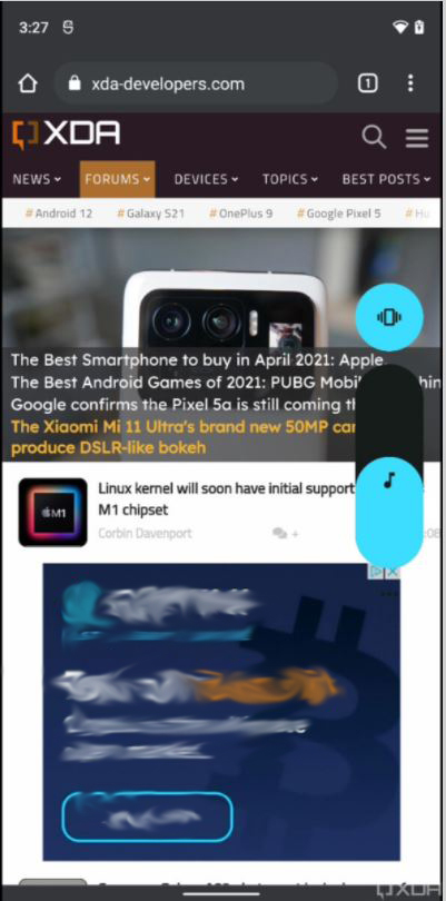
XDA Developers got access to a new unreleased build of the soon-to-come OS. Here are all the design changes the publication uncovered:
New volume panel UI
The volume slider in Android 12 will reportedly be much thicker than what we saw in the previous operating system. XDA’s report says the new slider will be well-rounded in all four corners and will match the colour of your system theme.
Splash screens for every app
XDA reports that the unreleased Android 12 build features automatically generated splash screens for every app. The splash screen shows the app’s icon with a background matching your current day/night theme, while the app’s actual content is loading. Currently, the automated splash screen appears with every app, though the function should be limited to apps that don’t have their own dedicated splash screen.
Ripple and over-scroll effects
There are two new animation effects in the unreleased build: over-scroll and ripple animations. These animations have been slightly tweaked from the previous developer preview, reports XDA. The over-scroll animation plays when the user scrolls past the top or bottom of a page, whereas the ripple animation appears when the user taps on an item.
Charging animation
Upon charging, a new ripple animation will play that initiates from the bottom of the screen and extends upwards. XDA says this is the same ripple effect that appears when the user taps on an item on a page (mentioned above).
New app drawer opening animation
One of the subtle new changes XDA noticed in the launcher is a new animation for opening the app drawer. It looks like the drawer opens quickly, is very bouncy and doesn’t track the user’s finger anymore.
Slight tweak to the brightness slider
In the previous developer preview, we saw that Google is going with a thick brightness slider. The same slider is present in the unreleased build, but it received a slight tweak. As per XDA, the slider remains thick up to the current level of brightness you have and gets thinner as brightness increases. Like the volume function, the brightness slider is rounded from the four corners and mimics the colour of your current system theme’s colour.

‘Reduce Brightness’ renamed to ‘Extra Dim’
In the first developer preview of Android 12, we saw a new setting called ‘reduce bright colours.’ This setting was renamed to ‘reduce brightness’ in developer preview 2. XDA reports that the name has been changed yet again in the unreleased build and is called ‘extra dim.’ This new setting will allow users to make the screen look dimmer than the panel actually allows and will be extra helpful in dark-room situations.
These are all the design changes found by XDA’s trial of the unreleased Android 12 build. Stay on the lookout for stories about functional changes and changes in the privacy features in Android 12.
Image Credit: XDA Developers
Source: XDA Developers
MobileSyrup may earn a commission from purchases made via our links, which helps fund the journalism we provide free on our website. These links do not influence our editorial content. Support us here.
