Following reports of a COVID-19 data overlay in Google Maps from earlier this month, the search giant has now announced it is rolling out the feature to users.
In a blog post, Google explained that people use Maps to get “essential information about how to get from place to place,” noting that it added features like COVID-19 transit alerts to help people stay safe if they have to travel during the pandemic. Now, it’s introducing a ‘COVID layer’ to Maps to overlays information about case counts in different countries, provinces or states.
Users can access the feature from Google Maps by tapping the ‘layers button’ in the top-right corner below the search bar and suggestion bubbles. The button looks like a small white circle with an icon that looks like stacked squares. Tapping it shows options like ‘Map Type’ or information overlays like transit, traffic or cycling routes.
The new COVID layer will show Maps users the seven-day average of new COVID cases per 100,000 people for the area of the map they’re looking at. Plus, it also shows a label that indicates if cases are trending up or down. Finally, Maps colour-codes different areas to provide a visual indicator of case density in different areas.
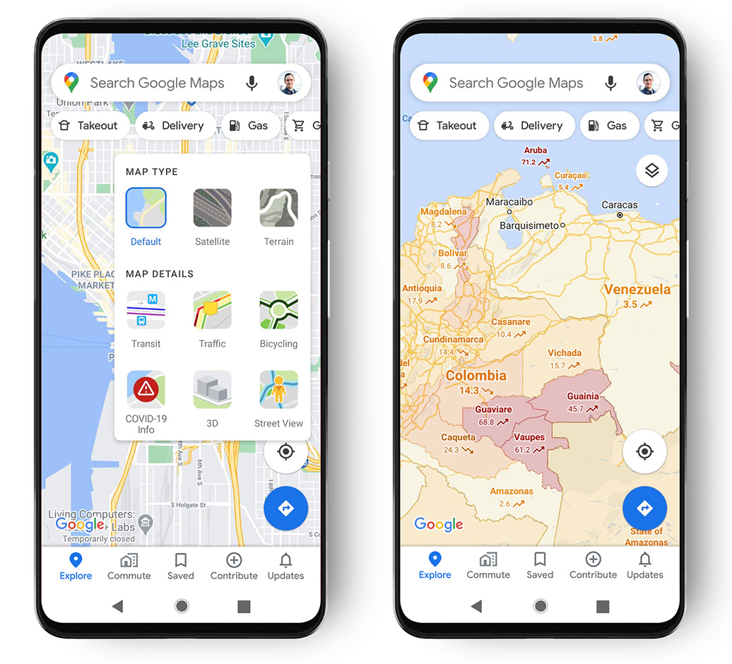
Google says trending case data will be visible at the country level for all 220 countries and territories Google Maps supports. There will also be state or province, county and city-level data where available.
Finally, Google notes in the blog post where it gets the data from. Sources include Johns Hopkins University, the New York Times and Wikipedia, which source data from public health organizations like the WHO, government health ministries, state and local health agencies and hospitals.
The new COVID layer will start rolling out globally on Android and iOS this week.
Source: Google
MobileSyrup may earn a commission from purchases made via our links, which helps fund the journalism we provide free on our website. These links do not influence our editorial content. Support us here.
