The OG Pebble was the first Kickstarter project I backed with any real potential. It was a new platform, both to me and the former InPulse employees that promised a lot, and learned even more, before eventually shipping nine months later.
When I first saw the Pebble, a crude prototype with its logic board attached with wires on the outside of the plastic casing, at Google I/O 2012, I was unimpressed. This was the time of Google Glass, to me a far more impressive piece of design, engineering and imagination.
And yet, today the Pebble is by far my most-used non-phone accessory. Since being updated to version 2.0, it happily buzzes to notify me of incoming texts, calls, tweets and breaking news, while making it easy to pay for a Starbucks drink or check into Foursquare with a few taps.
The Pebble Steel is the logical evolution of that clunky piece of plastic — a version 1.0 to the original’s technology demo — and it is phenomenal. But is it worth your $249? Let’s find out.
What Works
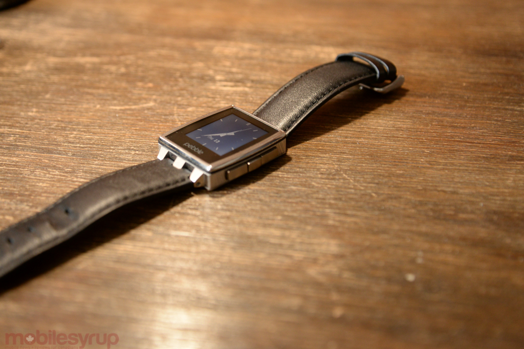
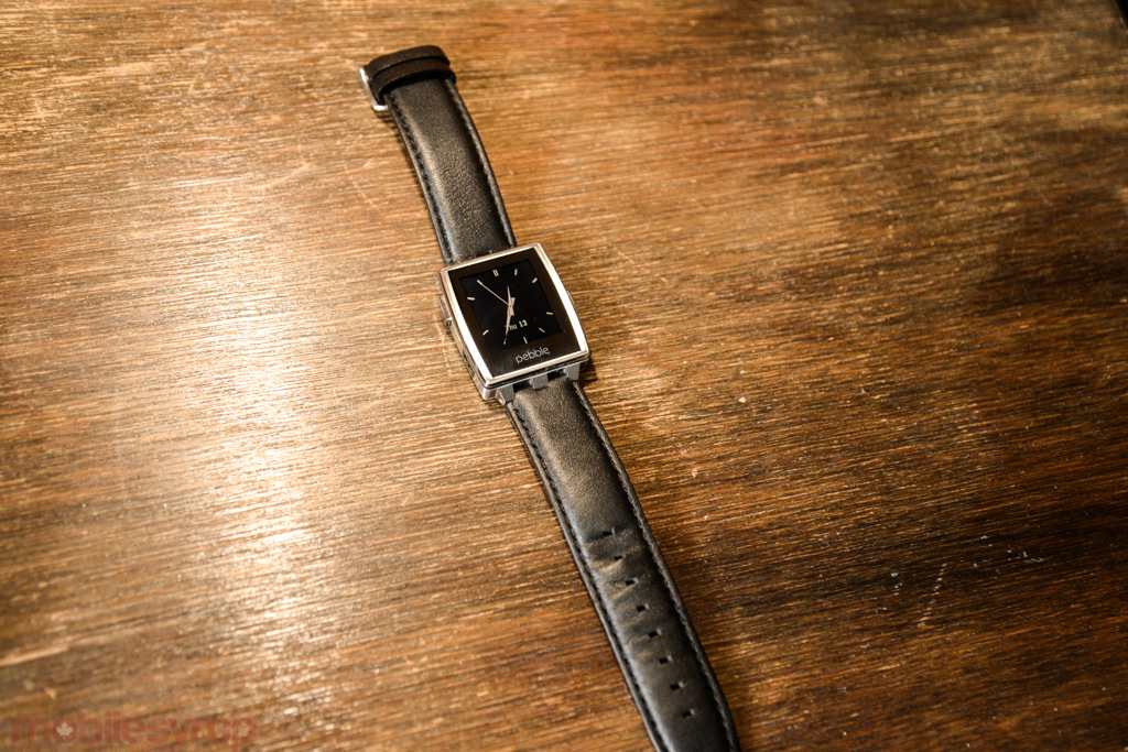
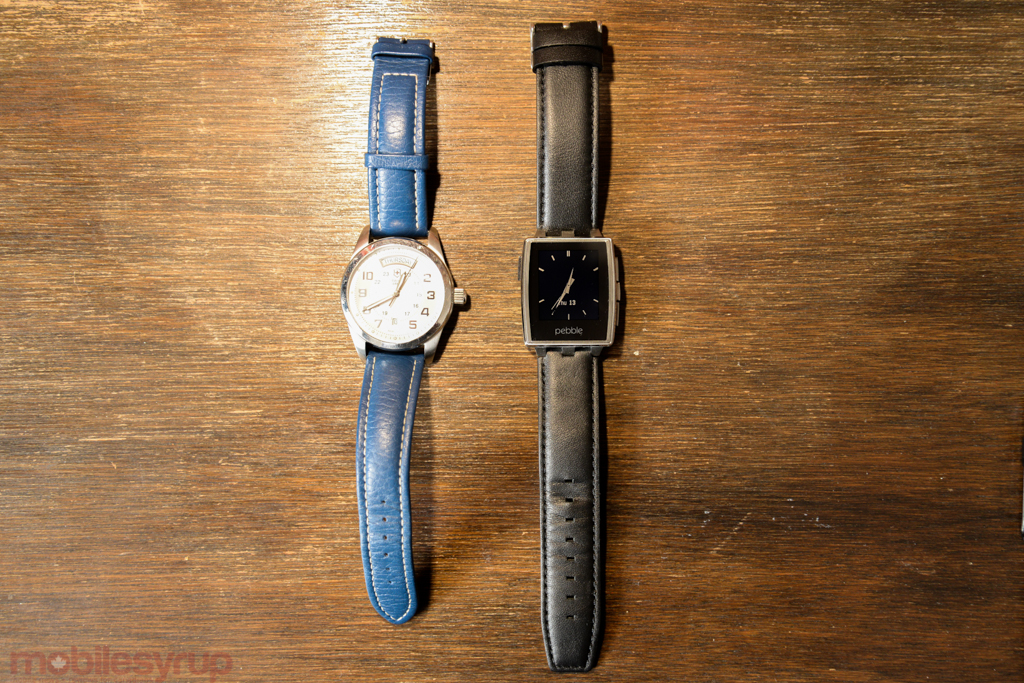
Everything great about the original Pebble has been improved in the Steel. The bezels around the e-paper screen have been reduced to manageable levels, and the steel casing is durable, attractive and weighty. Indeed, the Pebble Steel feels like a watch, though it still lacks the design prowess of a Breitling, Omega or even some high-end Swiss Army timepieces. Paired with a tasteful digital watchface — and with the new appstore, there are thousands of lovely ones — the new Pebble, which is alternately available in black matte steel in addition to brushed stainless steel, is fit for the average watch wearer.
Further improvements over the original Pebble include tighter, more clicky buttons — the original has squishy, loose keys — in the same configuration, three on the right and one on the top left. The vibration motor, too, is much improved, with a more even, less jarring action. Even the screen, which is identical to the original, is brighter thanks to a more powerful backlight. I also noticed the smartwatch’s performance is better, thanks to a doubling of the system memory.
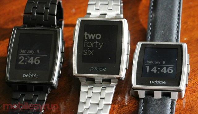
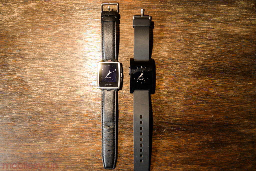
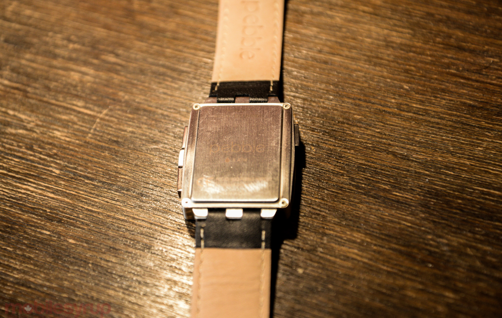
The box comes with two straps, a lovely treated leather one already attached to the watch, and a brushed stainless steel band ready to be taken to the local jeweller (or, if you’re brave, attached yourself). Thanks to the improved aesthetics — Pebble Steel is thinner and narrower — wearing the watch feels much more comfortable than the original, though it’s still a bit oversized for my liking.
Using the Pebble Steel, other than the addition of an RGB LED indicator, is the same as the original, and therefore extremely intuitive. Though some things, like apps, are conveyed unremarkably, working the list into the existing Settings menu architecture, the rest of the Pebble experience is a joy. Pressing the top or bottom buttons will cycle through various watchfaces, which are now installed from the iOS or (beta) Android app. I tested the Pebble Steel using iOS, and the connection was rock solid: any and all notifications from the phone are mirrored on the screen, which appear on top of the watchface, and can be dismissed using the middle right button, or cycled (if there are multiple) using the up or down buttons.
It’s a shame that, unlike on Android, notifications for individual apps cannot be toggled, but because I regularly restrict which apps can notify me on iOS, the issue of over-notifying rarely cropped up.
The app library itself has improved dramatically since the appstore’s debut in January. On top of basic versions of popular smartphone apps like Foursquare, Yelp, GoPro and others, independent devs have used open APIs to create remote controls for services like Hue, Nest, Starbucks and more. While I’m yet to be convinced that, for example, checking in on Foursquare using my smartwatch is faster or demonstrably better than the equivalent action on a smartphone — the purpose is the same, but the reward is less on the Pebble — the convenience is unmatched. These apps work best in situations where pulling out a smartphone would be either improper or impossible; same with checking notifications, which is often the case in a meeting or when your hands are otherwise occupied. I do hope the next generation of Pebble has some sort of microphone input for voice recognition, but as we’ve seen with S Voice on the Galaxy Gear, integration is a work in progress.
Still, Pebble’s array of amazing and unique watchfaces, and its growing app library, easily justify its $249 price. The two included watch straps are of high quality, and the battery lasts for several days (though not quite as long as the 5-7 days advertised).
What Needs Work
Pebble still takes a bit of getting used to, and scrolling through notifications, even with the newly-added central repository, is cumbersome. I wish the screen was higher-resolution, so text could be smaller without sacrificing quality.
The magnetic charging cable that comes included in the Pebble Steel is not only proprietary, but that of the original Pebble is incompatible with this new version. While the new red-tinged cable is of better quality and more secure than its predecessor, it’s unfortunate to see changes to the standard so early on in the watch’s lifecycle.
Any remaining quibbles with the Pebble Steel come from its newness — that of its ecosystem, of its use cases, of its screen technology — that will certainly be resolved in the coming years.

Conclusion
The Pebble Steel is both simple and simplified, and very exciting. It’s the first piece of wearable technology that fits with my individual workflow, because the Bluetooth-based pairing process is easy, and because Pebble is universally understood to be avoiding recreating a static smartphone environment.
It’s useful because it doesn’t try to do what your smartphone does, and keeps its scale small. I appreciate that; consumers will appreciate that.
MobileSyrup may earn a commission from purchases made via our links, which helps fund the journalism we provide free on our website. These links do not influence our editorial content. Support us here.