There’s a lot to like about the PlayStation 5.
As I mentioned in my review, the console has a surprisingly well-rounded launch lineup (Marvel’s Spider-Man: Miles Morales, Astro’s Playroom and Demon’s Souls being the big standouts), the genuinely innovative DualSense controller and unbelievably quick SSD-powered load times.
In spite of all of this, though, I think what I love most about the PS5 is its overall user experience (UX) — my favourite in any console to date. That’s because it’s so smartly focused on taking everything I just mentioned — the software, controller and console’s components — and seamlessly marrying them to make your time with the PS5 as user-friendly and smooth as possible.
The Control Center
“We truly believe our players’ time is valuable and should be meaningful. My hope is that when players see the UX for the first time, they’ll feel that we truly respect the time and passion they’re investing in PS5,” Hideaki Nishino, PlayStation’s senior vice president, platform planning & management, told MobileSyrup over email during a Canadian-exclusive pre-launch interview.
“Everything we’ve built is centred around them and helping them stay engaged and immersed in the games they love, while connecting with the PlayStation community in new ways.”
While that might sound like a bold claim, I find myself agreeing with Nishino, particularly with the “respecting your time” bit. To put it simply, the UX is so impressive because it ensures that much of what you’ll ever want to do with the console outside of playing games is easily accessible at the touch of a button — the PS button, to be exact.
“We truly believe our players’ time is valuable and should be meaningful”
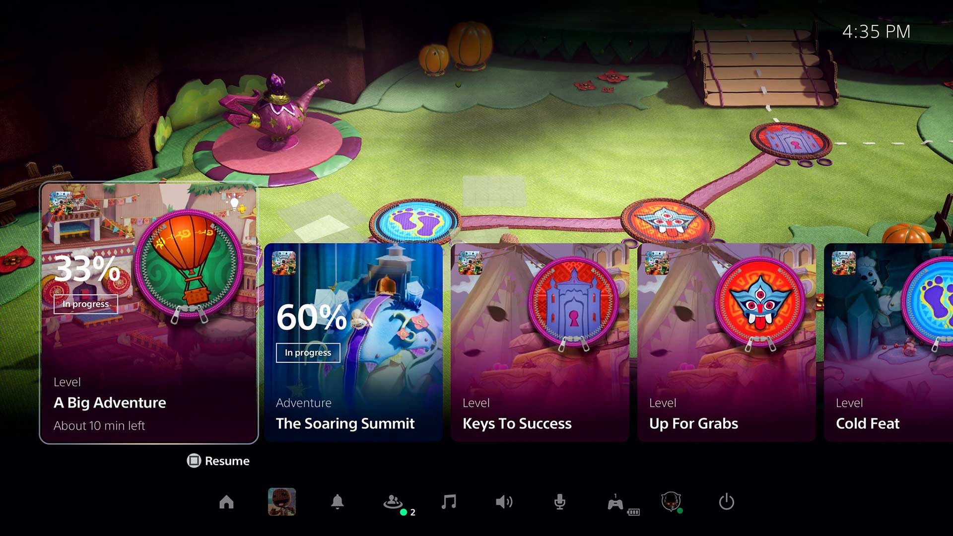
With one press, the centrepiece of the DualSense will bring up the Control Center, even when in a game or app. Ostensibly, this is like opening a Settings tab on your computer — your main activity remains open in the background while all of the options are put to your disposal.
From here, you have instant access to many of the common tasks you’ll perform on a console, including seeing which friends are online, checking the status of ongoing downloads, manage your controller settings and more. This is even customizable, if you don’t use certain options as much as others. This was the case for me with ‘Music’ (for Spotify integration) which I chose to replace with ‘Broadcast’ (direct access to linked YouTube/Twitch accounts) to prepare for my upcoming Extra Life charity stream. Once you’re done with the Control Center, you can just back out and immediately resume the game — a markedly faster experience over that on the PS4.
It’s also a fair step above the competition. The Switch’s basic, non-customizable UX is serviceable at best, while the new Xbox UI is decent but still somewhat cumbersome. Overall, I’ve been quite pleased with my time with the Xbox Series S and Series X, but the updated UI isn’t a drastic revision of the Xbox One’s, and is shared across current- and last-gen Xbox consoles, to boot. As a result, it doesn’t feel like much of an improvement, especially when it’s bombarding you with a deluge of screens just to do something as simple as check download status.
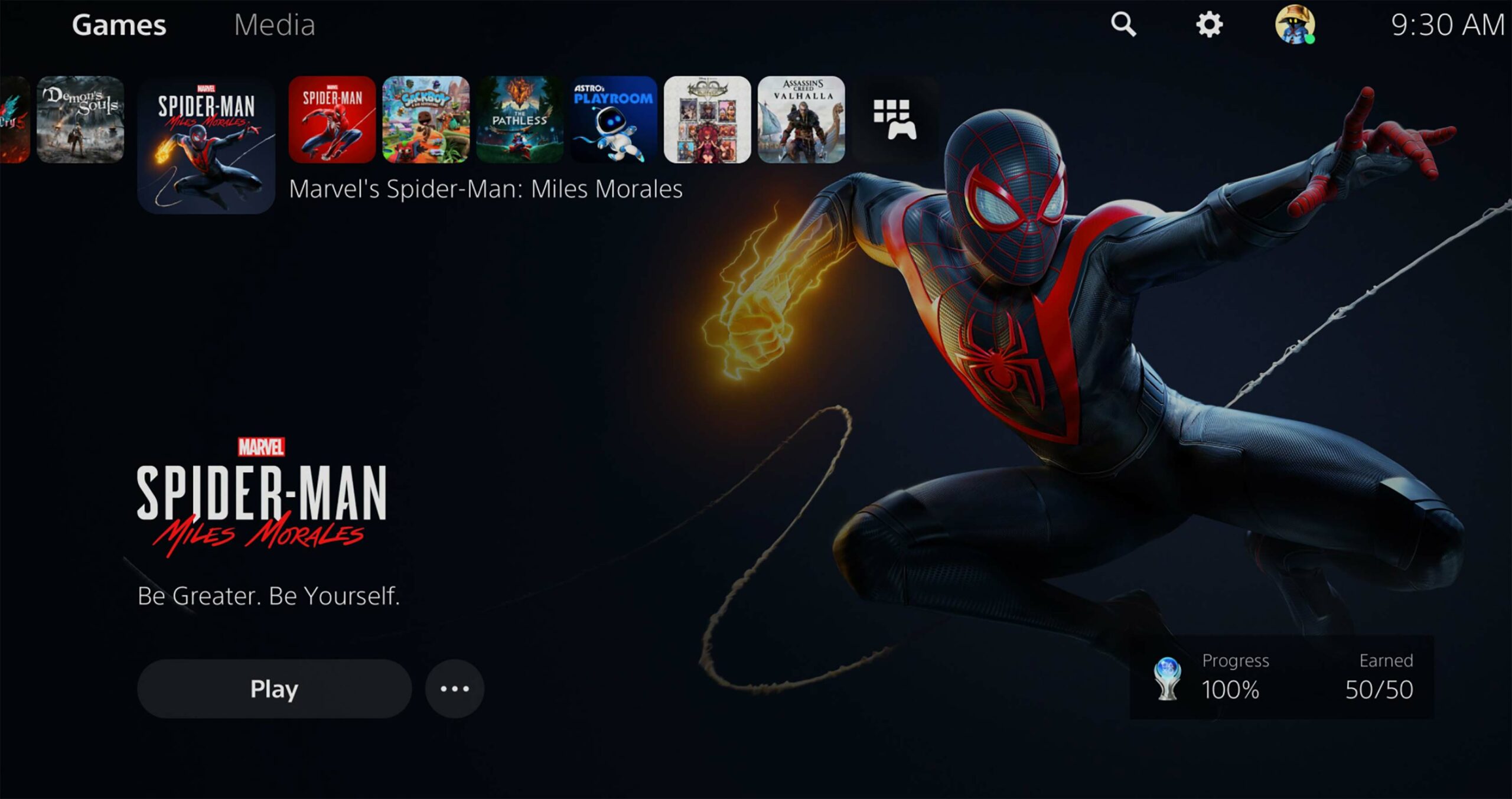
Sony’s also done a great job dividing content on the dashboard, with two clear sections for Games and Media. Call me meticulous, but I love having games and entertainment apps like Disney+, Apple TV and Bell’s Crave (which I can confirm is available on PS5 at launch) listed separately in such a way that feels organized and intuitive. Moreover, each game has its own integrated hub into the dashboard, including game-related services PlayStation Plus and PlayStation Now.
“In the process of designing the Activities system, we realized that most consoles don’t understand what’s happening inside the game”
Conveniently, this further cuts down on the time you’re spending in menus, as you’ll find everything related to the given title within its own section, including official news from the developer and PlayStation Blog, related streams from content creators and all associated downloadable content. That said, the PlayStation Store has also cleverly been integrated into the dashboard for quick and easy shopping.
Activities
But the best feature of the new UX is Activities, which are developer-curated links to specific parts of a game that you can select from the dashboard to directly jump into. Because of the PS5’s remarkable SSD, this is usually possible within mere seconds — less than ten, in fact, to bring me straight to a particular mission or level in Miles Morales, Astro’s Playroom or Demon’s Souls (minus obligatory opening titles the first time you boot them up).
“We had a top goal of making the most of your play time on PS5. Gamers are diverse — many are now parents — and have a hard time finding time to play games,” says Nishino about Activities. “We wanted to make it easier to get into the game, to remember where you were, and to find gaming opportunities that match your time and lifestyle.”
To that point, you’ll even get an estimate of how long to complete certain Activities — perfect for someone who might be short on time. What’s more, Activities are context-specific; impressively, the PS5 will even suggest different ones depending on your in-game behaviour. In all honestly, this wasn’t even something I consciously recognized until Nishino pointed it out to me, so subtle is its implementation.
“In the process of designing the Activities system, we realized that most consoles don’t understand what’s happening inside the game. So we worked with developers to make it easy for them to tell us what’s available ‘inside’ — like the menu in a restaurant window,” Nishino explains. “This lets us match potential gameplay with the player and make personalized recommendations. This ability to ‘see inside the game’ goes beyond what we’ve seen so far, and we have even more opportunities to expand it in the future.”
Best of all, Nishino confirmed that all PS5 games will support Activities, and even suggested how they might evolve over time. “We’re giving developers a lot of freedom in how they want to implement them based on their creative vision,” he says. “Activities are designed to break down barriers to gameplay, giving players more entry points into the game and allowing developers to shine a light on features or experiences that otherwise might easily be overlooked.”
“With Activities, we’ve begun to blur the lines and this creates a new collaboration with developers”
I certainly see what he means. As a big Spider-Man fan, I was initially inclined to binge the campaign. However, I would frequently see Activities suggesting all of Miles Morales‘ excellent side content, like the hilarious Peter Parker-led training missions or endearing Harlem community side missions. As a result, I came to appreciate how Activities subtly encourage you to better pace yourself, letting me savour the experience more and making my eventual completion of Miles Morales‘ riveting coming-of-age story feel all the more satisfying.
“From a broader lens, every console until today has treated gameplay and console UI as two separate worlds. With Activities, we’ve begun to blur the lines and this creates a new collaboration with developers, where developers don’t just make gameplay but are really extending the console UI to show their game in the best light,” explains Nishino. “This is a fundamentally different way to approach console UI and so far it looks like developers are really engaging with it creatively.”
Nishino’s comment about developers being able to “show their game in the best light” also stood out to me, as it’s exactly what the PlayStation Plus-exclusive ‘Game Help’ feature in Activities can do. In supported games, you’ll be able to bring up official, spoiler-free developer videos to assist you. These could help with finding a specific collectible or solving a puzzle, among other use cases.
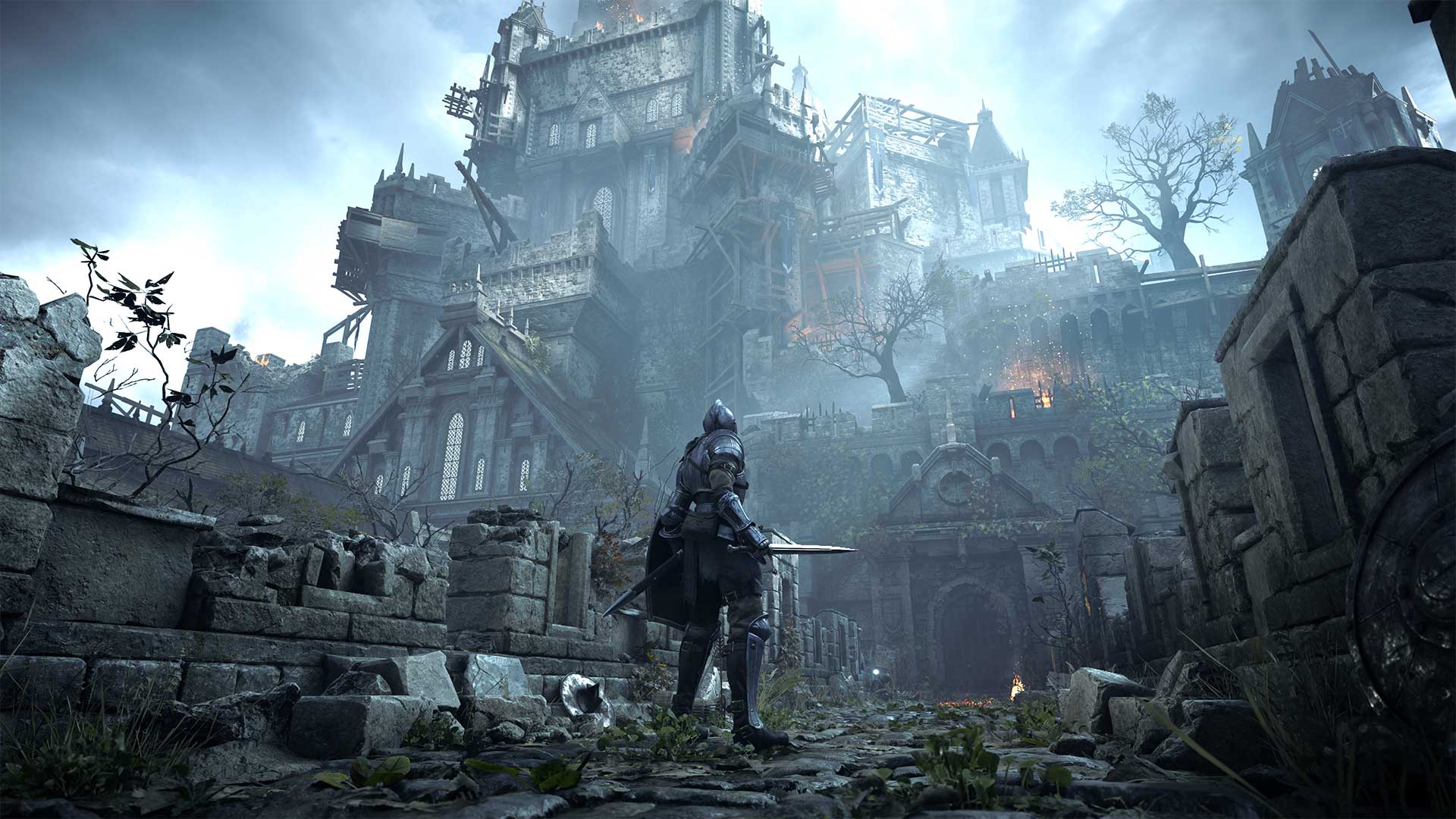
I was particularly impressed to see how this was implemented in Demon’s Souls, which features a staggering 180-plus assistive videos aiding you in combat, exploration and more. As a nice touch, you can even place these in picture-in-picture mode to watch as you play. Here, Game Help is an ingenious compromise to the ongoing debate surrounding games like the Souls series having an ‘Easy mode,’ as it’s completely optional and doesn’t change the game itself at all.
Overall, Nishino teased that the examples we’ve seen so far are “just the tip of the iceberg.”
Looking ahead
It should be noted, however, that the PS5’s ‘Switcher’ option that was first seen in the original UX reveal video isn’t actually Sony’s answer to the Xbox Series X/S’ Quick Resume. That feature allows you to rapidly swap between multiple ongoing games and pick up exactly where you left off.
Unfortunately, Switcher simply lists a few most recently opened games or apps. Activities do help offset the lack of Quick Resume (and, of course, have their own unique benefits), but they don’t offer similar direct access to wherever you left off. A comparable feature seems perfectly suited for the PS5’s remarkable SSD, so I’m hopeful one may come in the future (Nishino declined to comment.)
One of my other big hopes for the UX is deeper integration with the recently overhauled PlayStation App. To be sure, the new mobile app does do this to a solid extent, allowing you to peruse the PlayStation Store, begin downloads and receive notifications when they’re complete and create parties and voice chat. However, it’s missing the Xbox app’s incredibly handy ability to automatically save your console’s game captures so you can more easily share them via social media, text messages and more.
As it stands, the PS5 is disappointingly limited to sharing only to YouTube or Twitter. For now, Nishino notes that they “don’t have any additional announcements to make” regarding future updates to the PS App, but hopefully, this is something that could release down the line. Also shared between the PS5 and PS app is the social media-like ‘Explore’ tab, which contains official news about all of your games. Explore is currently only available in the U.S. at launch, but Nishino says “stay tuned” for Canadian availability.
Finally, custom themes are not supported on PS5 at launch, which is no doubt disappointing to some. However, themes are arguably less relevant now, as the PS5’s UX is specifically designed around spending as little time on the dashboard as possible. Plus, each game has its own hub with unique music and imagery, anyway, like Devil May Cry 5 Special Edition featuring character wallpaper to the fantastic tune of “Devil Trigger.” Still, the ability to set dynamic themes that apply across the dashboard — perhaps even with the option to supersede whatever music plays in individual hubs — would be quite welcome.
Ultimately, though, Nishino notes that this is just the beginning for the PS5 UX, and its already strong debut leaves room for further iteration.
“We’re in new territory here with what I think is the first platform that at its core was truly built to enhance and enrich play experiences for gamers.”
The PlayStation 5 is now available in Canada for $629 CAD for the standard model and $499 for the disc-less Digital Edition variant.
MobileSyrup may earn a commission from purchases made via our links, which helps fund the journalism we provide free on our website. These links do not influence our editorial content. Support us here.


