Google — well, parent company Alphabet — has given its logo its largest overhaul in 16 years.
Unveiled today, the new logo has wider, more pronounced strokes in a sans serif typeface the company developed in-house, called Product Sans.
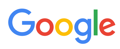
The idea behind the new logo is to make it scale across any and all screen sizes and resolutions, which sans serif fonts tend to do better than their serif counterparts. And while the flatness of the colours isn’t new — Google removed the subtle chrome lighting effects from its logo last year — the nod towards screens is.
The logo now also animates and pulses, which allows it a dual purpose as a loading screen, especially on mobile. With variations on search becoming more intwined with the Google experience — think Google Now, Now on Tap, etc. — the logo will be a visual add to indicate progress.
According to Fast Company, Google experimented with a number of designs, including a multicoloured “G” as well as a lowercase “g”. It even mocked up a fully geometric version of the logo.
![]()
As it stands, the new logo isn’t that different from its predecessor, and is still immediately recognizable. It’s just more acutely aware of its place in the design-focused, mobile-first web.
[source]Google Design[/source]
MobileSyrup may earn a commission from purchases made via our links, which helps fund the journalism we provide free on our website. These links do not influence our editorial content. Support us here.