Google Message first changed its text composition box back in January, but after many users complained about the design, the messaging app is redesigning the text area.
TheSpAndroid reports that Google Messages has changed the chat screen UI and the bottom bar where users can find the emoji button, input box, and attachment button.
The text field is divided by a line in the middle, separating the chat screen UI and the bottom bar as a double-line composition box.
The bottom bar has a lot of unused space between the emoji and photo buttons. Perhaps Google was thinking of adding additional feature buttons to the bottom bar similar to Apple’s messages app, which includes music, maps, and more.
The image below shows a comparison between the older version and the newer one:
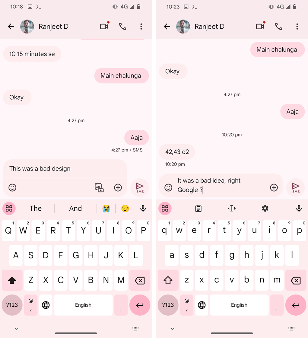
Messages’ old chat box (left) and new chat box (right). | Image Credit: TheSpAndroid
Now, the updated text area only has one single-line text box. The emoji button appears on the left side of the box, while a ‘+’ is on the right. The + button is likely where users can add photos and attachments, turning the previous two separate button functions into one. It also removes the unused space in the previous bottom bar and makes the design look cleaner.
The redesign comes with Google Messages beta version messages.android_20240404_01_RCO0.phone.open_beta_dynamic and should eventually hit the stable version of Messages.
Source: TheSpAndroid via Android Authority
MobileSyrup may earn a commission from purchases made via our links, which helps fund the journalism we provide free on our website. These links do not influence our editorial content. Support us here.
