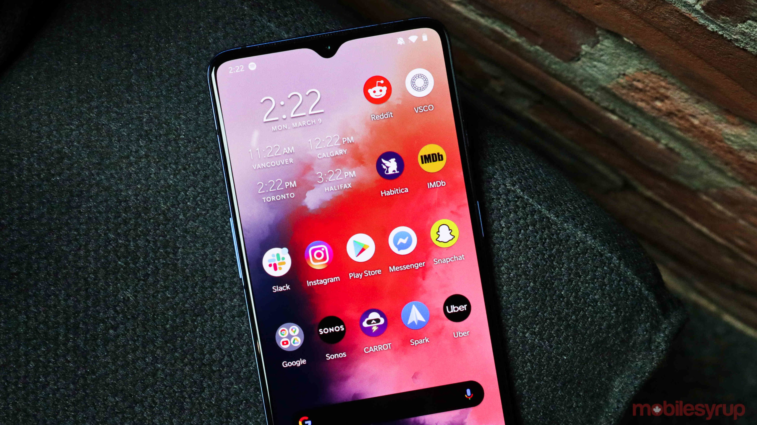
XDA Developer has gotten its hands on a beta version of the upcoming OnePlus launcher, revealing a handful of new features like a darker card shelf and revamped icon sizes.
On OnePlus phones, you can swipe towards the left to reveal a side zone full of helpful features like notes, a step counter and other useful tools. As of now, when you have the device’s ‘Dark theme’ turned on, this zone is dark grey. In the new update, it will be entirely black, according to XDA Developers.
This should help save battery-life, but more importantly, it will make the card zone fit in with the rest of OnePlus’ very black Dark theme.
In terms of icons, the company is now allowing users to display them on their home screens without labels. Third-party launchers have had this ability for a long time, so this isn’t a massive change for most people.
Something that might affect more users is the smallest icon size has been revamped to be closer to the medium size. This is a good idea given the tiny icons seemed out of place on OnePlus’ large phones.
Since most of these changes are optional, I don’t have any issues with them. That said, if I could choose one thing for the company to update, it would be either the folder design or the ambient display. Both feature small red highlights that make sense with OnePlus’ branding but are out of place on the phone since the rest of its launcher can be customized so significantly.
Source: XDA Developers
MobileSyrup may earn a commission from purchases made via our links, which helps fund the journalism we provide free on our website. These links do not influence our editorial content. Support us here.


