Google’s Messages app for Android underwent several design changes and shifts over the last few years as the company transitioned towards its new Material Design look.
A lot of those changes came piecemeal, such as the recent, small change to the image viewer in Messages.
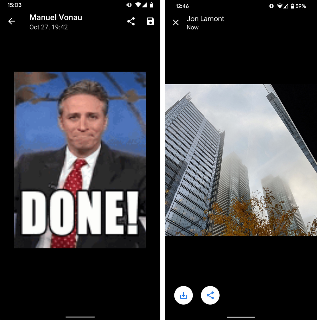
Messages version 5.2 (available through the beta program on the Play Store) changes the font, icons and more in the image viewer. To start, the sender’s name and the date and time the image was sent now appear in Google Sans instead of Roboto.
Further, the back arrow beside this information now appears as an ‘X’ icon.
Messages now zooms the picture to fill the screen better, and the update moved the share and save buttons.

Left: old Messages image viewer. Right: new image viewer in Messages 5.2
Previously, share and save appeared as icons in the top right corner of the screen. Now, both buttons appear in the bottom left corner. Google updated the style of the icons as well — instead of white icons on black, the new icons are blue and inside white circles. Additionally, the company updated the save icon from the old floppy disk to a downward arrow to imply a download.
At the moment, these icons remain white regardless of whether you have Messages in dark mode or not.
To check out the new Messages app, you’ll need to enroll in the beta on the Play Store. Alternatively, if you’re comfortable with downloading APKs, you can find the update online and sideload it manually.
Source: Android Police
MobileSyrup may earn a commission from purchases made via our links, which helps fund the journalism we provide free on our website. These links do not influence our editorial content. Support us here.


