After hinting at a redesign in September of 2016, the world’s largest professional social network platform has followed through.
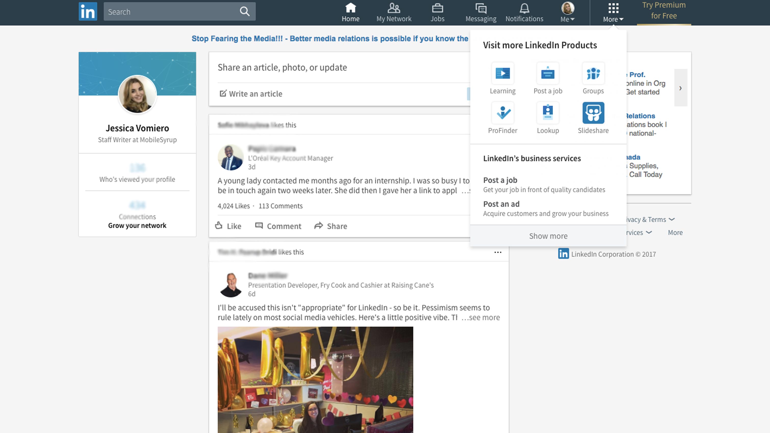
LinkedIn’s redesigned desktop began rolling out today, though it still hasn’t reached all users. The new design is comprised of a more personalize newsfeed, in-line real-time messaging and a modified navigation system.
LinkedIn claims that the News Feed will now be curated by a combination of algorithms and human editors, with more signals being added to show “quality” content from hundreds of influencers.
In addition however, LinkedIn’s messaging platform now more closely resembles Facebook, which reads as an attempt to move the platform away from email-like communication.
The search function has been simplified so there’s one place to find people, jobs, companies and groups. The navigation feature has also been optimized to showcase LinkedIn’s primary value, jobs and propositions.
After heading over to my LinkedIn account, I have to say that the desktop view is certainly more organized. With a much more — you guessed it — Facebook feel, the platform’s home page consists of a profile image on the left, newsfeed in the middle and a menu on the top.
The choppiness of the old LinkedIn is gone, while all the while remaining familiar. The redesign is mostly aesthetic and doesn’t proceed to alter key features of the platform.
LinkedIn previously hinted at a redesign in September, which marks the second time the company reorganized its customer-facing products.
LinkedIn seems to be looking towards improving its monthly active user (MAU) base, as its remained at 22 percent despite gaining more users each quarter.
The company was acquired by Microsoft last year for $26.2 billion, which officially closed in December.
MobileSyrup may earn a commission from purchases made via our links, which helps fund the journalism we provide free on our website. These links do not influence our editorial content. Support us here.