After weeks of teasing, Google is finally rolling out its redesigned sign-in page.
Unsurprisingly, the changes are pretty minor. After all, how much can you really do with a login screen? In a blog post, Google says that the sign-in and sign-up pages now sport a “more modern look” that’s “in-line with the Material Design across our other products.”
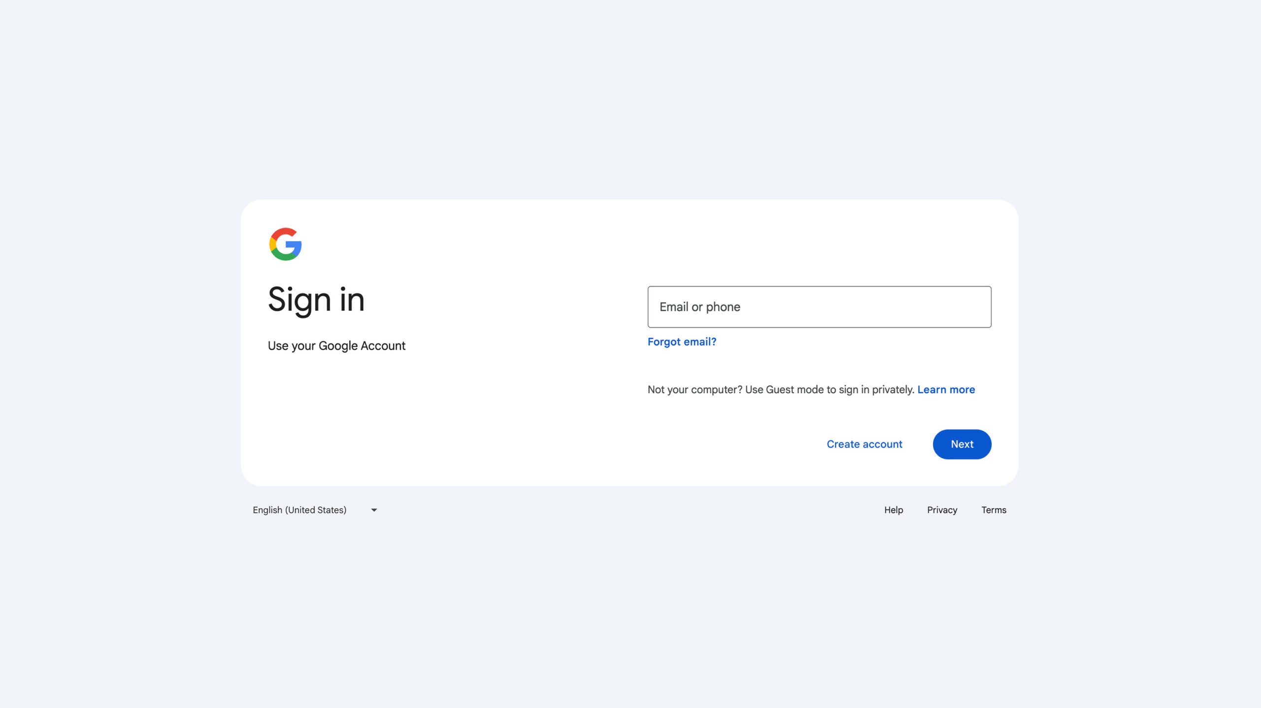
The change is purely visual, with no alterations to functionality. The biggest difference I see is that the background is no longer white but instead grey. The sign-in box itself remains white and now sports left-aligned text. Additionally, the box size adjusts to your screen size and will appear wider on laptops or PCs and narrower on smartphones.
Google started rolling out the change on February 21st and anticipates it will finish by March 4th. But, depending on how often you sign into your Google account, you might not see it for a while.
If you’ve logged into a Google service anytime in the last couple weeks, you might have seen a banner declaring the upcoming change. Given how much Google hyped up the change, I’m a tad disappointed by how minimal it is.
Image credit: Google
MobileSyrup may earn a commission from purchases made via our links, which helps fund the journalism we provide free on our website. These links do not influence our editorial content. Support us here.
