Google is reportedly testing a new Google Feed design. The company is currently testing the new design server-side. It was spotted by a number of Android Police tipsters and Redditors.
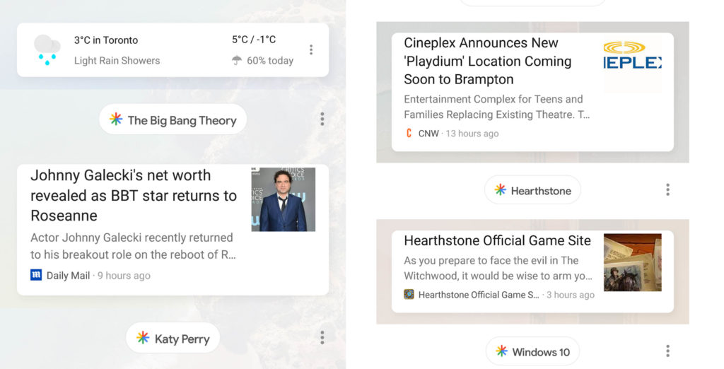
The new feed features a topic bubble above each card. News cards are also slightly more rounded than before, with a lightly coloured shadow beneath each card, which is very evident beneath the Johnny Galecki card beneath. Additionally, the whole layout uses a lot more space. Where the current Feed can stack three or four cards, the new now only fits two cards due to the topic bubbles.

Plus, it appears users can no longer hide specific topics, instead they’re limited to hiding stories or stories from a particular source. This means I can no longer hide cards related to the Toronto Maple Leafs, for instance. Further, cards are no longer swipeable either — currently, you can swipe cards away if you no longer want to see it — making it more effort to get rid of specific posts.
According to Android Police, the Feed change happens in both the Google app and within the launcher — some launchers like the Pixel one will reveal the Google Feed after swiping to the left from the home page.
It’s currently unclear if Google will push these changes to their app for everyone, however, due to all of the wasted space I really hope they don’t.
The Google Feed is available on all Android devices, either through their native launcher or by tapping on the Googe app.
We’ve reached to Google to see if they can provide more information regarding these changes.
Image Credit: SergeiWainsFellowes from Google Plus (right), TheCaptHammer from Reddit
Source: Android Police, Via: 9to5Google
MobileSyrup may earn a commission from purchases made via our links, which helps fund the journalism we provide free on our website. These links do not influence our editorial content. Support us here.


